The network for creativity
Join 1.25M professional creatives like you
Connect with clients, get discovered, and run your business 100% commission-free
Creatives on Contra have earned over $150M and we are just getting started
Back to feedPost
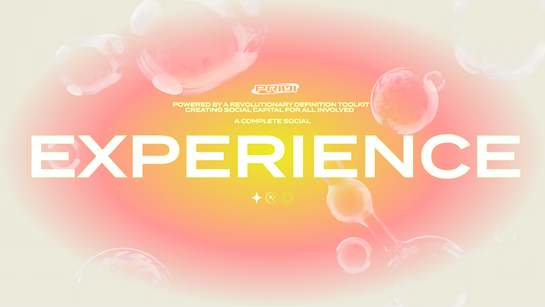
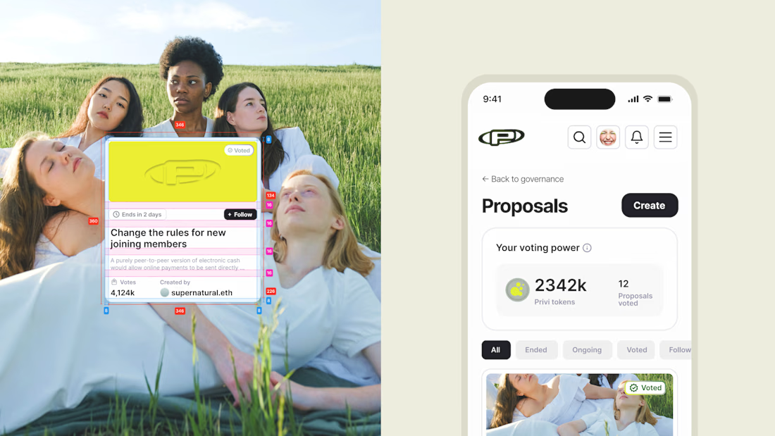
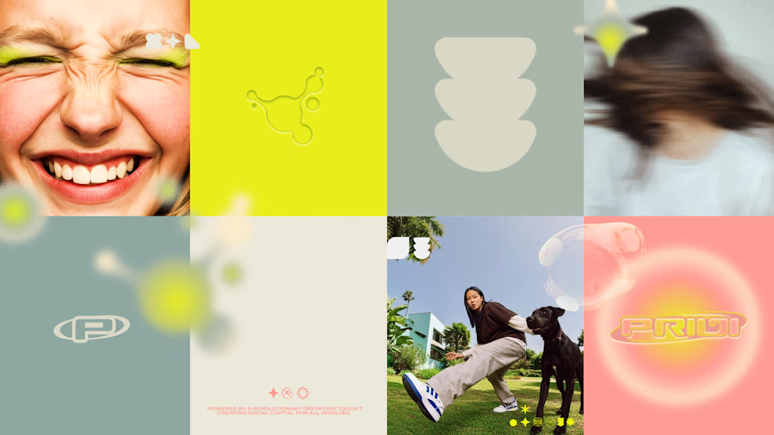
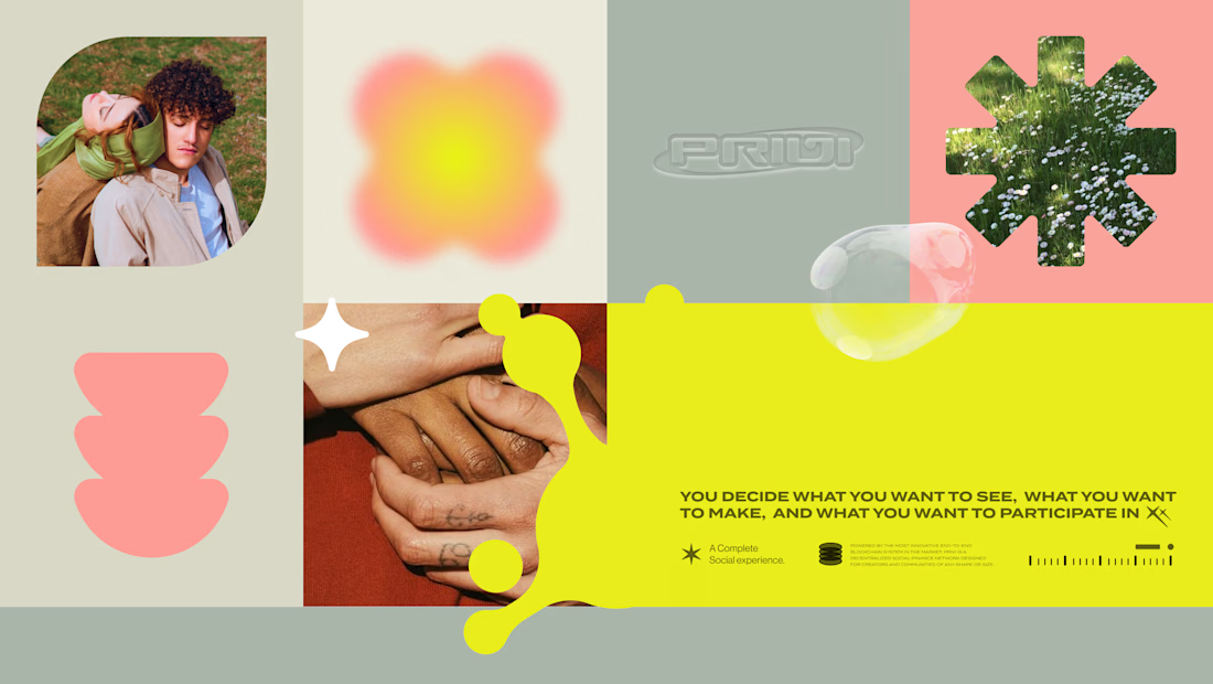
A social-finance startup enabling creators and communities to monetize and self-govern their digital ecosystems. We crafted a bold Gen-Z identity and visual system that translated its Web3 vision into an accessible brand through expressive design, UI concepts, and social content.



Very cool

Loving how energetic and fun this brand design is. Even photography is tying everything up very nicely!


This feels very Gen-Z in the best way — expressive, optimistic, and not intimidating.
How did you define the cultural references for the audience at the start of the process?


Thank you, that means a lot :)
We define cultural references through a structured but collaborative process. It usually starts with a deep-dive intake and continues through discovery sessions, where we treat each project as an experience to be designed, shaped by both the audience and the stakeholders.
Amazing approach!

Translating Web3 concepts into an accessible Gen-Z visual system is no small feat. You have managed to make the digital ecosystem feel human and expressive rather than just technical. That UI concept for the proposals looks incredibly intuitive. Great work!
Thank you so much <3
Making Web3 feel human and intuitive was a key goal from the start, so it’s great to hear the UI and visual system came across that way.

Love how you turned complex Web3 vibes into a bold, Gen-Z-ready brand 🔥 Super fresh and insanely well-executed!

These are super great

love this!


So cool I love the colorways!!

this is seriously vibey!! the gen-z energy is real and the visuals are so fresh and modern, love it

Good Work

Attractive

i love the way the branding is

Perfection, a goat for you. Love it
Awww thank you so much <3

Sooo genz, wha was your thought process when building colors and typos to use, cause they are so many modern typo and you choose a very concise and clear one and it fits exactly what you were trying to infuse a modern genz yet something with finance
Ahh love this question. The idea was to keep the system feeling fresh and culturally current without falling into the “trendy just to be trendy” trap. So we leaned into clarity-first type with a subtle personality, something that reads clean in finance but still feels a bit...
Really creative

love this color palette!

Great color combo 💯

Good work

Love it

The network for creativity
Join 1.25M professional creatives like you
Connect with clients, get discovered, and run your business 100% commission-free
Creatives on Contra have earned over $150M and we are just getting started





Related posts

An old client project: a full redesign of a crypto app.
Created the video with Opus 5.5

Top-notch design.

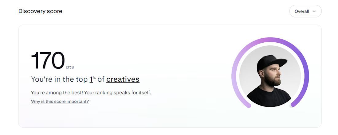
Top 1% on Contra. 🎉
A little milestone, but a reminder that showing up and doing good work consistently actually pays off.
If you're just starting out and wondering if it's worth it: it is. Keep going.
Thanks to all my clients and everyone here who's been so supportive.

That's Legendary bro congrats 🔥🔥🔥🔥

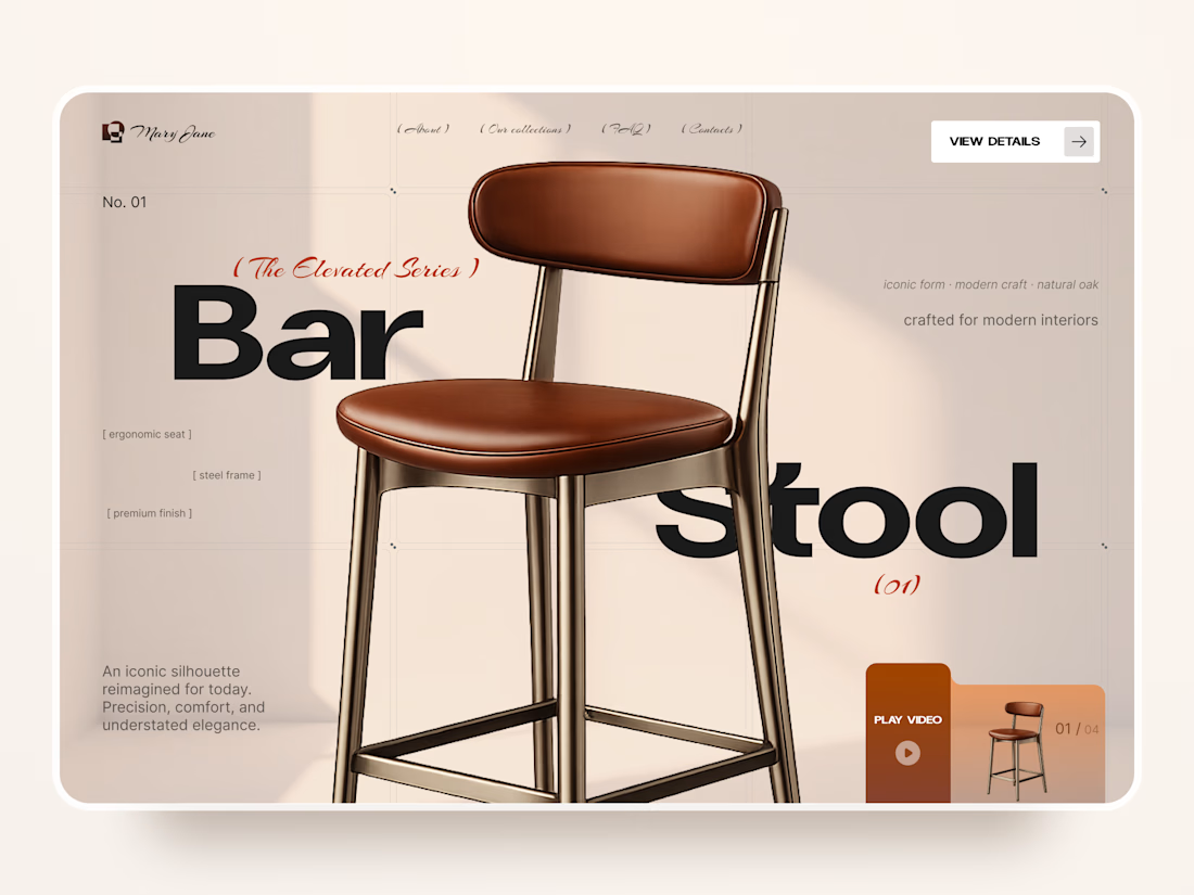
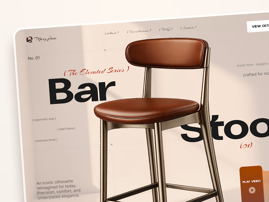
Mary Jane — Bar Stool Product Landing Page 🪑✨
A refined product landing page concept for a modern furniture brand, built around one statement piece
The design combines warm neutral tones, oversized typography, and editorial layouts to give the bar stool a premium, design-focused feel
Special attention was given to:
• Product-first composition
• Clean editorial typography
• Warm premium aesthetic
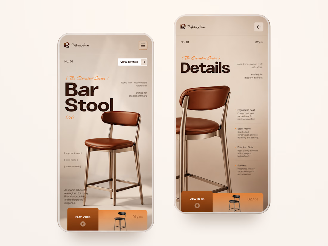
• Product details and features
• Video and 3D presentation
• Responsive mobile layout
The result is a simple, elegant experience that keeps the product at the center while giving the brand a distinctive visual character 🤎


Nice work