The network for creativity
Join 1.25M professional creatives like you
Connect with clients, get discovered, and run your business 100% commission-free
Creatives on Contra have earned over $150M and we are just getting started
Back to feedPost
Mary Jane — Bar Stool Product Landing Page 🪑✨
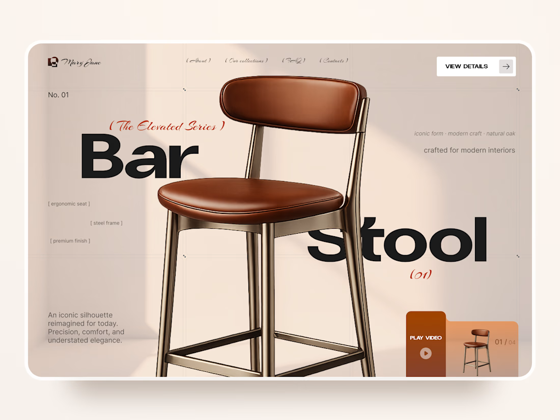
A refined product landing page concept for a modern furniture brand, built around one statement piece
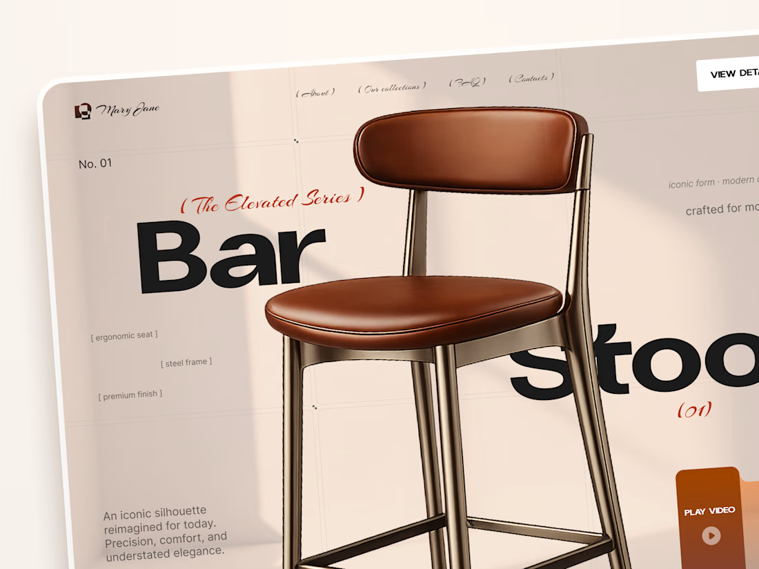
The design combines warm neutral tones, oversized typography, and editorial layouts to give the bar stool a premium, design-focused feel
Special attention was given to:
• Product-first composition
• Clean editorial typography
• Warm premium aesthetic
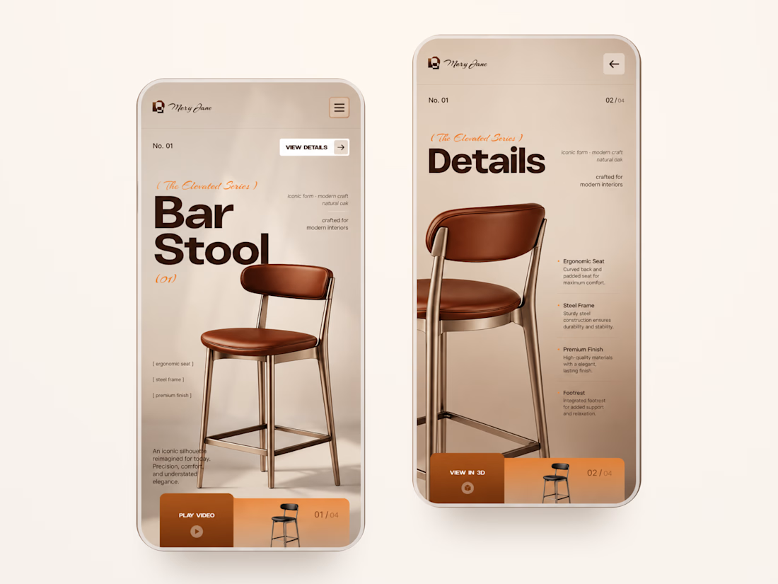
• Product details and features
• Video and 3D presentation
• Responsive mobile layout
The result is a simple, elegant experience that keeps the product at the center while giving the brand a distinctive visual character 🤎



that product presentation is really well done

this color palette is perfect 🤎

love these warm tones

Professional work

well done

Amazing work

I love how you incorporated the copywriting with the chair 🙌

Nice work

Clean and amazing

Love the colour play, Awesome

Good job


Nice branding posters great work 🎉🎉🔥🔥


product presentation looks cool

Good work klym


Great Work

Nice 👍🏻

Great work!

Very clean design


It feels cool 😎

I love the design aesthetics

The oversized type with those warm neutrals makes the stool feel so premium. Love how one product carries the whole page.


Amazing work👏🔥🔥

Letting the oversized "Bar Stool" type sit behind the chair keeps the product as the hero. Curious how you handled that type and product overlap on the mobile layout.

Love the vibe of this!

Looks so modern and perfect

This is stunning!!!

Good work

The network for creativity
Join 1.25M professional creatives like you
Connect with clients, get discovered, and run your business 100% commission-free
Creatives on Contra have earned over $150M and we are just getting started











Related posts

FOCUS — Creative Portfolio & Digital Art Website 🌸✨
A visually expressive website concept for a creative portfolio, built around digital art, bold imagery, and visual storytelling
The design combines vibrant pink tones, soft gradients, experimental typography, and immersive photography to create a distinctive editorial experience
Special attention was given to:
• Bold editorial hero composition
• Vibrant pink and dark color palette
• Experimental typography and visual details
• Immersive photography and digital artwork
• Creative project gallery and navigation
• Responsive mobile experience
• Clean layouts with a strong visual identity
The result is an expressive digital experience that puts creativity, emotion, and visual storytelling at the center of every screen 💗
Looking to create a standout portfolio or website for a creative brand? Let’s connect 🚀





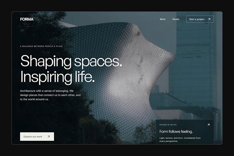
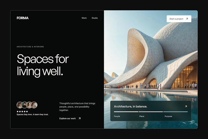
Design Exploration: Hero Section of Architecture Website. Which one do you think much better?


12 voted
43%
16 voted
57%
28 votes
Closed


An interaction study for Mare’s collection feed, exploring how to make groups legible within a dense, mixed-format archive.
The layout preserves image proportions and integrates collection labels into the packing system. On hover, image-derived gradients establish the collection boundary, while subtle displacement creates space around the active group without changing its position or scale.
The motion studies isolate assembly, packing, colour and proximity, using real collection content to examine timing, spatial continuity and hover behaviour.

