The network for creativity
Join 1.25M professional creatives like you
Connect with clients, get discovered, and run your business 100% commission-free
Creatives on Contra have earned over $150M and we are just getting started
Back to feedPost
Taste Test
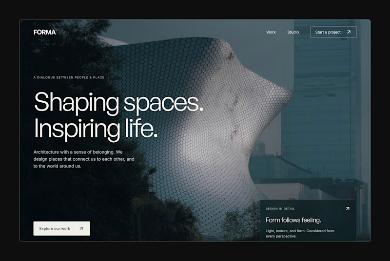
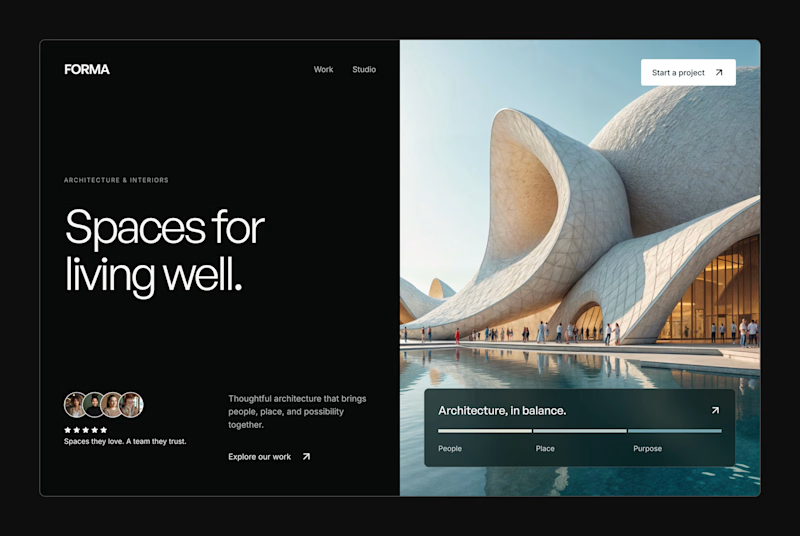
Design Exploration: Hero Section of Architecture Website. Which one do you think much better?


12 voted
43%
16 voted
57%
28 votes
Closed


split layout good

Thanks Nagaraj! Please you can vote 😃
done mate.

Split layout for me. In architecture the building is the proof, and the split gives it room while "Spaces for living well" stays readable at a glance. The full-width one is moodier, but the headline fights the texture. Could be fun to test the split with a slow parallax on the image side.
Very well said Mufaddal! Thanks for the insight.

Thank you Trueframe Team!

Wow it’s amazing bravo
Thanks Daniil!

Split layout is absolutely stunning 🔥🔥🔥🔥
Great job Prince 🎉🎉🎉

Full width wins for me

Split Layout wins for me, Prince Patrick. Giving the headline its own space instead of laying it over the image makes the message land just as hard as the architecture photography.
The network for creativity
Join 1.25M professional creatives like you
Connect with clients, get discovered, and run your business 100% commission-free
Creatives on Contra have earned over $150M and we are just getting started



Related posts

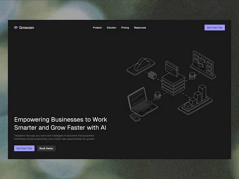
Designed a website concept for AI powered platform.
I wanted to give it a clean, minimal with a custom isometric illustration in the hero section.
Which version do you like better?
19 voted
59%
13 voted
41%

32 votes
Closed


guys, I need your help choosing a profile cover video.
which one looks better?
22 voted
13%
141 voted
87%
163 votes
Closed


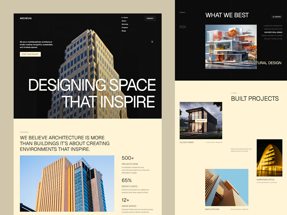
Archevia, Architecture & Design Website Template.
An editorial-style template built for architecture studios.
It features a CMS-powered project portfolio, service pages, testimonials, a contact form, and a blog.
Archevia is a device-friendly template with gallery-first layouts.
This is perfect for visual storytelling for design-led studios.
Check the comment.



nice work