The network for creativity
Join 1.25M professional creatives like you
Connect with clients, get discovered, and run your business 100% commission-free
Creatives on Contra have earned over $150M and we are just getting started
Back to feedPost
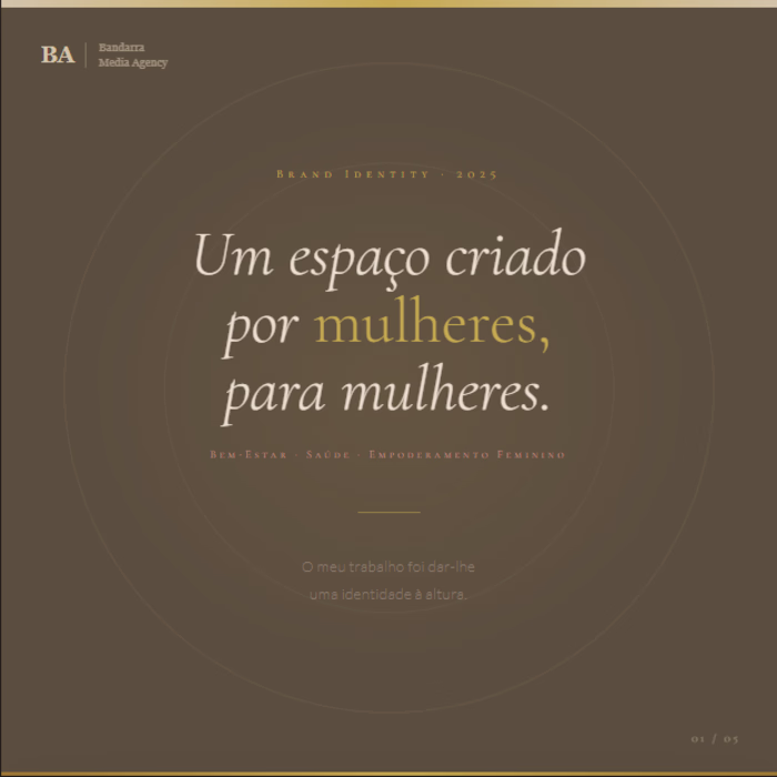
Brand Identity Design — Health, Wellness & Female Empowerment
A space built by women, for women. My job was to give it an identity worthy of its purpose.
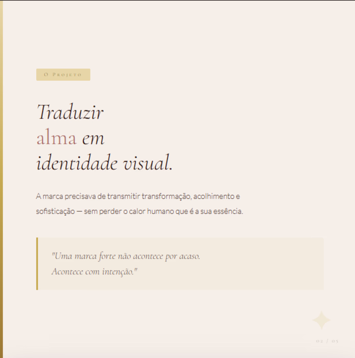
This project called for a chromatic and typographic system carefully crafted to communicate transformation, sophistication, and warmth — without compromising visual cohesion across touchpoints.
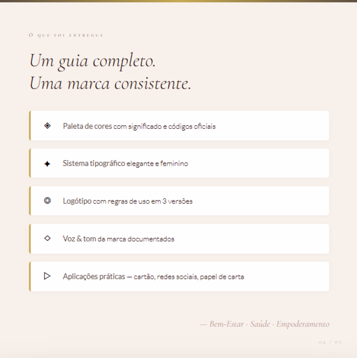
What was developed:
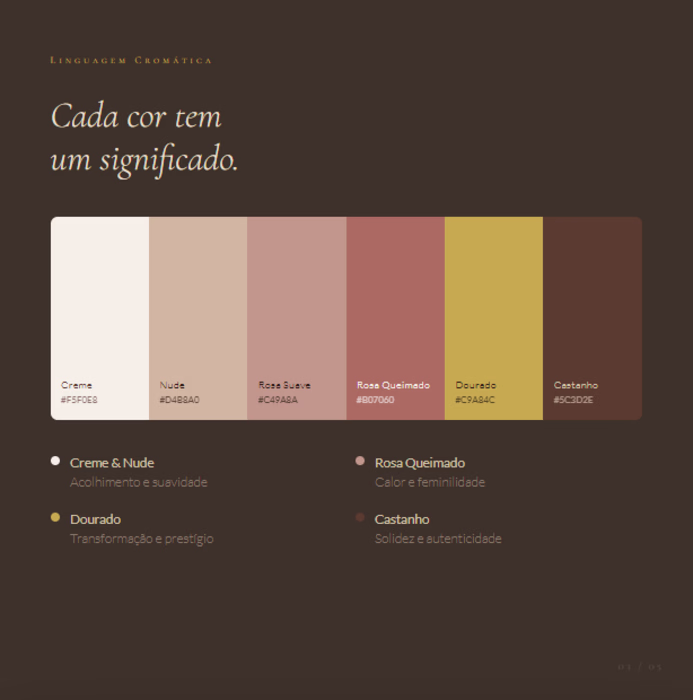
— Semantic color palette with 8 calibrated tones: cream, nude, burnt rose, mauve, warm brown, and a 4-stop gold scale — each color assigned a functional role within the visual hierarchy
— Typographic system built on italic serif display, spaced small caps for subheadings, and light sans-serif for body copy — creating editorial rhythm and femininity without sacrificing legibility
— Logo system with primary, reversed, and colored-background variations, including clear space rules and misuse guidelines
Brand DesignBrand StrategyVisual DesignClaudeCanvaAdobe Illustratorbrandidentitygraphicsdesignerbrandstrategist
Awesome!
Beautiful work!
Thanks 😊
Great Work.
Thanks 😊
great work
8-tone semantic color palette with functional roles in the hierarchy — that's a level of intentionality you don't see often. The italic serif + small caps combo is chef's kiss 🤌 Amazing work
The network for creativity
Join 1.25M professional creatives like you
Connect with clients, get discovered, and run your business 100% commission-free
Creatives on Contra have earned over $150M and we are just getting started
Related posts
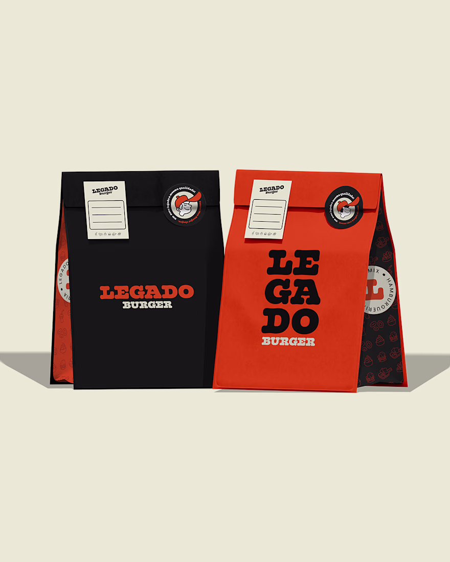
I had the honor of being part of the brand creation back when it was called Valhalla and operated only as an açaí shop. Over time, the business grew and became a well-known burger restaurant in the region.
However, there was an important problem: people had difficulty pronouncing and remembering the old name. To preserve the essence and legacy of Valhalla, Legado Burger was born.
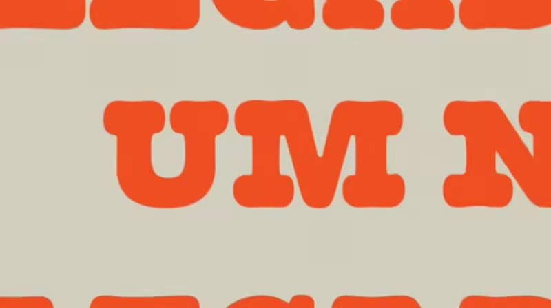
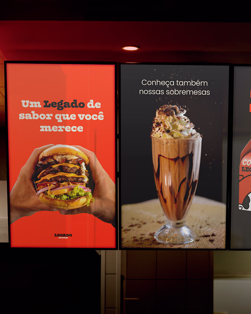
Visually, the changes were also significant. The purple and yellow palette was replaced by black and orange, creating a warmer, more vibrant atmosphere connected to the burger universe. The typography became more rounded, reinforcing the brand’s personality.
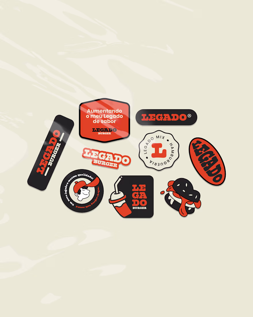
In addition, the project gained several custom illustrations and the presence of the mascot Léo, helping strengthen the identity and connection with the audience.
🔥 Full project: https://contra.com/p/F7QsUElk-legado-burger?r=othiagotaos
Great work!
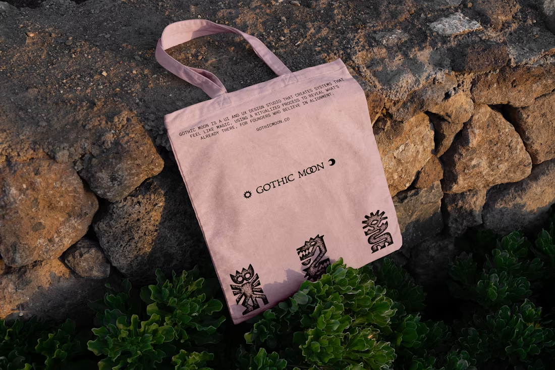
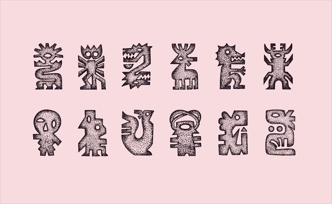
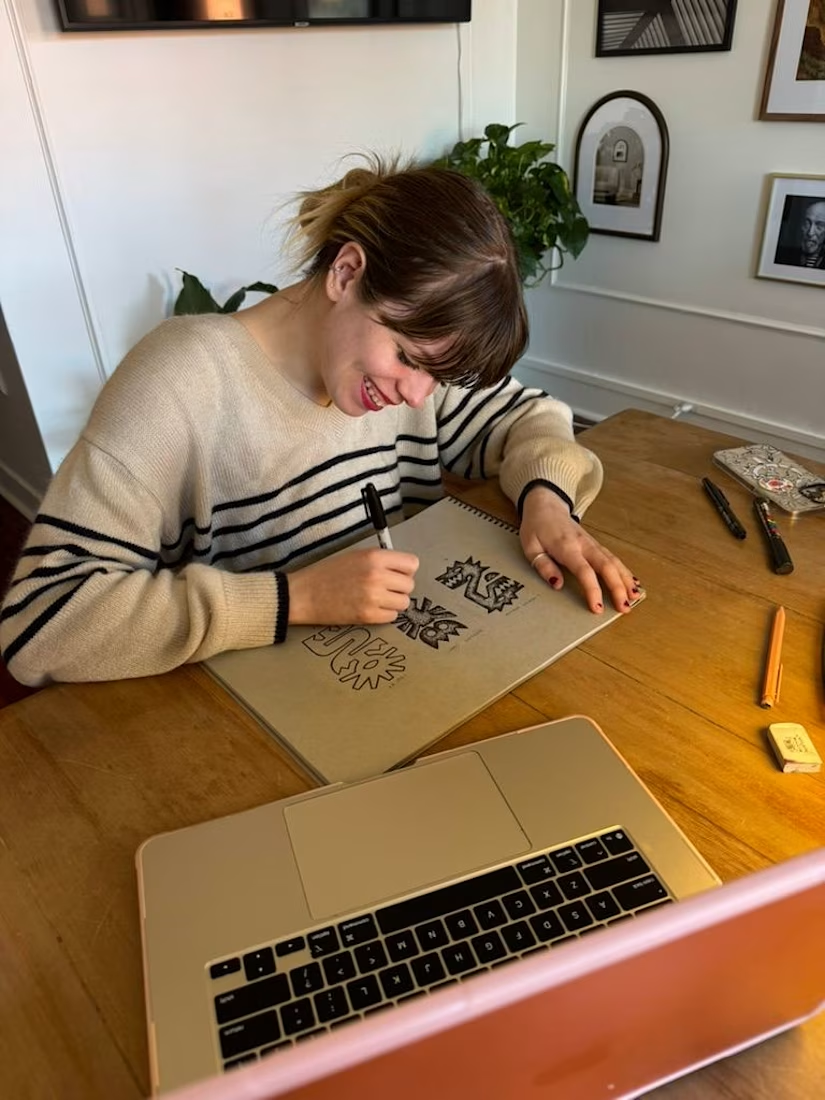
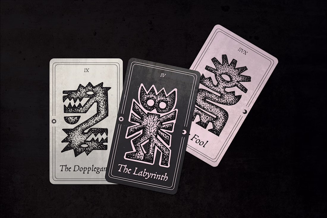
Stippled Illustrations and Identity Design for Gothic Moon, a a UI and UX design studio. Work done through Anchovies Agency within my role as Illustrative Art Director.
This looks clean and well thought out. How long did it take you to bring everything together?
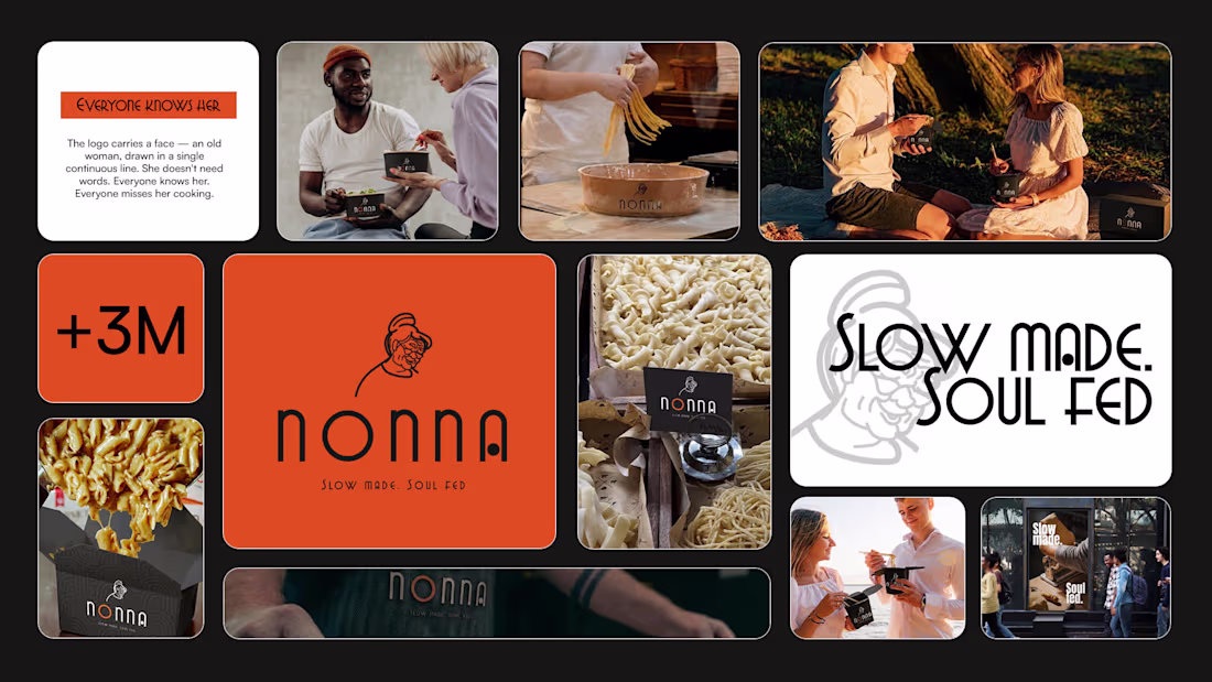
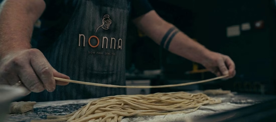
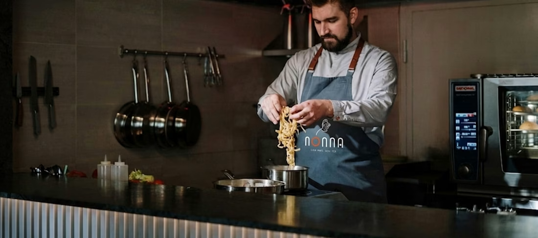
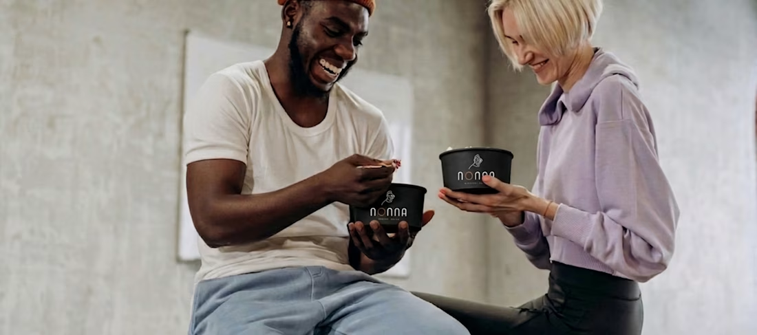
Some recipes don't need to be reinvented. They just need to be remembered. NONNA is a craft pasta brand built on the belief that real food takes time — and that time is always worth it. A complete brand identity designed to feel as honest as the pasta itself.
Brand DesignGraphic DesignProduct StrategyAdobe PhotoshopAdobe After EffectsAdobe Illustratorbrandingfreelancerlifeportfolioreview
Very very nice ^^
Trending
Claude
Claude has entered the design space. How are you using Claude Design?
Contra University
Learn from expert creatives how to earn more using next-gen AI tools.
creativeaiflow
Creative AI workflows are evolving. What tools do you use, and what are their strengths and weaknesses?
portfolioreview
The best portfolios tell a story, not just show a grid. Share yours for feedback.
freelancerlife
Freelancer life is wins, pivots, and everything in between. What’s yours right now?