
Bandarra Media Agency
Creative Social Media Manager & Content Creator
New to Contra
Bandarra is building their profile!
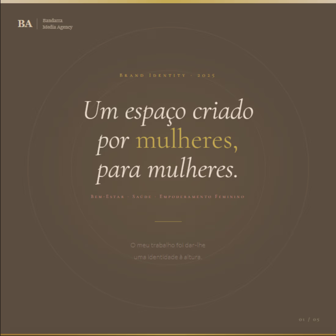
Brand Identity Design — Health, Wellness & Female Empowerment
A space built by women, for women. My job was to give it an identity worthy of its purpose.
This project called for a chromatic and typographic system carefully crafted to communicate transformation, sophistication, and warmth — without compromising visual cohesion across touchpoints.
What was developed:
— Semantic color palette with 8 calibrated tones: cream, nude, burnt rose, mauve, warm brown, and a 4-stop gold scale — each color assigned a functional role within the visual hierarchy
— Typographic system built on italic serif display, spaced small caps for subheadings, and light sans-serif for body copy — creating editorial rhythm and femininity without sacrificing legibility
— Logo system with primary, reversed, and colored-background variations, including clear space rules and misuse guidelines
8
15
273