The network for creativity
Join 1.25M professional creatives like you
Connect with clients, get discovered, and run your business 100% commission-free
Creatives on Contra have earned over $150M and we are just getting started
Back to feedPost
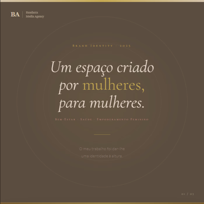
Brand Identity Design — Health, Wellness & Female Empowerment
A space built by women, for women. My job was to give it an identity worthy of its purpose.
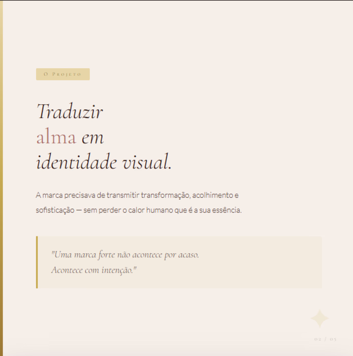
This project called for a chromatic and typographic system carefully crafted to communicate transformation, sophistication, and warmth — without compromising visual cohesion across touchpoints.
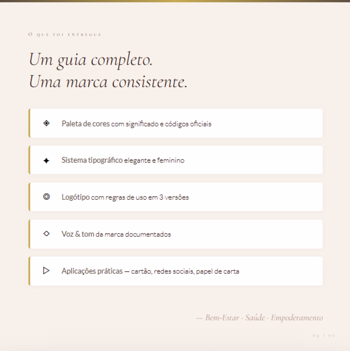
What was developed:
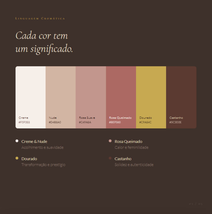
— Semantic color palette with 8 calibrated tones: cream, nude, burnt rose, mauve, warm brown, and a 4-stop gold scale — each color assigned a functional role within the visual hierarchy
— Typographic system built on italic serif display, spaced small caps for subheadings, and light sans-serif for body copy — creating editorial rhythm and femininity without sacrificing legibility
— Logo system with primary, reversed, and colored-background variations, including clear space rules and misuse guidelines
brandidentitybrandstrategistgraphicsdesignerBrand StrategyBrand DesignVisual DesignAdobe IllustratorCanvaClaude
Beautiful work!
Thanks 😊
Great Work.
Thanks 😊
great work
Awesome!
8-tone semantic color palette with functional roles in the hierarchy — that's a level of intentionality you don't see often. The italic serif + small caps combo is chef's kiss 🤌 Amazing work
The network for creativity
Join 1.25M professional creatives like you
Connect with clients, get discovered, and run your business 100% commission-free
Creatives on Contra have earned over $150M and we are just getting started
Related posts
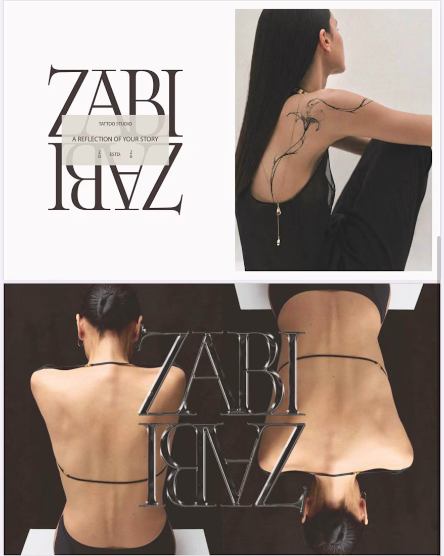
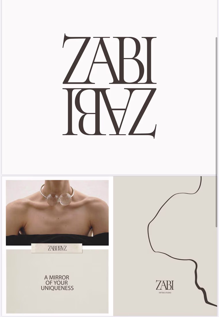
I’m currently working on a visual identity for a tattoo studio. I’ll show you a small part of this project.
It was important to convey femininity and character. The studio creates fine-line tattoos that look clean and reflect each client’s personal story. The mirror effect in the logo represents exactly this idea of reflecting stories through tattoos. The lines in the typography reference fine-line tattoo work, and their interconnection represents the close bond between the tattoo artist and the client. This reflects the core philosophy of the brand.
I’d be curious to hear your thoughts on the result. 😊
As a woman, I really appreciate how femininity is expressed here — not as decoration, but as character. Beautiful work.😍
👋 Hey, we’re Lynksen.
We build digital products and websites that don’t just work - they win hearts.
For 5+ years, we’ve been the go-to team for startups and brands chasing big ideas - turning raw sparks into products that fuel millions of daily clicks, swipes, and sign-ups.
We move fast, combining product thinking, clear UX, and real business needs to create smooth, high-converting products for brands ready to make an impact.
👉 Have a project idea? We are available for new projects hello@lynksen.com or DM us!
post is awesome love the person who edited it lol
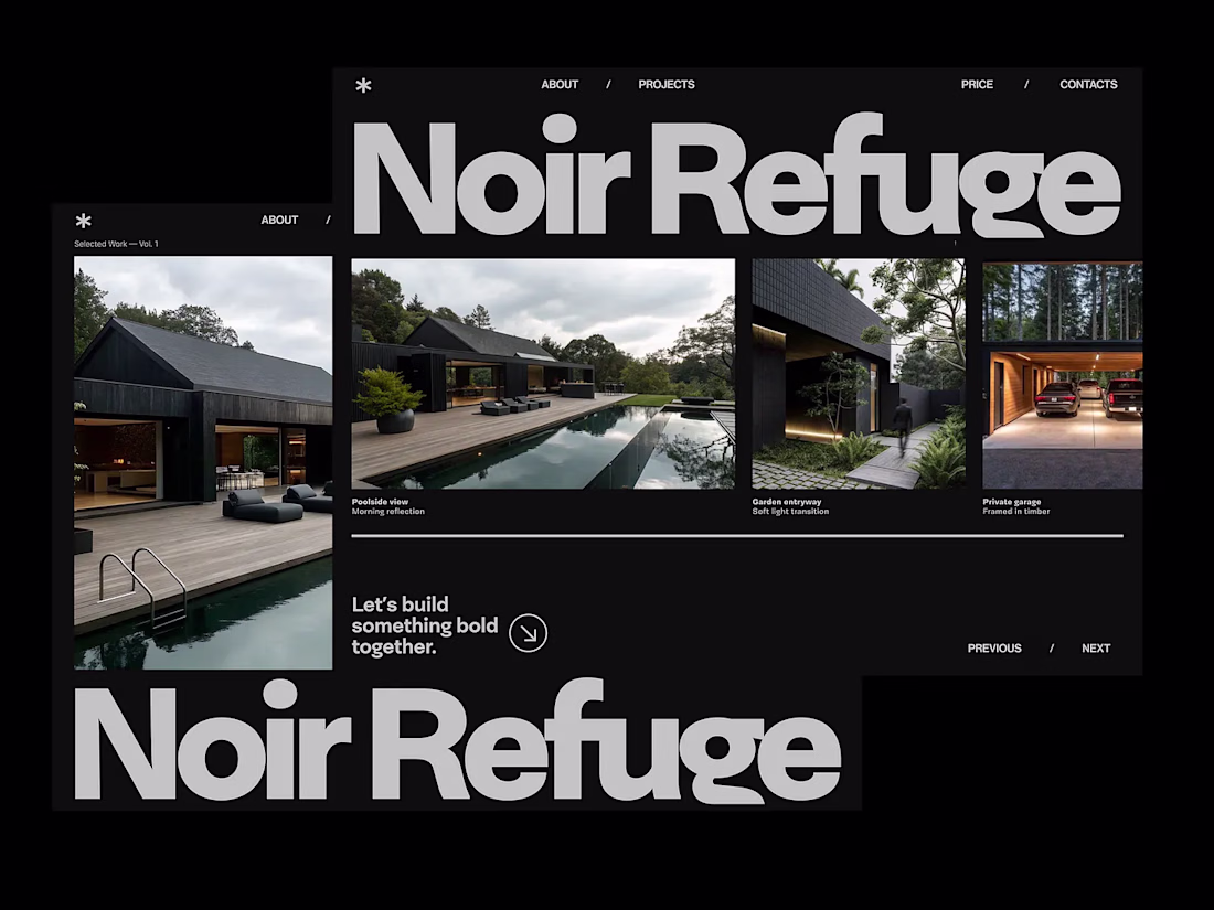
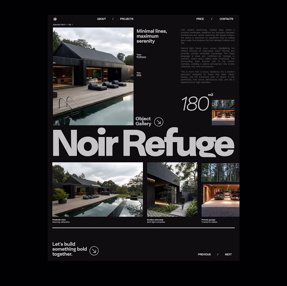
⚫Noir Refuge — Premium Architectural Website
The project explores how a digital experience can communicate silence, depth, intimacy, and refined architectural character through visual design. The direction combines minimal layouts, cinematic imagery, strong typography, soft motion, and a restrained monochrome palette to create a calm but memorable brand presence.
More works: https://dribbble.com/polinadubenko
Looks Good
Trending
Claude
Claude has entered the design space. How are you using Claude Design?
Contra University
Learn from expert creatives how to earn more using next-gen AI tools.
MagicPath
The canvas is infinite, and exploration is becoming the workflow. How are you using MagicPath?
creativeaiflow
Creative AI workflows are evolving. What tools do you use, and what are their strengths and weaknesses?
freelancerlife
Freelancer life is wins, pivots, and everything in between. What’s yours right now?