The network for creativity
Join 1.25M professional creatives like you
Connect with clients, get discovered, and run your business 100% commission-free
Creatives on Contra have earned over $150M and we are just getting started
Back to feedPost

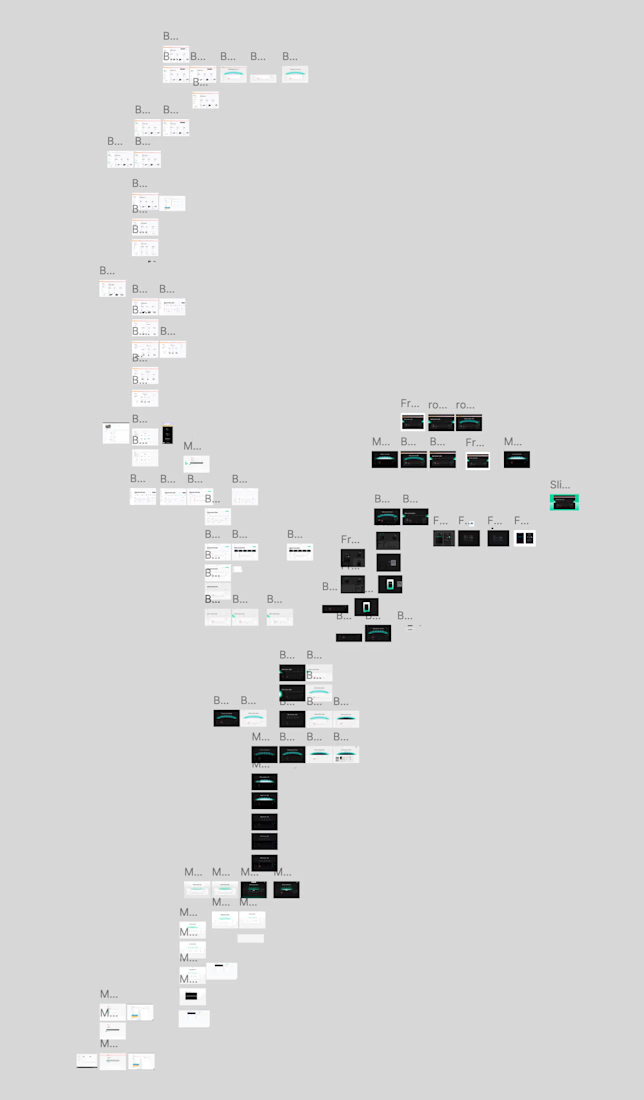
Here are two variations of a project management dashboard I designed during the project's exploration phase. We ended up going with a different direction, but I like the compactness of these.

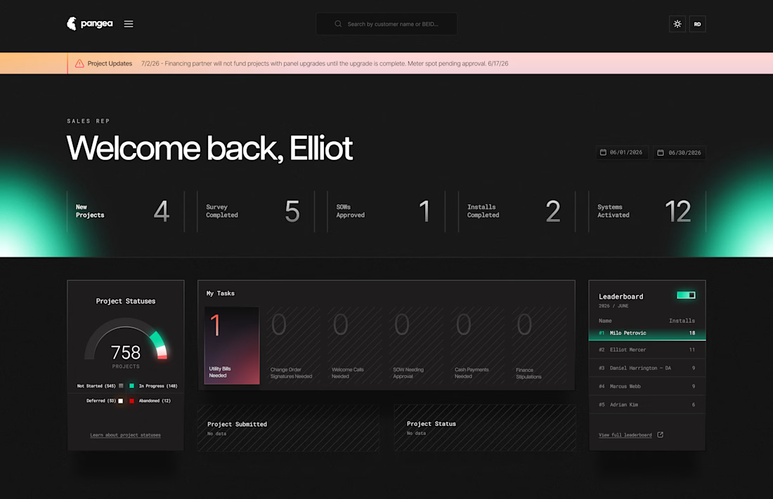
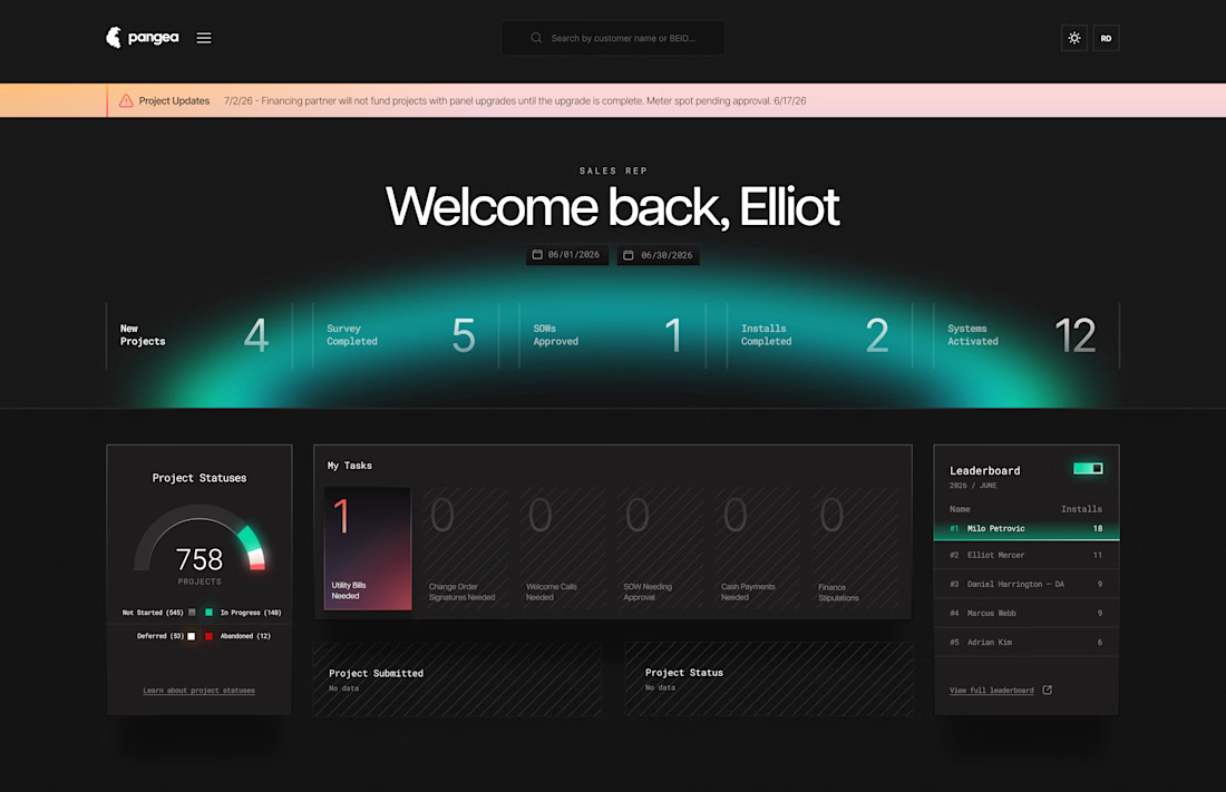

The split between the dense left variation and the spacious right approach is really insightful. Most dashboards get stuck in one philosophy. Your left version prioritizes information density, but the right balances scannability with breathing room. What was the actual feedback...

both looks perfect to me ❤️
The network for creativity
Join 1.25M professional creatives like you
Connect with clients, get discovered, and run your business 100% commission-free
Creatives on Contra have earned over $150M and we are just getting started






Related posts

Exploring hero sections for Nation e-commerce
Loving the direction

Solid layout, Miguel! The contrast between the clean typography and those interactive bento-style cards is crisp. Building this layout with smooth CSS grid transitions or GSAP pin scrolling would make the UX feel incredibly interactive.

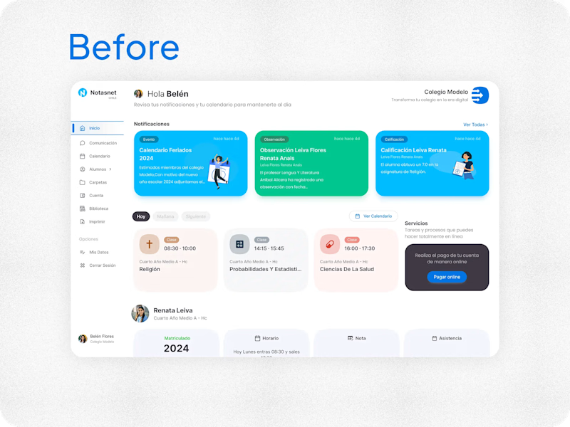
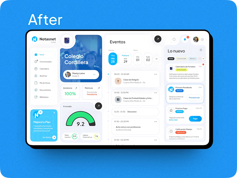

After absolutely it's more practical 🎉🎉🔥🔥

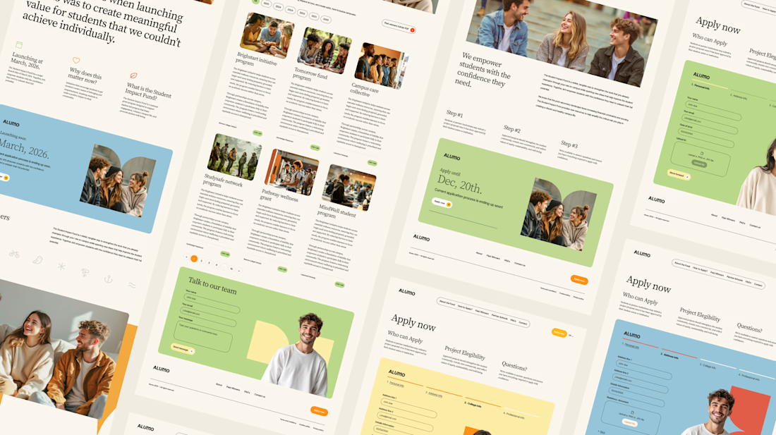
The Client: Alumo is a student impact fund that pools collective influence from influencers and partner schools to deliver a $250,000 annual grant program for student-led projects across Canada.
The Issue: The fund needed a website that could communicate trust and purpose to two very different audiences — students applying for grants and partner schools or influencers considering joining — while also showcasing past winners and guiding applicants through the process clearly.
The Solution: A multi-page website was designed with a warm, approachable visual identity using earthy tones, generous imagery, and clear information hierarchy. Each section — About, Past Winners, and How to Apply — was structured to reduce friction and build confidence, making it easy for students to understand eligibility and take action before the deadline.

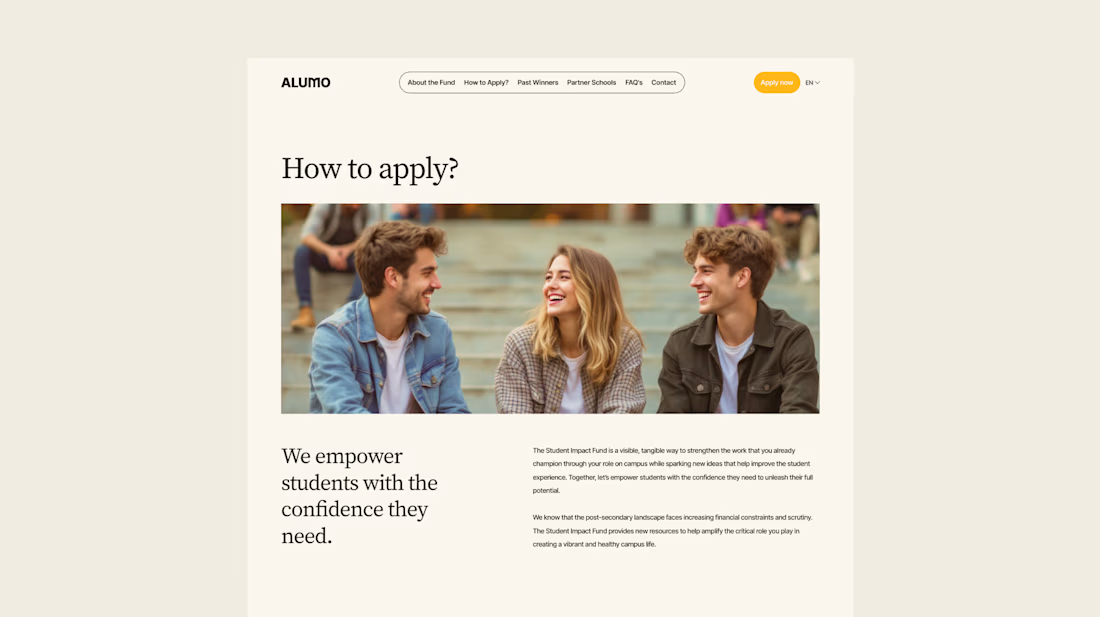
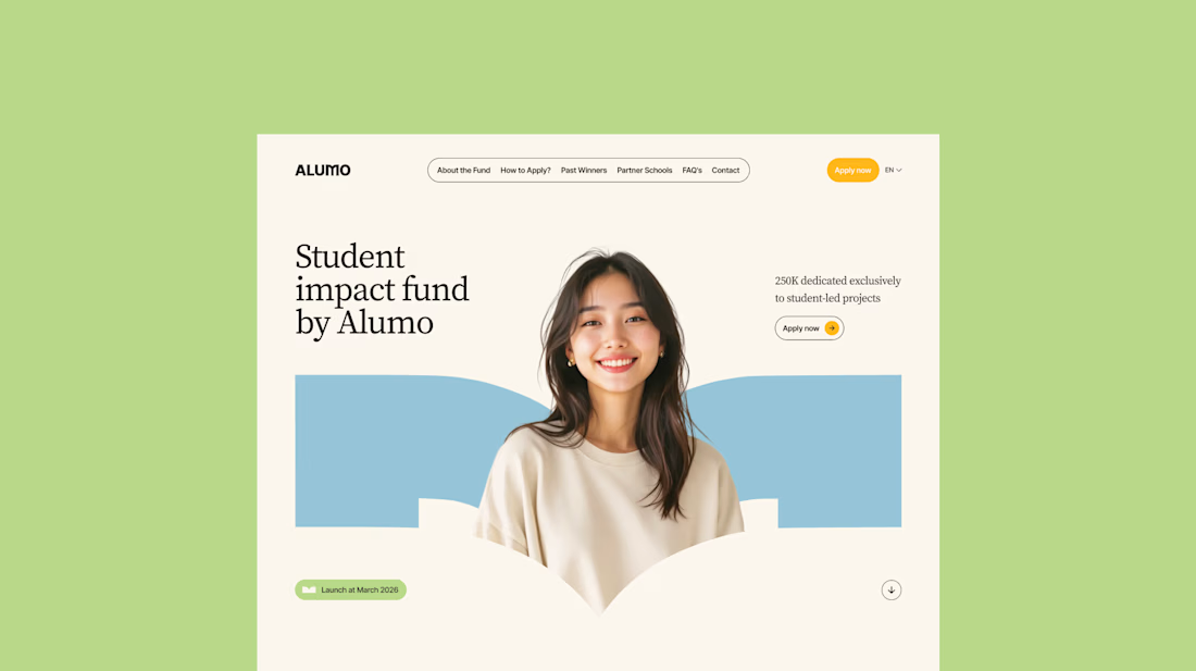
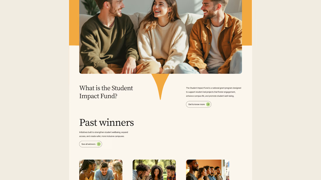

Love how you're tackling trust + purpose for a $250K fund - that's a tough balance with two audiences. Communicating credibility for a student-led initiative across Canada is huge. Would love to see how you solved it!