The network for creativity
Join 1.25M professional creatives like you
Connect with clients, get discovered, and run your business 100% commission-free
Creatives on Contra have earned over $150M and we are just getting started
Back to feedPost

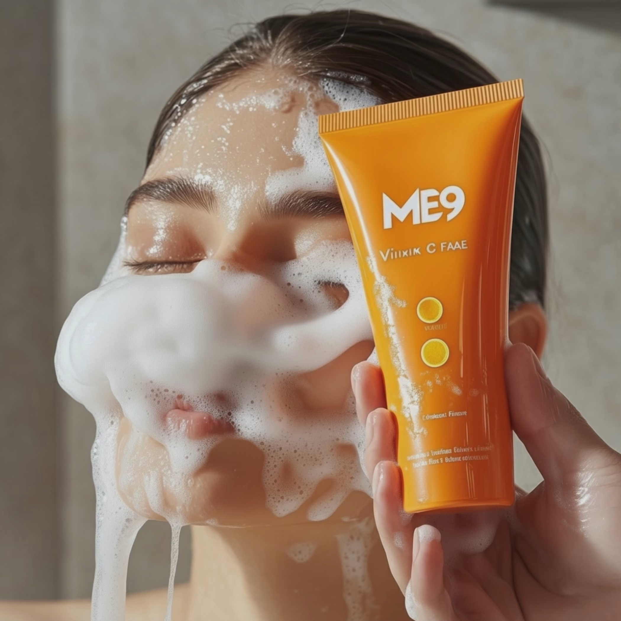
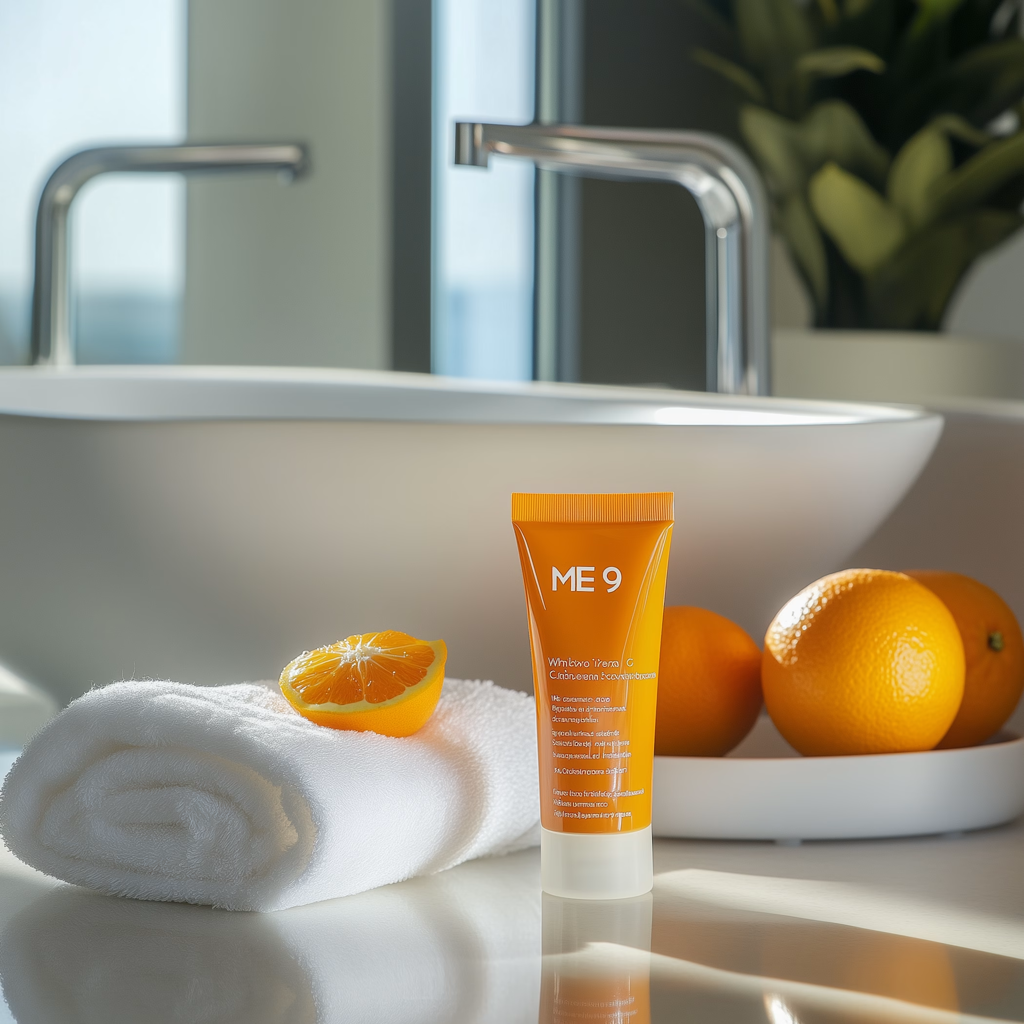
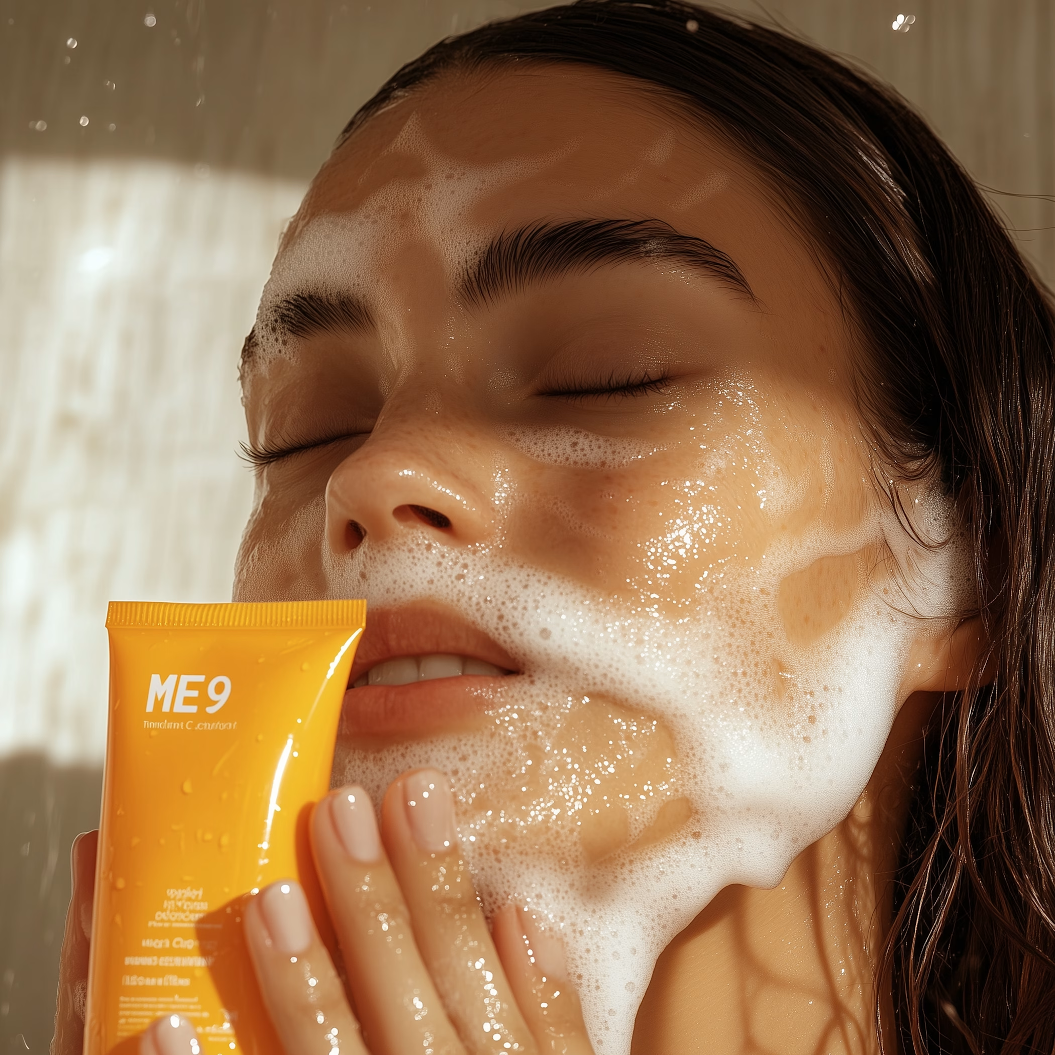
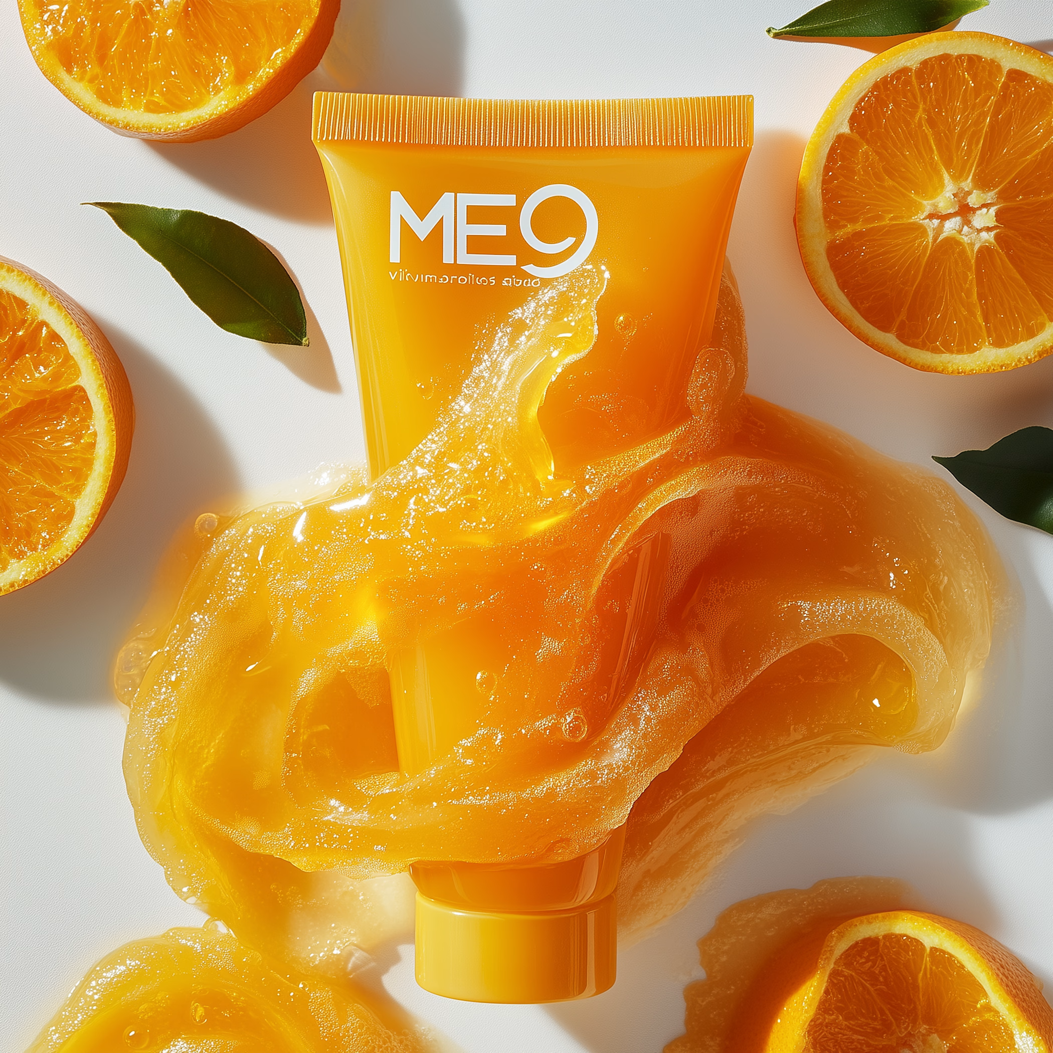
Luxury Skincare Product Photography (AI-Powered, Ad-Ready Visuals)
High-end skincare product visuals created for modern beauty brands that want premium, conversion-focused imagery.
This project focuses on luxury aesthetics, clean compositions, and ad-ready lighting suitable for: • Facebook & Instagram Ads • Shopify / DTC Websites • Amazon & Ecommerce Listings • Landing Pages & Brand Campaigns
Each visual is crafted using AI-assisted workflows to achieve studio-quality results without the cost or delay of traditional photoshoots.
✔ Luxury lighting & textures ✔ Clean, minimal, premium look ✔ Consistent brand-ready visuals ✔ Fast turnaround ✔ Custom concepts available per brand
Ideal for skincare, cosmetics, wellness, and personal care brands looking to elevate their visual identity and boost conversions.
MidjourneyproductphotographyProduct PhotographyCreative Design Adobe PhotoshopskincarebrandingbeautyadsAI VIsual DesignerCanva


The network for creativity
Join 1.25M professional creatives like you
Connect with clients, get discovered, and run your business 100% commission-free
Creatives on Contra have earned over $150M and we are just getting started




Related posts

⁕ Full Brand Identity for Trace™
One of the project's greatest challenges was creating an identity that is instantly recognizable and inspires investor confidence, while balancing a futuristic aesthetic with the sense of reliability intrinsic to the brand's values.
The core concept draws inspiration from the cosmos and the brand's drive to transcend boundaries; no matter the distance, the delivery is guaranteed. We translated this visually through patterns forming paths that lead to a destination, a motif that extends to every corner of the visual language.


"The Trace" is one of your best branding works. fantastic execution man

After a long time finally
New case study: Conduct AI 🖥️
Designed and built in Framer.
Take a look 👇


Love the clean layout.

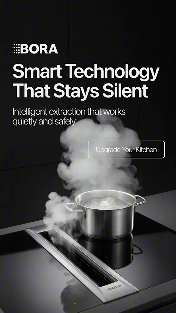
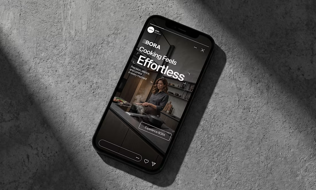
BORA – Ad Creative Concept
Most kitchen appliance ads sell you the warm family dinner. I wanted to try the opposite.
Built this BORA concept as a portfolio piece, treating the product like architecture instead of tech – dark marble, concrete, no hands, no food styling. Just a pot, steam, and silence.
The steam does all the movement in the motion piece. Typography stays out of the way – one line, low CTA, nothing fighting the composition. Turns out when you strip out the lifestyle, the price point sells itself.


Treating the appliance like architecture is a strong direction.