The network for creativity
Join 1.25M professional creatives like you
Connect with clients, get discovered, and run your business 100% commission-free
Creatives on Contra have earned over $150M and we are just getting started
Back to feedPost

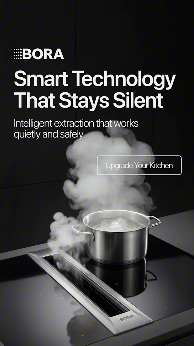
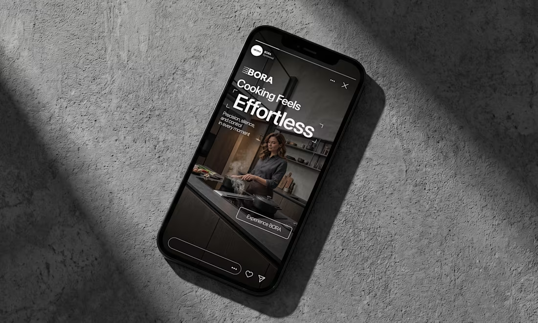
BORA – Ad Creative Concept
Most kitchen appliance ads sell you the warm family dinner. I wanted to try the opposite.
Built this BORA concept as a portfolio piece, treating the product like architecture instead of tech – dark marble, concrete, no hands, no food styling. Just a pot, steam, and silence.
The steam does all the movement in the motion piece. Typography stays out of the way – one line, low CTA, nothing fighting the composition. Turns out when you strip out the lifestyle, the price point sells itself.




Treating the appliance like architecture is a strong direction.

This is impressive! 😮

Treating a kitchen appliance like architecture instead of a warm family dinner is such a smart flip, everyone else in the category shot the same casserole. Letting the steam do all the movement while the type stays quiet is the move. Strip out the lifestyle and the price point really does sell itself.


Treating the product as architecture changes the entire value perception. The restraint is doing the selling: one material world, one moving element, and no lifestyle clichés competing with the object. I would be curious to see whether the same language can survive a 15-second...
The network for creativity
Join 1.25M professional creatives like you
Connect with clients, get discovered, and run your business 100% commission-free
Creatives on Contra have earned over $150M and we are just getting started







Related posts

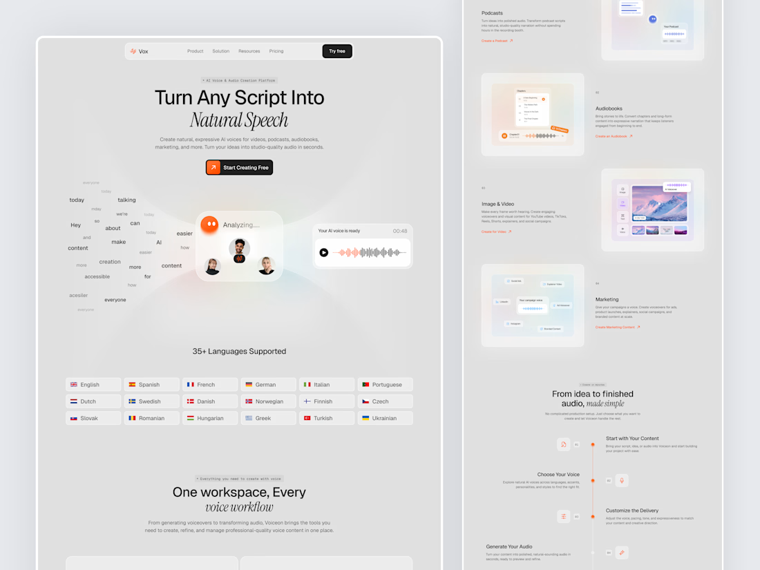
Designed a modern AI Voice SaaS Landing Page.
A soft light interface with gentle color glows, warm orange accents, and elegant italic serif headlines for a calm and creative first impression.
A floating word cloud turning into a voice wave, a language grid, use case cards for podcasts, audiobooks, video, and marketing, plus a simple step by step flow make AI voice creation feel easy to understand. Clean spacing and soft cards keep the whole page light and easy to explore.


Nice UI

What if a fintech logo explained the product before you read anything?
Terza splits every payday into Spend, Save and Bills.
So the mark is one coin cut by a single slice, and the app opens on it.
Concept brand plus a working prototype, built by our studio.
Would you get the idea from the logo alone?
https://contra.com/p/bekYUeXP
https://givemeprompts.com

That's a great idea good job Supreme 🔥

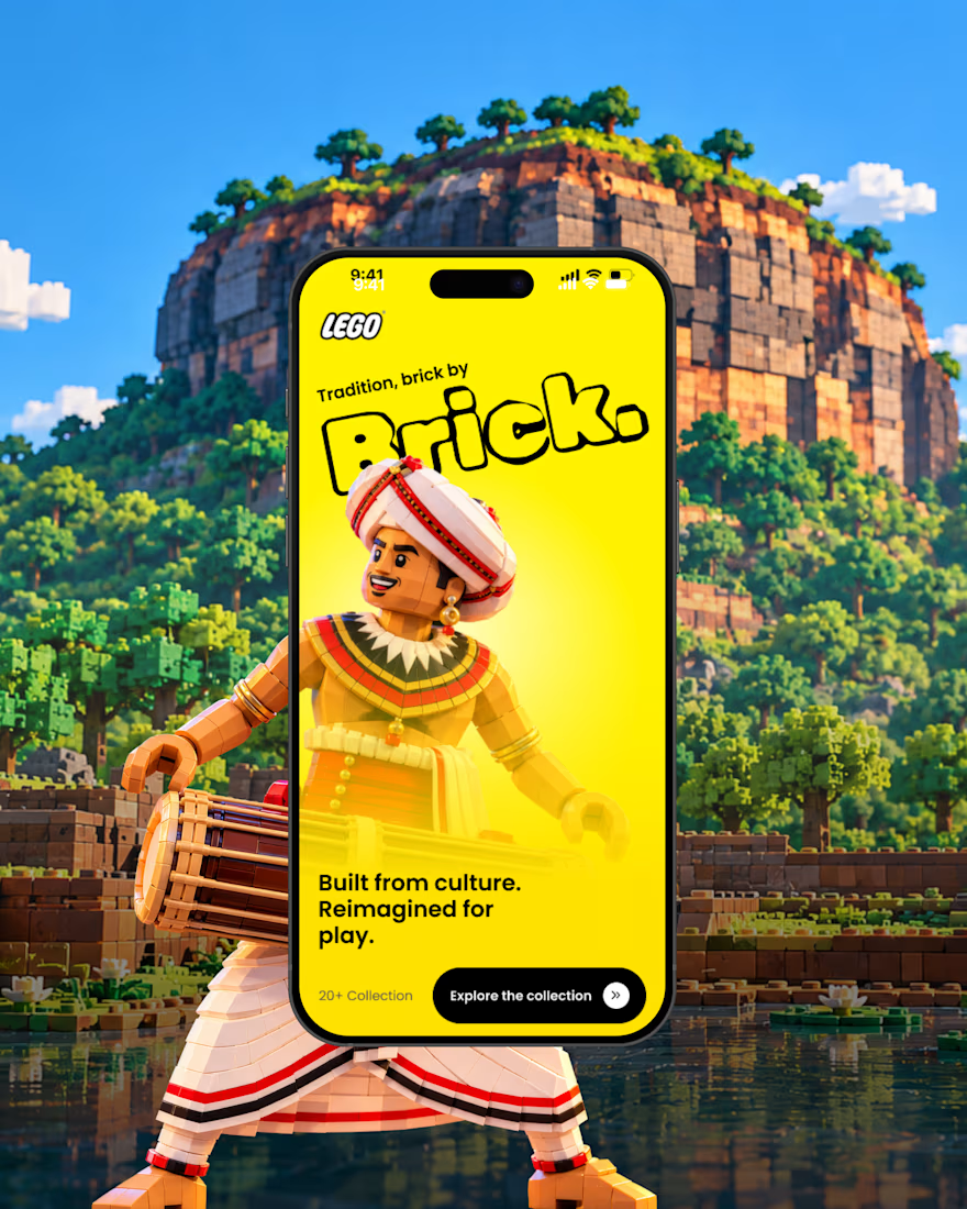
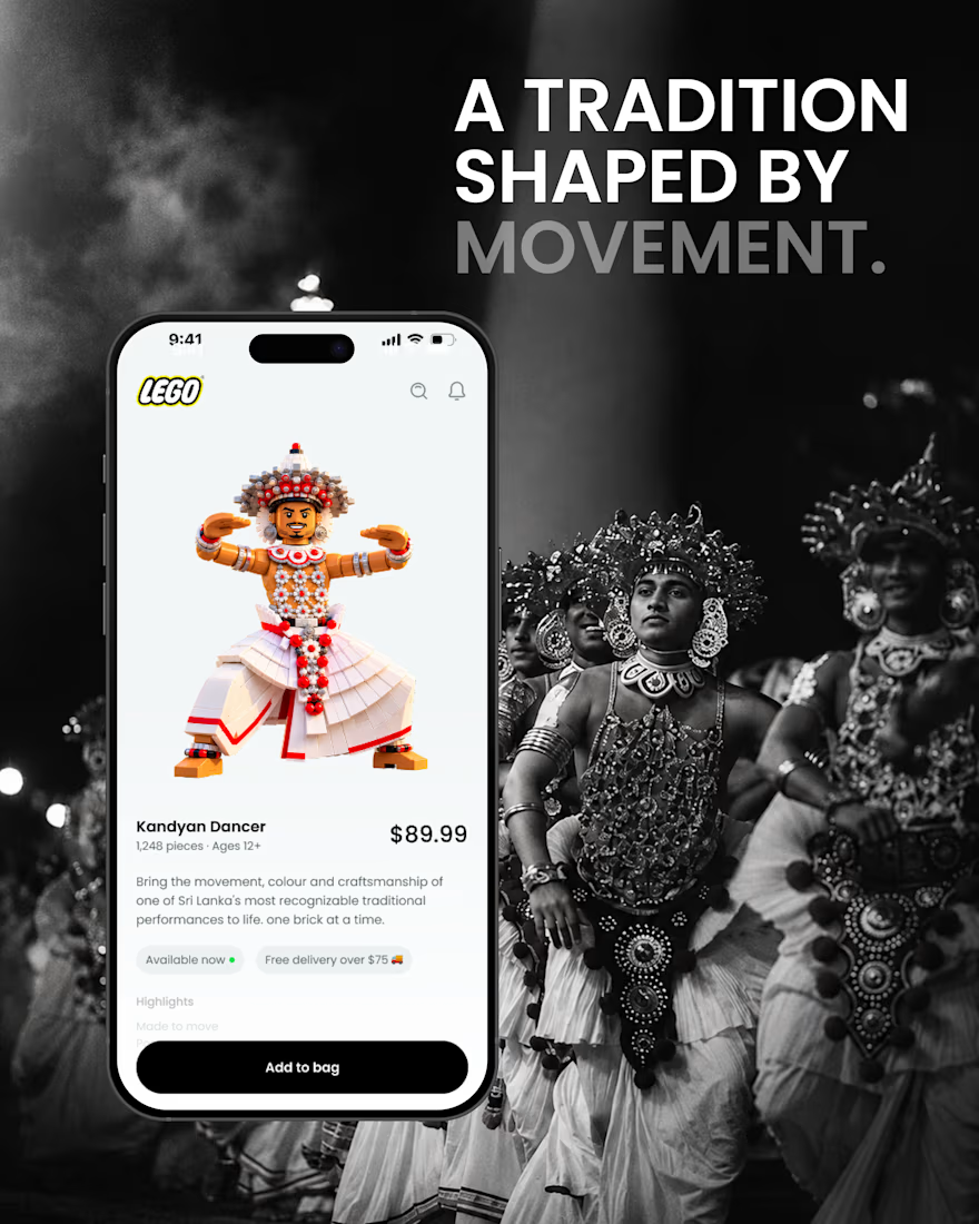
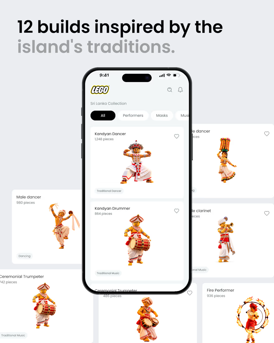
What if Sri Lankan tradition found its way into the LEGO app? 🇱🇰🧱
A small product design exploration.
Had a small idea and decided to visualize it. ✌️
I reimagined a few elements of Sri Lankan culture traditional dancers, masks, musicians, and instruments as brick built characters, then explored how they might live inside a LEGO style mobile experience.
Just a hypothetical design experiment combining culture, product design, and a little AI-assisted exploration.
Not affiliated with or endorsed by LEGO.
#ProductDesign #UIDesign #DesignConcept #DesignExploration #CreativeAI #SriLanka #SriLankanCulture #LEGO
That's awesome great job 🎉🎉