The network for creativity
Join 1.25M professional creatives like you
Connect with clients, get discovered, and run your business 100% commission-free
Creatives on Contra have earned over $150M and we are just getting started
Back to feedPost
Taste Test

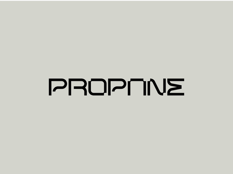
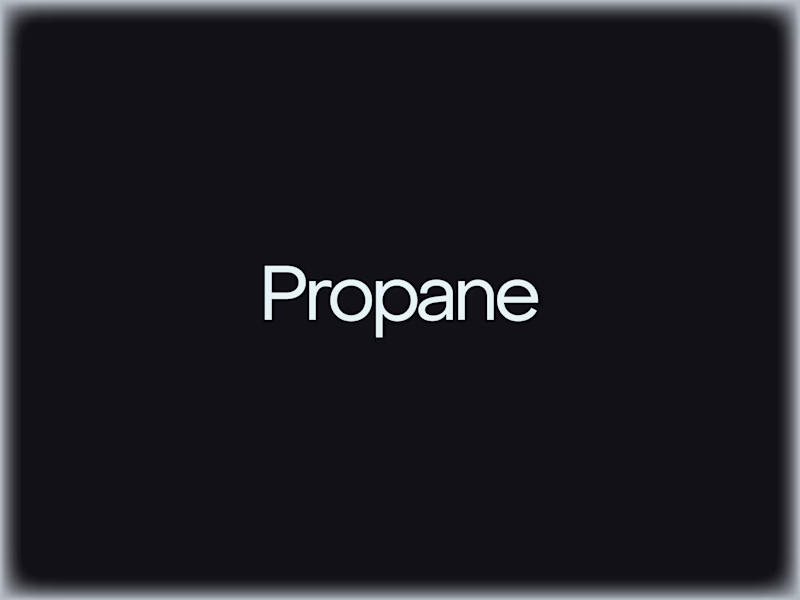
Fully customized wordmark or edited variation of a geometric sans serif, which one are you choosing and why?
The way it differentiates from the geometric sans is that it represents a modular typeface engineered on a strict grid to ensure structural stability, balanced weight, and consistency.
Subtle circular corner cutouts introduce a human touch within a controlled, architectural framework.
I can share their construction grids I used to create them, is this something you'd want to see?

17 votes
Ends in 1d

Honestly like the full custom wordmark

Custom wordmark for me. The circular cutouts give it a personality the plain sans just doesn't have. And yes please share the grids, would love to see the construction

Fully custom wrdmark for me


Great job Filip🔥🔥
The network for creativity
Join 1.25M professional creatives like you
Connect with clients, get discovered, and run your business 100% commission-free
Creatives on Contra have earned over $150M and we are just getting started











Related posts


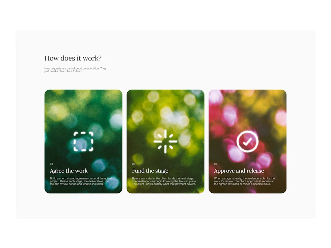
Your web sections always have such strong art direction. Great to see the brand carried right into the layout.


One letter. Eight personalities. 🔤
I explored the letter S in 8 different directions: soft and rounded, sharp and angular, bold and blocky, and fast like a bolt.
Same letter, same white-on-black treatment. The only thing that changes is the character.
Each mark could suit a different kind of brand, from tech and sports to fintech and lifestyle.
Which S would you pick, and what kind of brand would it belong to? Drop the number below. 👇
Looking for a logo mark or a full brand identity? My services are on my profile.
S letter designs is the best ❤️
Great job Shahwaiz🔥🔥

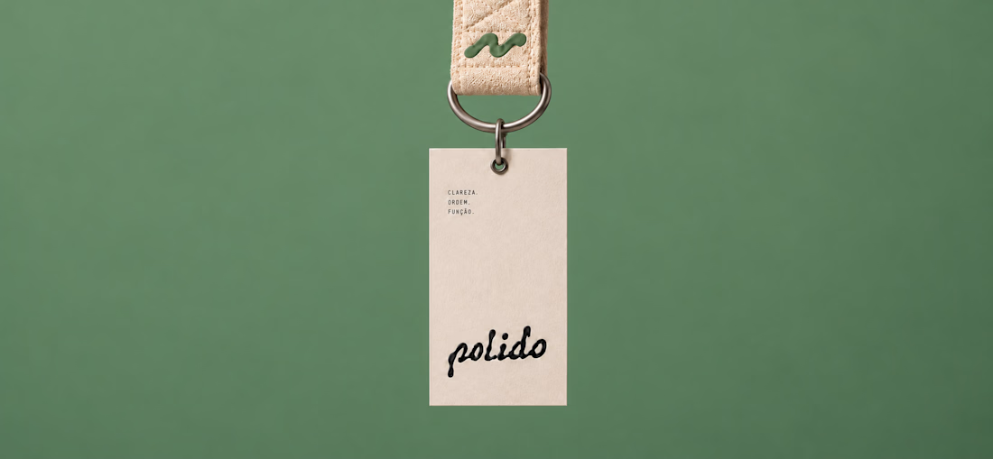
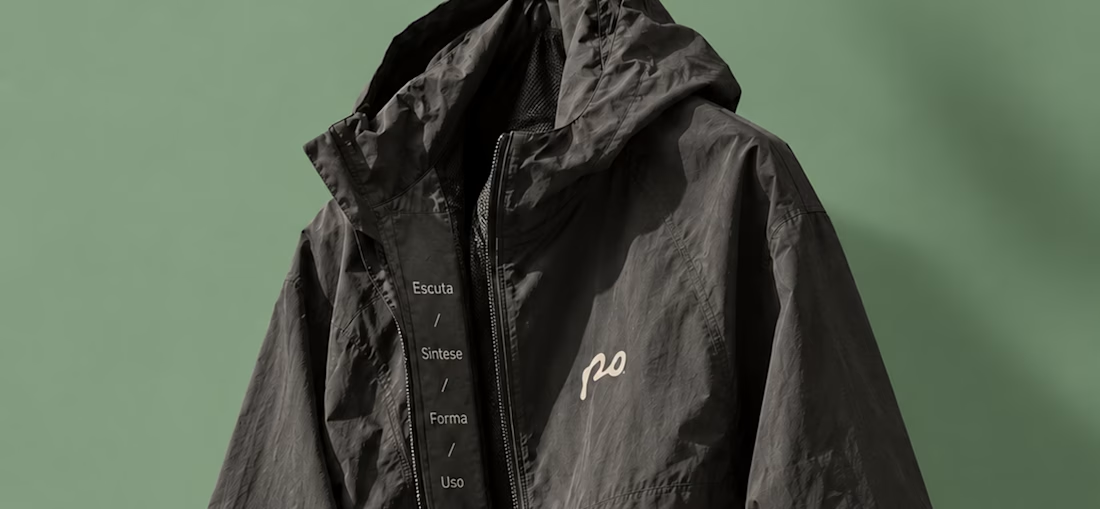
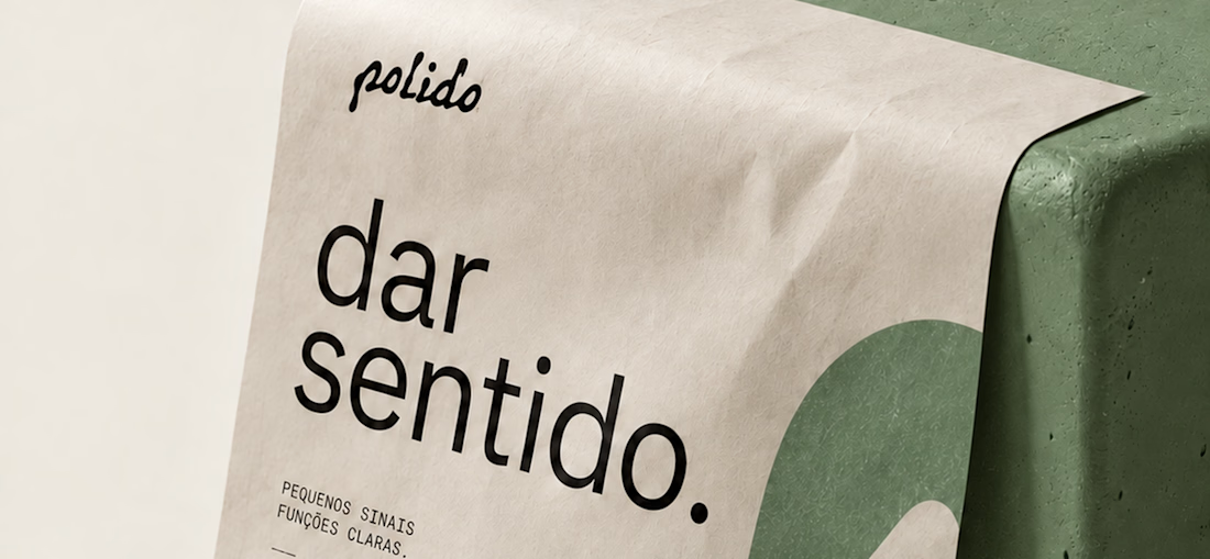
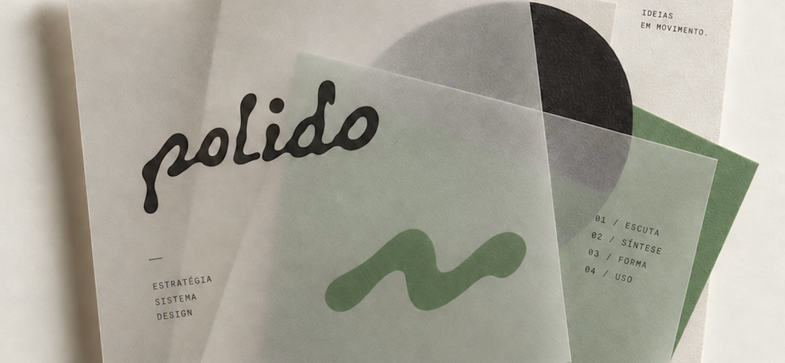
POLIDO — Brand Identity & Visual System
POLIDO is the visual identity of my independent brand design practice, shaped by a process of listening, synthesis, form, and use.
The identity brings together a hand-drawn signature, restrained typography, tactile materials, and a palette of warm paper, graphite, and Basil green.
From printed matter to apparel and physical applications, the project explores how a consistent visual language can adapt to different materials and contexts while maintaining its character.
Scope: Brand Strategy, Visual Identity, Art Direction, and Mockup Design.

High end branding