The network for creativity
Join 1.25M professional creatives like you
Connect with clients, get discovered, and run your business 100% commission-free
Creatives on Contra have earned over $150M and we are just getting started
Back to feedPost
Taste Test
Design Duel ⚡
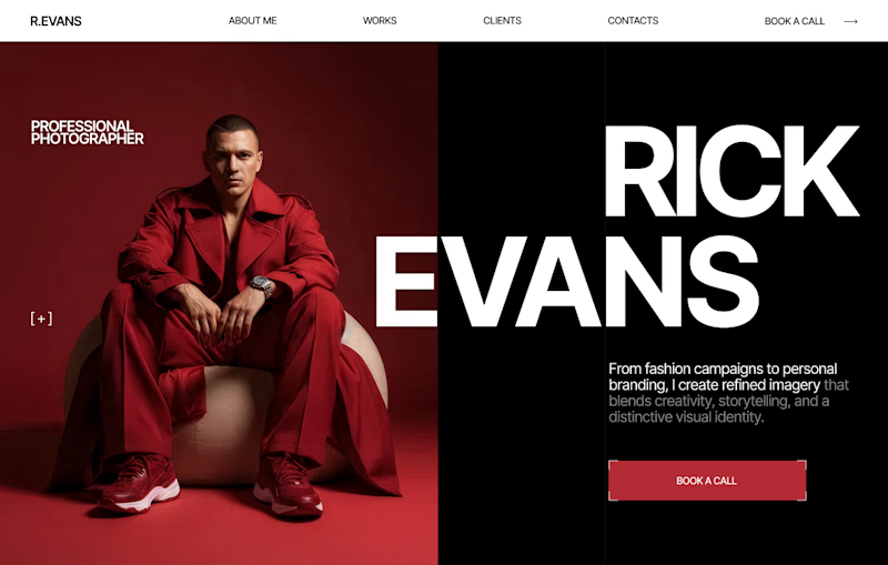
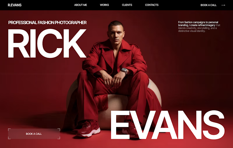
Two hero concepts. One fashion photographer.
🅰️ Structured split layout 🅱️ Full-screen editorial experience
Which one would you choose for your portfolio? Vote A or B and tell me why.


6 voted
20%
24 voted
80%
30 votes
Closed

I love both! But I would say B


I love your designs so much! 😍

Sasha, thanks a lot😍

Lovly design

Great designe and two variants is so cool.hard to chose one
Thanks😍

Left option!)
Thanks😍


Hard to choose one! Very nice, Nataly 🔥
Thanks a lot. I appreciate that😍

Very impressive.
Thanks a lot😍

Definitely B.
Thanks a lot😍


I love option B. It gives AURA!!!! 🥹


The full-screen editorial concept (B) looks incredible, but what really makes it work is how the white typographic layer breaks across the boundary of the dark background and the image. It adds a beautiful layer of depth and makes the layout feel alive rather than static. Lovely attention to detail!


Excellent design !

B really looks better


Fantastic work 😍

I will go with B.
It showcase the picture on a large scale and that alone tells the story unlike A the picture is scrampes up and not the main attraction


A most likely

Better use B


I'd lean toward B. The structured layout gives the typography more room to breathe while keeping the photography as the focal point. What often gets underestimated is that strong visual hierarchy makes a portfolio feel more premium because visitors instantly know where to look....


B makes a massive statement 🔥


very creative design.


Nicely done!
The network for creativity
Join 1.25M professional creatives like you
Connect with clients, get discovered, and run your business 100% commission-free
Creatives on Contra have earned over $150M and we are just getting started
Trending

Claude
Claude has entered the design space. How are you using it?

Contra University
Learn from expert creatives how to earn more using next-gen AI tools.
Brand Design
The best brand designers are on Contra. Scroll to see what's trending in brand design. What are you building?
creativeaiflow
Creative AI workflows are evolving. What tools do you use, and what are their strengths and weaknesses?
freelancerlife
Freelancer life is wins, pivots, and everything in between. What’s yours right now?



Related posts

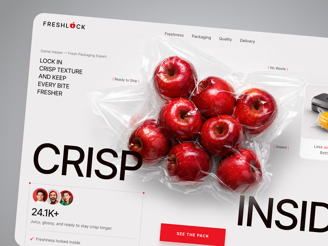
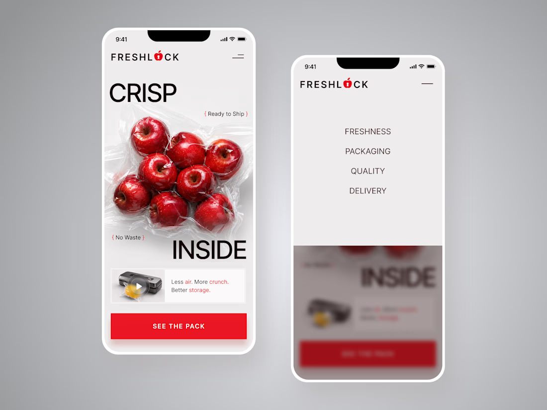
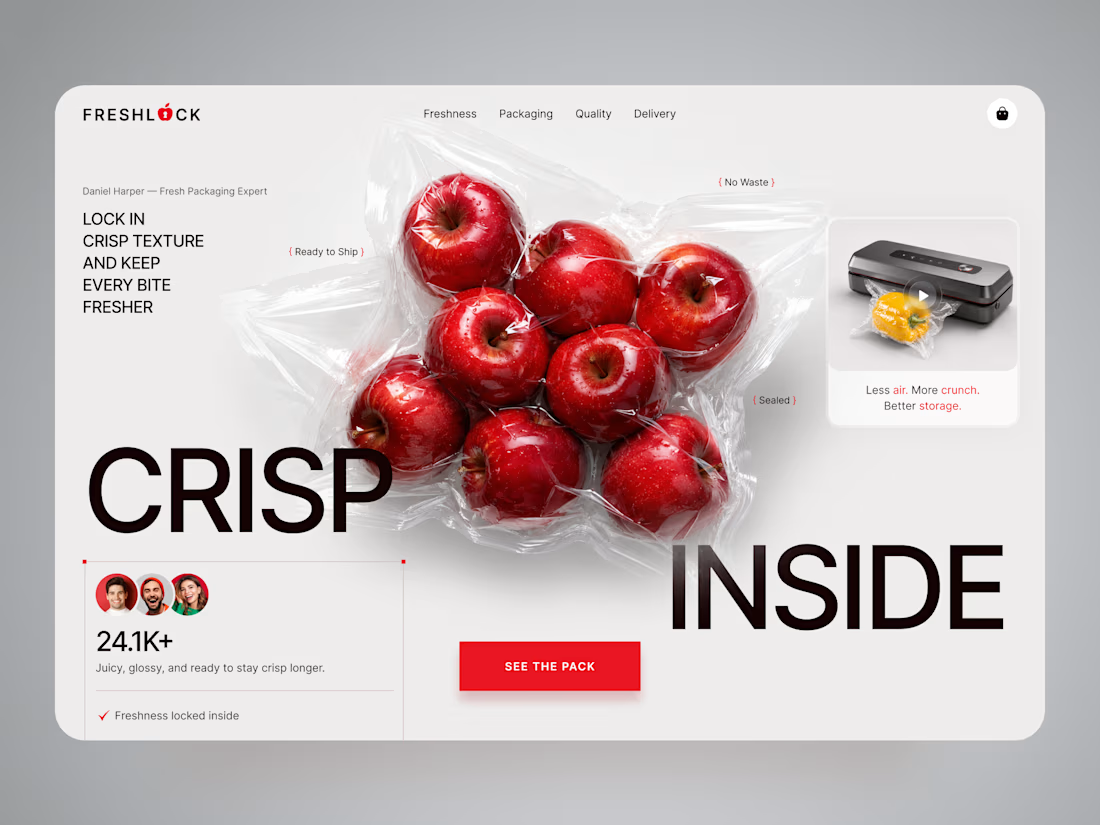
FreshLock — Food Packaging Landing Page Design 🍎📦
FreshLock is a modern landing page concept created for a food packaging brand focused on preserving freshness, reducing waste, and presenting innovative packaging solutions through a clean digital experience.
The goal was to communicate product benefits instantly while making the website feel fresh, premium, and trustworthy. The visual direction combines bold typography, minimal layouts, realistic product imagery, and vibrant red accents to create a strong first impression while keeping the focus on the product.
Special attention was given to:
• a product-first hero section that immediately highlights freshness and packaging quality;
• clean visual hierarchy that makes key messages easy to scan;
• responsive desktop and mobile layouts optimized for every device 📱;
• trust-building elements showcasing product quality, freshness, and customer confidence;
• bold CTAs that encourage users to explore the product and learn more;
• a minimal interface that lets the packaging and product visuals become the center of attention;
• a scalable landing page design suitable for future product launches and marketing campaigns.
The result is a modern, conversion-focused landing page that helps communicate product value, strengthens brand credibility, and creates an engaging experience from the very first screen ✨
Looking to create a modern landing page for your food, packaging, FMCG, or consumer product brand? Let's build something fresh together 🚀


🔥 🔥 🔥

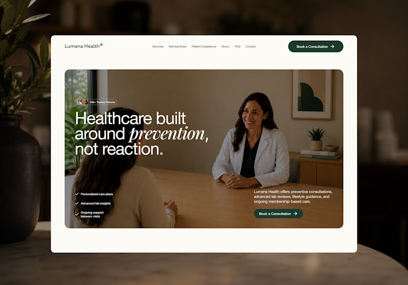
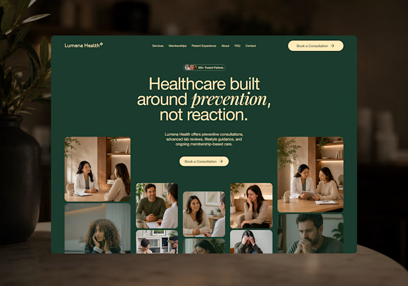
I’m exploring two homepage hero directions for a Lumena Health concept and testing which one feels stronger for a preventive healthcare brand.
Both directions focus on the same core message: healthcare built around prevention, not reaction.
Direction 1 feels more warm, human, and consultation-focused.
The large lifestyle image creates a clear patient/provider moment right away, which helps the experience feel personal and trustworthy.
Direction 2 feels more premium, editorial, and brand-driven.
The dark green background, centered headline, and image collage make the page feel more elevated and visually distinctive.
Direction 1: personal, warm, trust-focused
Direction 2: premium, editorial, brand-forward
Which direction feels stronger for a preventive healthcare website?
25 voted
40%
37 voted
60%
62 votes
Closed

Direction 1's consultation-focused warmth feels like it'll convert better for anxious first-time patients, but Direction 2's premium editorial feel might build more trust with referral sources. Did you already have a lean going in, or are you genuinely torn?


I need to confess!
I love trout fishing! It's my passion, where time flies, and I can disconnect from the everyday world and reset my creative juices.
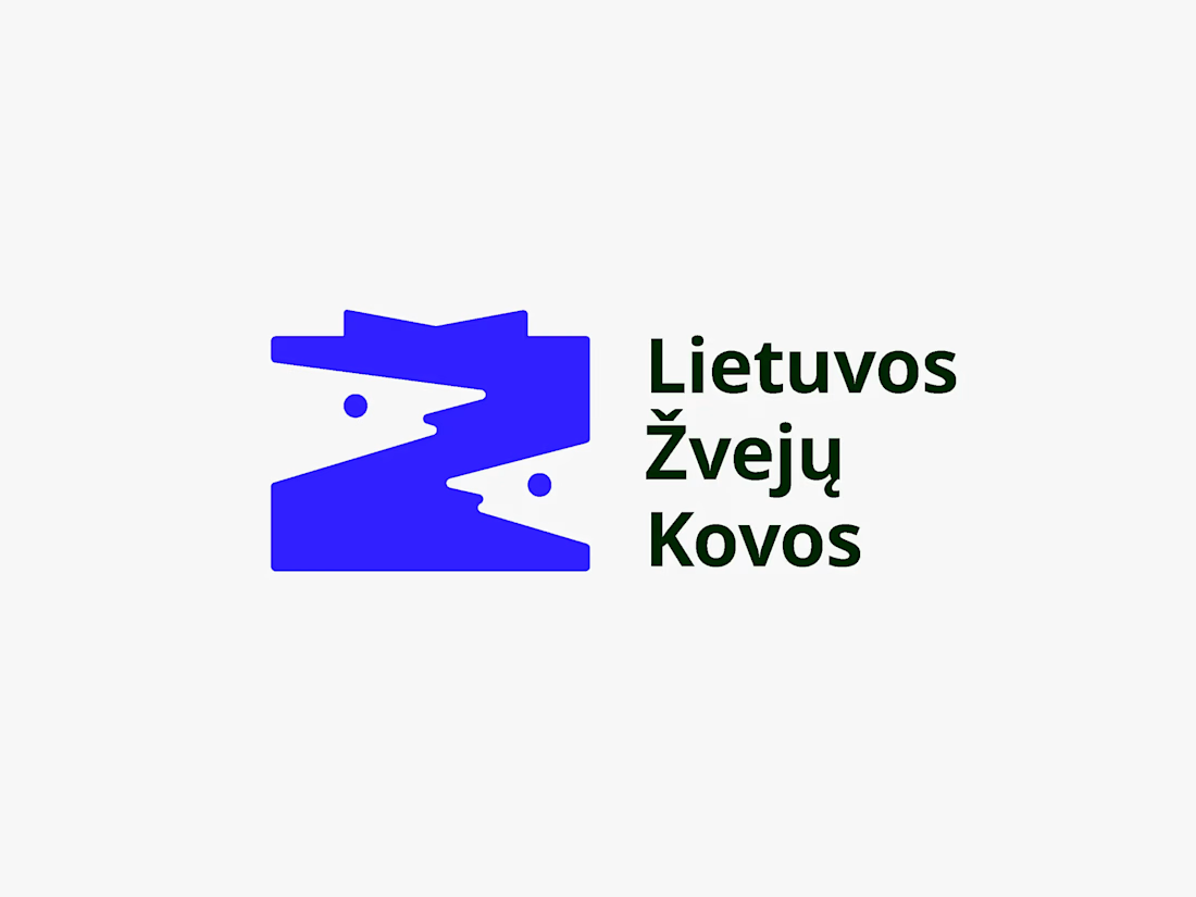
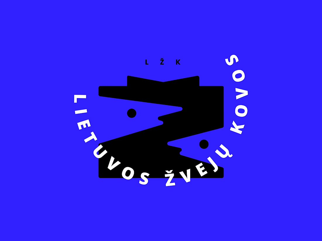
I had the chance to design a logo for a local fishing contest that my friends are running, and here are the two logo variations I came up with.
LŽK stands for "Lithuanian Fishing Battles," and the concept behind it was to combine two fish heads in the negative space to form the letter Ž, as it's the first letter of the Lithuanian word for "fish" (žuvis)
🐠 🐡 🐟

I don't know if it's just me but i admire when i see blue used well in designs. 👏