Ankit Singh - UI/UX designer crafting clean, user-first digital products. | ContraWork by Ankit Singh
Ankit Singh

Ankit Singh

UI/UX designer crafting clean, user-first digital products.

    $10k+
    Earned
Cover image for A complete platform for field-service
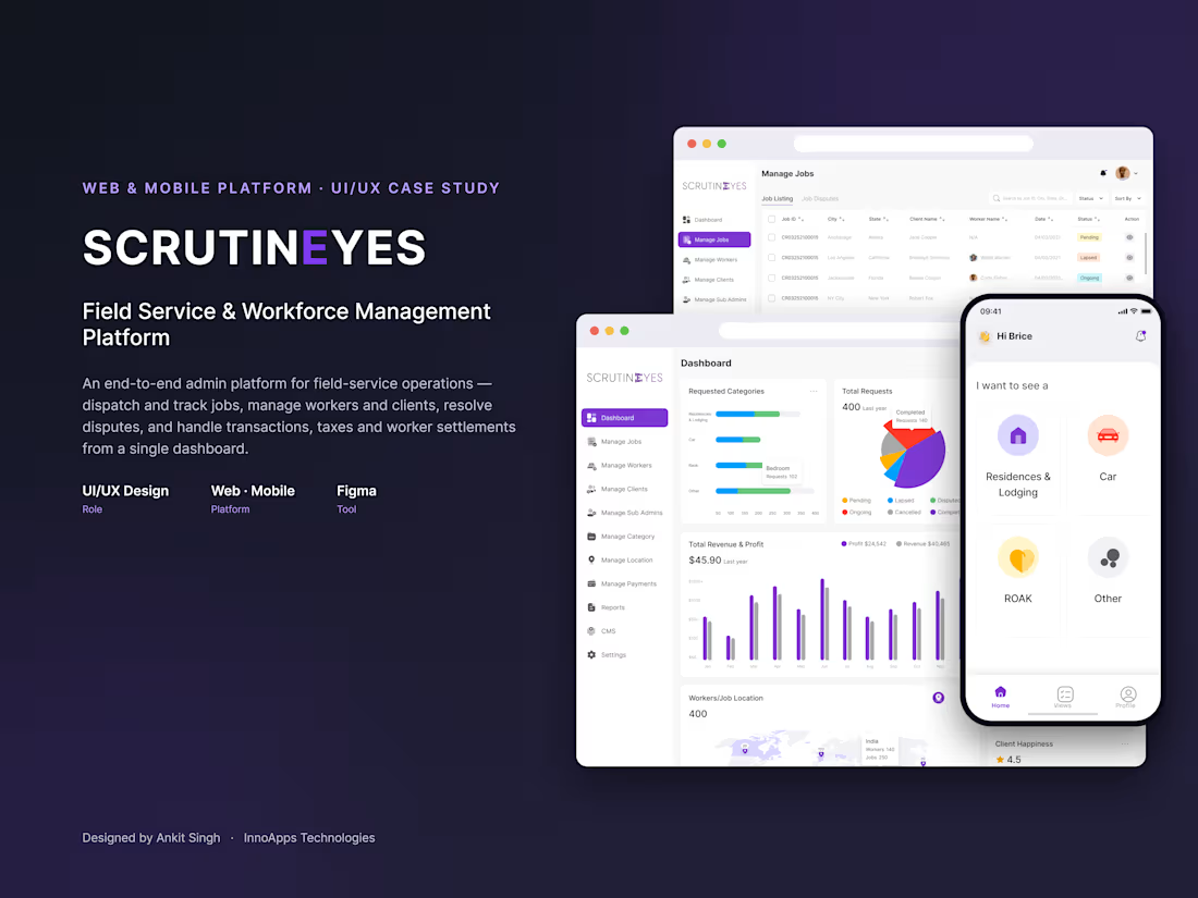
A complete platform for field-service operations, designed end-to-end in Figma. The admin web panel handles job dispatch and tracking, worker and client management, dispute resolution, payments, taxes and settlements — while the companion mobile app lets clients request jobs by category and track every request on the go. 60+ web screens and a full mobile flow for iOS and Android.
1
23
Cover image for Mobile app design for Professional
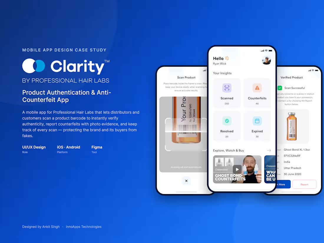
Mobile app design for Professional Hair Labs that lets distributors and customers verify product authenticity in seconds. Scan a barcode to confirm a product is genuine, report counterfeits with photo evidence, and track every scan with history, watch lists, and alerts. Designed end-to-end in Figma — UX flows, UI design, and a full screen system for iOS and Android.
0
35
Cover image for Clarity Codes is a SaaS
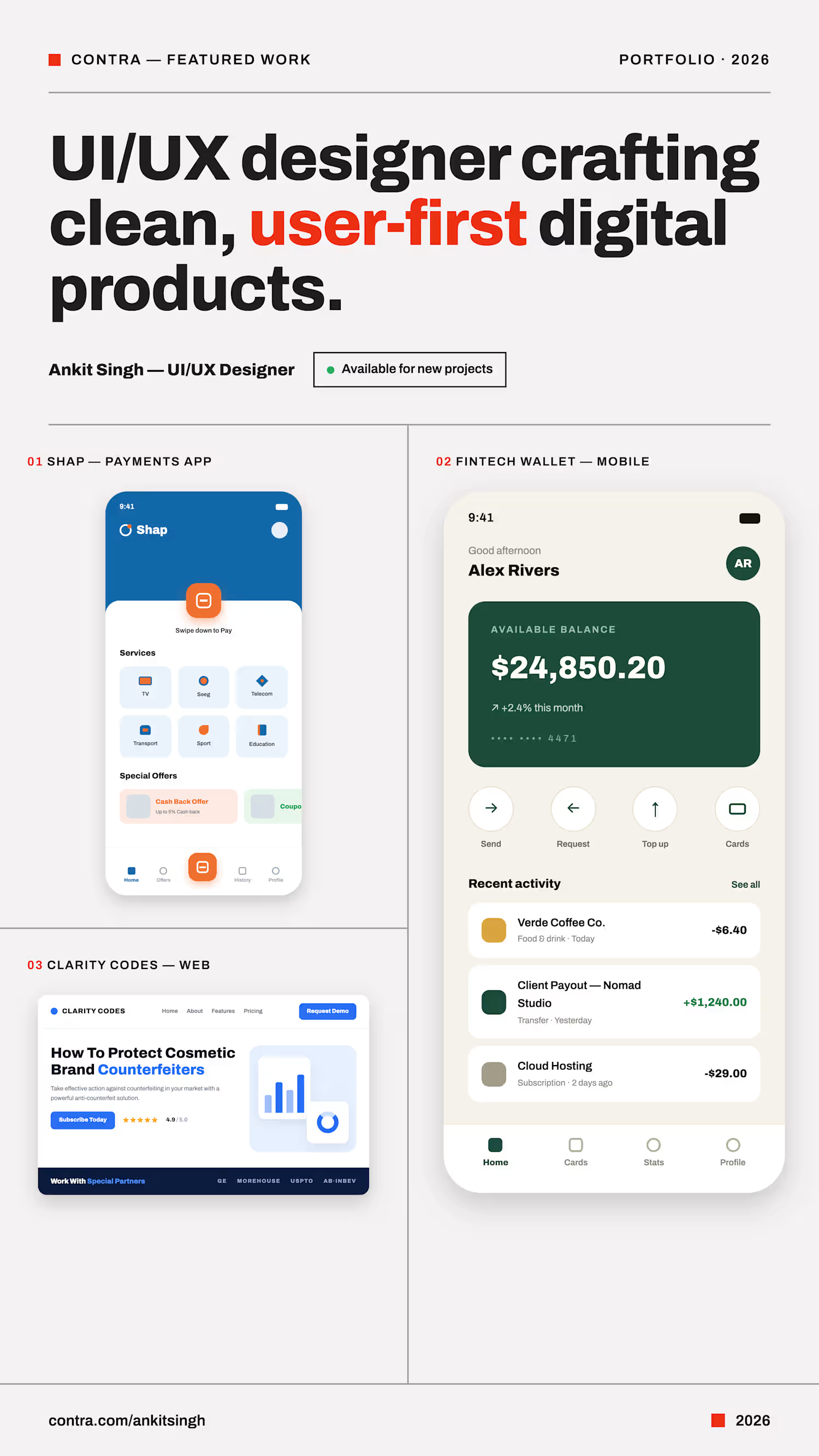
Clarity Codes is a SaaS platform that helps brands detect, track, and stop counterfeit versions of their products from reaching the market. The challenge was designing a marketing website that could make a fairly technical product — brand protection and counterfeit detection software — feel approachable to business owners, while still giving enterprise buyers the depth they'd expect before booking a demo: transparent pricing, a real team, and proof the company is established. I designed the site as a full multi-page system in Figma: a benefit-led landing page that leads with the problem ("How to protect your brand from counterfeiters") before introducing the product, a pricing page with clear monthly/yearly plans and a full feature comparison table, an About page that builds trust through partner logos and the team, and a Careers page to support hiring. A consistent blue-and-navy visual language, rounded cards, and generous whitespace tie every page together into one cohesive system.
0
56
Cover image for Wyred is a mobile app
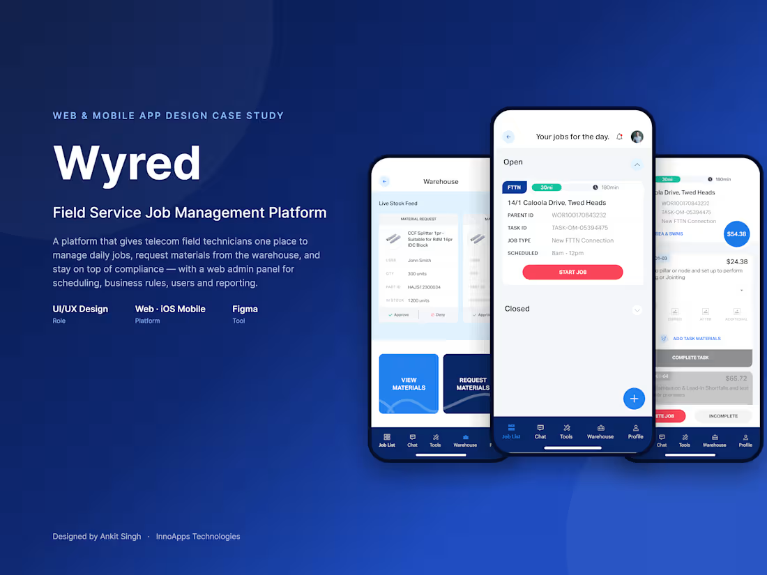
Wyred is a mobile app designed for telecom field technicians who install and service FTTN (Fibre to the Node) connections. Before this redesign, technicians relied on paper job sheets, phone calls to the warehouse, and manual compliance tracking — a workflow that slowed teams down and created room for error out in the field. I designed the full mobile experience in Figma, structuring the app around three core workflows technicians use every day: creating and completing job cards on-site, requesting and tracking materials from the warehouse, and keeping licenses and compliance documents up to date. Every screen shares a consistent visual system — rounded cards, clear status indicators, large touch targets, and a persistent bottom navigation bar — so technicians can move between tasks quickly, even one-handed, between jobs. The result is a clean, purpose-built iOS app that brings job management, warehouse operations, and compliance tracking into one connected experience.
0
73
Cover image for Designed the complete UI/UX for
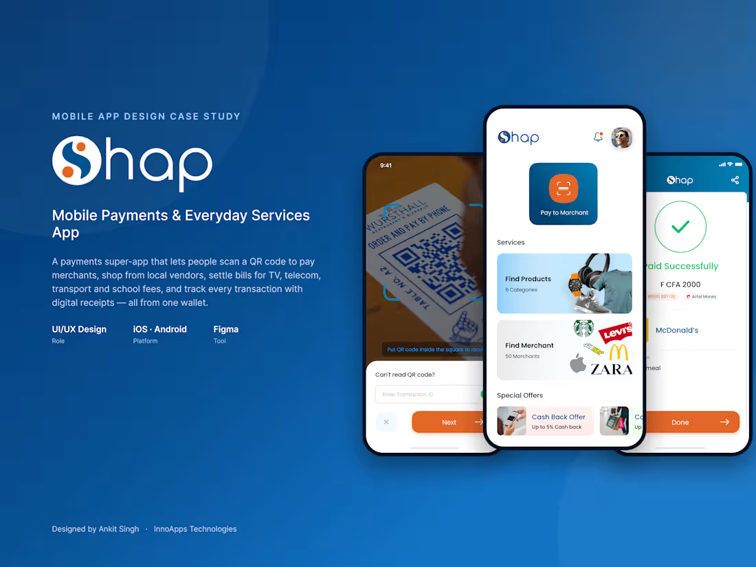
Designed the complete UI/UX for Shap, a mobile payments app enabling users to pay bills, scan & pay via QR code, and manage services like TV, telecom, transport, and education payments in one place. Key screens included: home dashboard with quick-access services, QR scan & pay flow with fallback transaction ID entry, merchant payment screens, profile & account settings, and a searchable "All Services" directory. Focused on a clean, trustworthy visual language (deep blue + orange accent) suited for financial transactions, with clear iconography and minimal friction in the payment flow — critical for user confidence in fintech products.
0
71
Cover image for Designed and developed a full
Designed and developed a full website for Clarity, a SaaS platform helping cosmetic brands protect against counterfeiting. The project included a landing page, feature breakdown, pricing page, and client testimonial section. Key focus areas: building trust through clean visual hierarchy, simplifying a technical product (counterfeit detection/tracking) into clear benefit-driven messaging, and designing a transparent 3-tier pricing structure (Free, Basic, Pro) with a feature comparison table. Delivered a fully responsive design with mobile app promotion, FAQ section, and global user map to reinforce credibility and reach.
0
77