The network for creativity
Join 1.25M professional creatives like you
Connect with clients, get discovered, and run your business 100% commission-free
Creatives on Contra have earned over $150M and we are just getting started
Back to feedPost

Lessayer
Where Belle Époque elegance meets contemporary minimalism.
The identity started with a simple challenge: how can a luxury pastry brand feel refined and timeless without relying on predictable visual codes?
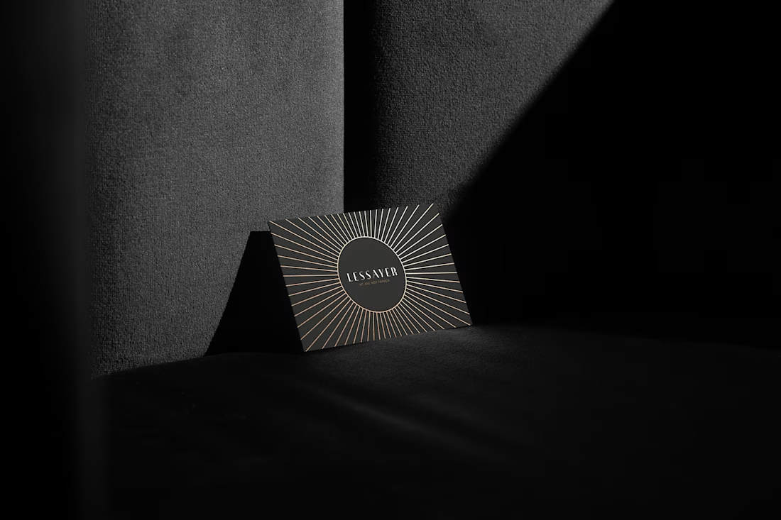
The answer became a single geometric symbol combining three ideas a crown, a sliced cake, and a subtle reference to the New Zealand sun.
One mark. Three meanings. One distinctive identity.
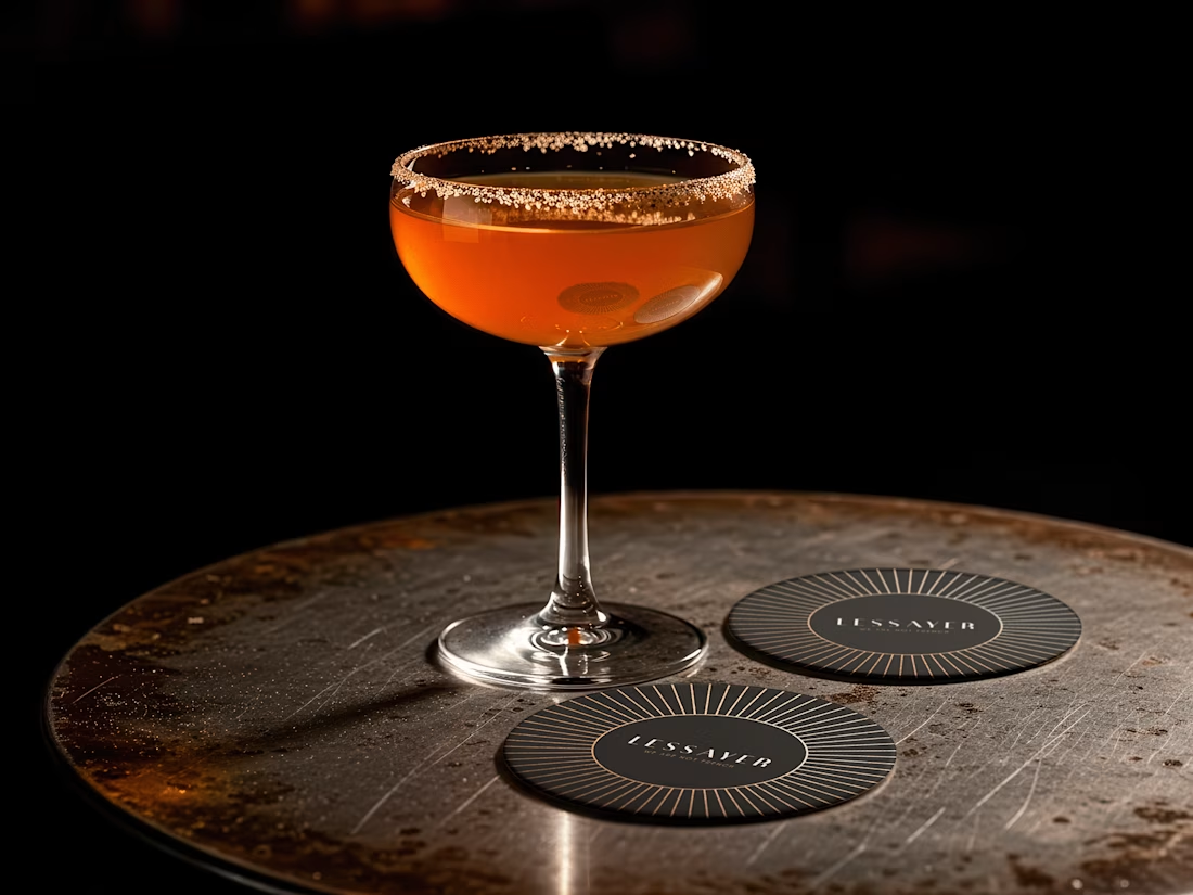
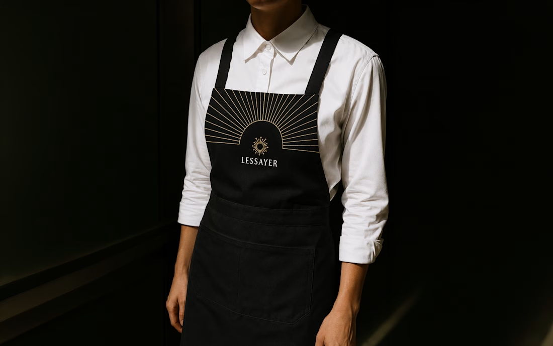
Here’s a first look at the logo construction and stationery system.
Full case study coming tomorrow.


So luxe!
Thank you so much

The three-meaning symbol is a beautiful bit of restraint—each reference stays legible without making the mark feel busy. The black-and-metallic presentation also fits the premium pastry positioning perfectly.
Thank you very much for your valuable feedback! I’m pleased to hear that the identity aligns with the brand’s positioning; I believe that’s one of the best compliments a designer can receive.

A crown and a sliced cake reading into a pastry mark makes sense, but the New Zealand sun reference is the detail I never would have guessed just from looking at the symbol. Is Lessayer actually based there, or is that more of a personal touch baked into it?
Thank you for the feedback and the question. Lessayer is based in New Zealand, and they will be opening their official store soon. Working with the founder, we studied Fiordland National Park and the way sunlight filters through the trees. We then decided to use the sun as a...

Thank you so much! I’m really glad you picked up on that reference. It means a lot to see that the idea comes through so clearly in the final identity. Really appreciate your thoughtful feedback!

Thank you so much

Neat!!
Thanks!

Such an excellent restaurant if it came true
Thank you so much! It is true, the will open the first store before the end of October
Congrats !!!! 🎉
Thank you! I truly appreciate your support!
The network for creativity
Join 1.25M professional creatives like you
Connect with clients, get discovered, and run your business 100% commission-free
Creatives on Contra have earned over $150M and we are just getting started








Related posts

How can branding make people feel part of a community?
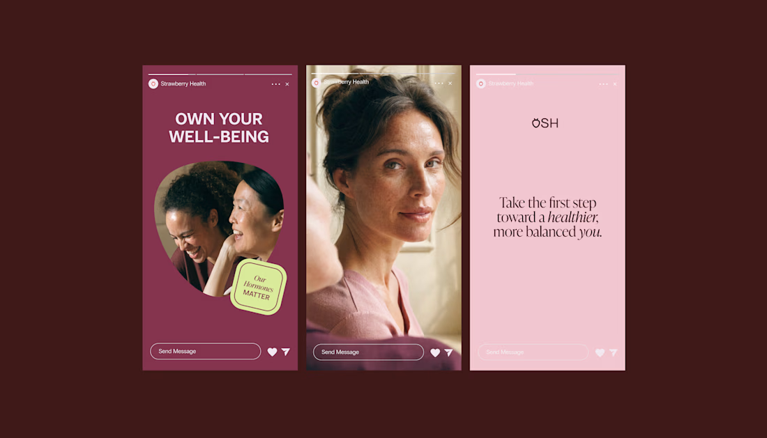
When working on Strawberry Health, we explored how visual identity could make women’s health feel more approachable and collective.
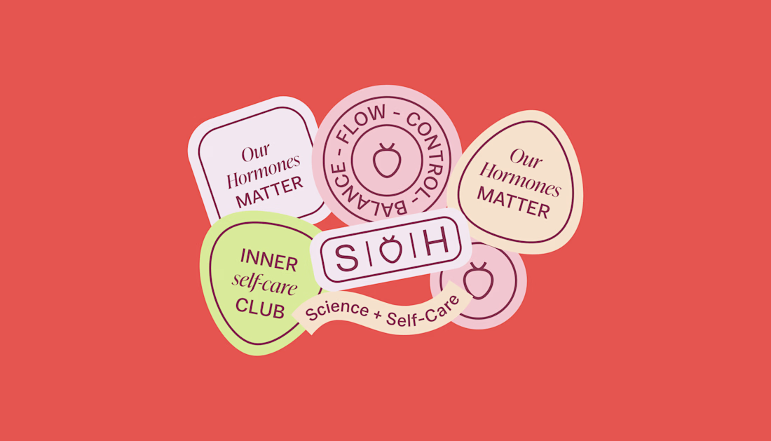
One of the ways was through supporting brand elements: stickers, badges and phrases that could live beyond the logo and become expressions of belonging.
These elements turned the identity into something people could interact with, share and make their own.
It’s a small detail, but I think it’s an important part of building brands around communities: the identity shouldn’t only identify the brand. It should give people something to identify with.
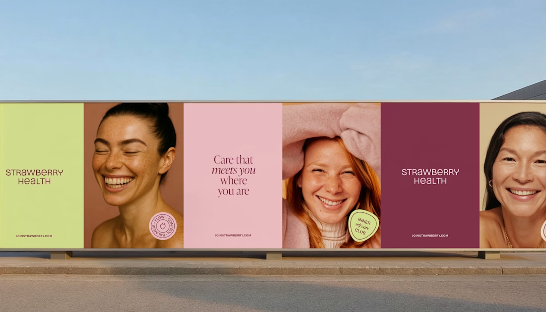
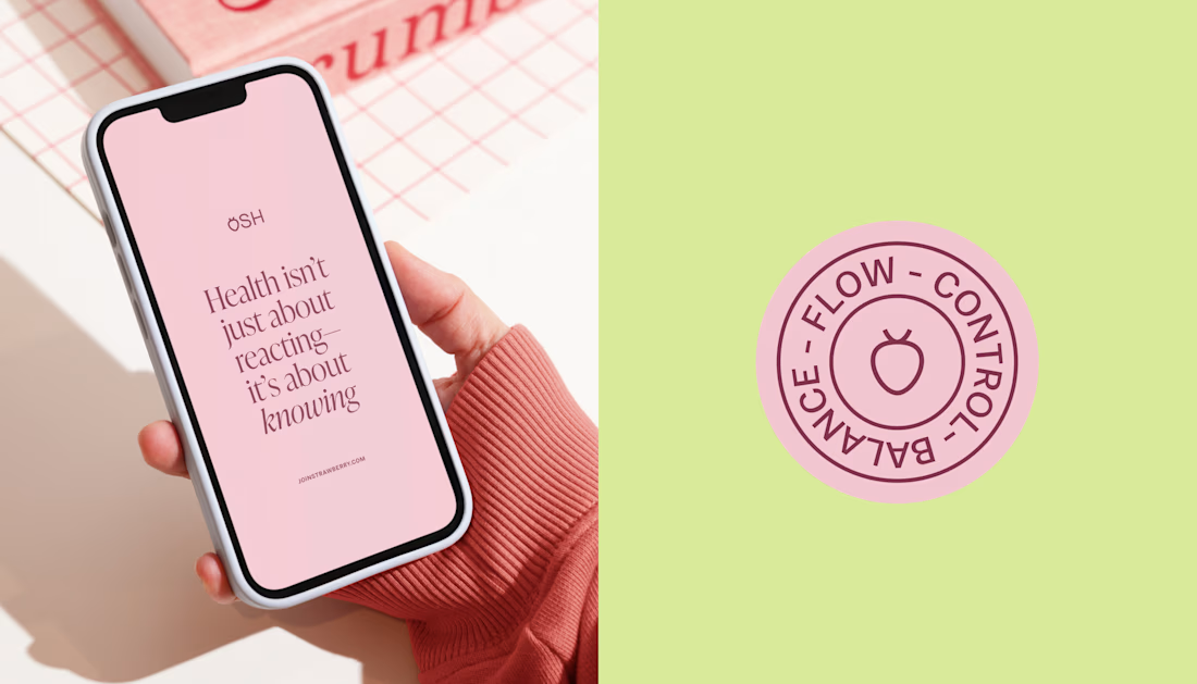

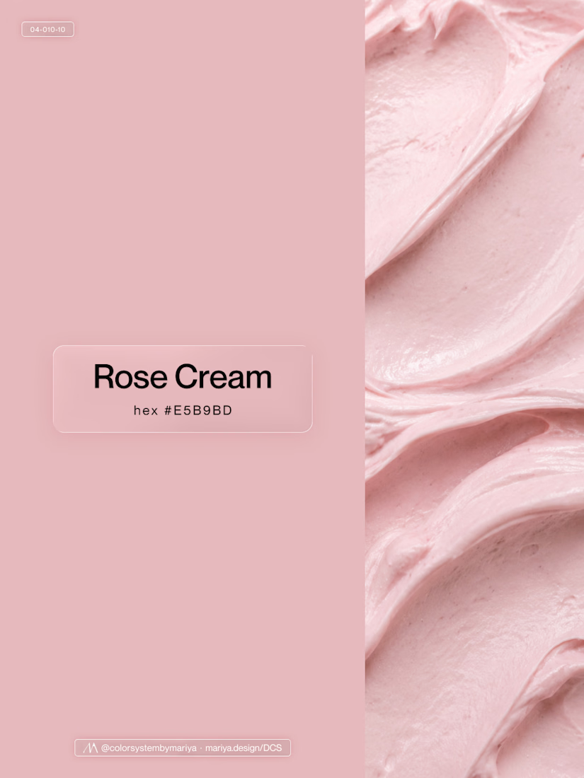
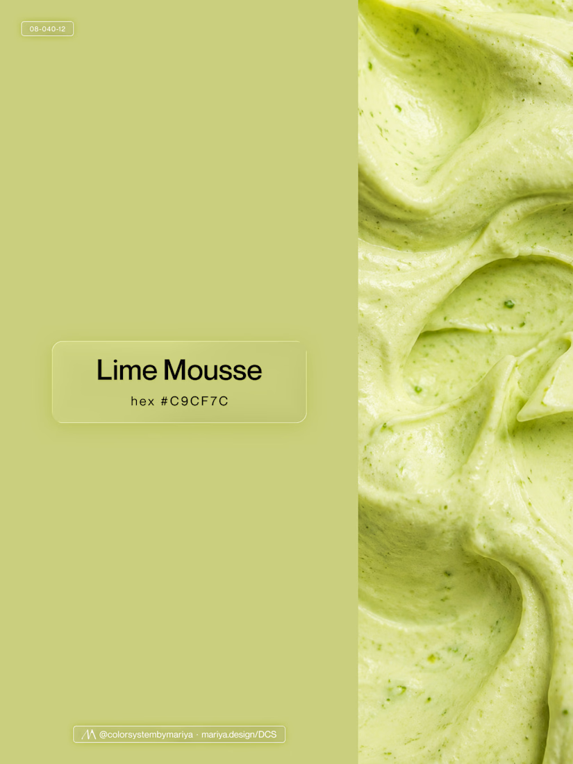
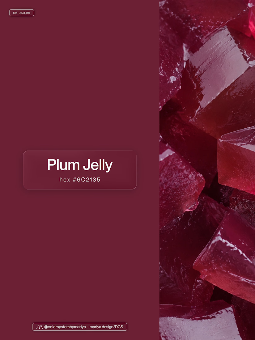
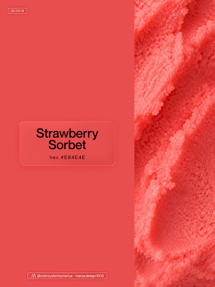
Love, love, love the colors. My mind goes: Rose Cream, Lime Mousse and Plum, hmmmm, which Plum... Plum Jelly. And of course, Strawberry Sorbet.
Let me match the vibe using my delicious swatches 😊


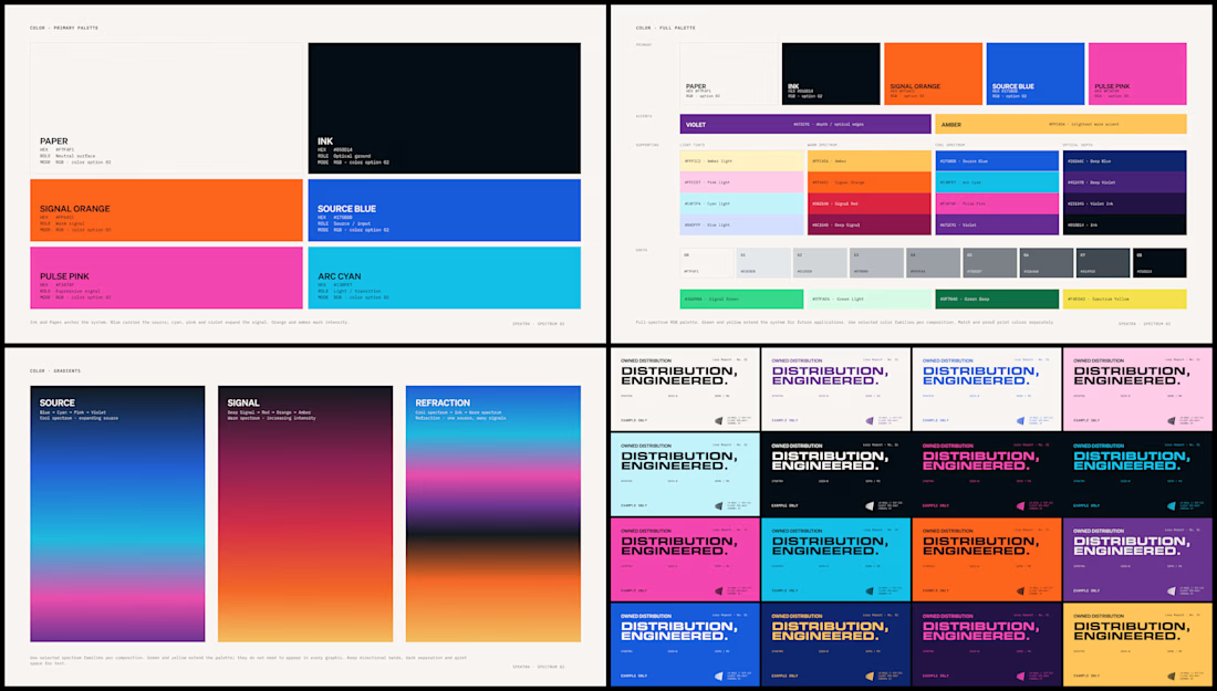
Spektra's founder had a practical question during the identity work: if the team needed green one day, would there be a green that belonged?
So I defined every color in the system, including green, with shades and pairings for each. When that day comes, the green is already there.

This is my biggest client success story of my carreer.
It's hard to capture 3+ years of work into a single use case page.
Though I gave it a try (it's never perfect 😉)
Read the use case here and let me know what you think of the work. Thanks!🤙🏻

Distilling three years of multidisciplinary work into one use case page is the real craft here, Tim. Long-term client relationships are the best portfolio proof there is. Congrats on the DeFi brand journey.