The network for creativity
Join 1.25M professional creatives like you
Connect with clients, get discovered, and run your business 100% commission-free
Creatives on Contra have earned over $150M and we are just getting started
Back to feedPost

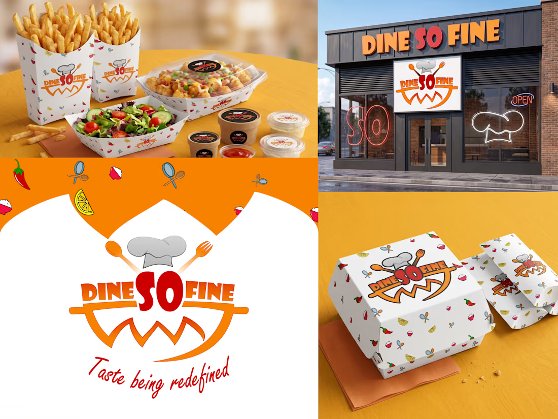
Check out how we cooked up the complete visual identity for Dine So Fine! 🍔 We designed this fast-casual brand to pop with energy, flavor, and a playful vibe that makes you hungry just looking at it.
🧑🍳 The Core Identity: We crafted a bold, appetizing logo that puts the spotlight right on the name, integrating a chef's hat, spoon, and fork right into the typography. Beneath the text, an orange smiling swoosh adds a welcoming touch, all tied together with their signature tagline, "Taste being redefined," in a flowing red script.
🌶️ The Aesthetic: To keep things fresh and fun, we built a bright, high-contrast color palette of vibrant orange, striking red, and crisp white. We then designed a custom, repeating pattern scattered with playful food illustrations—like chili peppers, lemons, and fresh herbs—to give the brand a lively, dynamic feel.
🥡 Real-World Application: We rolled this identity out across a massive fast-food packaging suite, applying the custom pattern to fry boxes, burger cartons, salad boats, paper bags, and sauce cups. We even mocked up a full physical storefront featuring neon window decals and bold exterior signage to show exactly how the brand commands attention on the street.
This project was all about bringing high-energy, mouth-watering visuals to life.


The network for creativity
Join 1.25M professional creatives like you
Connect with clients, get discovered, and run your business 100% commission-free
Creatives on Contra have earned over $150M and we are just getting started





Related posts

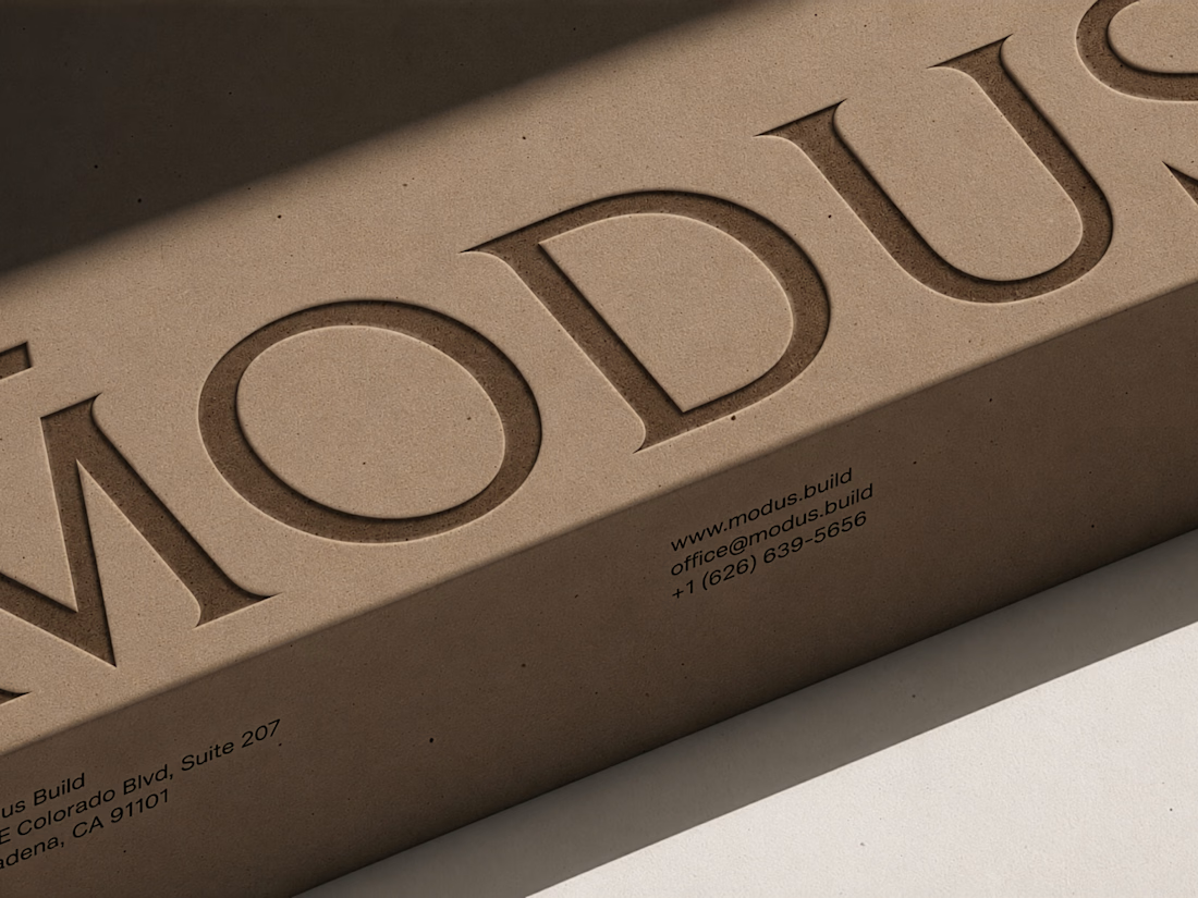
MODUS Build - Brand Identity & Web Design
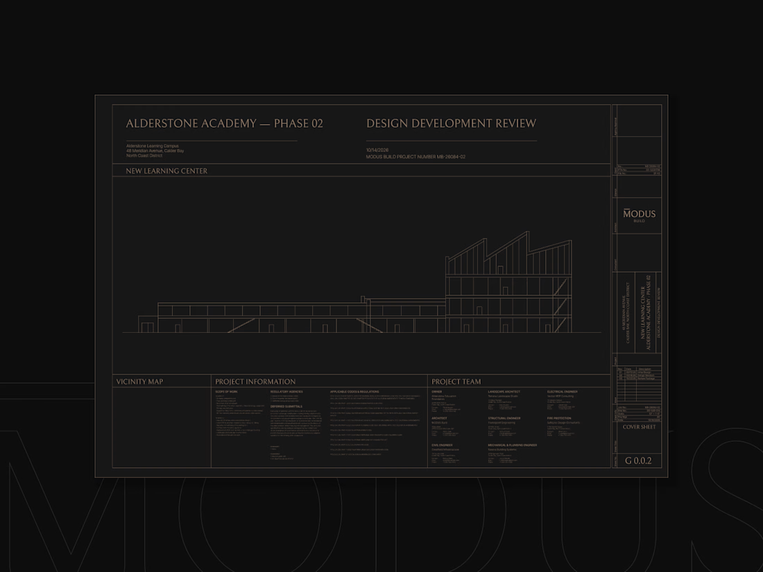
Coming from an architectural background, I approached MODUS Build with a particular appreciation for precision, proportion, and thoughtful design.
The challenge was to create a distinctive identity that communicates these values without relying on conventional construction imagery.
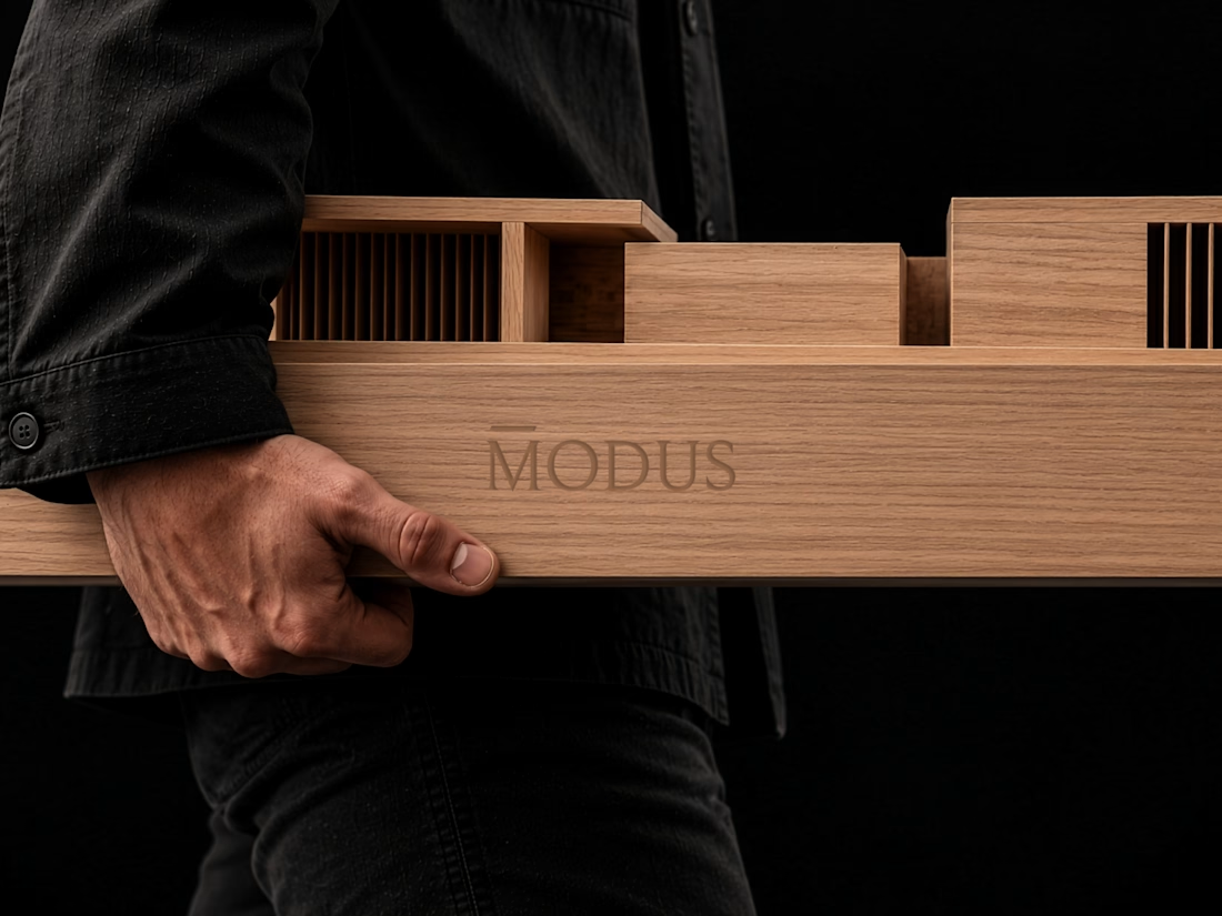
The concept was built around a simple typography idea: “The Measure of Good Building.” A small detail above the letter M represents a reference measure - a fixed length against which other dimensions can be measured. This subtle intervention gives the logo its meaning and connects it directly to the brand's philosophy.
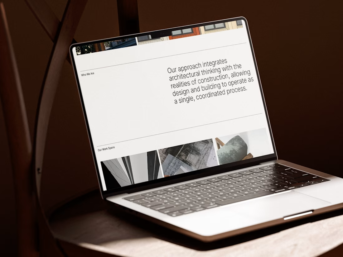
I carried this idea into a cohesive visual system, bringing together typography, graphic patterns, brand applications, and website design.
For me, the most rewarding part was creating something visually refined yet purposeful, where even the smallest detail has a reason to exist, keeping the same principle as in architecture.
#branding #logodesign #webdesign



Great brand design Alexandar wooden style is so premium🔥🔥

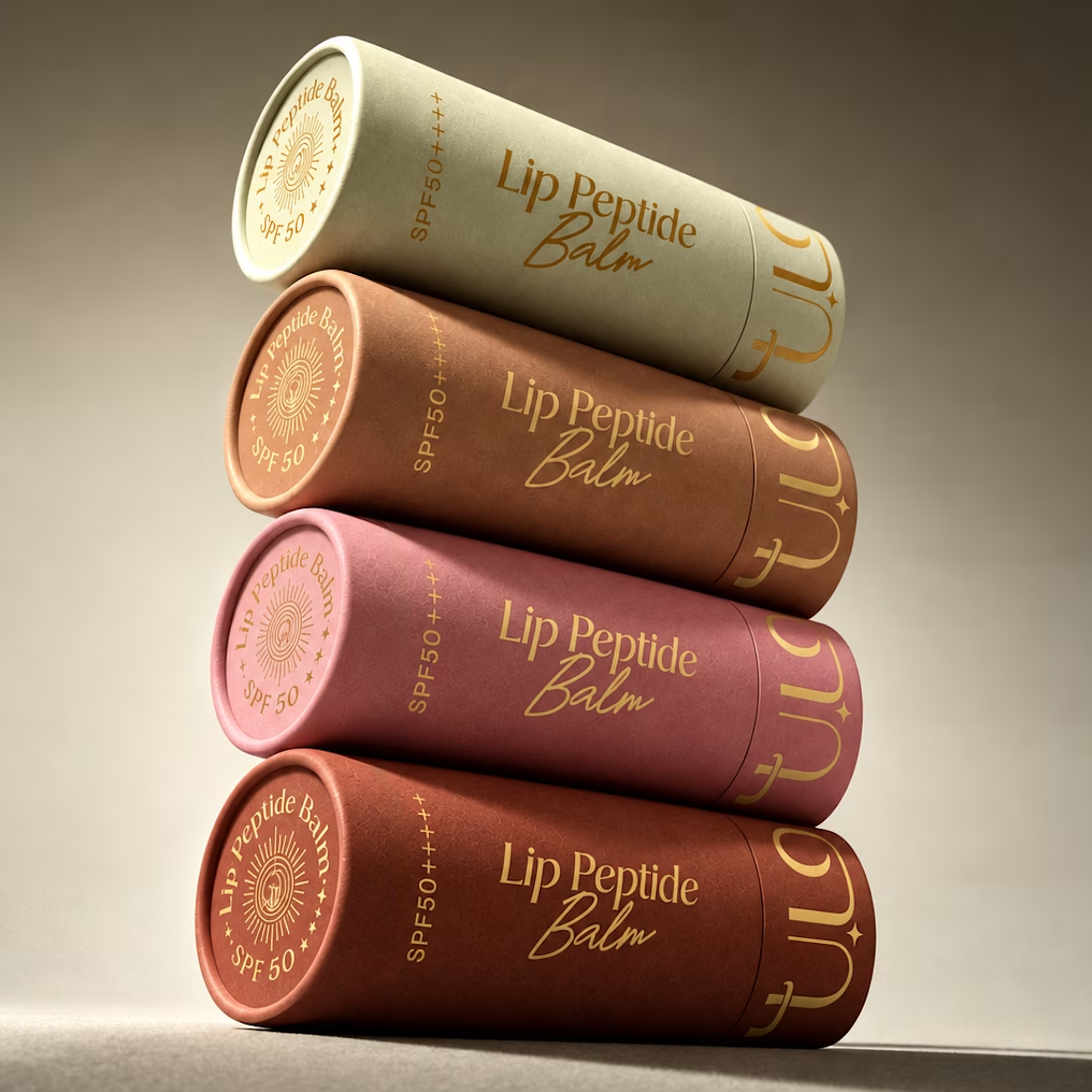
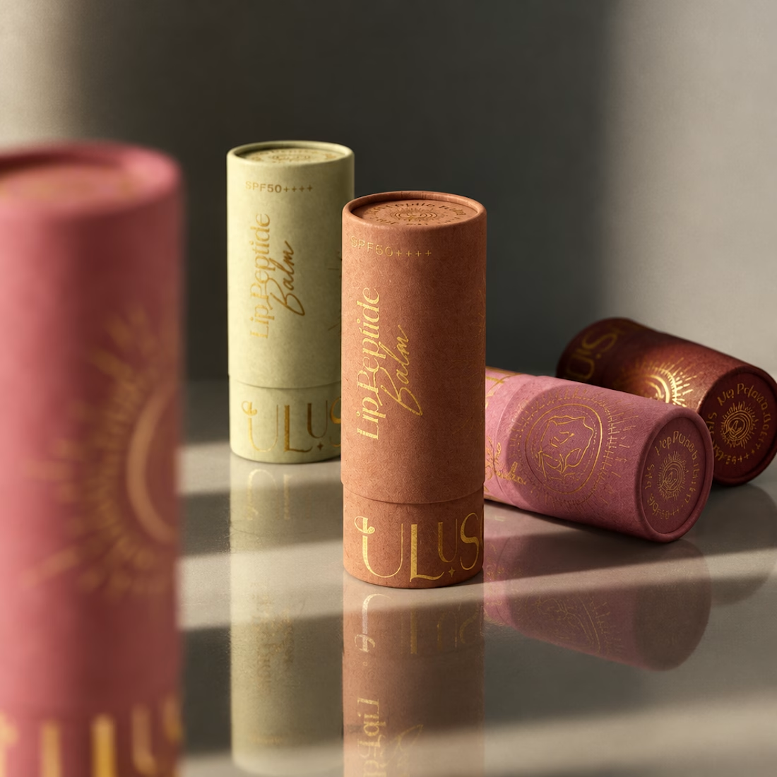
A little packaging design appreciation 🌞
UluSoleil was one of my first big clients, and over time, I helped bring four of their products to life through packaging design.
This lip balm tube was all about balancing a delicate, feminine aesthetic with clear product communication, thoughtful typography, and functional packaging.
I’m still working on the full case study, but I wanted to share a little peek at the process!
More to come ✨


Gorgeous color story and tactile packaging! Beautiful work, Anita!

Honey should taste like somewhere 🍯
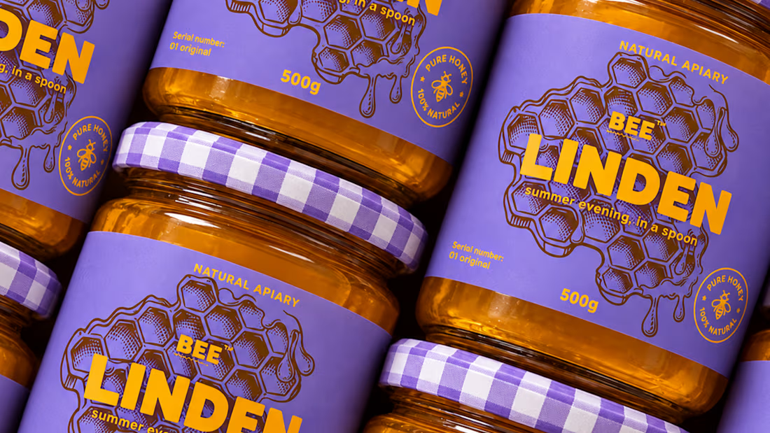
Spent the past week designing BEELINE, a single-apiary honey brand built on one idea: every jar comes from a specific place and time, so the packaging should show it.
No hexagons, no cartoon bees, no wooden crates. Just one thin line, the flight path of a bee from hive to flower, drawn short and direct for acacia, long and tangled for buckwheat. Four varieties, four colors, four routes. 🐝
Sometimes the most honest thing a jar can say is where it’s been.



Love the storytelling behind this packaging. Turning each bee’s flight path into a visual identity is such a clever touch.