The network for creativity
Join 1.25M professional creatives like you
Connect with clients, get discovered, and run your business 100% commission-free
Creatives on Contra have earned over $150M and we are just getting started
Back to feedPost
Taste Test

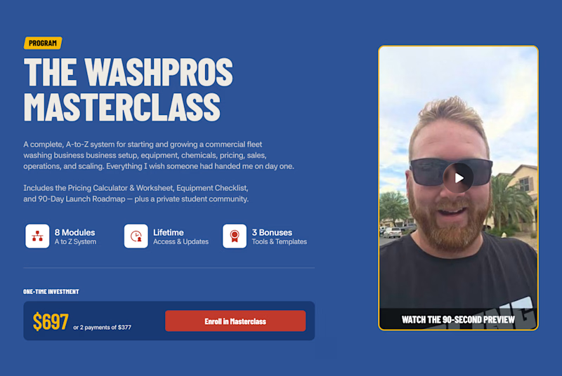
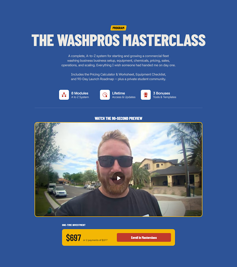
Split-testing my sales page layout same content, different structure. Curious which one you'd click Enroll on faster. 👇
.
.
Curious which one wins? Follow along for more tests like this: x.com/rightnextstep

13 votes
Ends in 1d

It honestly depends on the visual layout out the section above and below this one but by the look of it section 1 has a nice hierarchy and ux wise it’s communicating everything in one fold💪🏻
Layout of the*

Section one has a clear visual layout hierarchy to present the information efficiently, with minimized spacing that keeps the layout compact and well-balanced.

Feels like mobile vs desktop to me 😁

1 looks much more better

The network for creativity
Join 1.25M professional creatives like you
Connect with clients, get discovered, and run your business 100% commission-free
Creatives on Contra have earned over $150M and we are just getting started
Trending
retrofuturism
Share your favorite designs from the past exploring the distant future. Or your own take on the aesthetic 🚀
halftone
Dots. Texture. Grain. Let's see your designs using the halftone technique.

Midjourney
Creatives are showing off what they're making with Midjourney.
colorgrade
Video editors sound off: How do you enhance the mood of your video in color grading?


Related posts

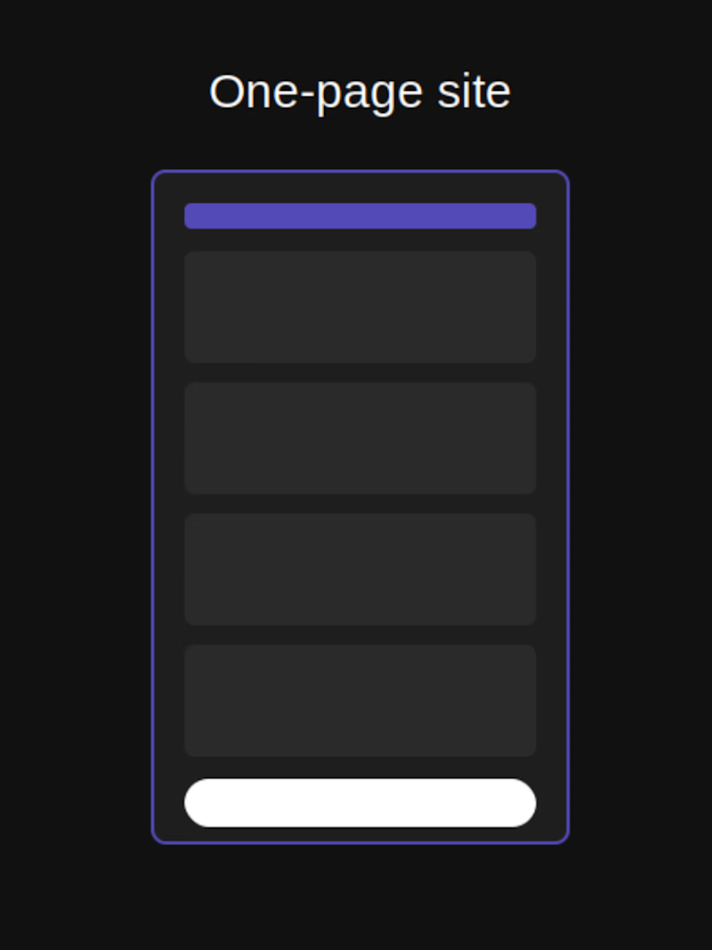
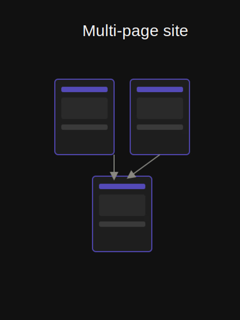
One-page or multi-page
which one actually converts better? 🤔
Everyone assumes more pages = more professional. But for most small businesses, a single well-structured page keeps people focused instead of clicking away.
Multi-page makes sense when there's real content to separate. Otherwise, it just adds friction.
Which one do you use?
9 voted
82%
2 voted
18%
11 votes
Closed

Personally, I'd pick 1 page.
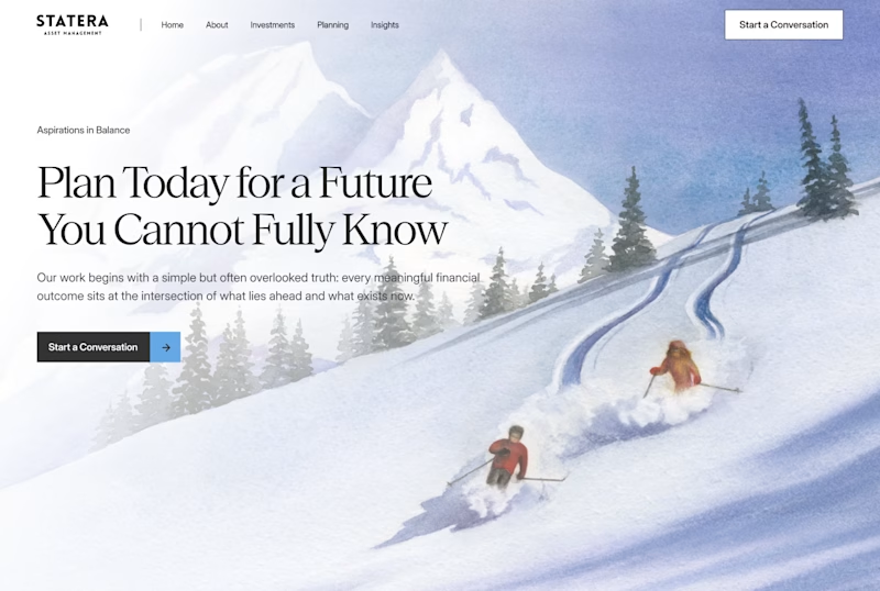
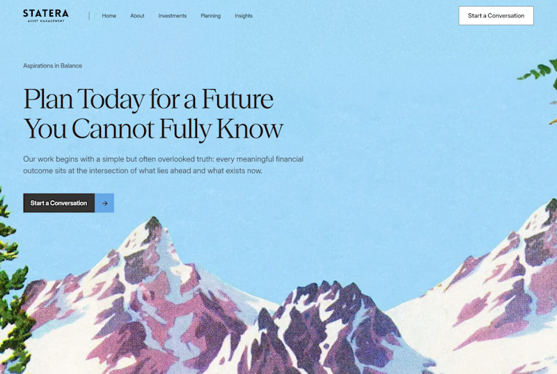
A/B testing hero sections for a project. Which one lands better for a financial planning brand?
.
.
More of this over on X, in real time ideas, questions, and the people building cool stuff https://x.com/rightnextstep?s=11

23 voted
68%
11 voted
32%
34 votes
Closed

i opted for section 1! the figures make for a human touch that most finance planning brands tend to gloss over with tech-forward-looking details. i think it's refreshing to actually see the winding path behind the pair in the snow, it reflects the copy so well!


THE BEST APP ICON MAY NOT EXPLAIN THE PRODUCT.
It may trigger the next open.
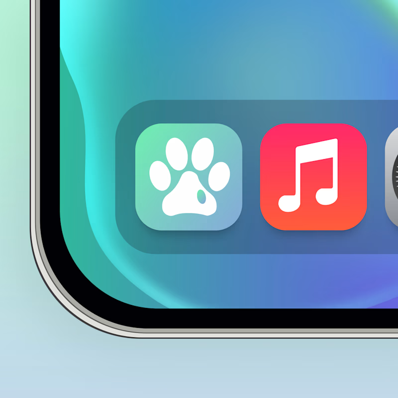
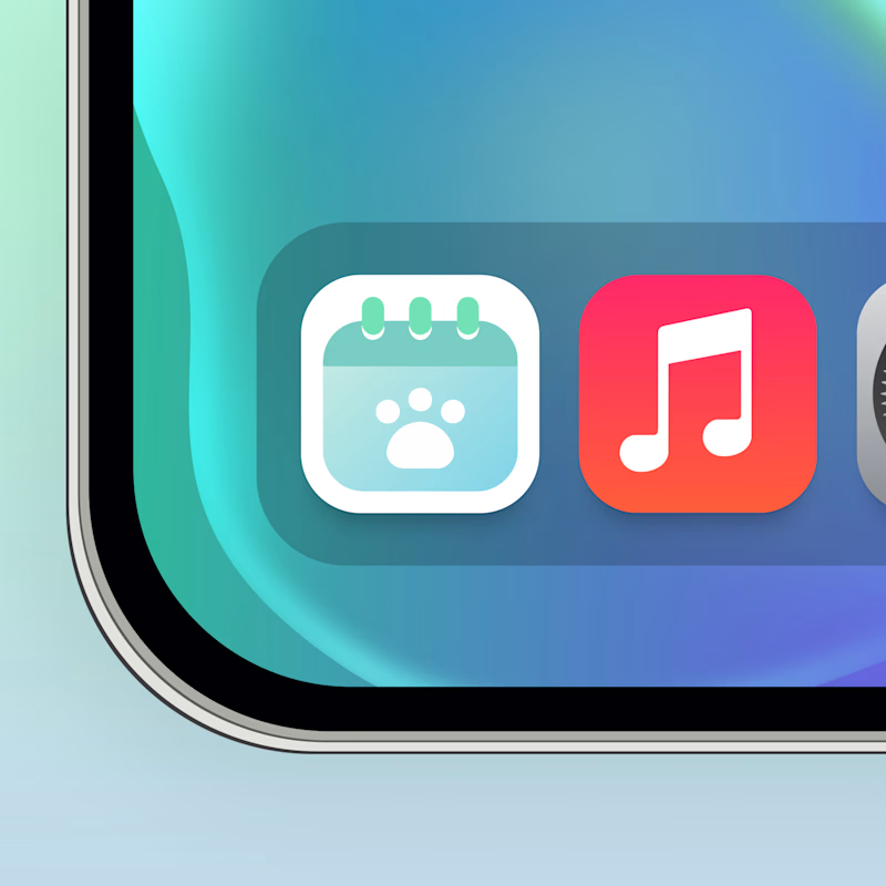
Same pet app. Two behavioral cues.
🐾 A creates instant recognition. The brain connects the icon with the pet before processing a feature or task.
📅 B creates functional context. It signals there is something to remember, check or manage.
Both work, but for different parts of retention
Recognition builds familiarity. Context creates a reason to return.
The real growth question:
Which cue is stronger once the user already understands the product?
🐾 A Emotional recognition
📅 B Functional intent
👇 Which one would make you reopen the app?
👉 BOOK A MOBILE APP STRATEGY SESSION
https://calendly.com/asol_design/book-diagnostic-call-linkedin-clone
106 voted
67%
53 voted
33%
159 votes
Closed

I think B is the better option, though it could use a little more contrast. A feels too generic, if my Paws & Palms became an app, its icon could end up looking very similar to A and get confused with other apps. Something more unique and instantly identifiable would help it stand out.