The network for creativity
Join 1.25M professional creatives like you
Connect with clients, get discovered, and run your business 100% commission-free
Creatives on Contra have earned over $150M and we are just getting started
Back to feedPost



Love this!!!

So beautiful Rhayanna!

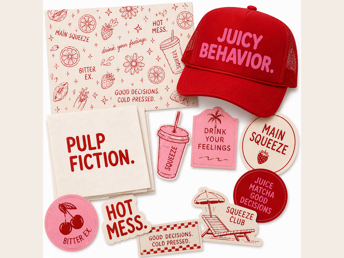
adorable, i'm so in love with those stickers.


"Pulp Fiction" and "Hot Mess" as sticker copy is such a fun way to give a juice brand actual personality instead of the usual healthy-and-boring route. Was the wordplay yours from the jump, or did it come out of brainstorming with the client?

good looking


the naming alone sells it


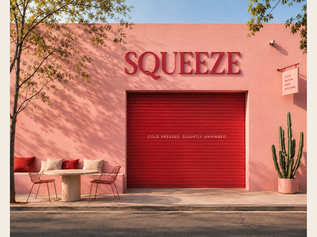
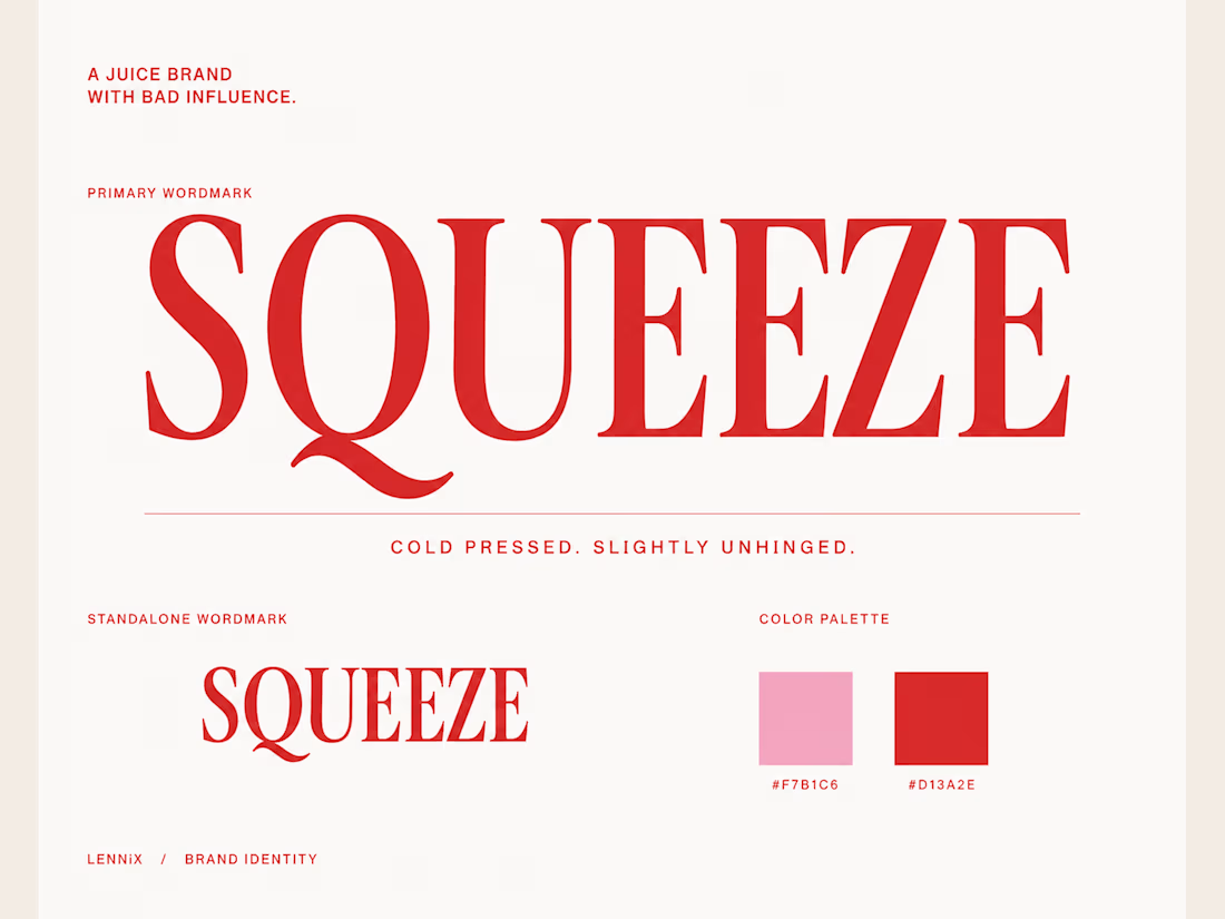
branding feels cohesive, fresh, and memorable


Unconventional branding with a bold, cheeky personality always stands out in retail! Loving the rebellious vibe and edge brought to a juice brand identity


The angle gives the brand so much personality.

Clean work


The network for creativity
Join 1.25M professional creatives like you
Connect with clients, get discovered, and run your business 100% commission-free
Creatives on Contra have earned over $150M and we are just getting started



Related posts

⁕ Full Brand Identity for Trace™
One of the project's greatest challenges was creating an identity that is instantly recognizable and inspires investor confidence, while balancing a futuristic aesthetic with the sense of reliability intrinsic to the brand's values.
The core concept draws inspiration from the cosmos and the brand's drive to transcend boundaries; no matter the distance, the delivery is guaranteed. We translated this visually through patterns forming paths that lead to a destination, a motif that extends to every corner of the visual language.


"The Trace" is one of your best branding works. fantastic execution man



Going with A-Studio, clear direction and easy to navigate 😊

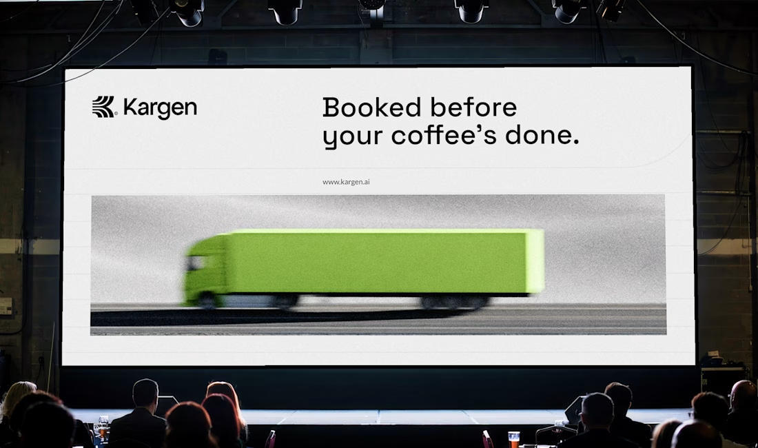
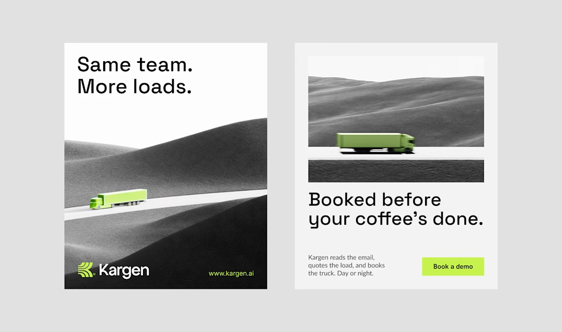
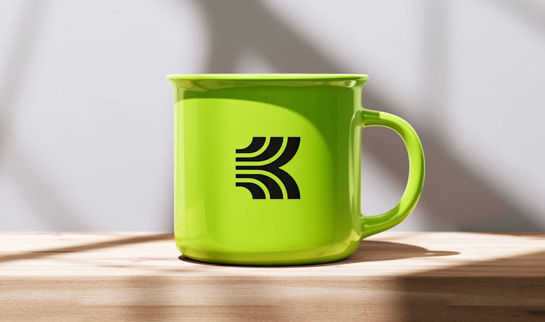
One of the directions I explored for Kargen. It didn't make the final cut, but I think it holds up. We decided to go totally different route.
Kargen is an AI that books freight on its own. It reads the email, quotes the load, and books the truck, day or night. The brand had to feel as fast as the product, but calm with the pace.




Sick 🔥