The network for creativity
Join 1.25M professional creatives like you
Connect with clients, get discovered, and run your business 100% commission-free
Creatives on Contra have earned over $150M and we are just getting started
Back to feedPost
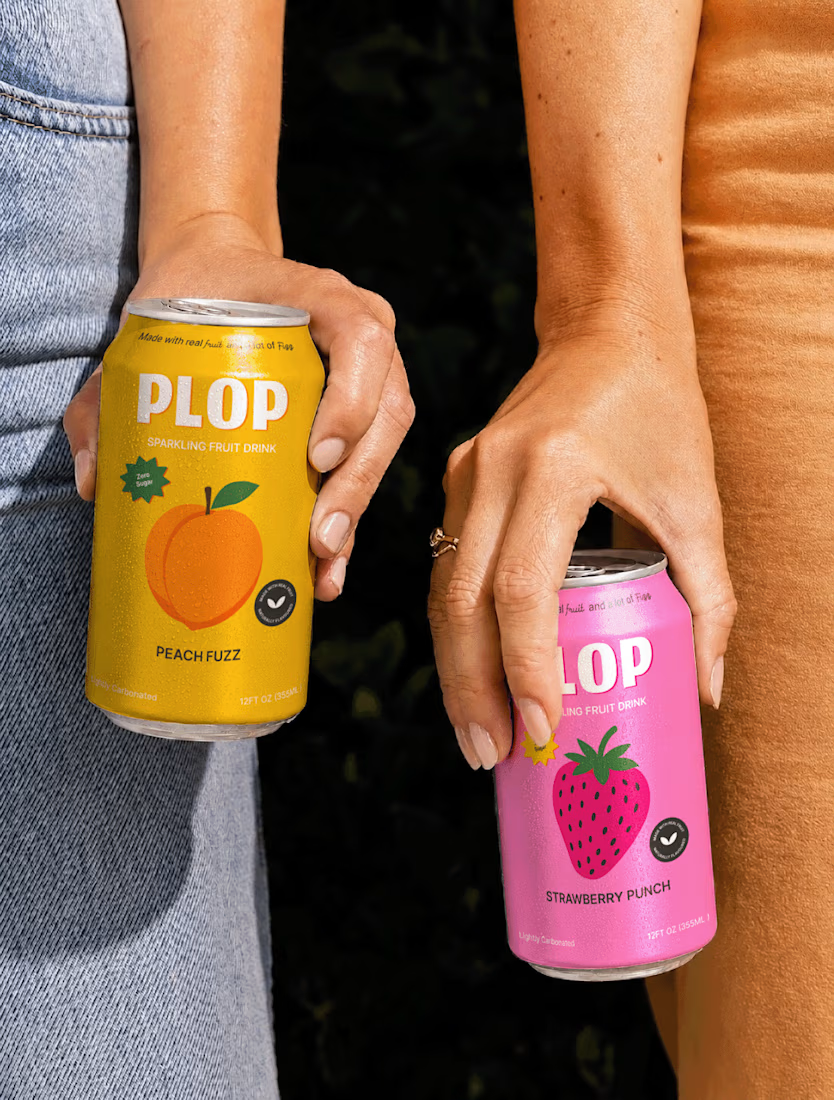
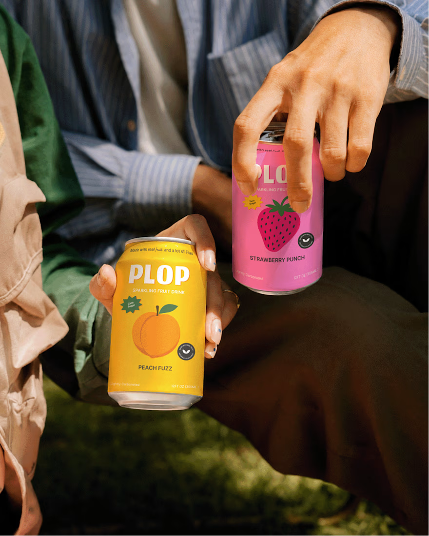
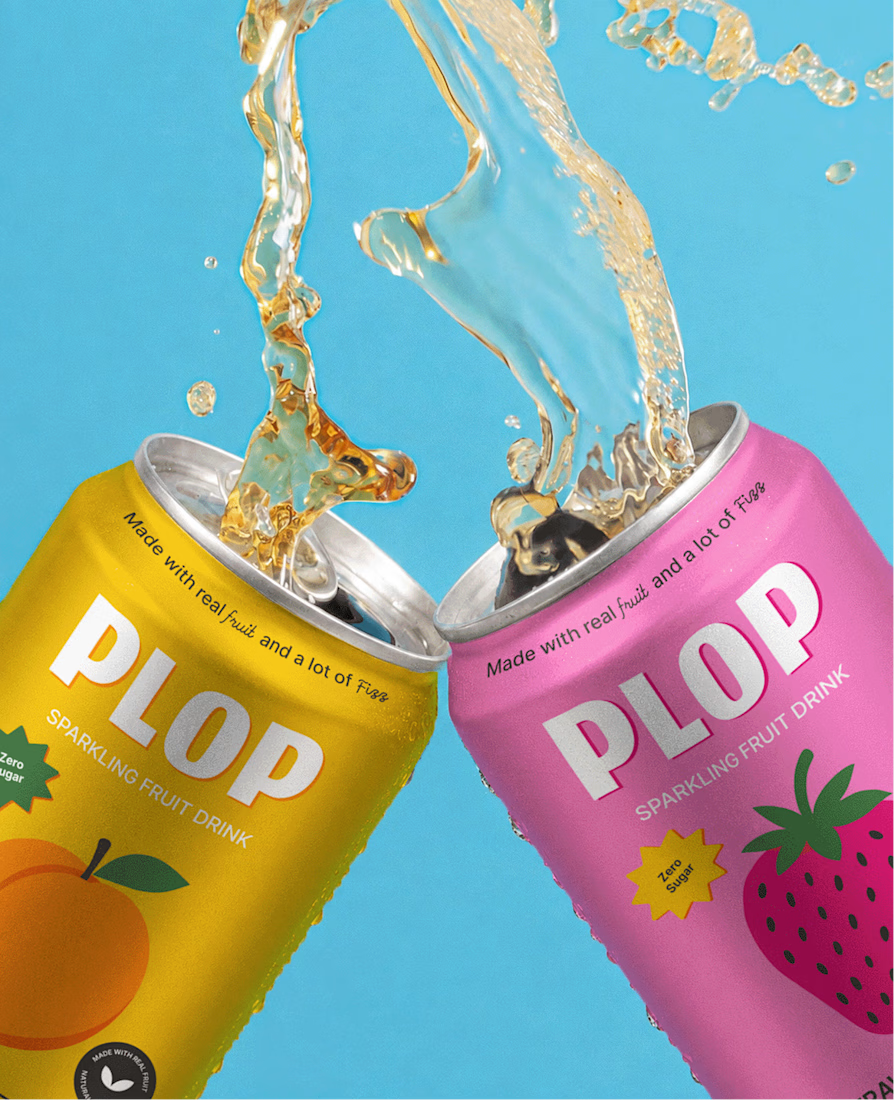
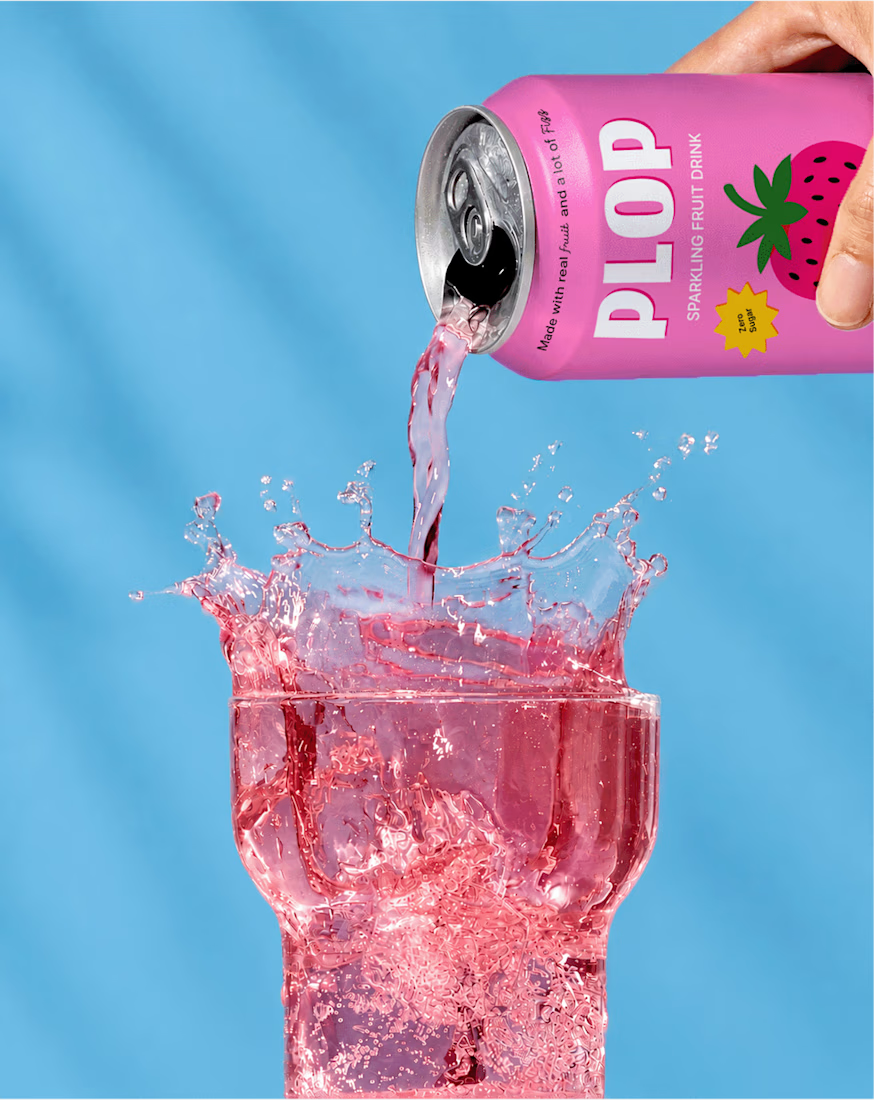
A playful sparkling fruit drink built around bold flavour, bright colours, and a personality that refuses to take itself too seriously. Every element is designed to feel energetic, juicy, and instantly recognizable.



I Love this, this is Nice


Thank you

The bright colors really fit the product. It feels fun without going too far.
Thank you.
Just curious, what attracts you more colors or illustrations?
Honestly, the illustrations caught my attention first. The colors make it pop, but the illustrations give it that personality and make it more memorable.
Thanks I love the illustrations as well

If I walk into a store I will definitely make a buying decision before even checking the content of this drink. The color and branding is eye catching
What attracts you more? Is it the colors or the illustration?
The colors first actually
Ohh nice

love the design
Thank you. What do you love most about it?
The color combination. and being less is more approach.

Nice 🔥
Thanks

nice
Thanks

If you use image generation then it's a really good use of it. Great work though.
Yes, I created the mockup images using gpt and later worked in photoshop to create final mockups.
Great, you are getting the point. I am gonna follow you and make sure to dm with new post. I'd love to see your work.

Cool
Thanks Ayesha, what did you like about it?
colors!

The bold colors and playful art direction work really well here
Thanks Akib


Thanks John, what did you like about it the most?

Nice Work!
Thanks , what did you love about it the most?

Nice
Thanks Aliza, What did you like about it the most?
Colours combination I like most...

The color is really eye catching
Thanks Esther

Awesome
Thanks , What did you like about it the most?


Amazing work🔥👏👏
Thanks! What did you like the most?

Nice design!
Thanks! What did you like the most?

looks very fantastic
Thanks Arman, what did you like about it?

Really pretty
Thank you Aminu, what did you like about it the most?
It's really captivating, first sight on it and you can see the uniqueness.

Awesome!
Thank you Victrex, what did you like about it the most?

Thanks , what did you like about it the most?

looks fantastic
Thank you, what did you like about it the most?
its creative
Thanks
The network for creativity
Join 1.25M professional creatives like you
Connect with clients, get discovered, and run your business 100% commission-free
Creatives on Contra have earned over $150M and we are just getting started





Related posts

Winder is a bold brand identity built around a geometric W-inspired symbol, combining sharp angles and forward movement to represent progress, speed, and direction.
The identity uses a striking red and deep burgundy palette, supported by clean typography and a consistent visual system across brand guidelines, digital applications, and product mockups.
Progress in Motion.


Great logo it feels it really has an identity 🎉🎉

Very well looking composition, good sinergy

Safe or bold, which one actually makes you stop scrolling? 🤔
Sans: the serif, tight tracking, one accent color playbook every skincare brand is running right now.
Bold: the same idea, redesigned with attitude. 💅
25 voted
32%
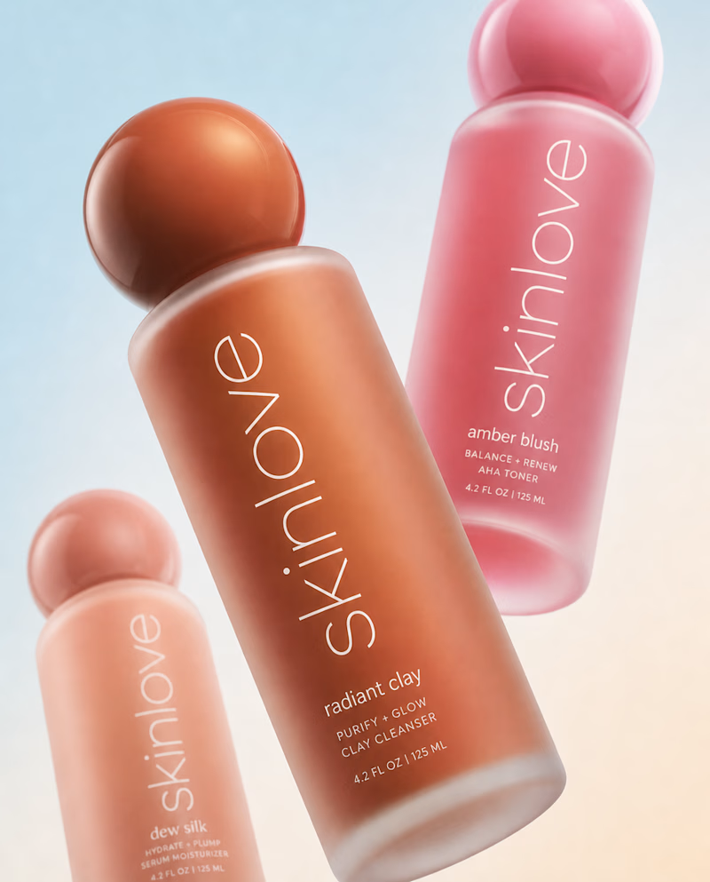
53 voted
68%
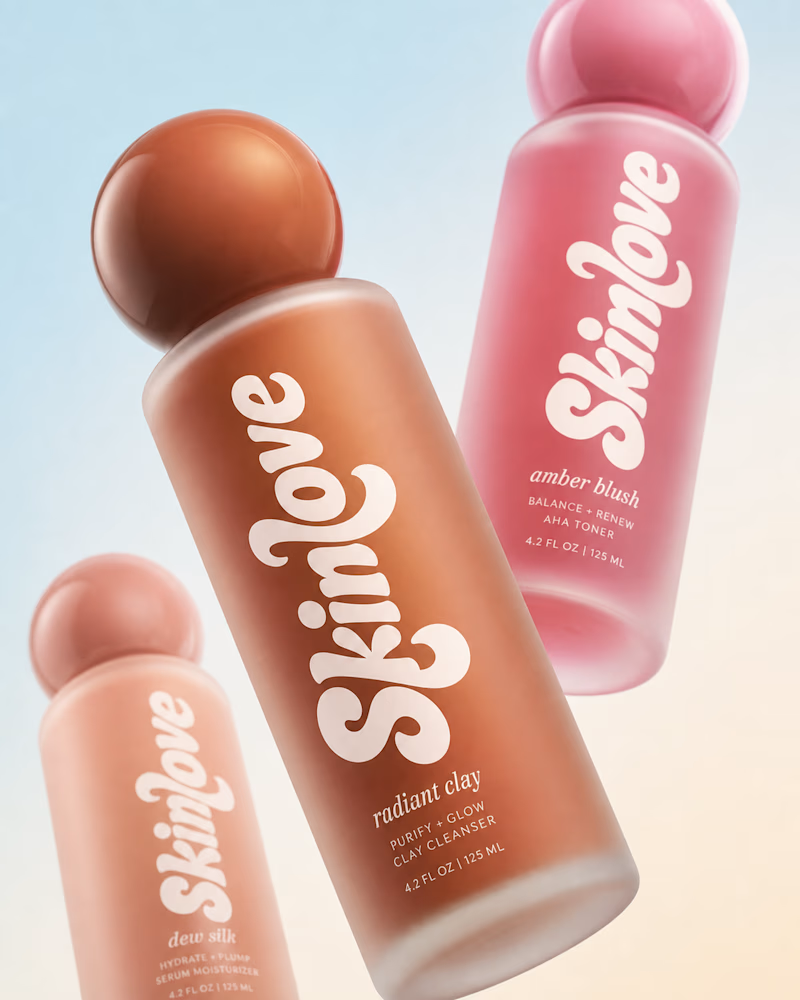
78 votes
Closed

Still waiting to hear back from @Contra HQ
So I did what any designer would do: I made the card myself 😂
Brushed metal. Laser-engraved logo. Holographic Mastercard rings. Full 360° spin. I'm going to keep polishing this until the real one shows up in my mailbox. Your move, Contra 👀
(Concept / fan design, not an official Contra product..Yet 🙌 )


“Okay, this looks WAY too good 🔥 Contra needs to make this real 👀”