The network for creativity
Join 1.25M professional creatives like you
Connect with clients, get discovered, and run your business 100% commission-free
Creatives on Contra have earned over $150M and we are just getting started
Back to feedPost
Taste Test
Same design. Which palette? 👀
You picked your favorite preview last time. This time, I’m putting the colors to the vote.
One body-care packaging concept, with the same typography and composition:
A · Rose Cream, Strawberry Sorbet + Plum Jelly
B · Lime Mousse, Coconut Cream + Plum Jelly
Which would you choose and what does it make you feel about the brand?
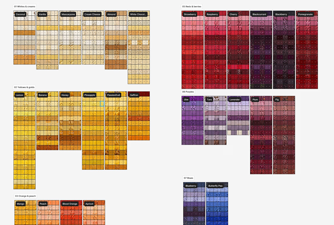
Both palettes use colors and matching ingredient textures from DCS 654, my library of 654 dessert-inspired colors.
Take a closer look: dcs.mariya.design

7 voted
44%
9 voted
56%
16 votes
Closed

Great work

Thanks, Rahman, which of the two feels more delightful to you?

The pink and plum combination feels so warm, Mariya! Love the simple fruit shapes
Thank you, Thayline! Then I think you will love these sweet tonal trios.
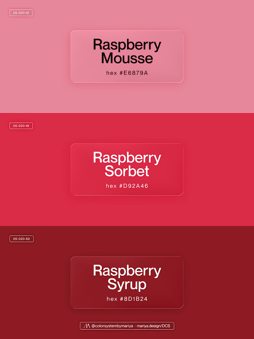
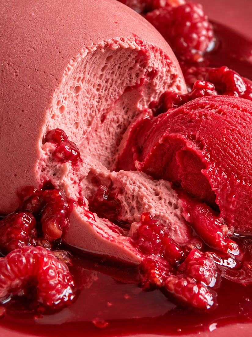
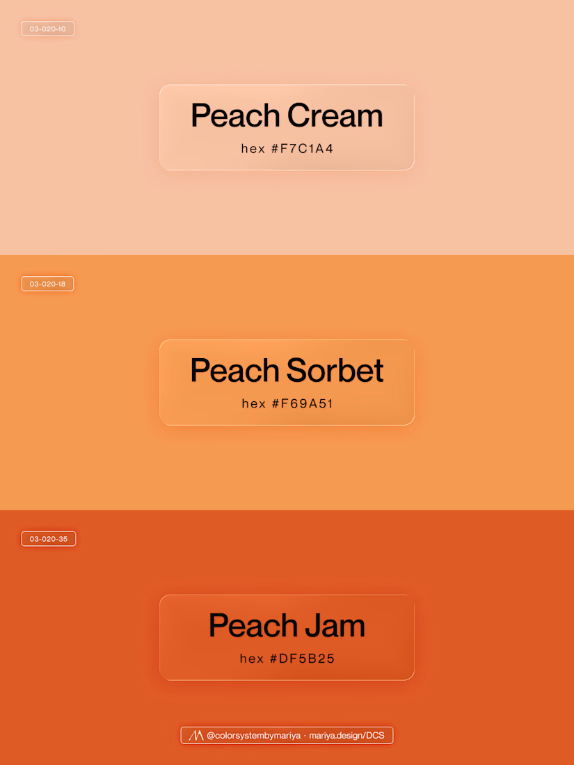
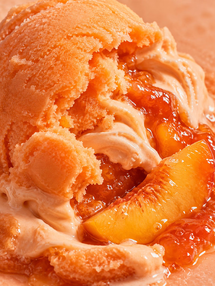
Thanks! 🧡🧡

B is absolutely stunning 🎉🎉🎉🎉
Great job Mariya❤️
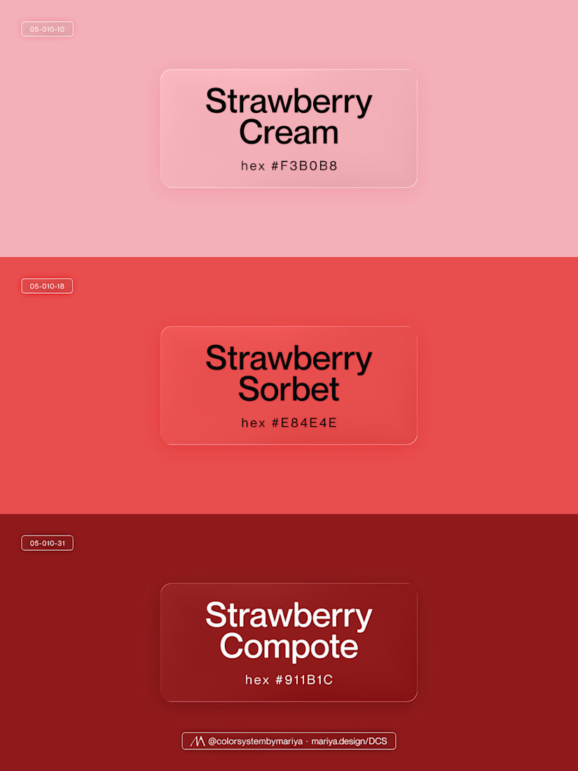
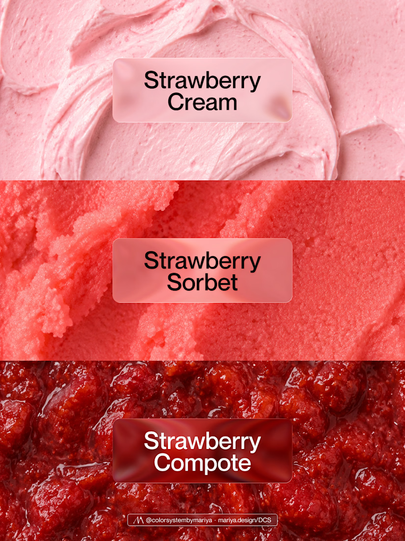
Thank you so much, Mostafa! Enjoy this strawberry tonal trio! 🍓

For body care- B feels more lush and natural too me

huge fan of B!


Recognizing those Strawberry Health colors 👀 cool to see them in this context!
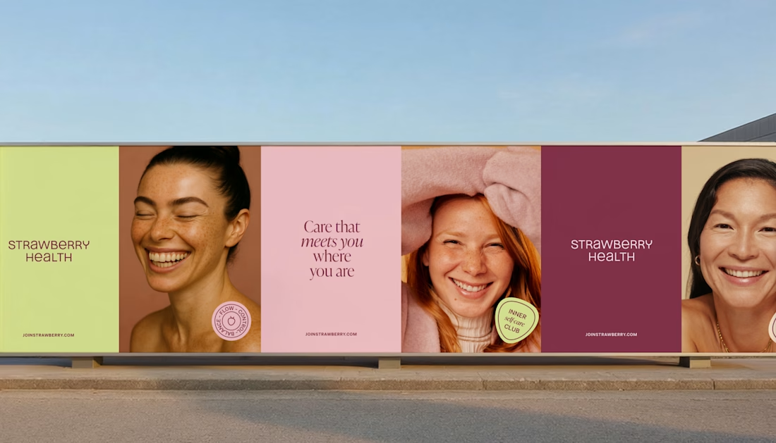
Actually, no. I have 654 delicious color in my library and I've been working months on curating it. I just matched your visual with my existing work, as I said in the reply "I will match the vibe". 😉 So, no, my colors weren't inspired by your post.

A


Incredible!

Great example of how the same composition can tell a different brand story just through palette. The lime/coconut option feels fresh, while rose/plum leans more indulgent.
The network for creativity
Join 1.25M professional creatives like you
Connect with clients, get discovered, and run your business 100% commission-free
Creatives on Contra have earned over $150M and we are just getting started
Related posts

Need a second pair of eyes 👀
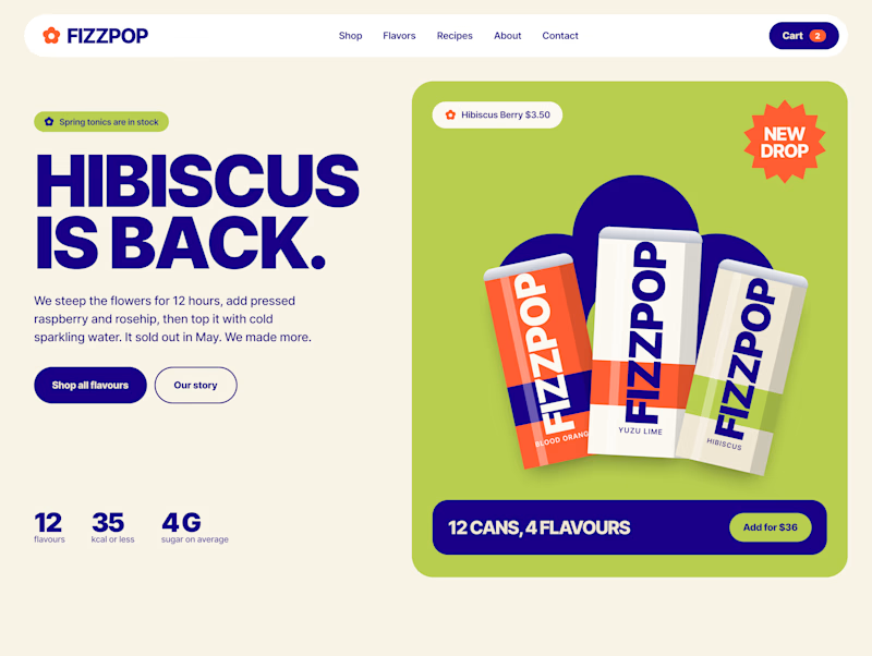
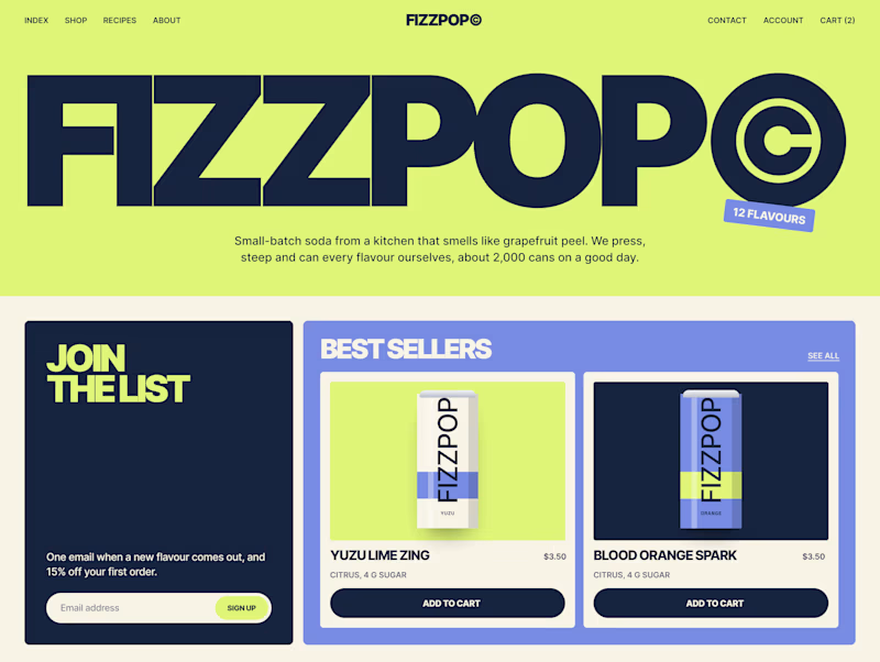
I'm designing the online store for FizzPop, a craft soda brand: all-natural sodas, sparkling waters and botanical tonics.
Flower Fizz(A): eggshell, tiger orange and deep ultramarine, with flower shapes and stacked colour swatches for the flavours
Corner Shop(B): lime, soft blues and navy, editorial layout with a giant wordmark and menu-style flavour tiles
38 voted
44%
48 voted
56%
86 votes
Closed


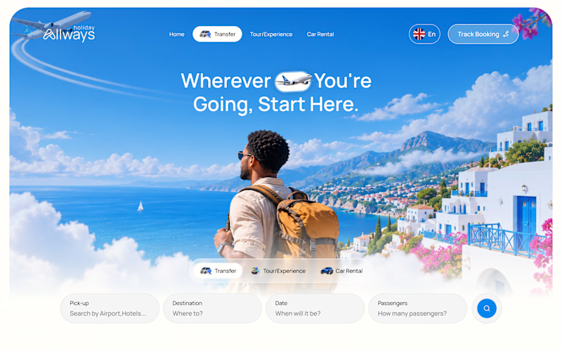
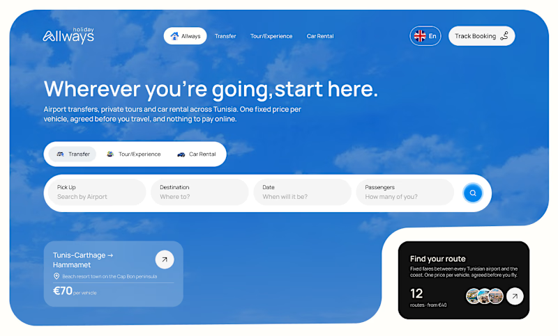
I missed an important detail in th first design direction, and the client rejected it.
After revisiting the feedback, I came up with another directiona nd it got approved
Both designs serve the same product, which one do you think got accepted for a web application?
Direction 1
Direction 2
9 voted
69%
4 voted
31%
13 votes
Closed

Dir 2 for sure!

One pixel grid. A whole brand.
For Appy, a London product studio for impact-driven startups, the wordmark, icons, 3D smile and Appy Pixel, its custom typeface, all come from the same grid.
Appy Pixel won Typography at the Online Design Awards.
Type first or symbol first: where do you start a rebrand?


thats so nice, i loveee



