The network for creativity
Join 1.25M professional creatives like you
Connect with clients, get discovered, and run your business 100% commission-free
Creatives on Contra have earned over $150M and we are just getting started
Back to feedPost
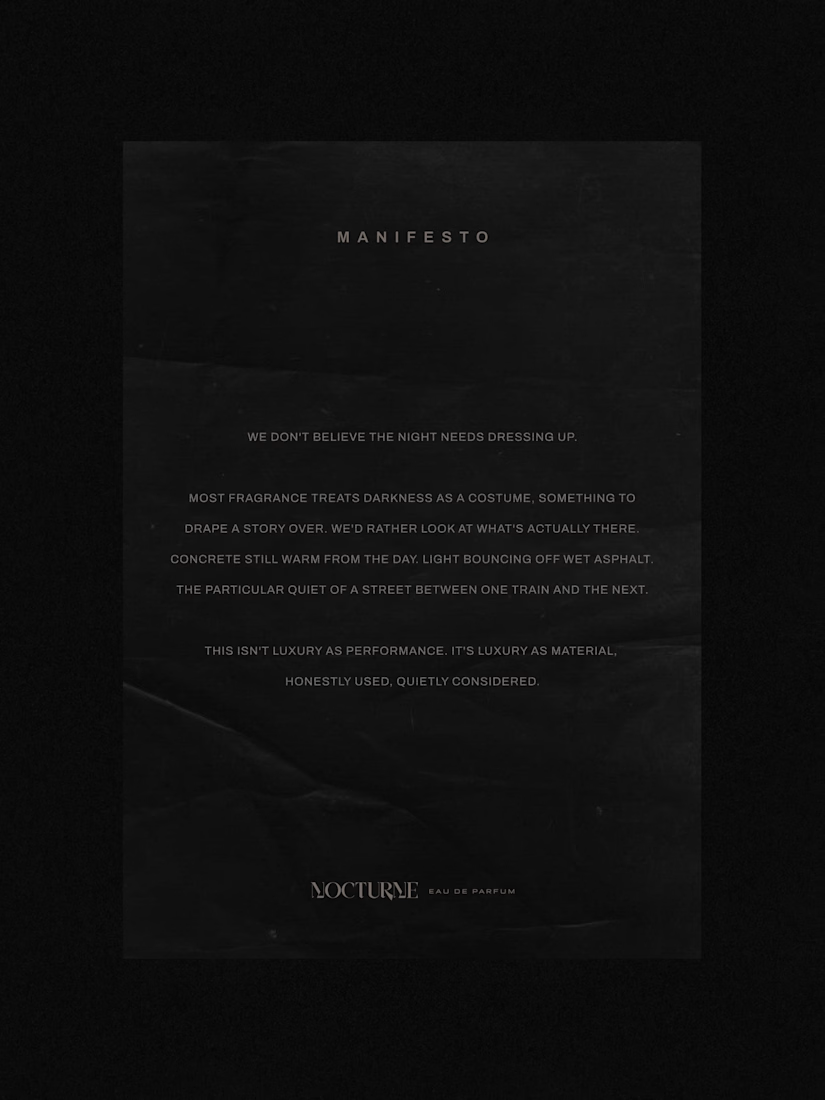
Nocturne is a self-initiated fragrance house I built from the ground up, treated with the same process I'd bring to any client: strategy first, then design.
The brief was familiar: a fragrance inspired by the city after dark. Most fragrance branding solves that with common approaches such as moonlight, mystery, or gold foil details. I wanted to solve it with something more specific: what does after dark actually look like in an urban environment? Concrete, streetlight, wet pavement, the quiet stretch between one train and the next.
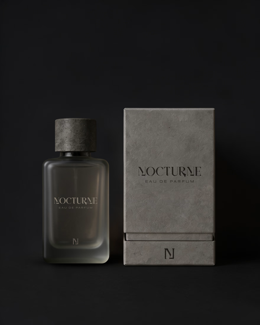
That question shaped everything downstream. An archetype chosen deliberately against category convention, Creator and Explorer rather than the more expected Lover or Magician. A material-first approach to the bottle and packaging. Sandblasted glass, a textured concrete-like cap, no gold, no ornament. And a running checklist I held every decision against throughout the project.
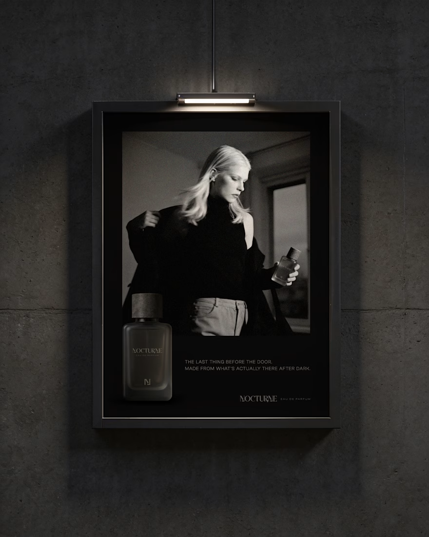
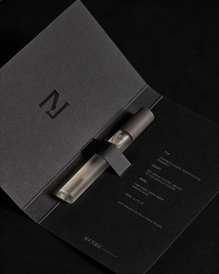
The case study covers the strategy behind Nocturne, not just the finished system: positioning, personality, the reasoning behind each material and typography choice, and how those decisions translated into the bottle, packaging, and campaign work.
I'd love to hear what you think, especially if you enjoy seeing the thinking behind a visual identity as much as the final result.




Trading moonlight and gold for concrete and sandblasted glass makes the idea feel much more specific. That restraint gives the whole identity a quieter kind of luxury.

Thank you so much, Milan, for sharing your thoughts on this. I'm really glad you picked up on the quiet luxury quality, as that was something I intentionally wanted to bring into the brand. 🤍

beautiful work!
Thank you very much! 🤍

Very premium and sophisticated Bianca, amazing!! 🚀
Thank you so much, Tan! I'm really glad the project came across that way! 🤍

Thank you so much, Ganesh! Exploring highlights and shadows is something I really enjoy when working with mockups and imagery, as it helps create a more realistic and art-directed feel. I'm glad you noticed that! 🤍

Good Work!
Thank you very much! 🤍

Self-initiated work like this is honestly the best portfolio move, you get to make every call a client would normally veto. My guess is the dark minimal direction felt inevitable once you had the brief, or did you seriously test something lighter first?
Exactly! I did explore lighter directions as well, keeping the minimal and editorial qualities while still trying to capture the darker essence of the brief. But once I considered the concept, brand meaning, and target audience together, the darker direction felt like the most...

Self-initiated work like this is usually where the strategy muscle actually gets built, no client pushing back on the concept.
Absolutely! It gave me the space to really explore the strategic thinking behind the concept and see how consistently I could carry it through the whole identity. Of course, working with clients brings a different and equally valuable perspective, especially when it comes to...

Premium Look
Thank you very much Seemak! 🤍

Thank you very much, Sahil, for your feedback! I'm glad to hear that the choices I made in the visual direction resonate with the brand concept. 🤍
The network for creativity
Join 1.25M professional creatives like you
Connect with clients, get discovered, and run your business 100% commission-free
Creatives on Contra have earned over $150M and we are just getting started








Related posts


EarthHub – A Platform for Nature Expeditions ⛰️
Stumbled upon this project in my hard drive, had to publish!


Top to bottom nice work

The most serious brand I’ve ever worked on mails you a phone shaped like a shell.
Deadpan voice. Inflated letters. One strange object a month.
STILL LIFE SERVICE, case study out now.
Would you open the box?

I'd open the box for sure! Inflated letters with a deadpan voice is such a fun mix.

The team is cooking
Motion design for the logo we are making for Nation e-commerce


Wou