NOCTURNE — Branding & Packaging Design

Bianca Santiago


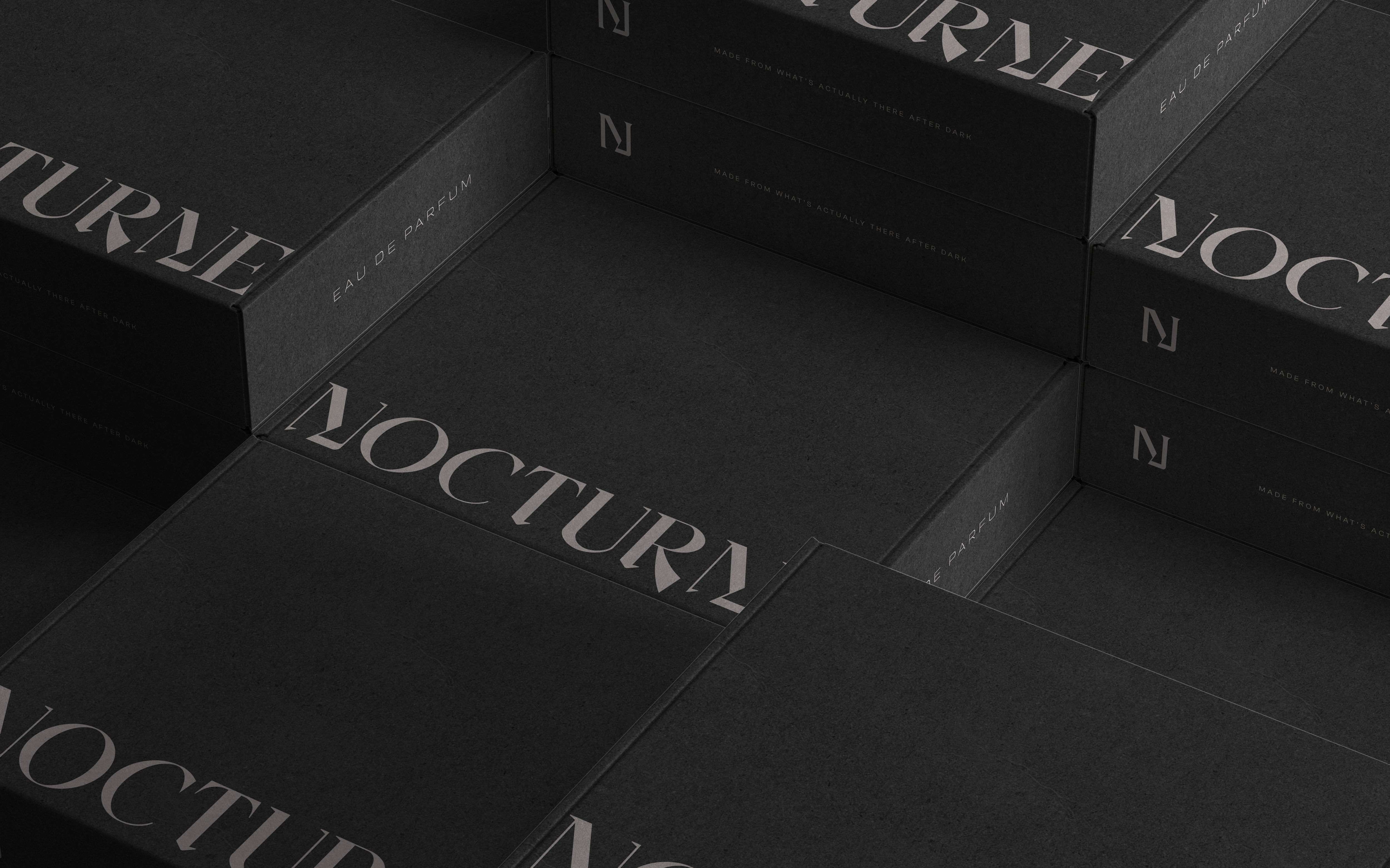
NOCTURNE
Made from what's actually there after dark
Nocturne is a contemporary fragrance house built from the city after dark.
To bring this idea to life, I wanted to move past the usual cliché approach (moonlight and mystery), and lean into what "after dark" actually looks like: concrete, wet pavement, streetlight, the particular quiet of a street between one train and the next.
This identity treats scent the way a photographer treats a subject—observed, not staged. Bottle, packaging, and campaigns all come from the same material world, matte glass, brushed concrete, restrained type, nothing borrowed from old perfume convention.
Industry
Cosmetics and Beauty
Market
DACH, Denmark, Sweden, South Korea
Deliverables
Logo Suite (Primary logo, secondary and brandmark)
Color Palette
Typography System
Brand Textures
Fragrance bottle
Outer Packaging / Box
Fragrance Card
Business Cards
Editorial Campaign Billboard
Hang Tag
Shopping Bag
Shipping / Mailer box
Social Media Graphics (IG feed posts and stories)
Website hero + Ingredients Page design
One-Page Brand Guidelines Sheet
Lummi AI-Generated mockups and photography: Brand Bottle & Packaging, Fragrance Cards, Billboard, Hang Tag, Shopping Bags and model persona.
Timeframe
3 weeks
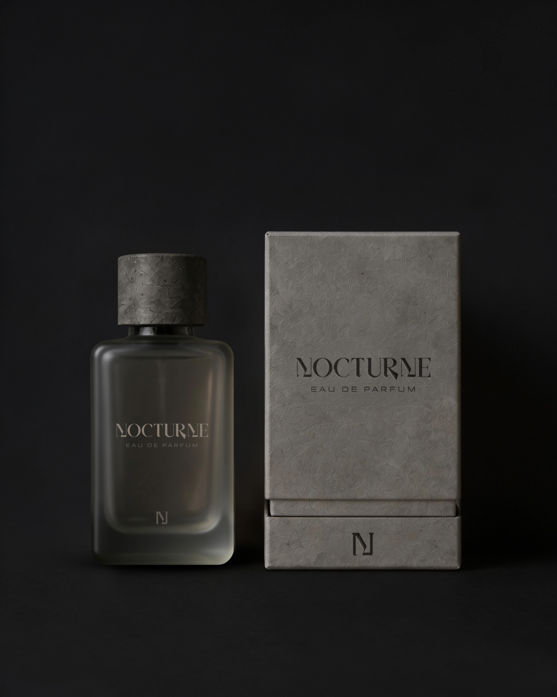
Fragrance Bottle + Outer Packaging / Lid-Base Box
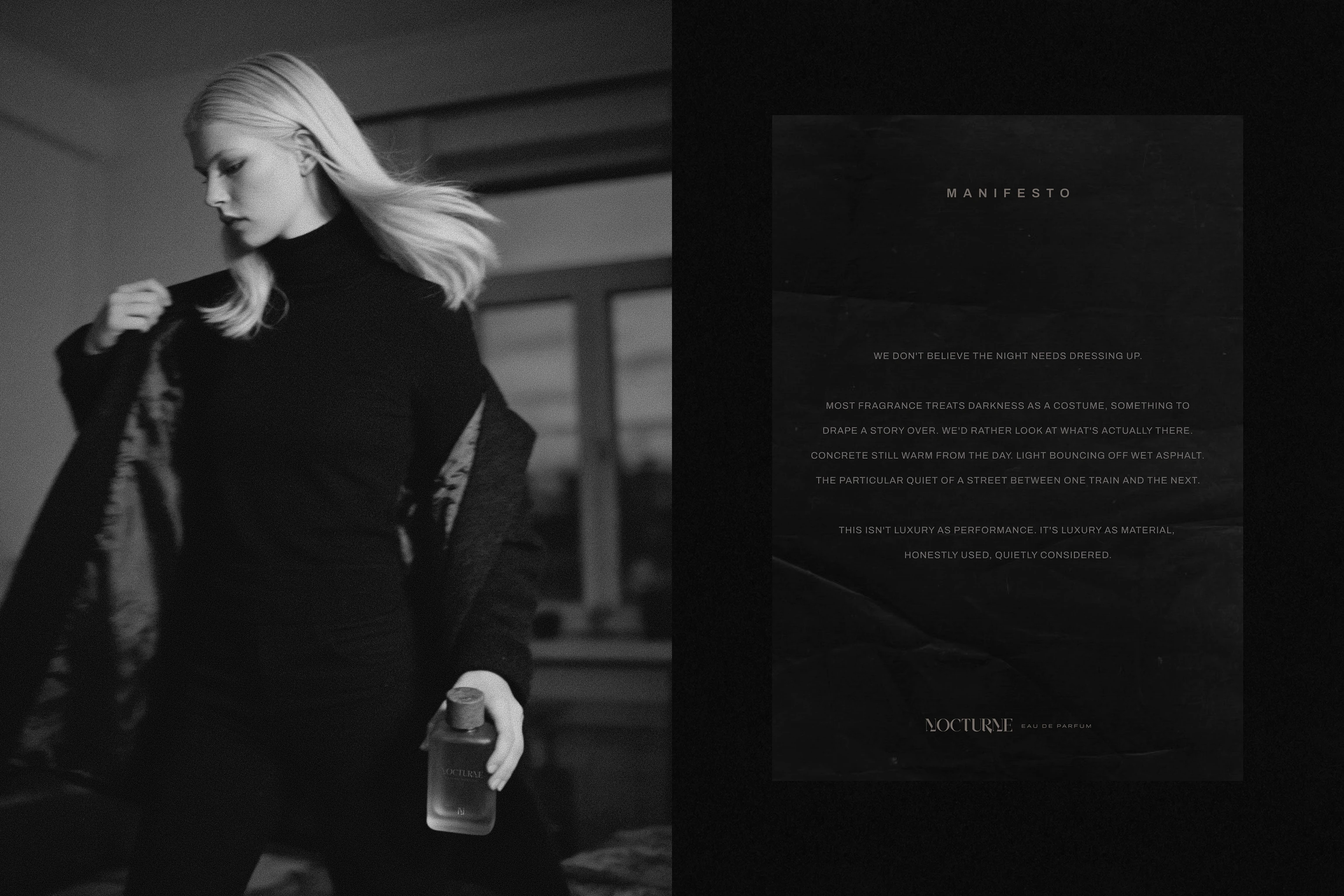
Model Persona + Brand Manifesto
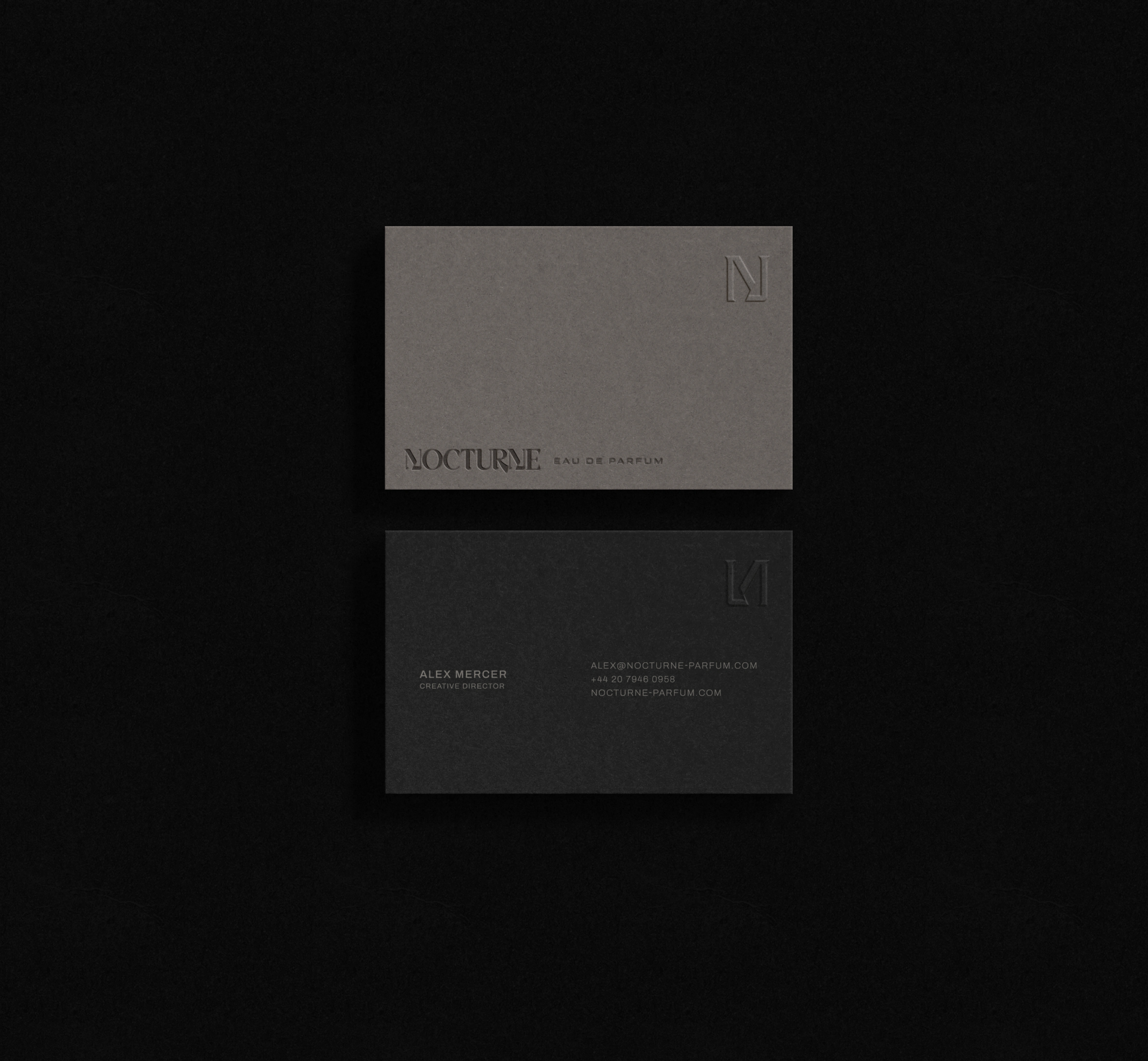
Business Cards
The Challenge
The brief, part of the #tbbNocturne design challenge hosted by @the.brief.booth, called for a full visual identity for Nocturne, a conceptual fragrance house built around the idea of the city after dark. The brief itself flagged the real risk early: fragrance branding has a very small set of default moves, moonlight, mystery, seduction, gold foil, cursive script, and even the "dark, minimal, industrial" alternative has become its own well worn shorthand in the niche fragrance space. Byredo, Le Labo, and a wave of similar brands already occupy that exact territory.
So the actual challenge wasn't designing an attractive bottle. It was finding a specific enough point of view that the identity couldn't be mistaken for another entry in an already crowded aesthetic, while still delivering a full, professional system: logo, bottle, packaging, fragrance card, business card, and campaign material.
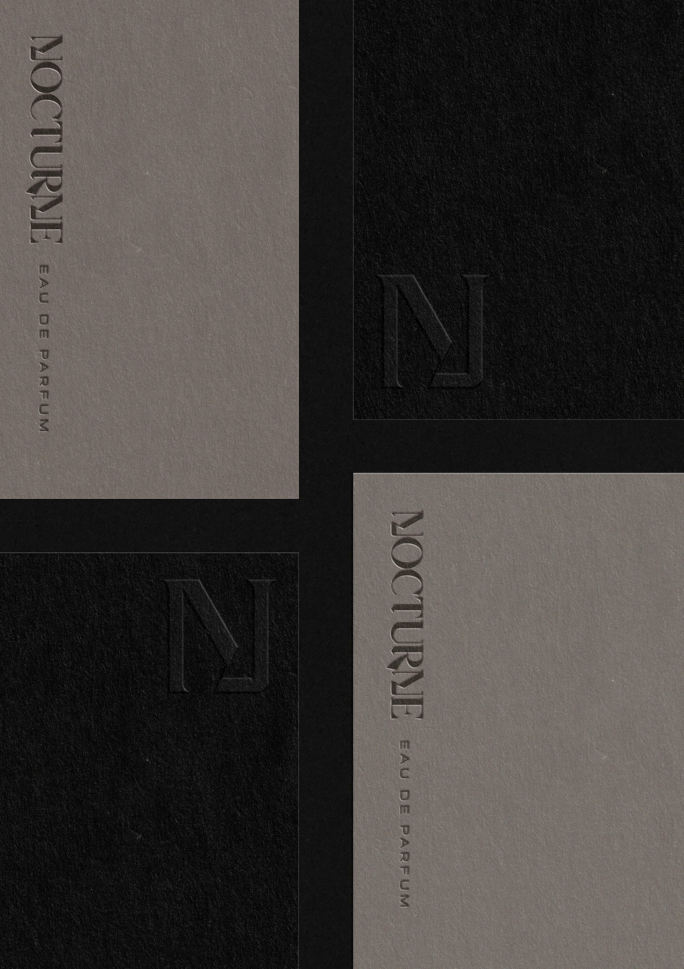
Business Cards
The Solution
Bottle and packaging: a material-first approach rather than a decorative one, sandblasted and frosted glass, a matte, textured cap drawing from concrete and stone rather than polished metal, and a two-piece telescoping box construction refined over several rounds specifically to avoid the drawer-and-handle look most AI generation tools default to for "packaging with an opening."
Typography: a bold, condensed, high-contrast serif wordmark paired with restrained, small-caps supporting type, structured into a clear three-level hierarchy so the system stays legible whether it's applied at business-card scale or billboard scale.
Photography direction: grainy, observed, documentary-style imagery rather than glamorous staged photography, with a consistent "hour of night" carried across bottle, campaign, and social content so the mood reads as one specific place rather than a general dark aesthetic.
Campaign: several environmental directions developed and tested, an underground tunnel display, a concrete wall at dusk, a framed illuminated poster, all built to avoid the seduction and romance convention that dominates fragrance advertising, paired with short, specific copy pulled directly from the brand manifesto rather than generic tagline language.
Extended system: beyond the brief's required deliverables, the identity was tested across a discovery and tester set, hang tag, shopping bag, and social and website touchpoints, to demonstrate the system holds together as a full brand rather than a single hero shot.
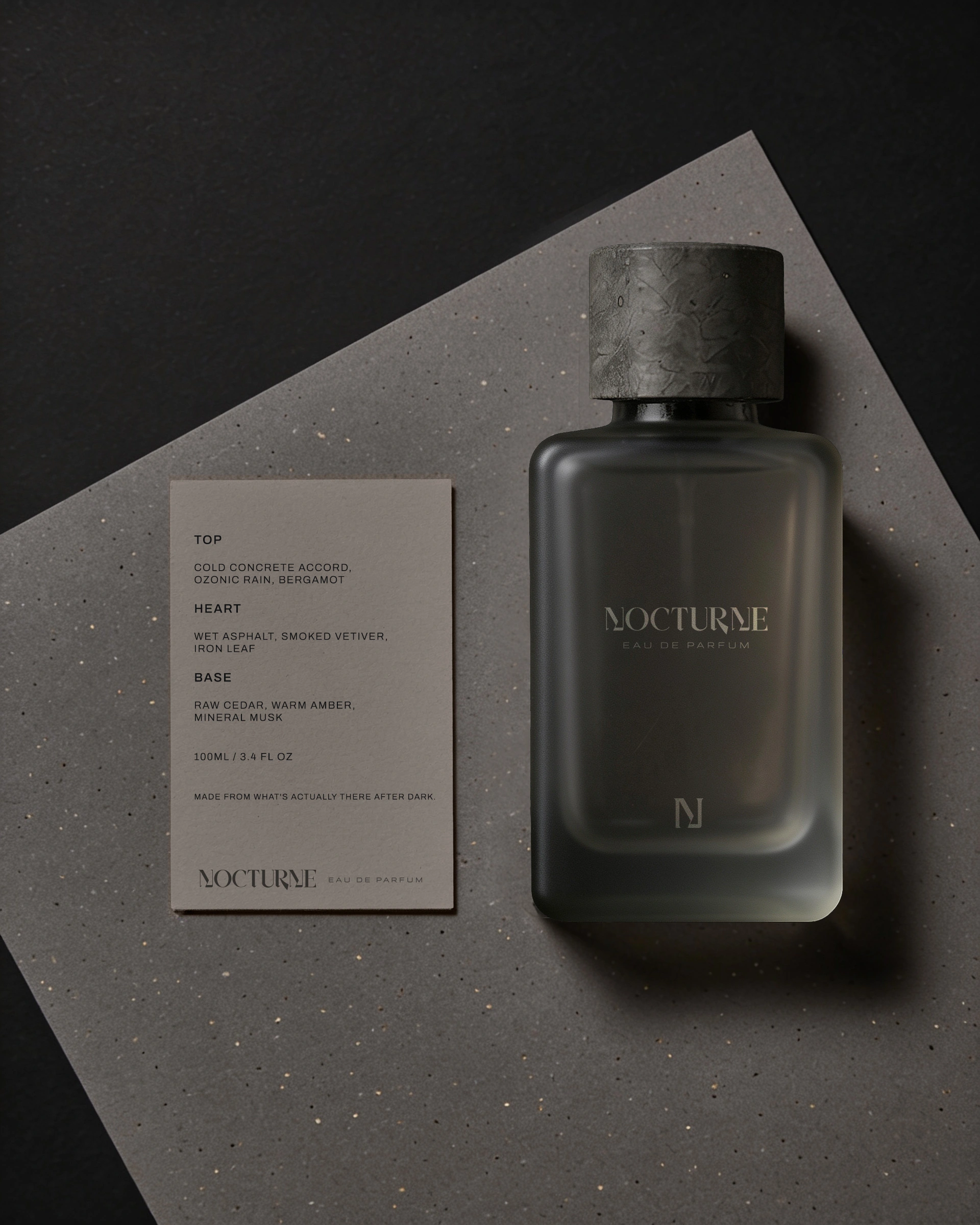
Fragrance Card
The Result
A complete, internally consistent identity system delivered across more than a dozen touchpoints for the #tbbNocturne challenge submission, spanning brand strategy, logo and typography system, bottle and packaging, fragrance and business cards, campaign material, and an extended set of applications beyond the brief's original required scope.
Every visual decision across the project traces back to a documented strategic reason, from the choice of archetype through to the exact construction of the box, rather than resting on style alone. The outcome is a system built from a checked, repeatable process, one where the reasoning behind each choice holds up as clearly as the finished images do.
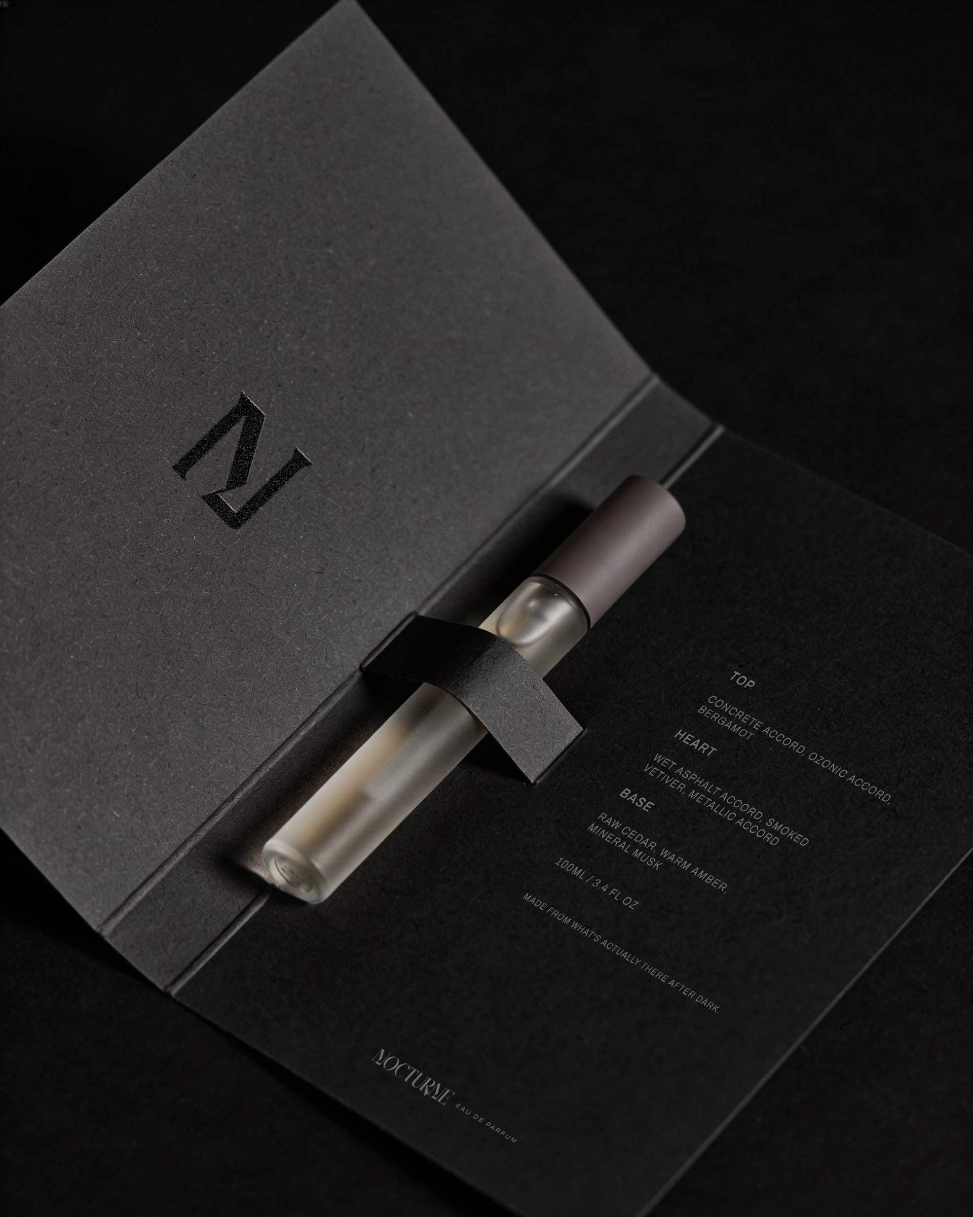
Fragrance Tester Card
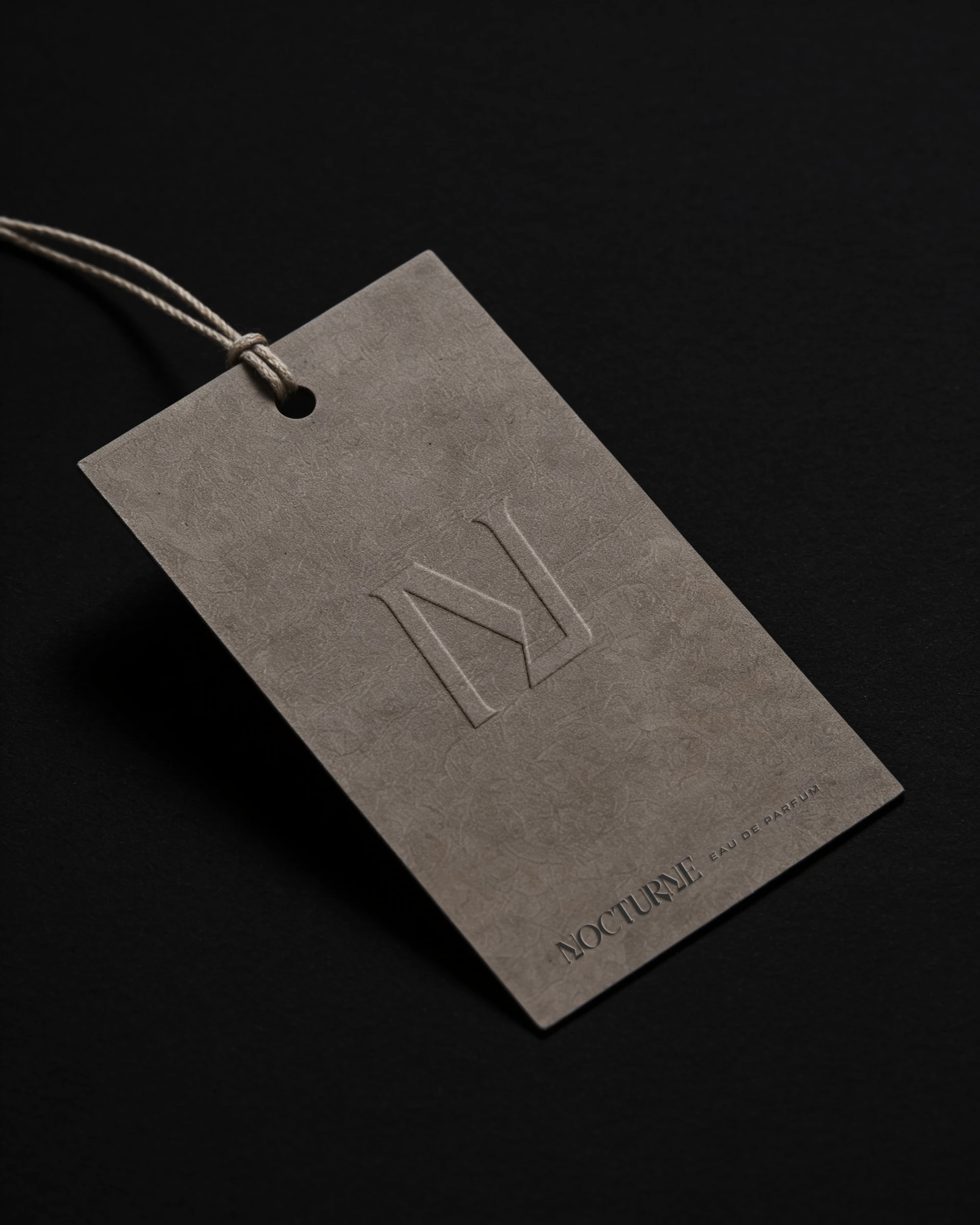
Hang Tag
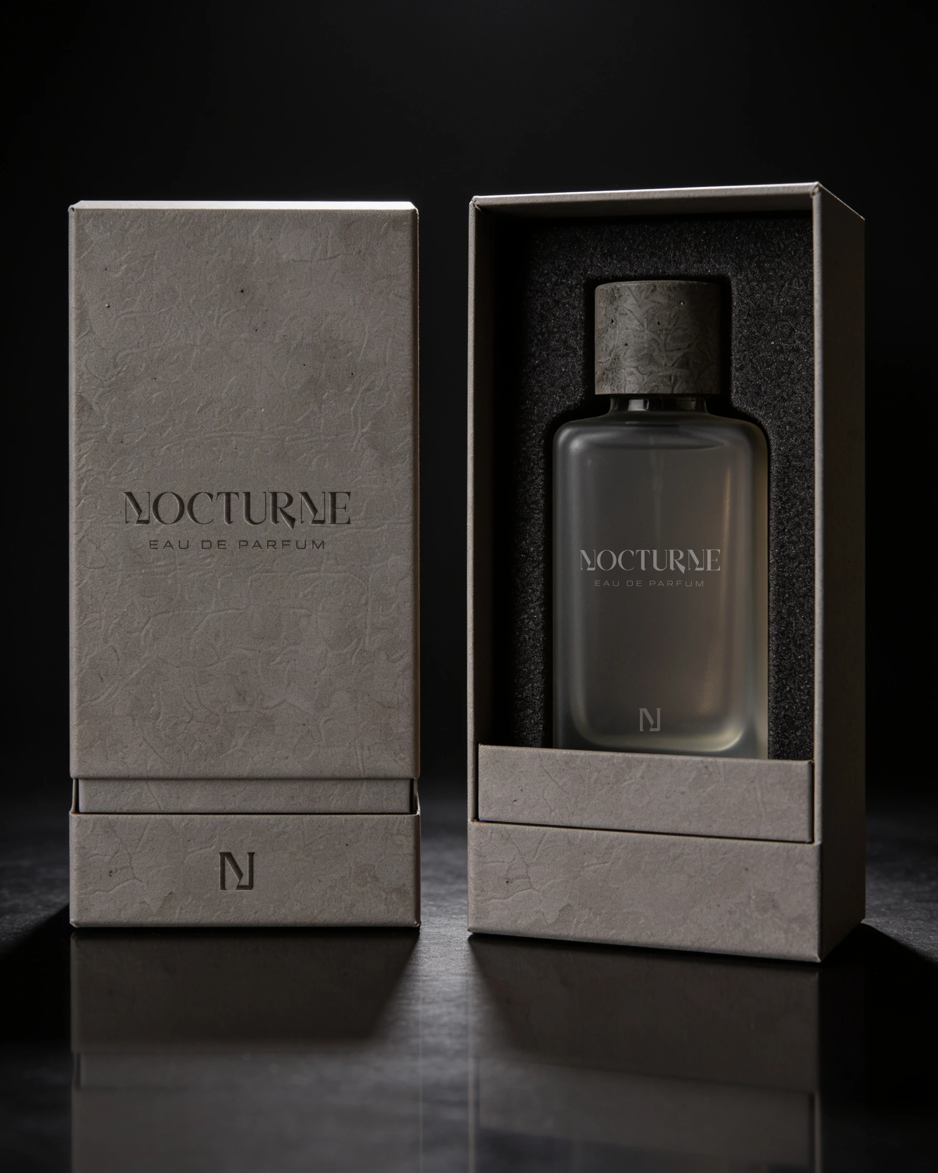
Outer and Inner Packaging Concept
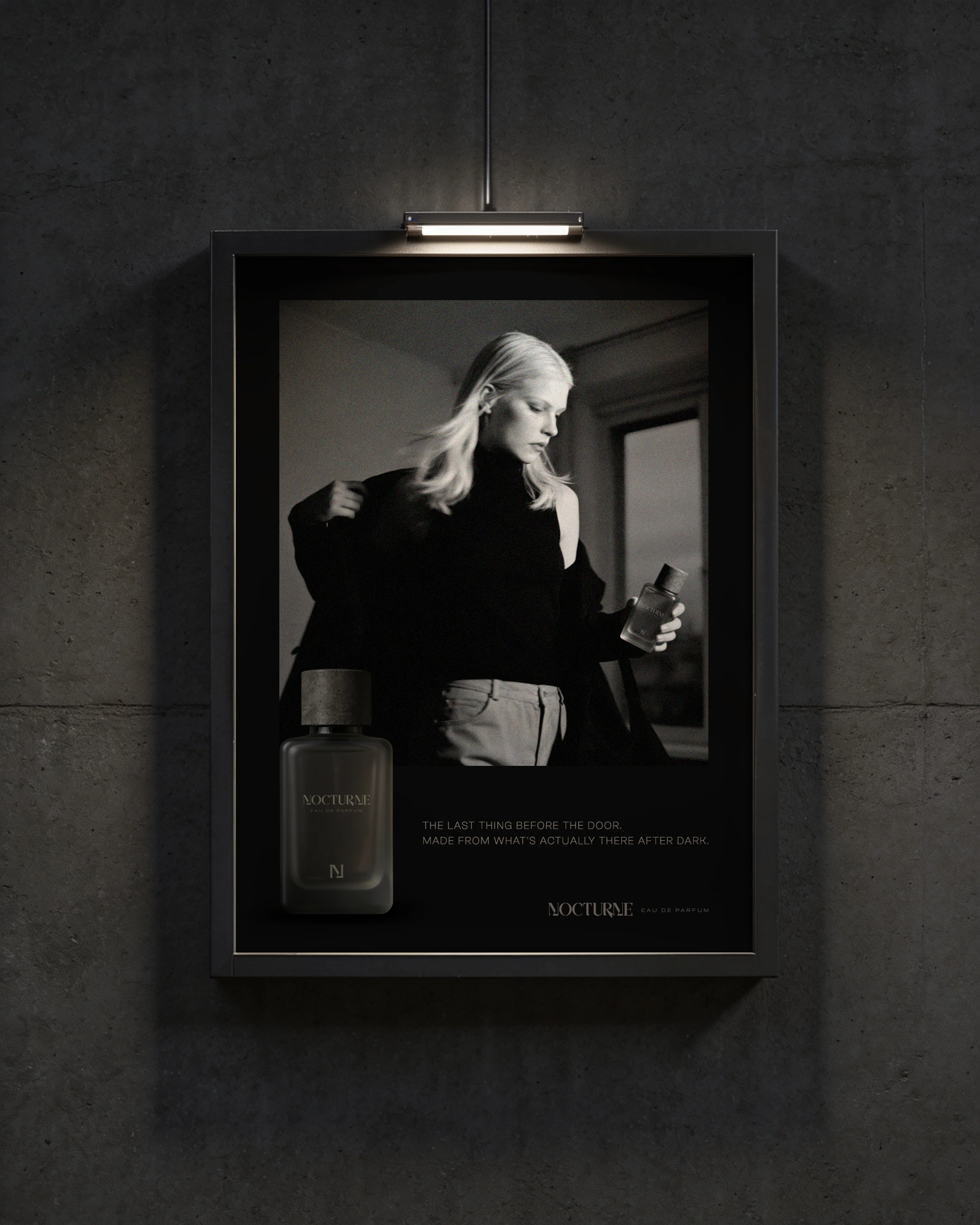
Billboard Campaign Design
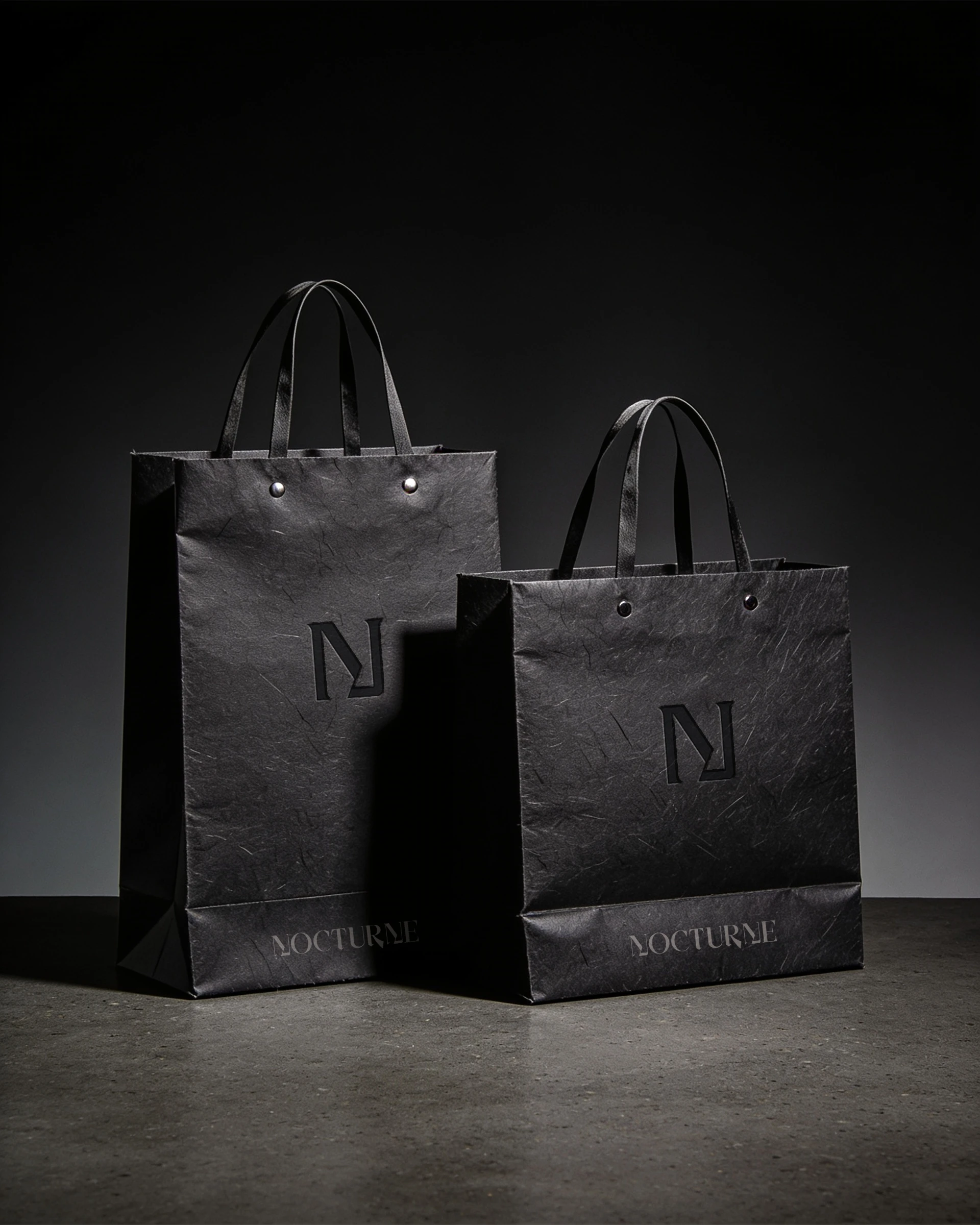
Shopping Bags
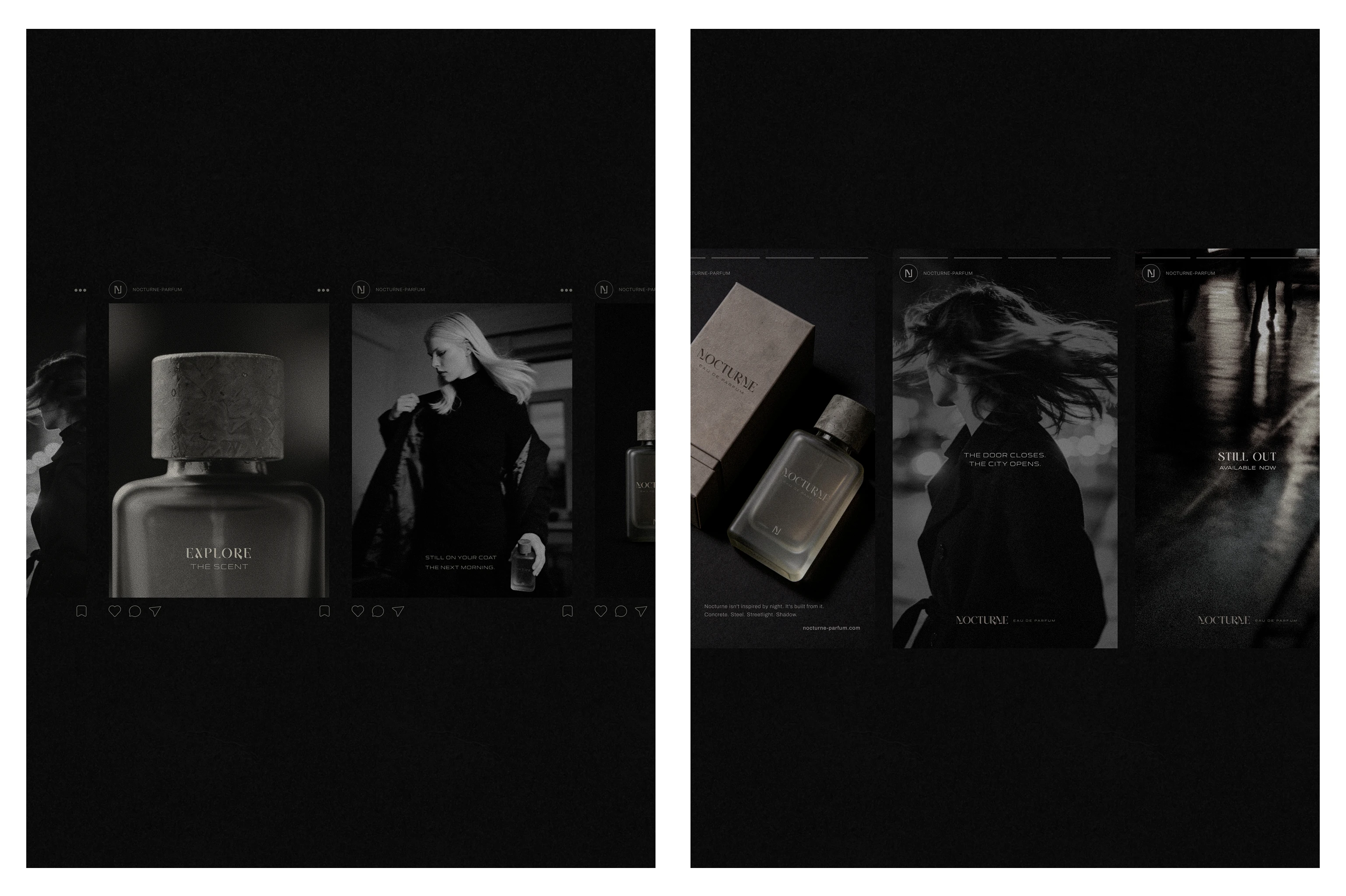
Instagram feed and stories design
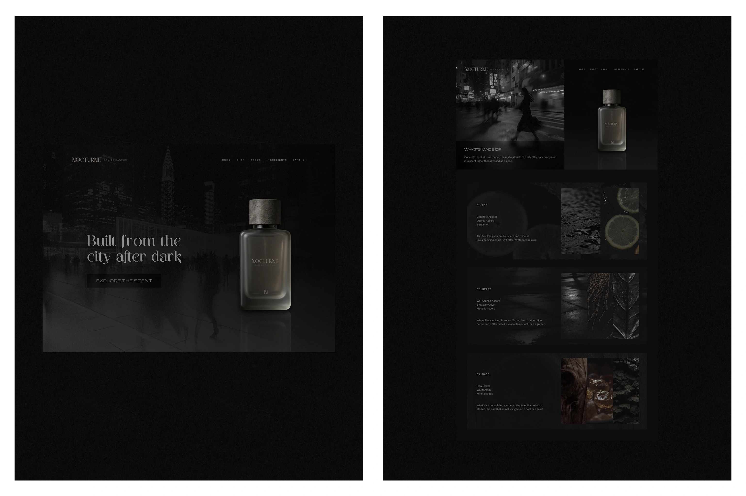
Website Hero section + Ingredients Page design
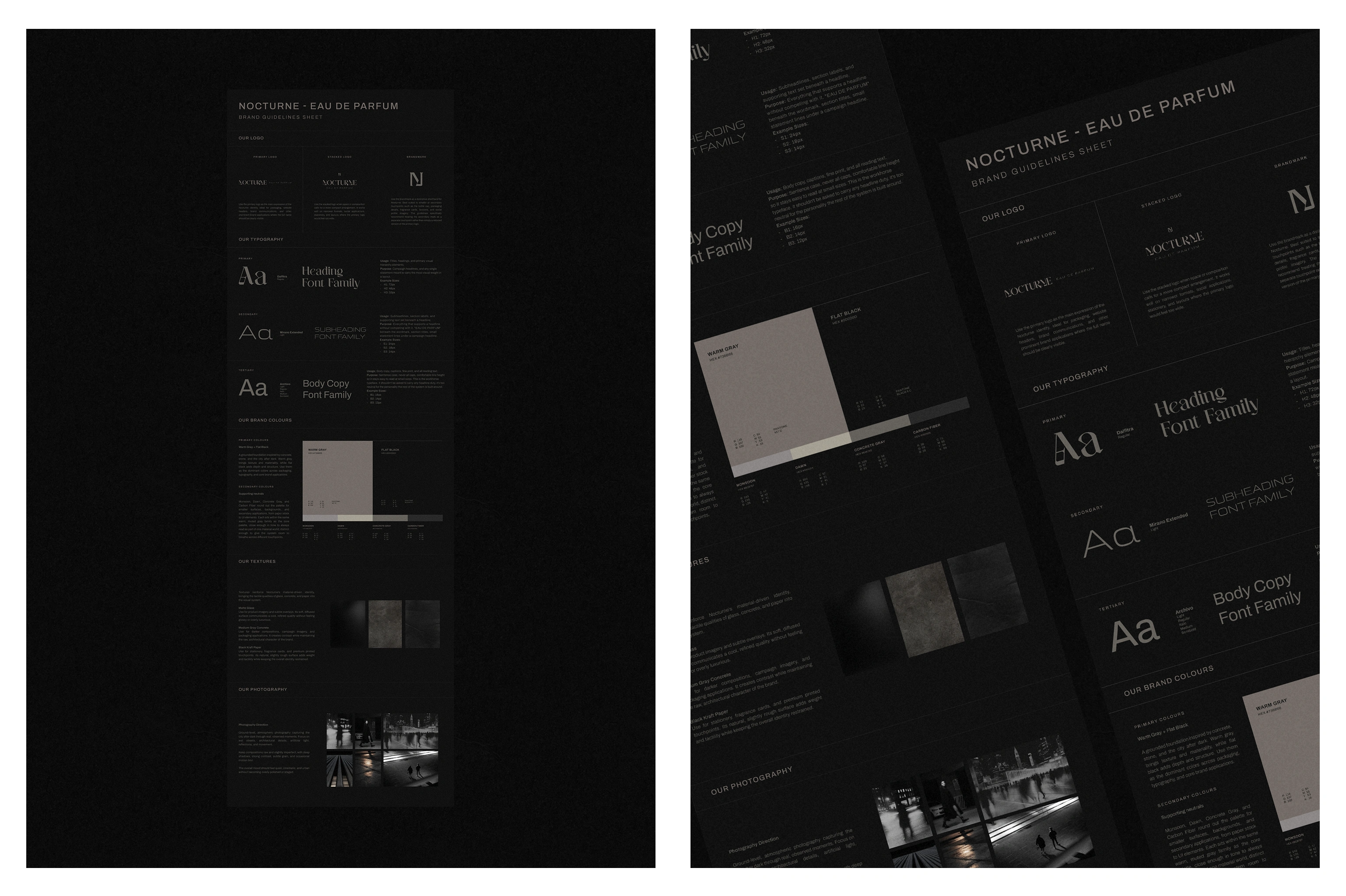
One-Page Brand Guidelines Sheet
Let’s Connect!
If you’re a founder looking for a refined and strategic brand presence that feels distinctly yours, I’d love to help bring it to life. Feel free to reach out and talk about your brand in more details. 🤍✨
Like this project
Posted Sep 3, 2026
Developed brand identity and packaging for Nocturne, a fragrance house inspired by the urban after dark atmosphere.
Likes
1
Views
12
Timeline
Aug 3, 2026 - Aug 16, 2026