Lumière – Brand Identity Design
Bianca Santiago
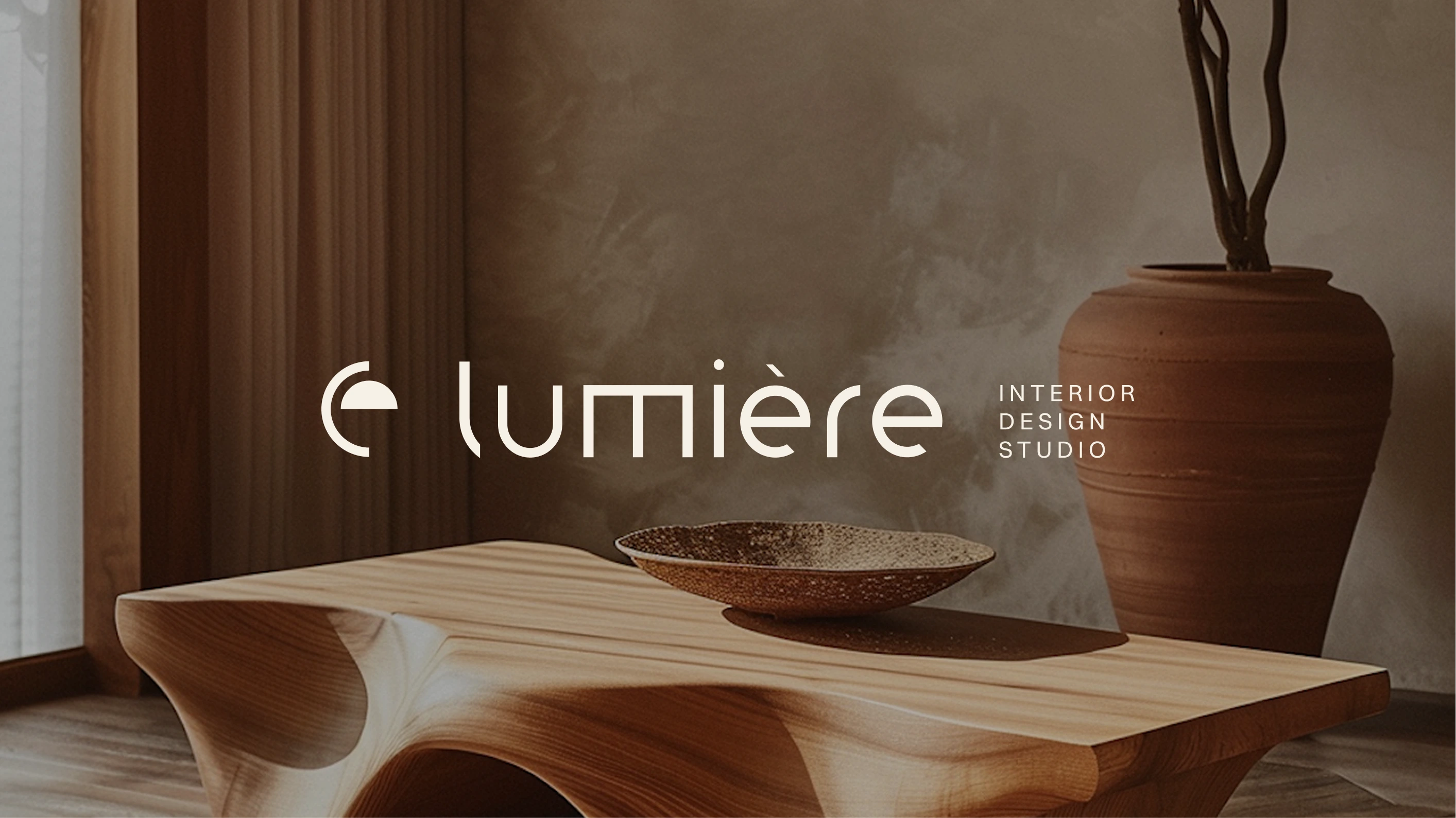
LUMIÈRE
Illuminating The Art of Living.
Lumière, (meaning "Light" in french), is an interior design studio I created to express a refined balance between light, form, and material. Inspired by natural light and quiet architecture, the brand blends sculptural shapes with soft textures and a neutral, timeless palette. Every piece is designed to evoke calm and subtle sophistication.
Industry
Interior design studio
Market
Berlin / DACH
Deliverables
- Logo Suite
- Color Palette
- Typography System
- Stationary & Social Media Kit
- Mini Lookbook
- Brand Guidelines
Timeframe
4 weeks
Interior & Furniture Images
Clemara Studio from Lummi
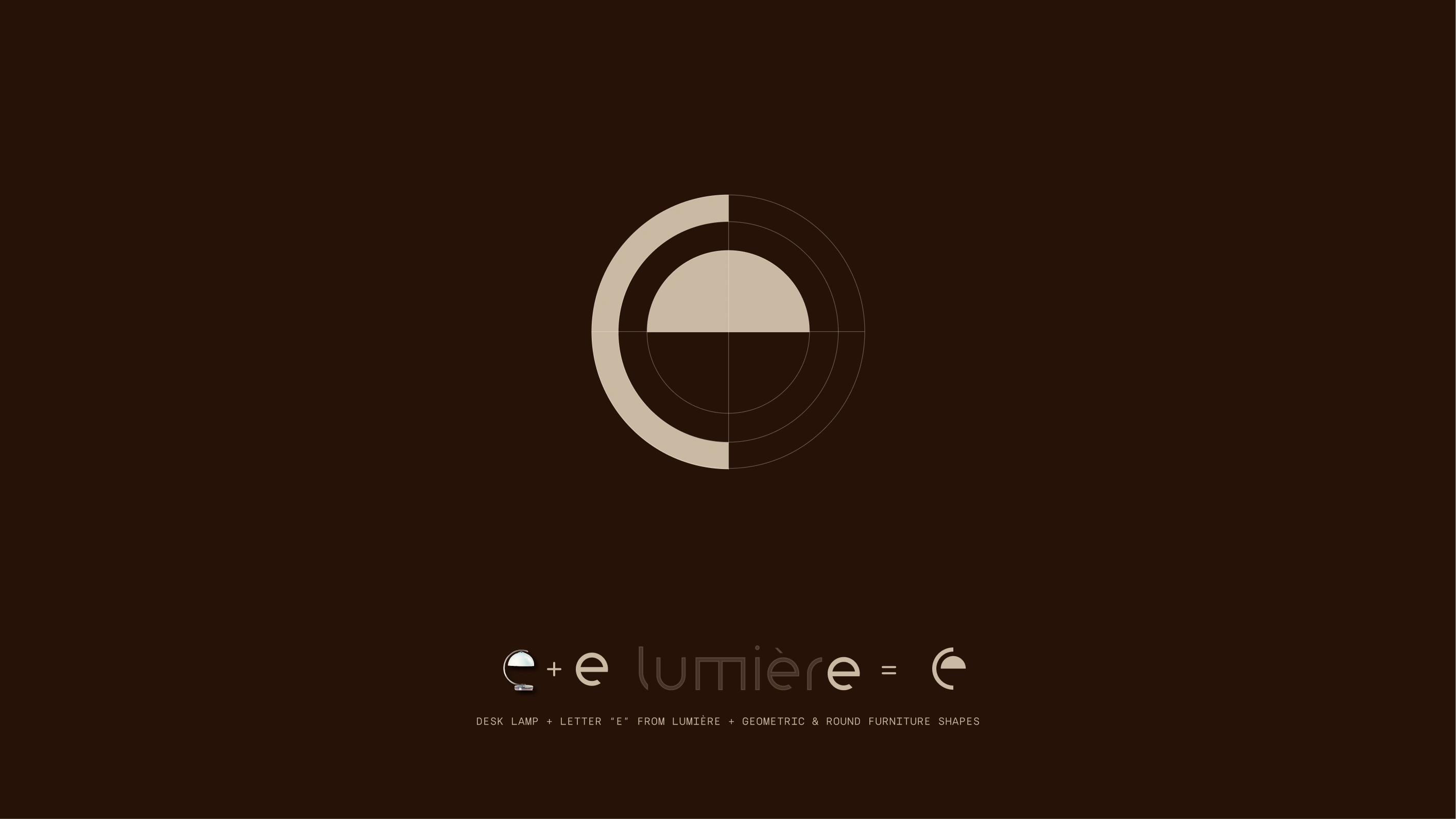
Logo concept
Lumière Logo Concept
The Lumière logo is a study in meaningful simplicity, where form and identity converge. At its core, the mark synthesizes three essential elements: the letter "e" extracted from the brand name, the circular geometry of a desk lamp's glow, and the rounded, sculptural forms that define Lumière's furniture aesthetic. Concentric circles create depth and dimension, echoing both the warmth of ambient light and the crafted curves found throughout the collection.
The interplay of negative and positive space (light meeting dark), reinforces the brand's French name, "light," while maintaining visual balance and geometric precision. This distilled symbol captures Lumière's essence: thoughtful design that illuminates living spaces with timeless elegance and understated sophistication.
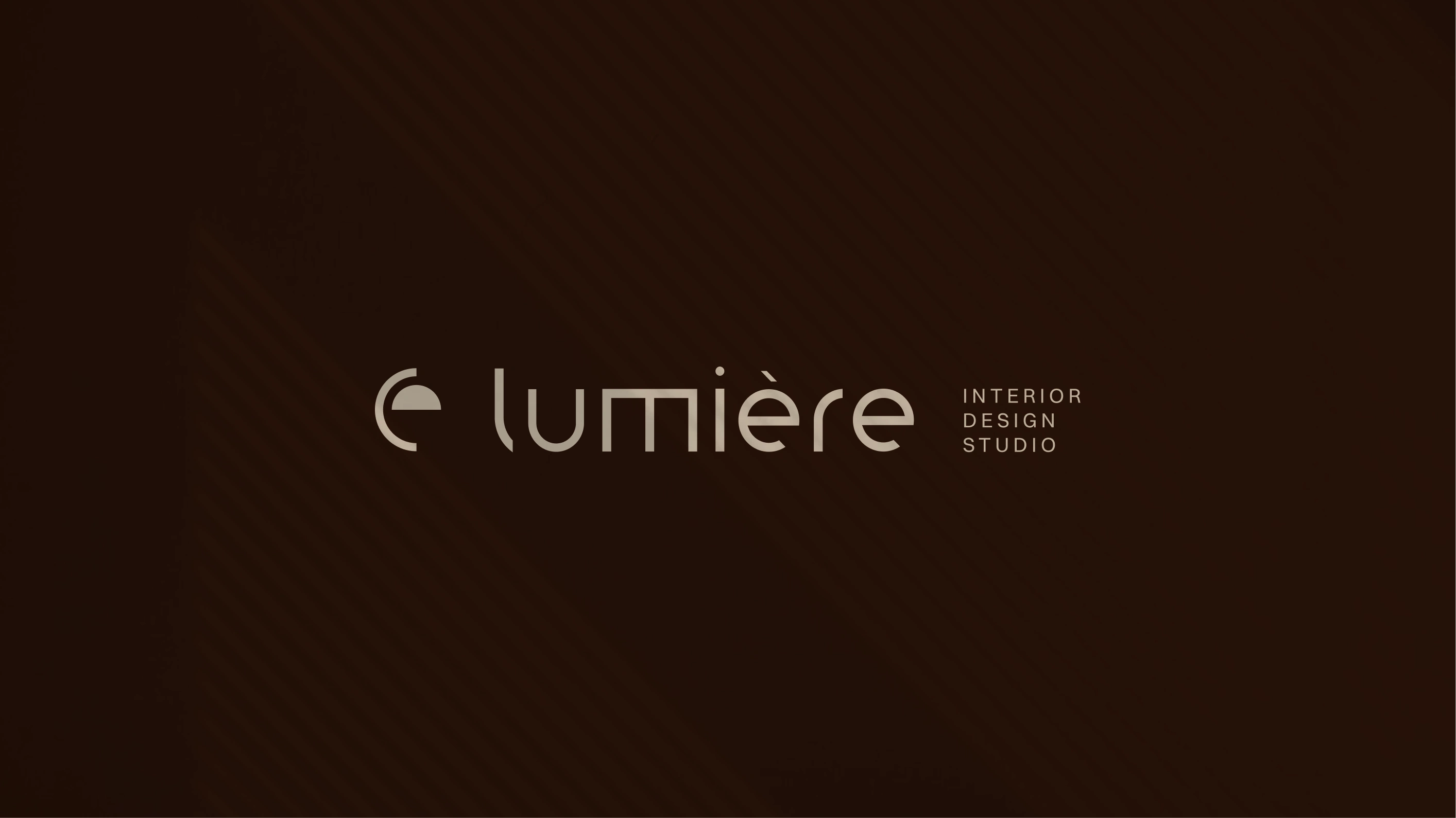
Full logo version
The Challenge
My goal was to design a cohesive visual identity for a seasonal collection that positions Lumière as a high-end yet approachable studio. The identity needed to adapt across different touchpoints—from printed materials and product photography to a website and collection launch event.
The Solution
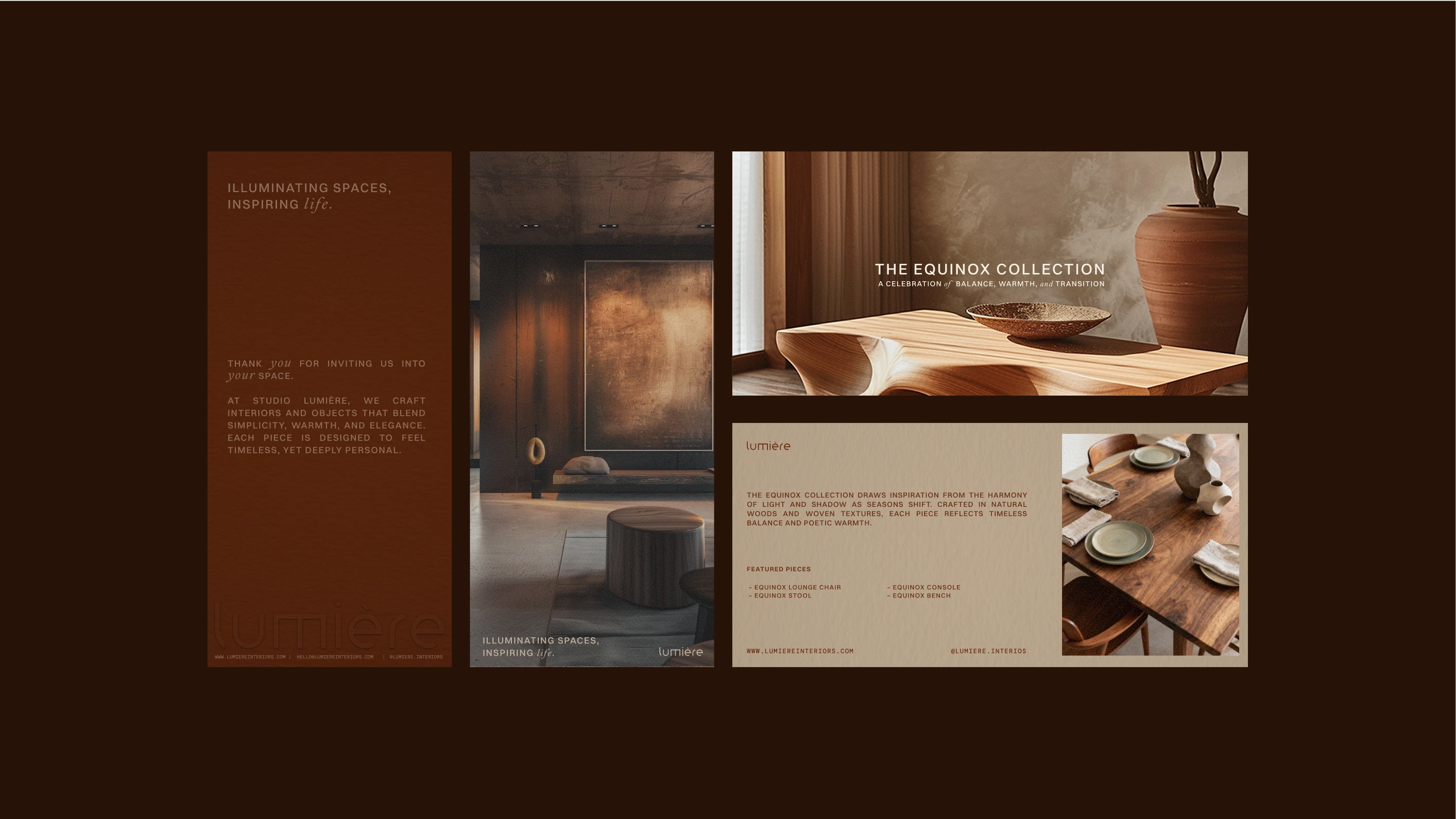
I developed a flexible identity system that feels editorial yet grounded. Switzer serves as the clean and versatile primary typeface, paired with Calendas Plus for warmth and contrast, and Silka Mono for product details. I designed logo variations, stationery, an A5 mini lookbook, and a manifesto layout to express the brand’s philosophy. The overall direction favors generous white space, tactile paper finishes, and soft, natural tones.
Brand Strategy Workshop
I defined the brand’s tone, target audience, and product tiers through a strategy exercise. This process helped identify the key touchpoints where the identity should be most expressive—such as invitations, lookbooks, and the social media presence.
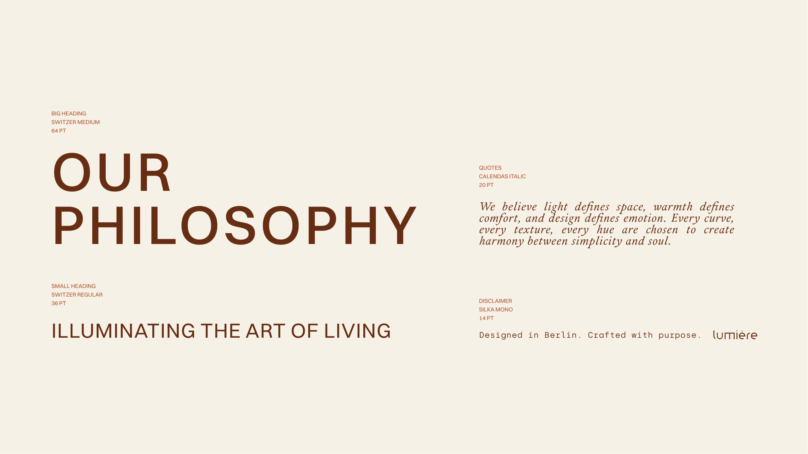
Brand Typography
Brand Color Palette
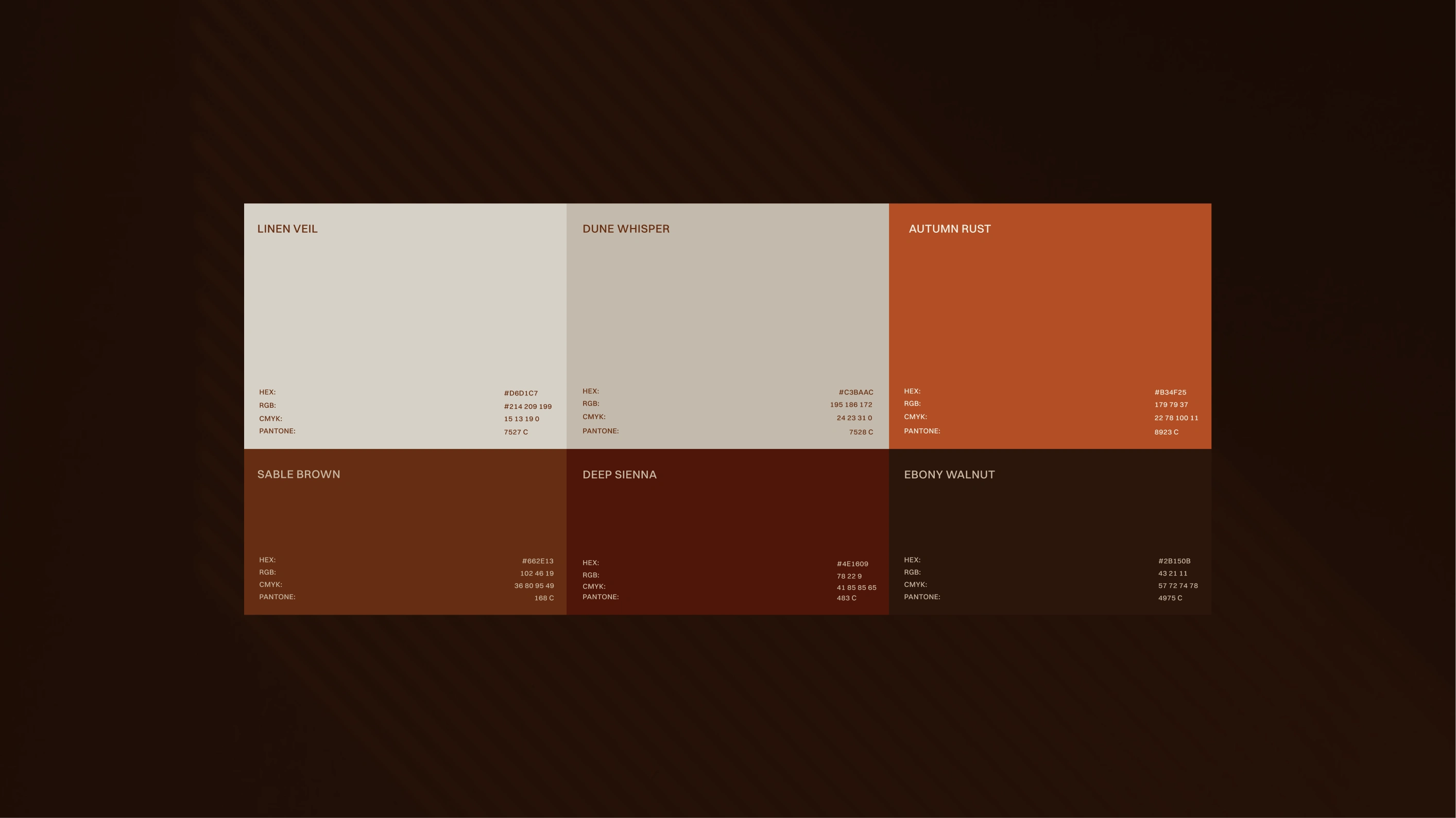
Brand Colors
A palette of colors such as Linen Veil, Dune Whisper, Autumn Rust, Sable Brown, Deep Sienna and Ebony Walnut were chosen to mirror natural materials and the depth of autumn light.
DL Cards
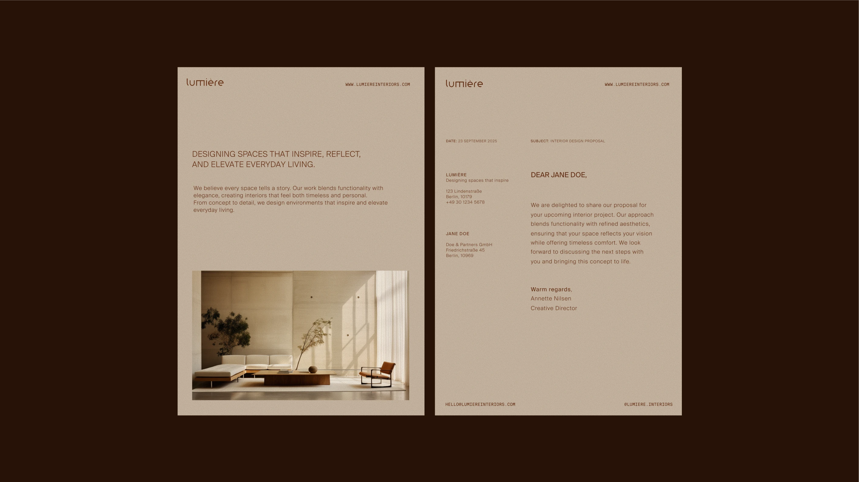
Letterhead (Cover and Inner page)
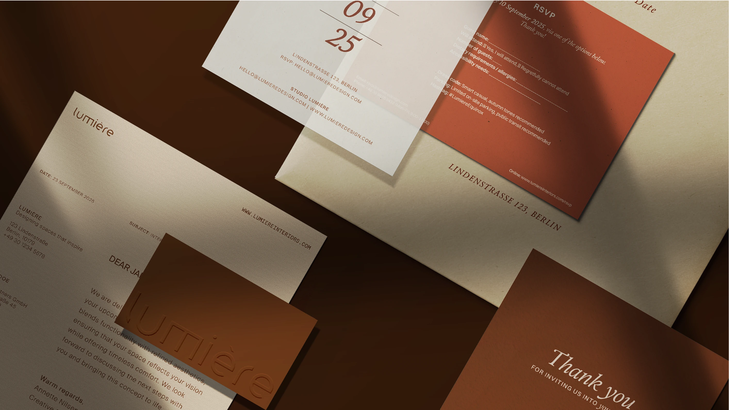
Brand Stationary
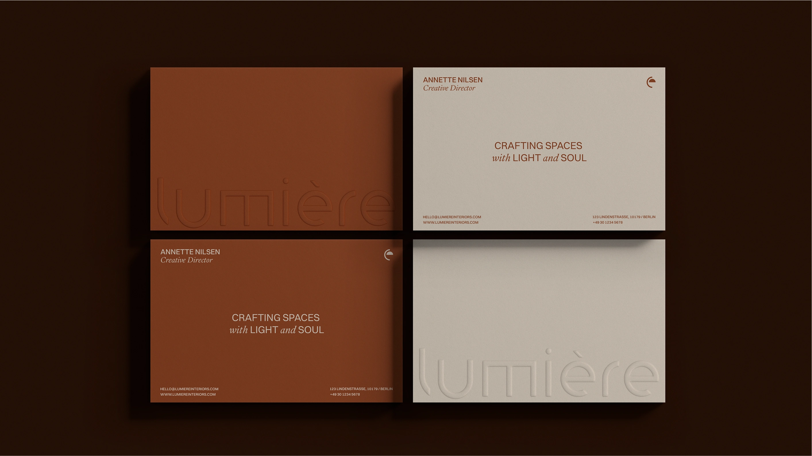
Business Cards
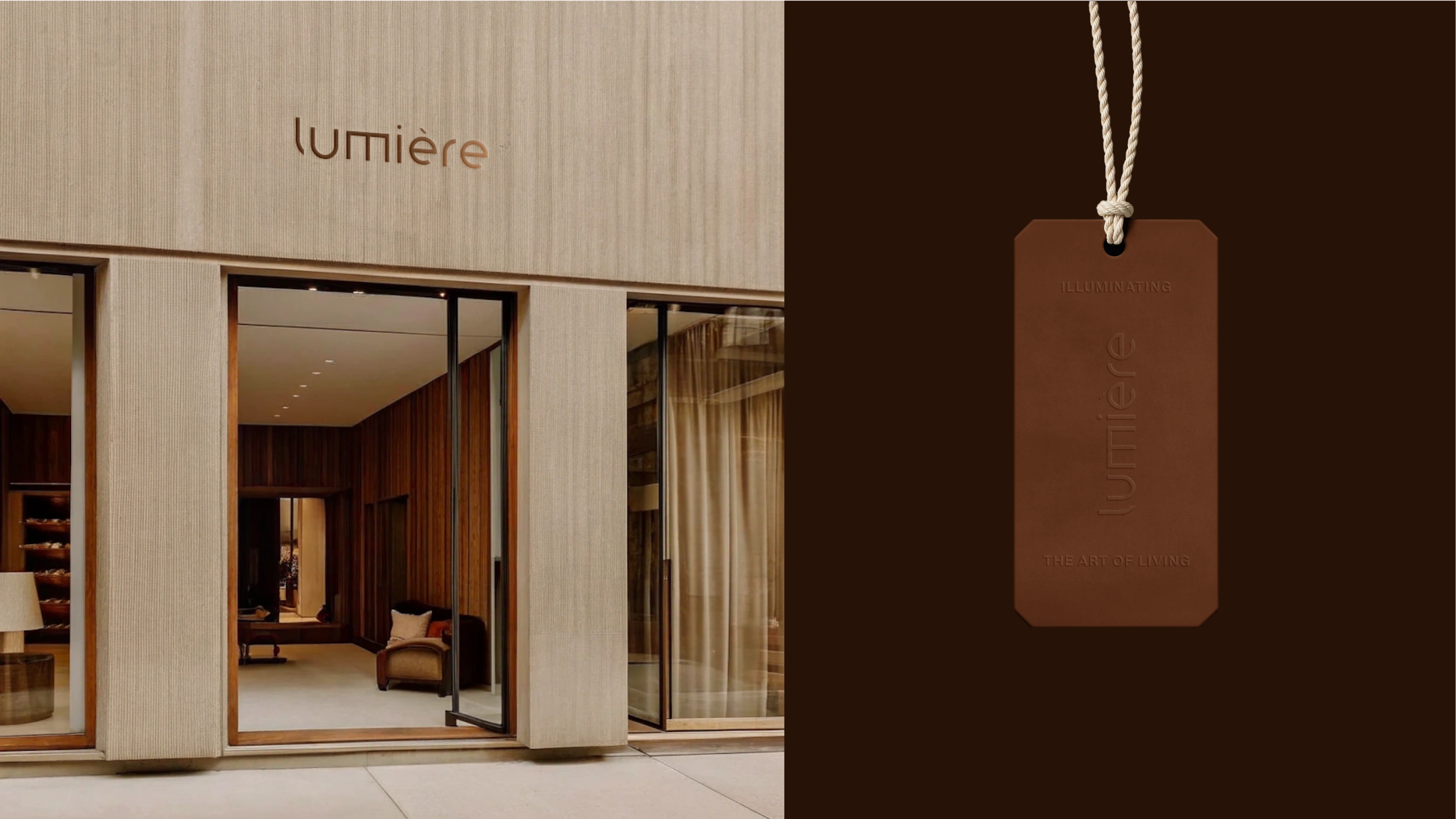
Store Facade & Tag
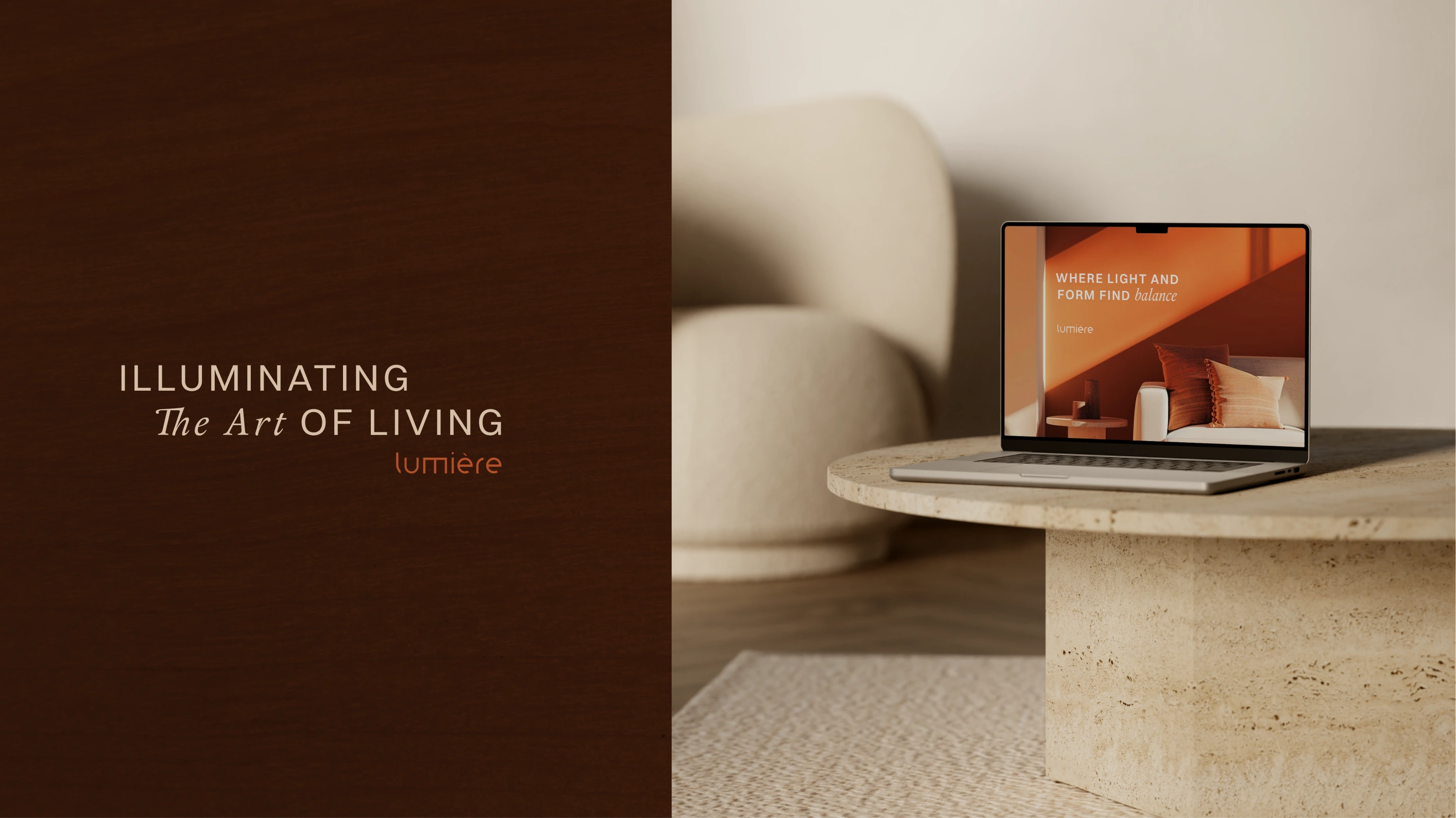
Brand Slogan + Website Hero
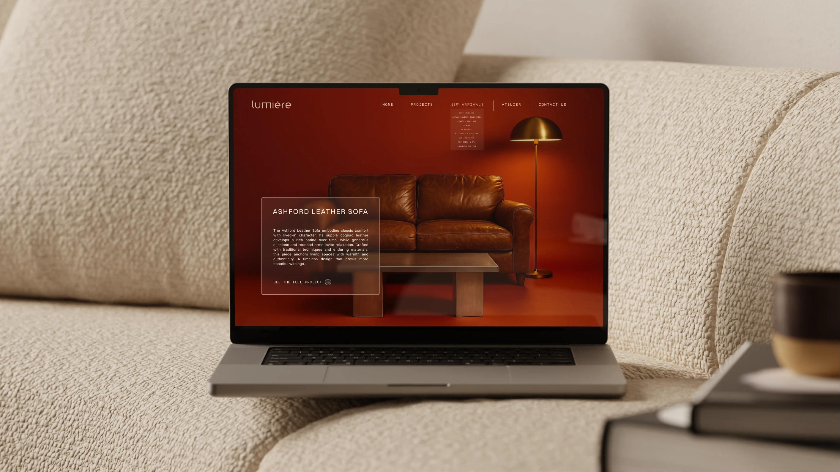
Website Hero Design
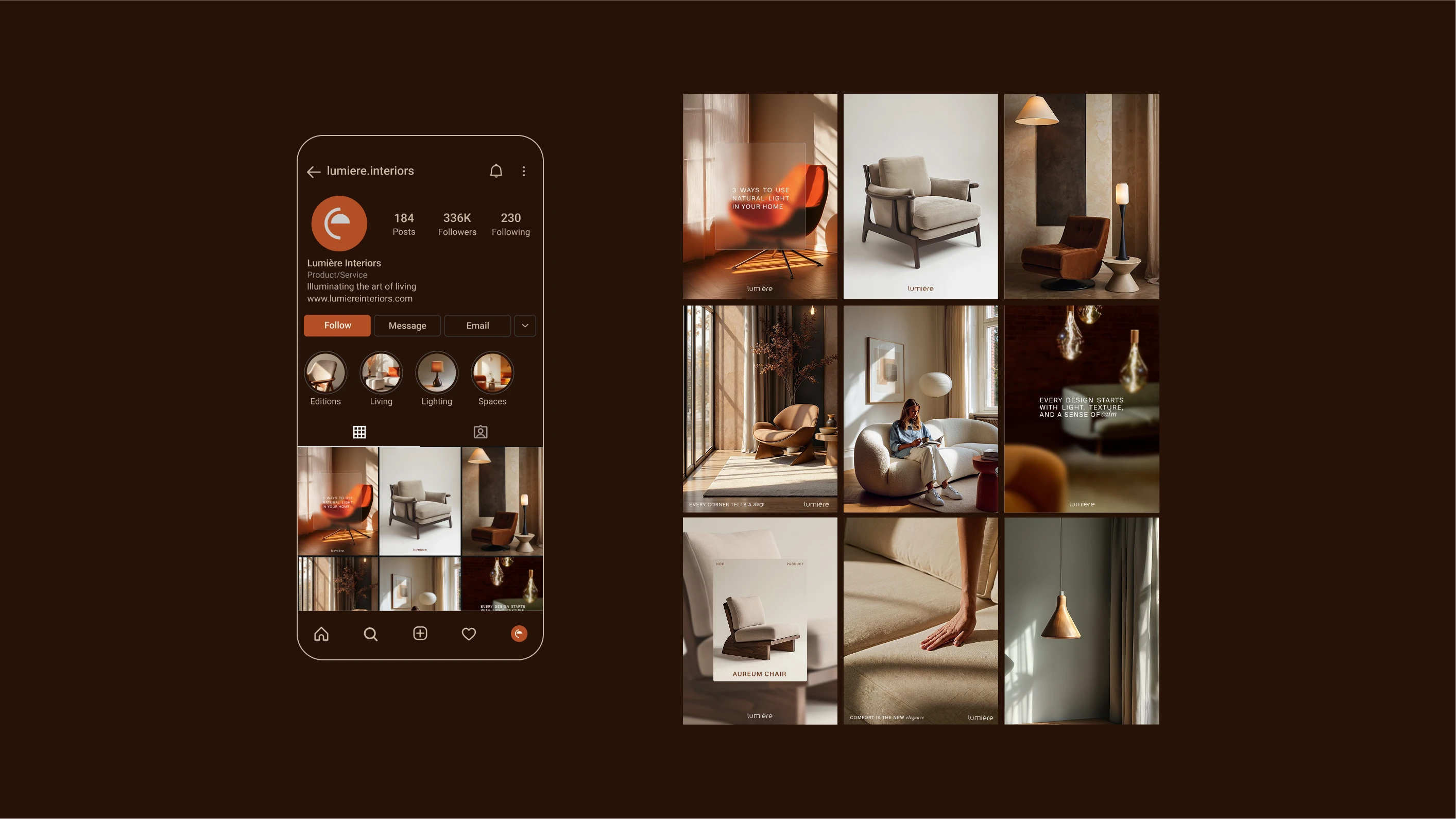
Instagram Feed Design
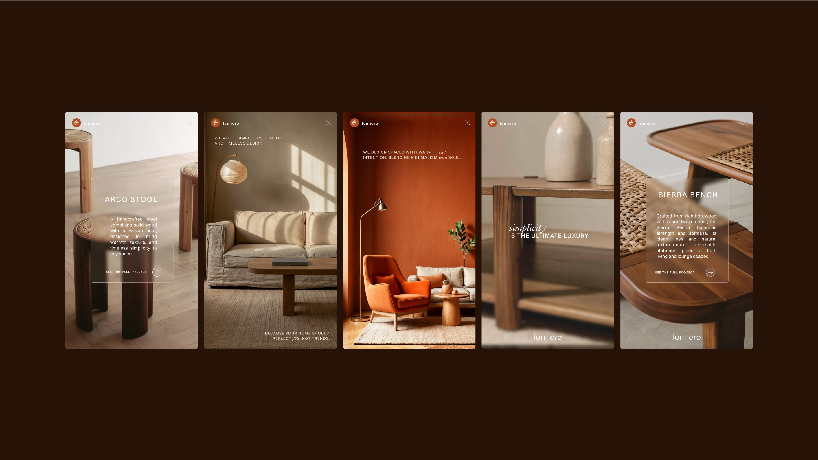
Instagram Stories
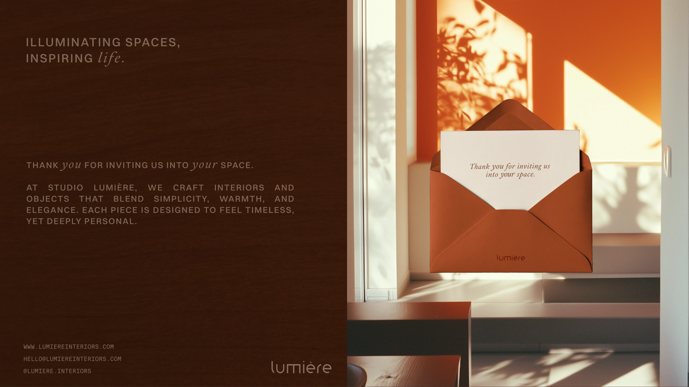
Invitation Card
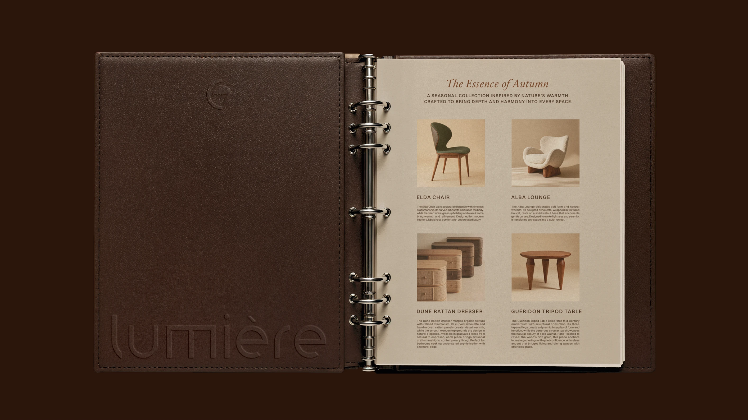
A5 Mini Lookbook
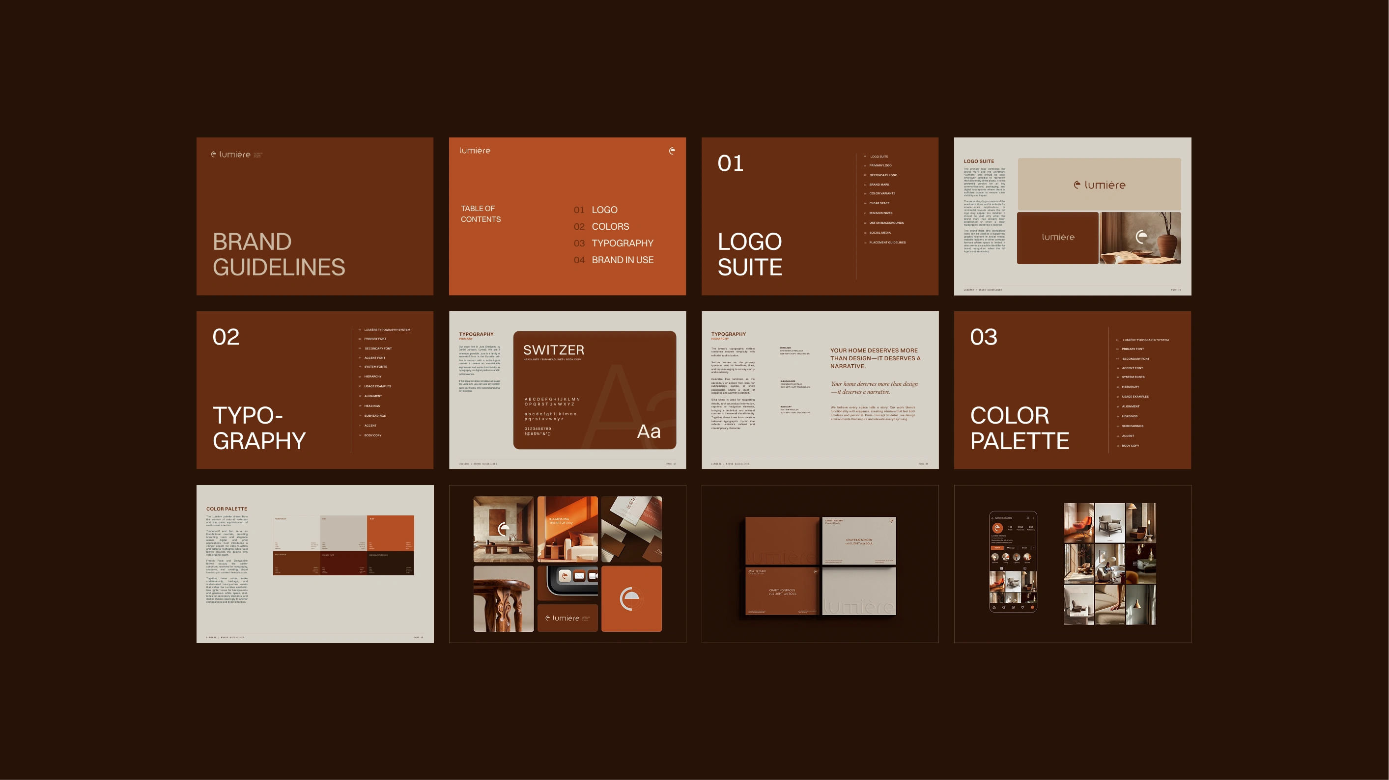
Brand Guidelines
Brand Guidelines
The guidelines outline the correct use of the logo system, from the full lockup to the standalone mark. They also define the typographic hierarchy, color palette, and material recommendations, ensuring consistency across all printed and digital applications.
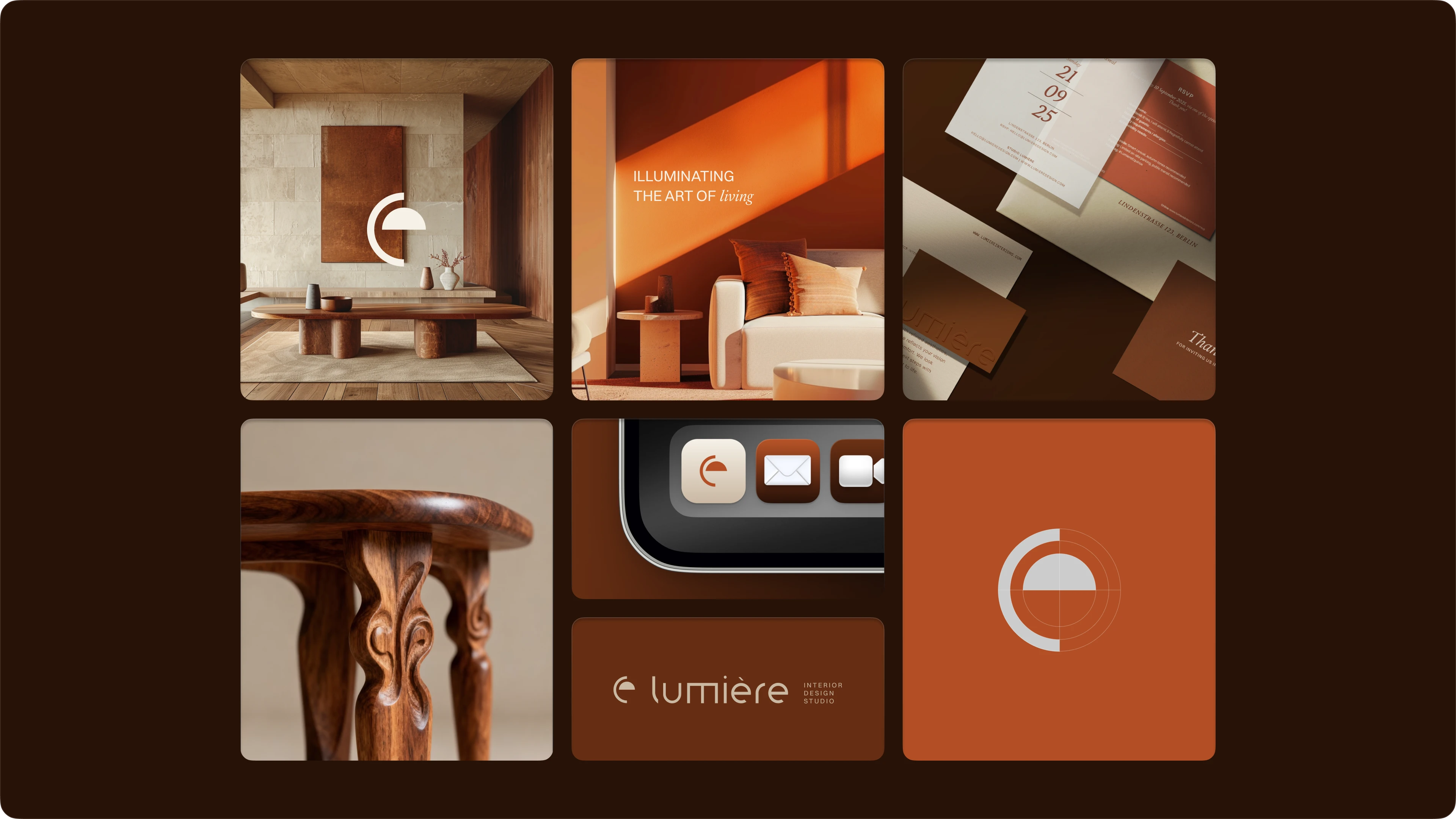
Bento view
Let’s Connect!
If Lumière resonates with you, I’d love to hear from you. Whether you’re envisioning a new project or simply want to exchange ideas, feel free to reach out. I’m always open to meaningful collaborations.
Like this project
Posted Oct 13, 2025
A refined brand identity created for Lumière — an interior design studio that blends modern elegance with timeless warmth and effortless sophistication.
Likes
34
Views
259
Timeline
Sep 1, 2025 - Oct 10, 2025