The network for creativity
Join 1.25M professional creatives like you
Connect with clients, get discovered, and run your business 100% commission-free
Creatives on Contra have earned over $150M and we are just getting started
Back to feedPost

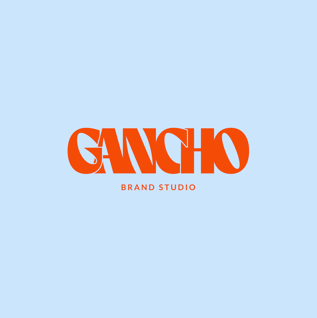
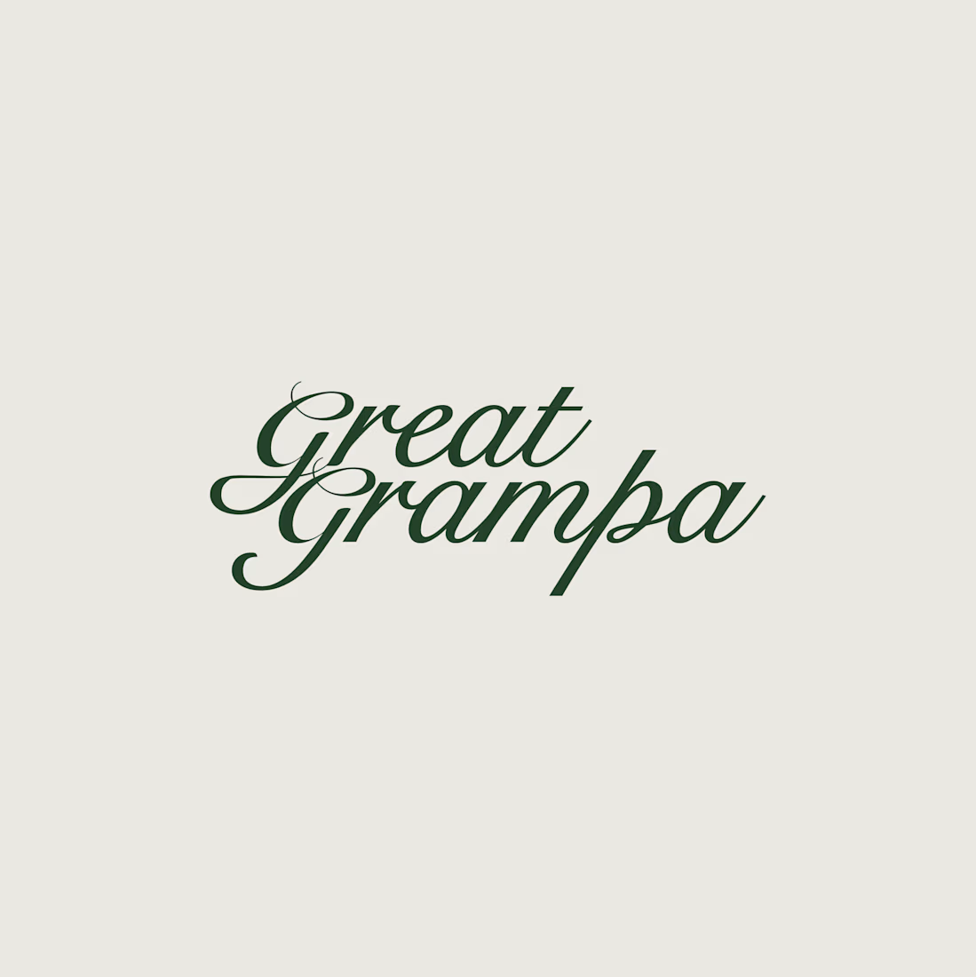
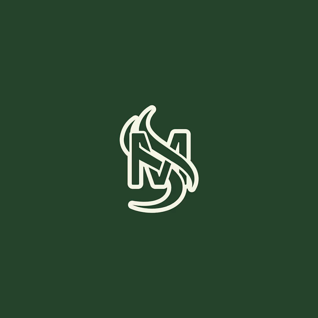
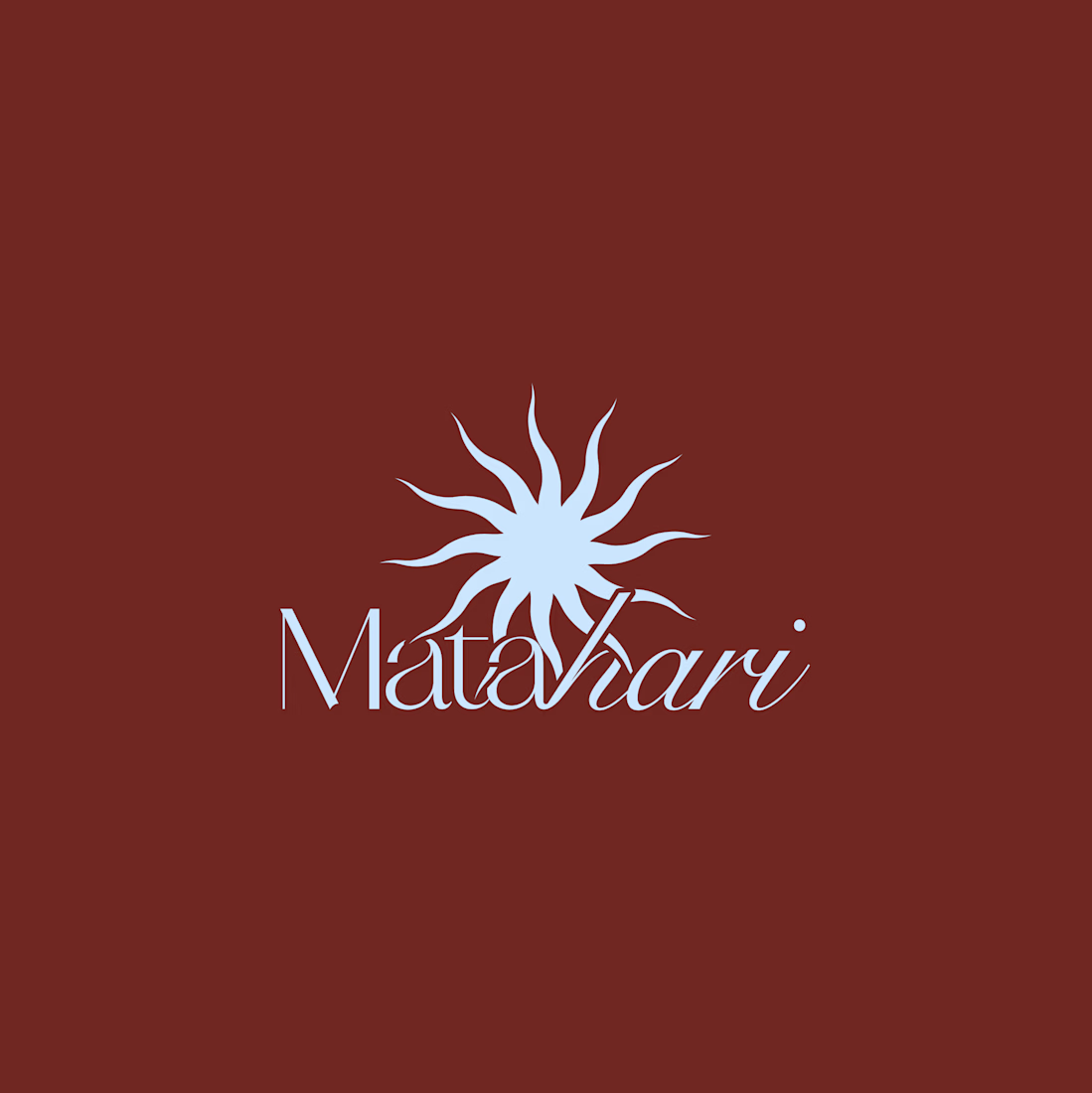
Logo design exploration from the last few months.
Some locked, others discarded.


Amazing!!

Thank you so much!


the discarded ones are always my favourites
Hahah right?

Eye catching


Looks goood

Wooow I just love the last one, how the sun beams are going over or behind the text, veeery clever!! 🙌
Thank you so much! It was quite a fun exploration!

all of these are lovely, but gancho's gets a gold star from me!
Thank you!! I am actually working on creating the case study for that!
ahhh, i'll be keeping an eye out!

Bravo! My favorite Gancho and Matahari
Thaaaanks!!

gancho is my fav

Welldone

I love them all😍
Thank you so much!

great

Superb

I love how unique Gancho looks. The typeface is so sick
Thaaanks! I am building the case study, can't wait to share the process!
Goodluckkk! I'd love to see it

This is mind blowing!
Well done
Appreciate it!

Thank you!

Love it 🧡

Awesome!

Great work

Loving logotypes & symbols! 🙌
Thank you so much!

last one is cool!

I love the first slide,
It is bold done right, heavy, but with real character. It's not just thick lettering, the way the letters connect and vary in shape gives it personality.
Appreciate it!

Amazing🔥

Such a beautiful collection! Each mark has its own personality, yet they all feel so thoughtfully crafted.💯
Thank you so much!

There’s something valuable about seeing the ideas that didn’t make the final cut. Logo exploration is often where the strongest direction emerges—great to see the process behind the polished outcomes.
The network for creativity
Join 1.25M professional creatives like you
Connect with clients, get discovered, and run your business 100% commission-free
Creatives on Contra have earned over $150M and we are just getting started









Related posts




Clean and confident work! The green gradient with the mark feels very modern for fintech - trustworthy but not boring. The app screens look really polished. Curious how you landed on this mark, does it represent growth / movement?

A flower that inflates arrives in the mail.
Next month, a phone made of shell.
STILL LIFE SERVICE. Case study dropping soon.
Which object earns your shelf? Reply below.
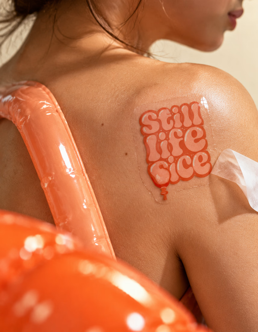
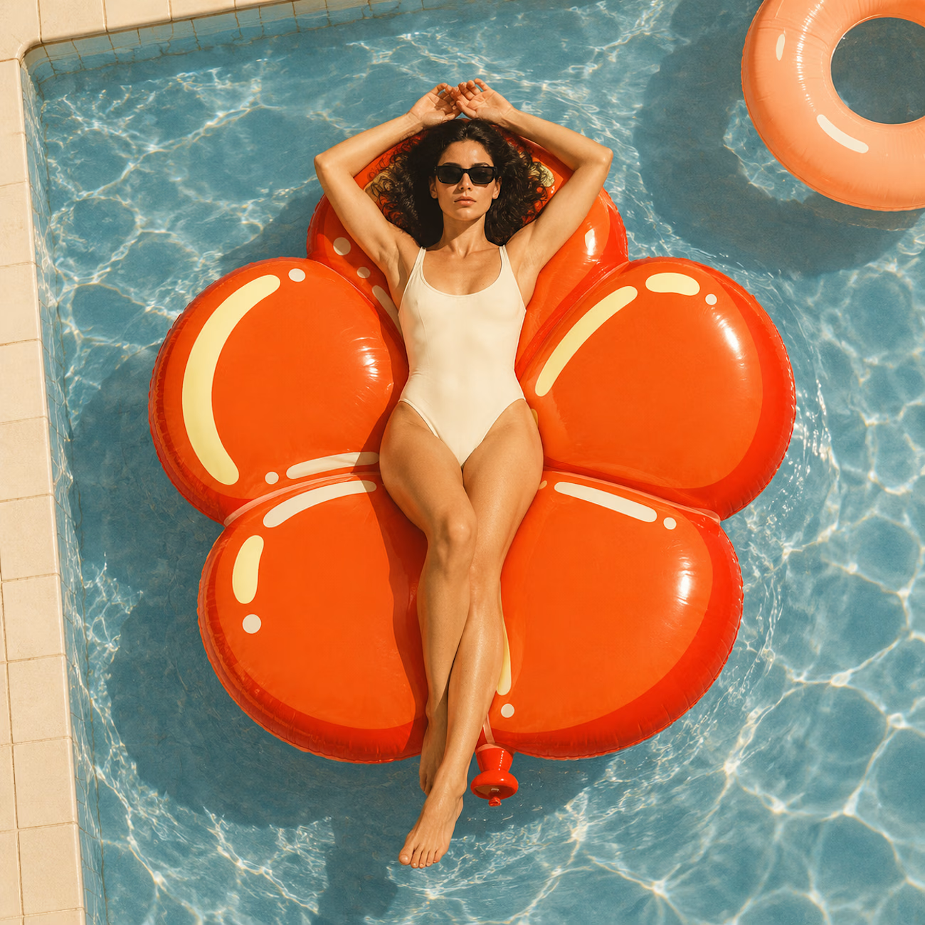
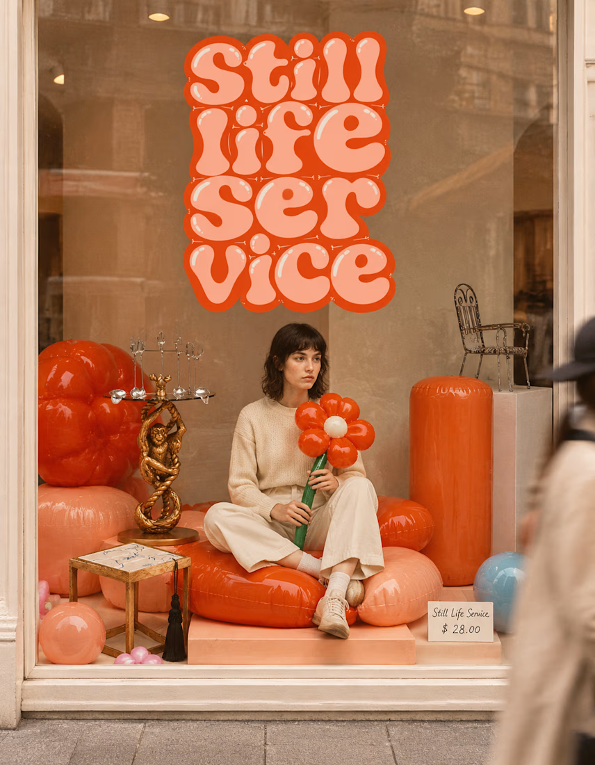

The inflatable flower. Only houseplant I'm guaranteed not to kill. Also, a new object every month is a sneaky good retention hook, people will stay subscribed just to see what's next.


Congrates!!