The network for creativity
Join 1.25M professional creatives like you
Connect with clients, get discovered, and run your business 100% commission-free
Creatives on Contra have earned over $150M and we are just getting started
Back to feedPost

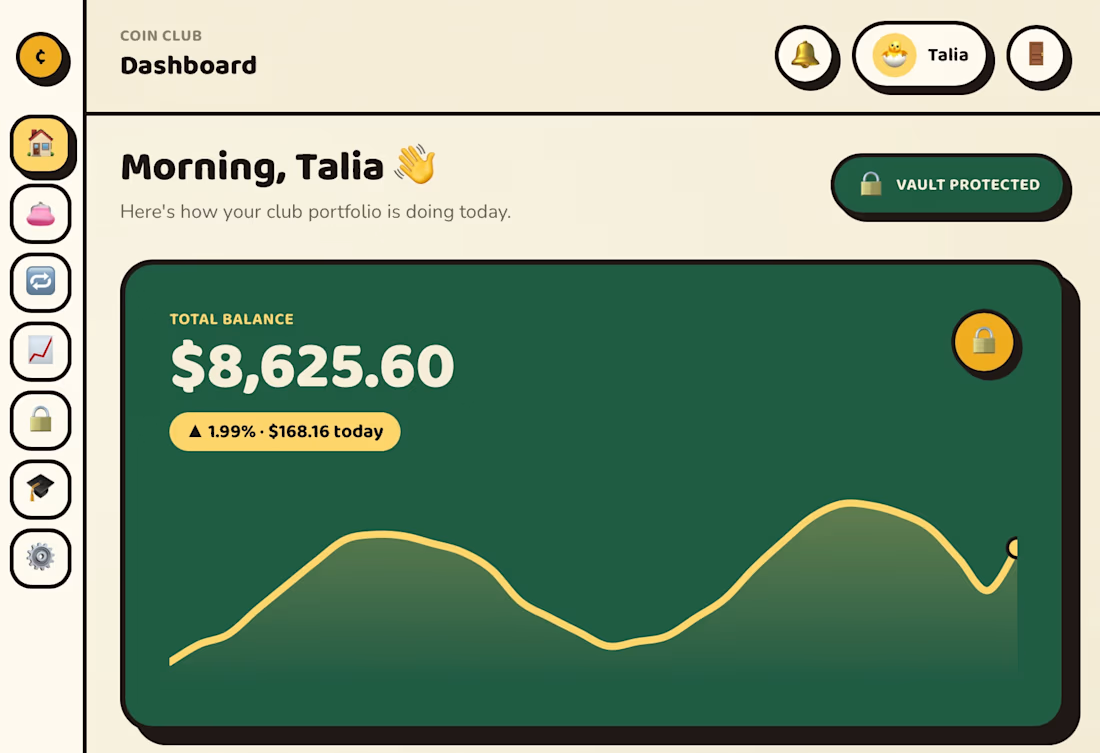
New weekend project: Coin Club - a fictional fintech/crypto platform with a rubber hose-inspired visual style.
I wanted to apply a lot of what I do in my day job around dashboards, workflows, data-heavy interfaces, and internal tools, but package it into something a little more fun.
Features include:
• Portfolio dashboard
• Asset swaps
• Markets and watchlists
• Security vault
• Learning hub
• CMS-powered blog
Tech stack:
• Next.js
• TypeScript
• Tailwind CSS
• Framer Motion
• Supabase
• Sanity
Very different visually from the kind of work I normally do, but it was a fun challenge exploring how far I could push a playful design system while still keeping the product usable and structured.
Feedback is always welcome.



Amazing design! 👏

The rubber hose style in a fintech context is a bold swing. Most crypto dashboards go cold and corporate but making the swap flow feel approachable while keeping the data legible is genuinely hard to pull off. The portfolio view especially looks clean.
The network for creativity
Join 1.25M professional creatives like you
Connect with clients, get discovered, and run your business 100% commission-free
Creatives on Contra have earned over $150M and we are just getting started







Related posts

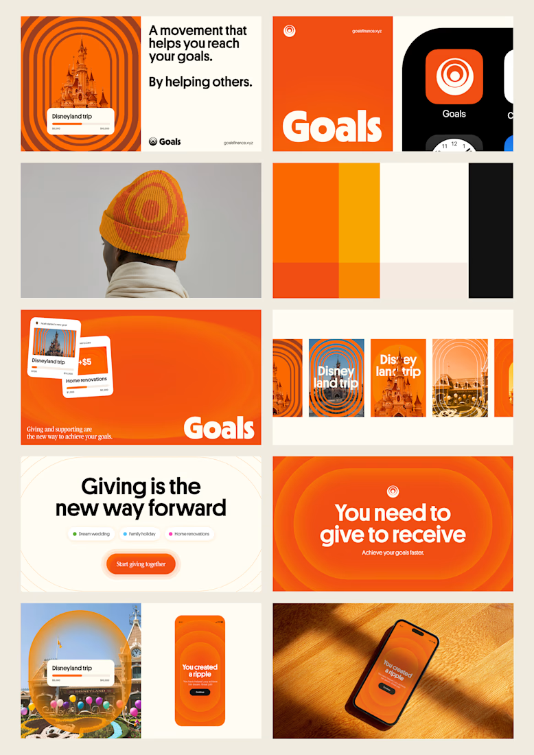
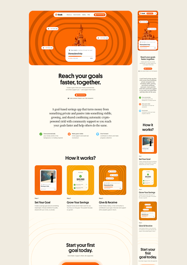
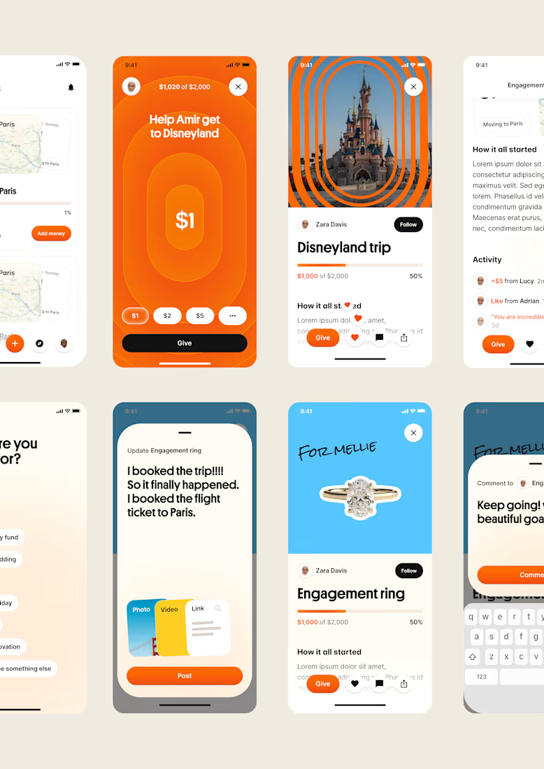
one of my favourite things about running a one-person studio is that nothing gets lost in translation.
the idea behind the brand is the same idea that shapes the website and the product.
no handovers, no starting from scratch, no trying to explain the vision to someone new.
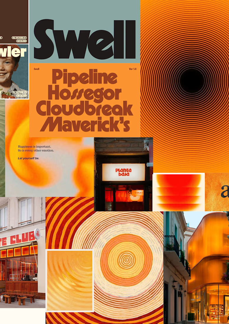
a little look at how that came together for goals, from the first moodboard to the app ↓

Love it!

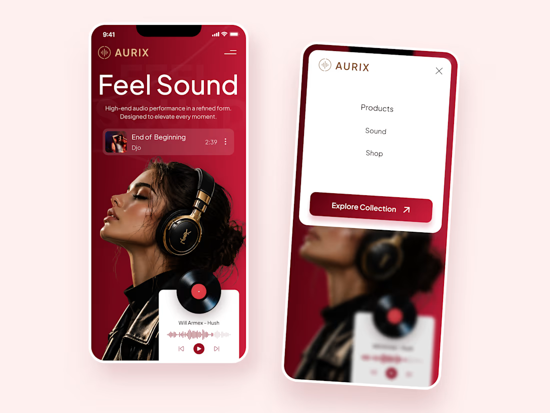
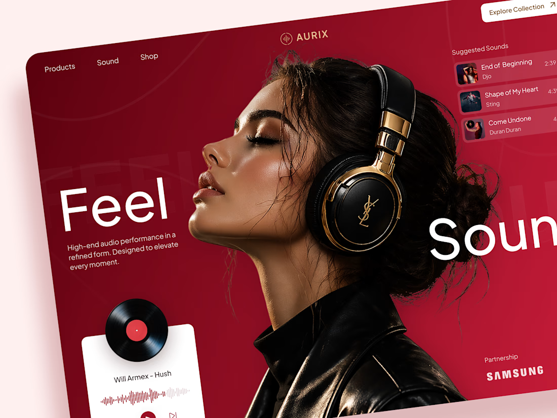
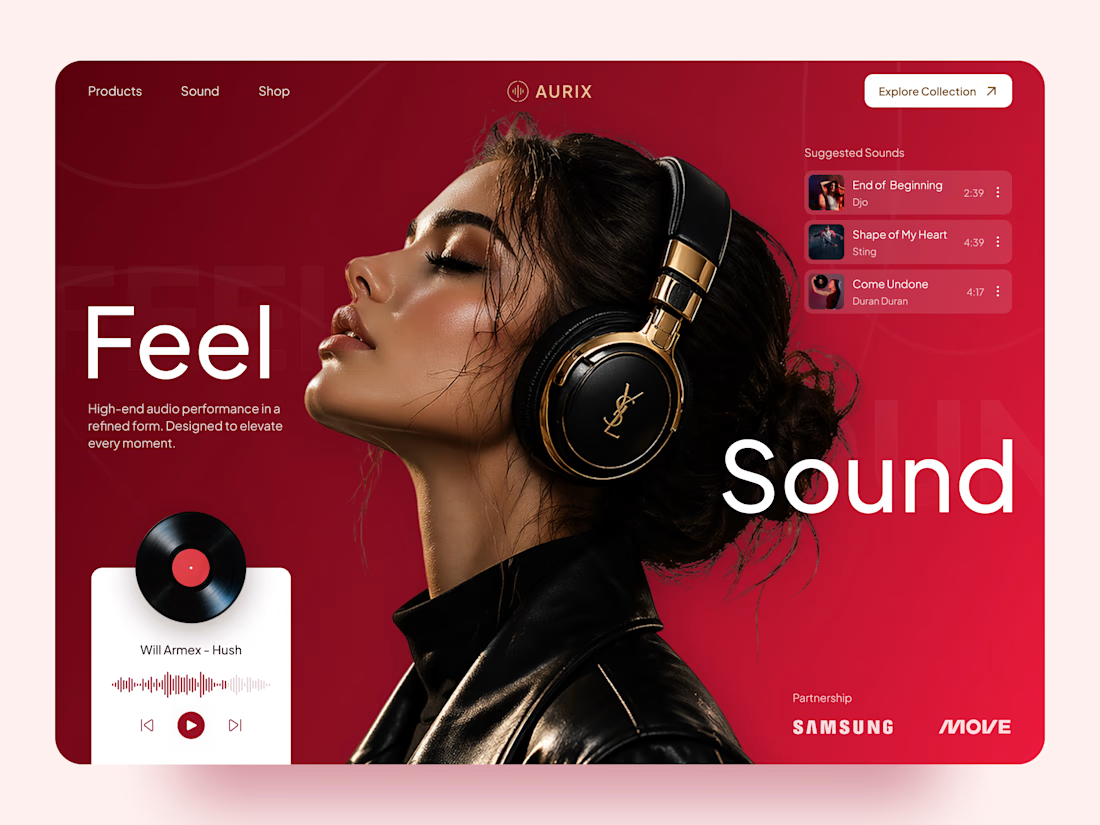
AURIX — Premium Headphones Landing Page 🎧❤️
A bold landing page concept for a premium audio brand, combining luxury headphones, music, and a strong lifestyle aesthetic
The design brings together deep red tones, elegant black and gold details, oversized typography, and immersive lifestyle imagery to create a modern, fashion-inspired experience
Special attention was given to:
• Bold lifestyle-focused hero composition
• Rich red and gold color palette
• Clean, oversized typography
• Music player and suggested tracks
• Premium product presentation
• Responsive mobile experience
• Minimal navigation and clear CTA
The result is a stylish, immersive landing page that connects premium audio with fashion, music, and everyday lifestyle ✨



Love the style!


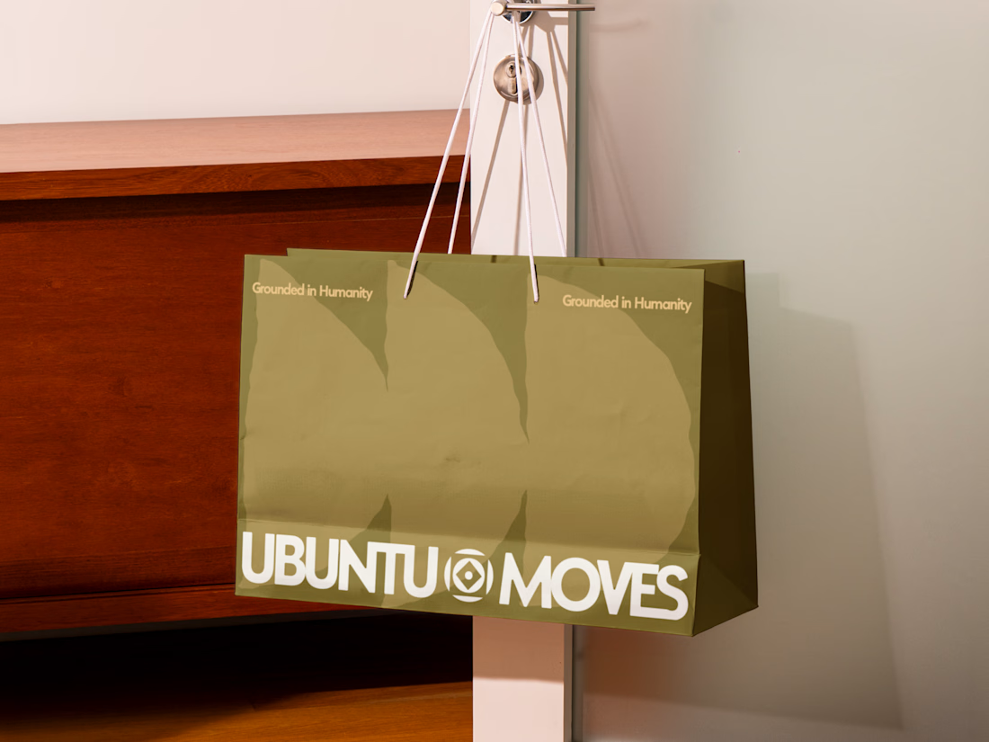
Grounded in humanity, made for movement.
Packaging and custom Framer website design for Ubuntu Moves, a wellness brand inspired by the belief that “I am because we are.”
Earthy colors, expressive patterns, and bold typography bring its sense of connection into the physical and digital experience.
Thanks @Can Girgin for the Framer development💫


The olive shopping bag with the wordmark split around that circular emblem looks great in the warm light, and the big tonal arches printed behind it add movement without shouting.