The network for creativity
Join 1.25M professional creatives like you
Connect with clients, get discovered, and run your business 100% commission-free
Creatives on Contra have earned over $150M and we are just getting started
Back to feedPost


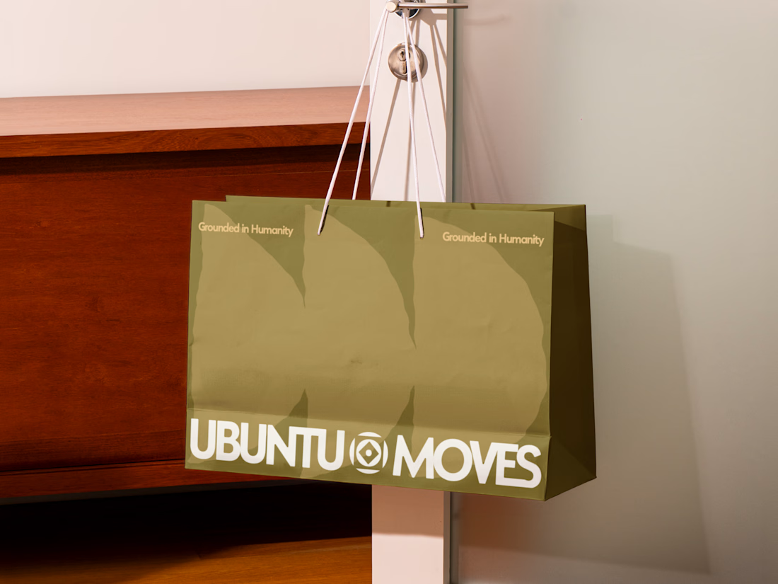
Grounded in humanity, made for movement.
Packaging and custom Framer website design for Ubuntu Moves, a wellness brand inspired by the belief that “I am because we are.”
Earthy colors, expressive patterns, and bold typography bring its sense of connection into the physical and digital experience.
Thanks @Can Girgin for the Framer development💫


Really like the packaging direction

Love the mark. Well done

Well designed 👏

Nice work

That's really unique packing design thats great 🔥🎉

This is super cool!

Love the cohesive brand-to-web direction!

The earthy palette carrying from the cork mat to the shopping bag to the site is what makes this feel like one brand instead of three deliverables. Curious how you handled the patterns on the Framer side: SVG components or image fills? Keeping them crisp and light on mobile is always the tricky part.

Lovely use of colour

Carrying one visual system from packaging into the website makes the handoff much clearer. For ecommerce images, I find it useful to define the background palette and product scale early, so later feature graphics still feel like the same range. Did you include product-image guidelines in the identity handoff?


the humanity line doubling as the bag's pattern instead of a logo repeat is smart branding


The olive shopping bag with the wordmark split around that circular emblem looks great in the warm light, and the big tonal arches printed behind it add movement without shouting.

The packaging is doing the talking here.

The earthy palette with those patterns feels so warm. Really nice how the packaging and the site feel like the same brand and not two separate projects

the olive bag with the tone on tone pattern is so good. love how quiet the tagline is next to that bold logo

wowww!!! crazyyy

Love how "I am because we are" isn't just the tagline, it's in the pattern too: repeated shapes that only work together. The olive and cream keep the bold wordmark grounded instead of loud. Did the pattern come before the logo, or grow out of it?
The network for creativity
Join 1.25M professional creatives like you
Connect with clients, get discovered, and run your business 100% commission-free
Creatives on Contra have earned over $150M and we are just getting started







Related posts


Daewoo's marketing site for Velocipedo, an electric trike. Designed and built in Framer.

Great work on the Velocipedo site!

Nocturne is now on Framer 🌙
A sleep-app template where one night plays out as you scroll: dusk to dawn in three acts, with the sky, the clock and the widgets changing as you go.
Native Framer layers, a CMS, code components with properties and five skills for Framer's agent.
Get it on the Framer Marketplace, $59:
https://www.framer.com/marketplace/templates/nocturne-app/

Nice!

Solvana is a self initiated brand identity for a boutique yoga studio, built to feel calm, grounded and premium without the usual wellness clichés. The project

Great concept and a very strong visual direction.