
Intro paragraph
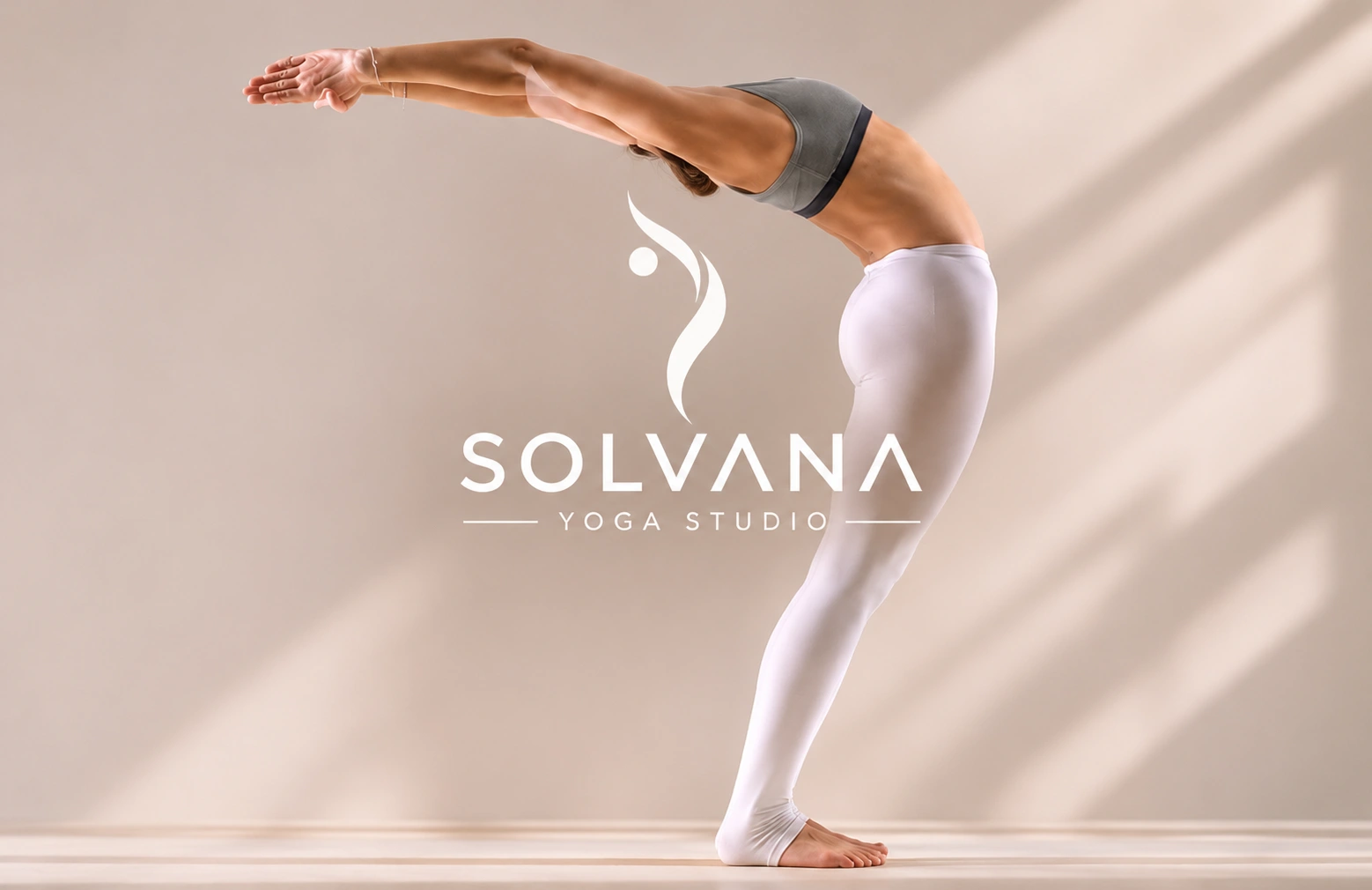
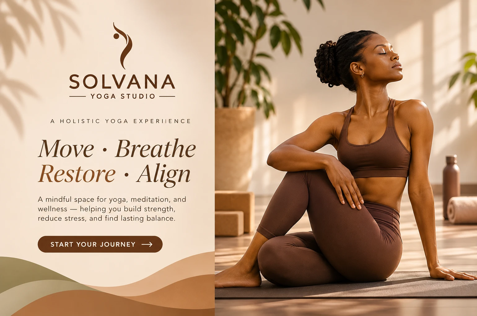
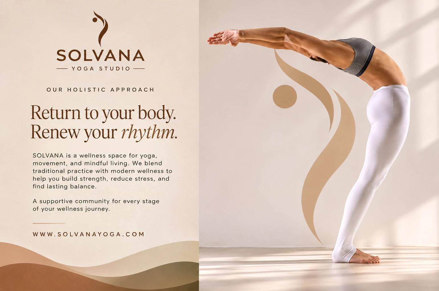
Solvana is a self-initiated brand identity for a boutique yoga studio. The goal was a brand that feels calm and grounded without slipping into the usual wellness clichés like lotus icons, pastel gradients or stock “zen” imagery.
The challenge
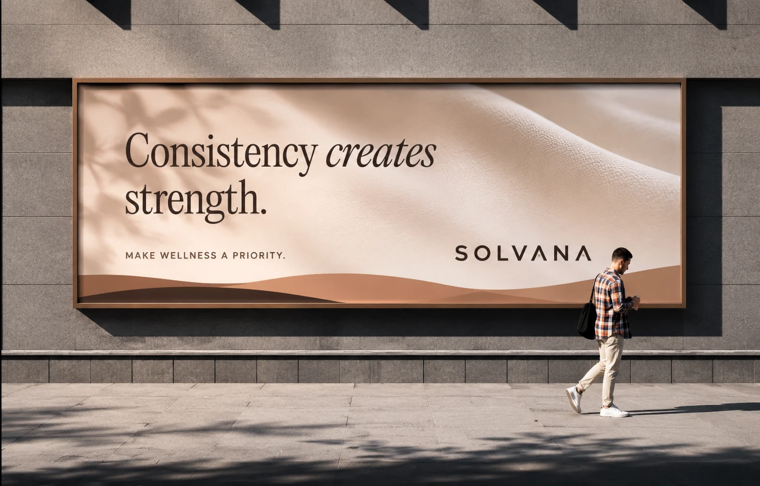
Most yoga brands look the same. I wanted to see how far restraint could go: a quiet identity that still feels premium, has a clear personality, and is easy to recognise from a business card all the way up to a storefront.
Approach: the mark
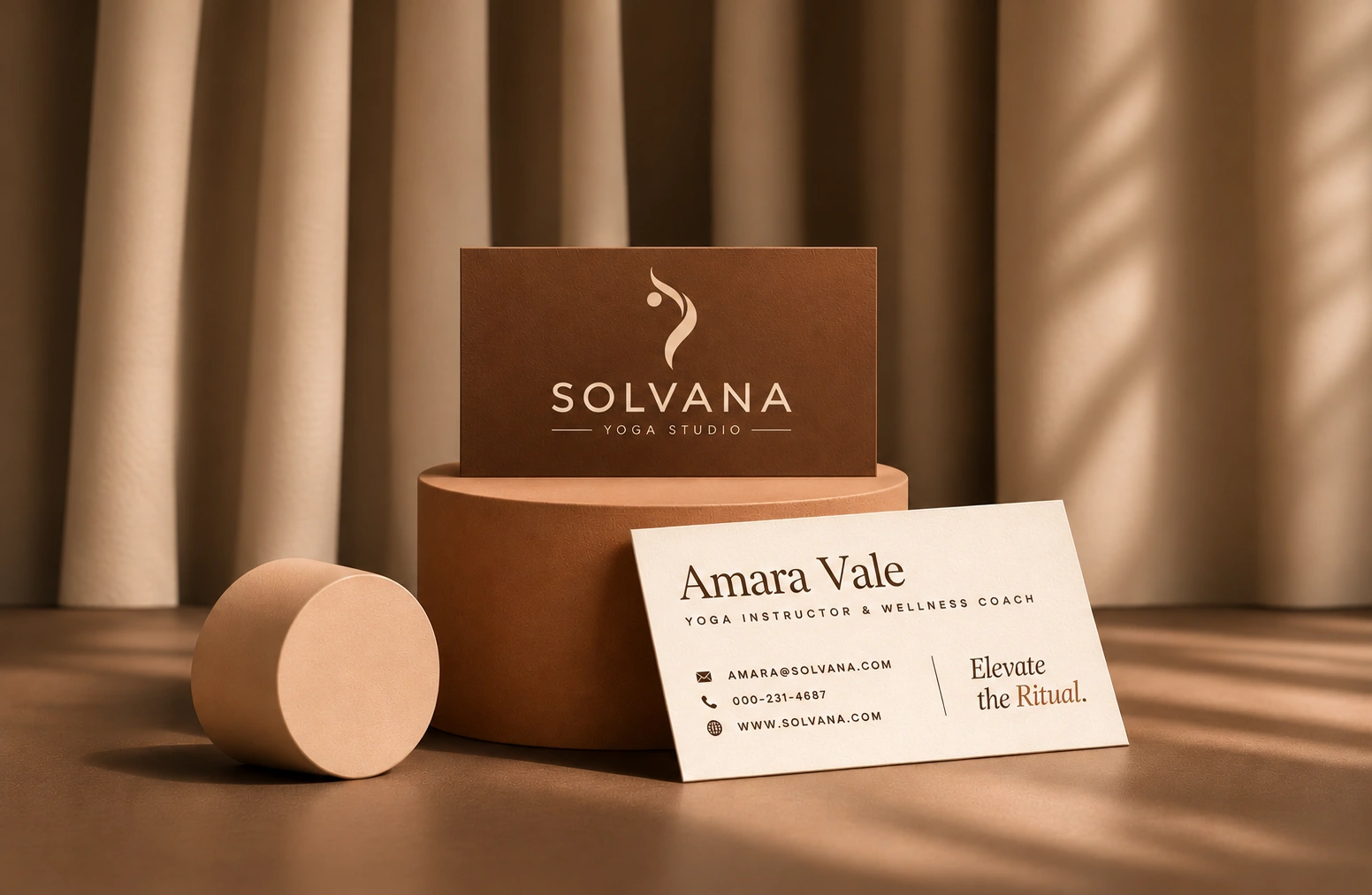
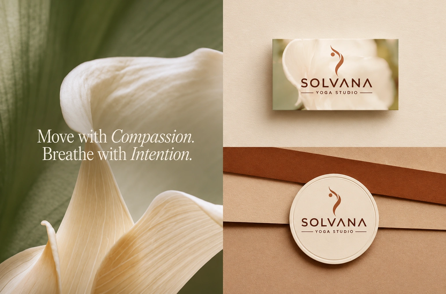
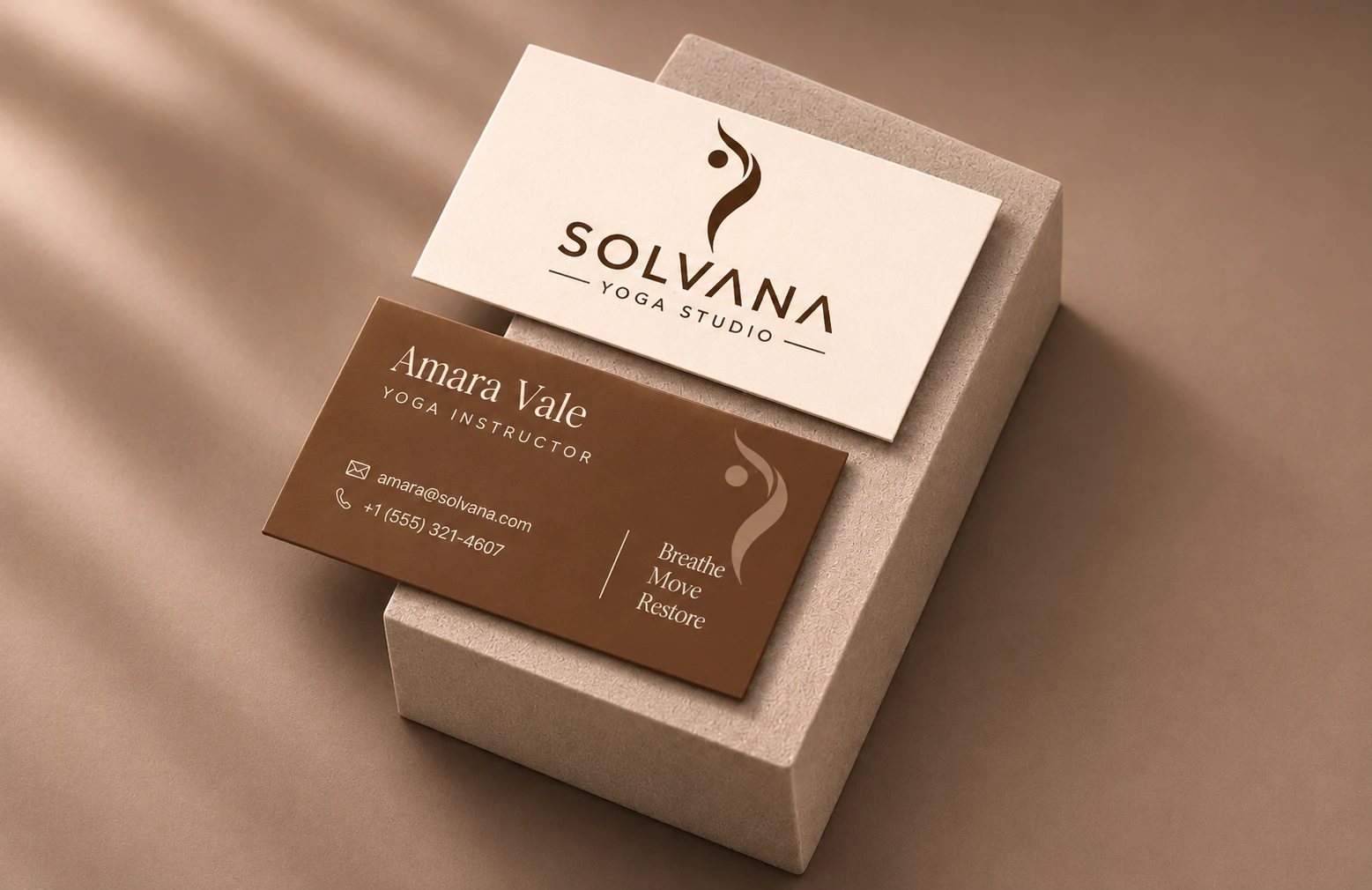
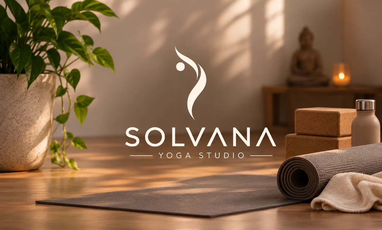
The mark is built around a single flowing line inspired by the shape of the spine and breath in motion. It sits above a spaced-out serif wordmark that brings balance and a sense of space.
Approach: colour and photography
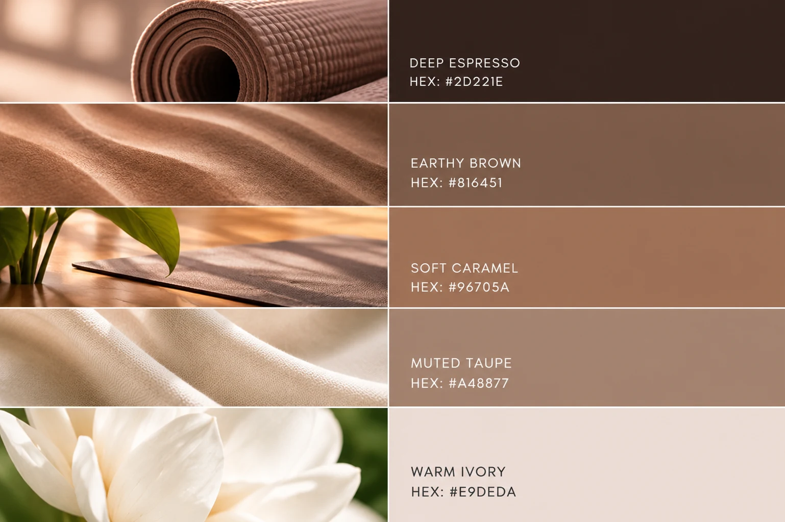
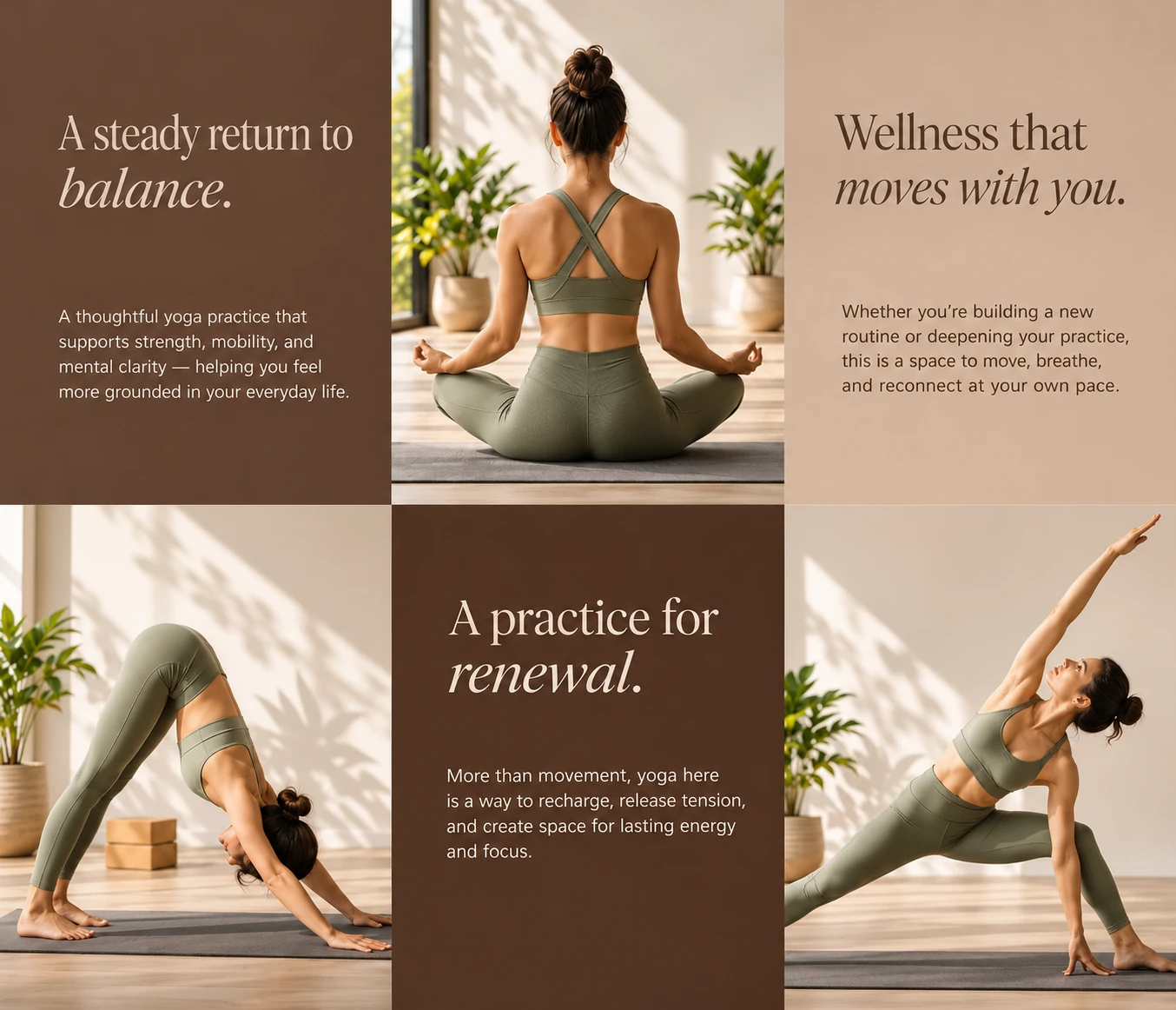
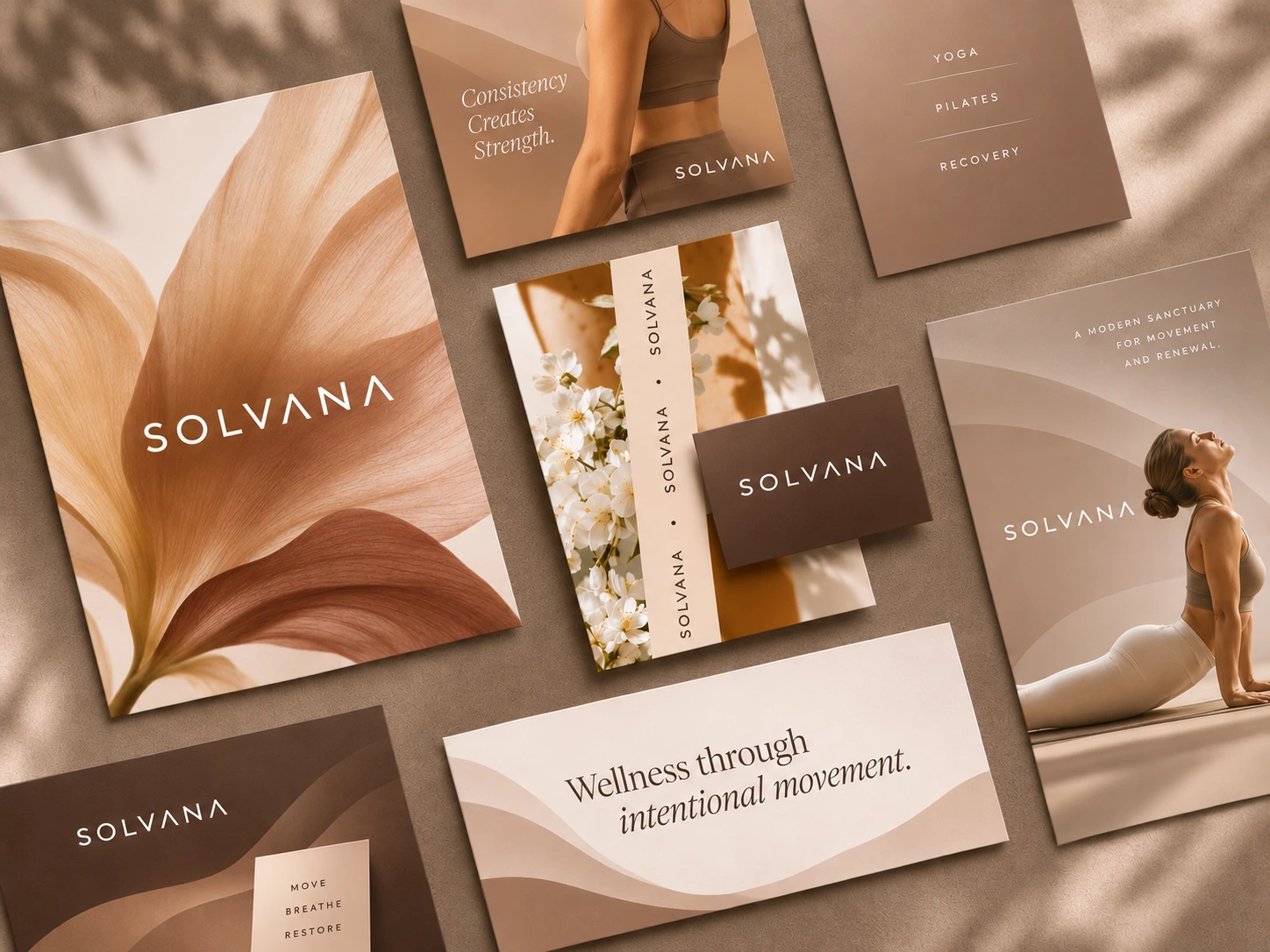
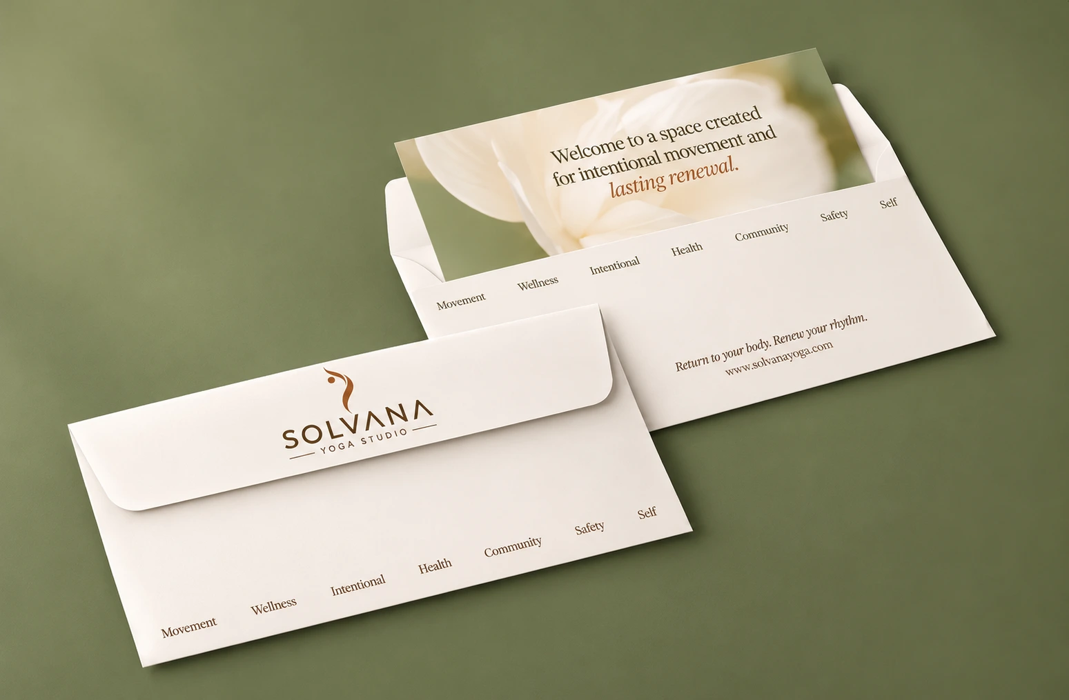
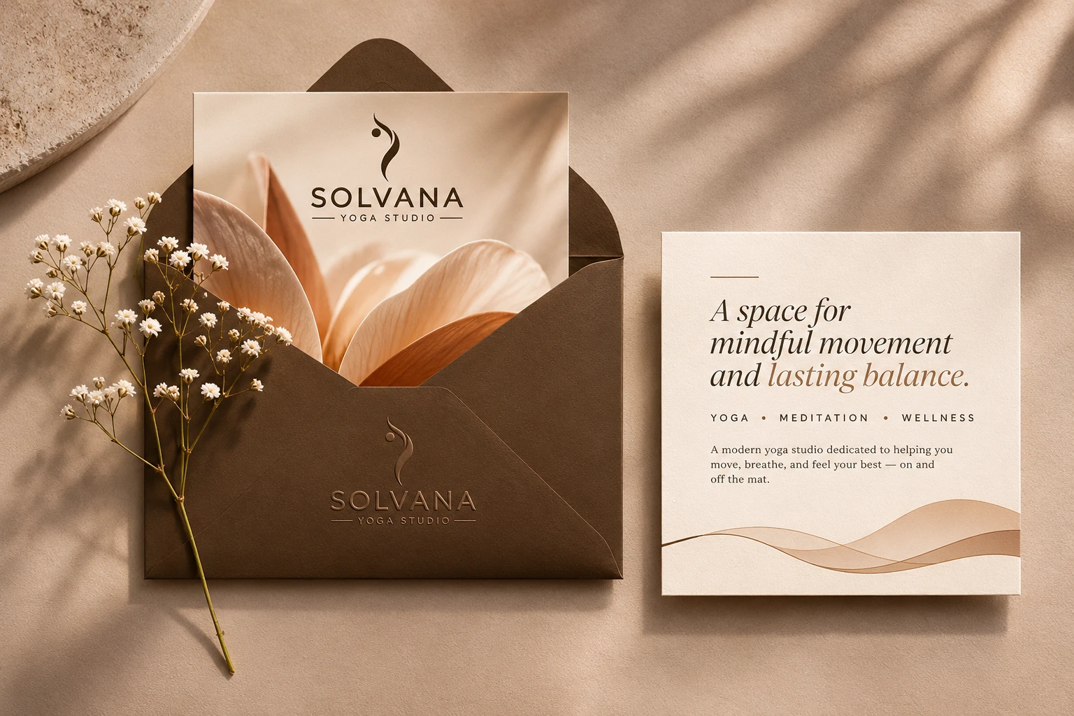
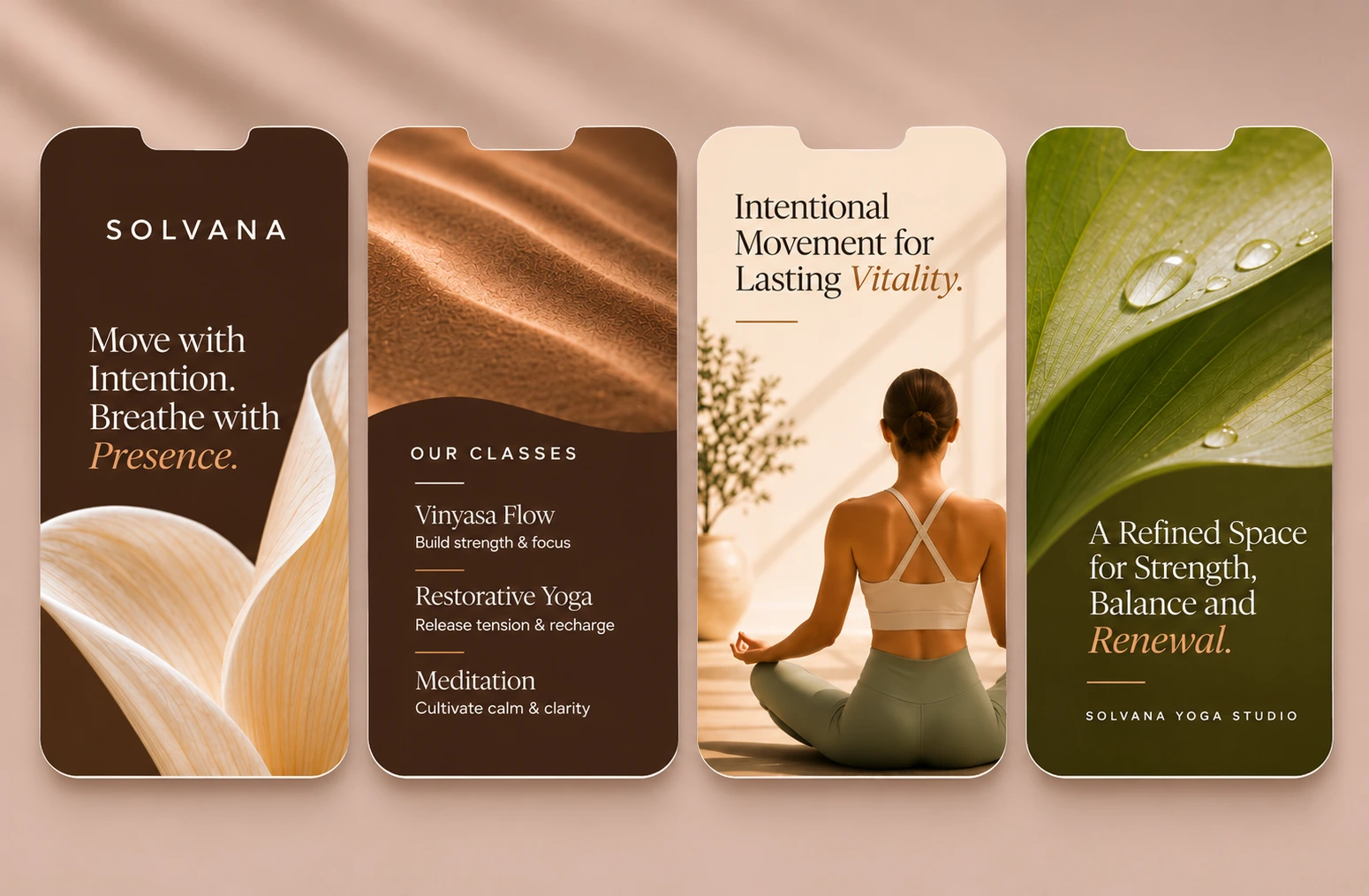
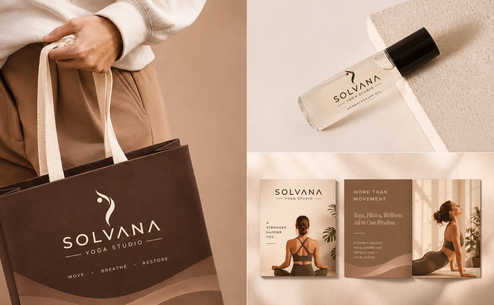
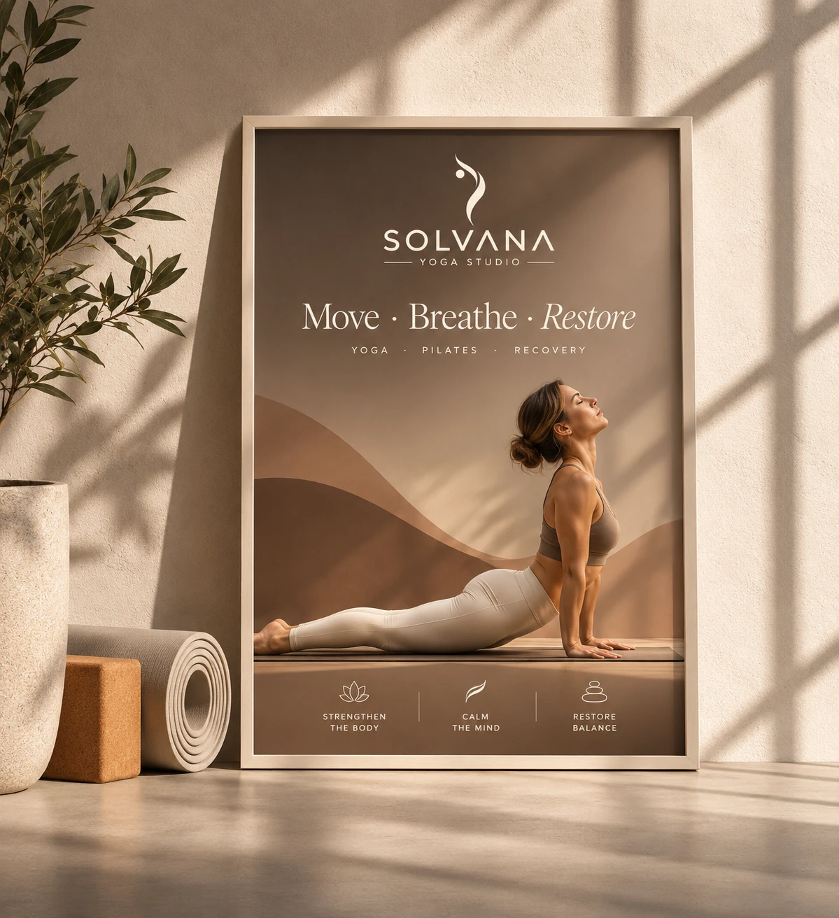
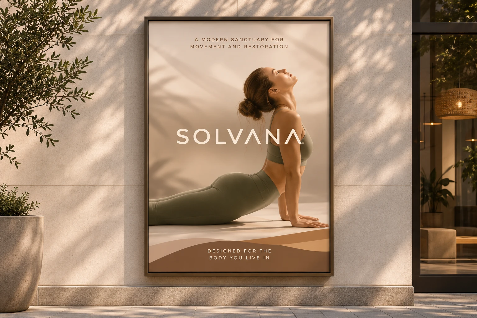
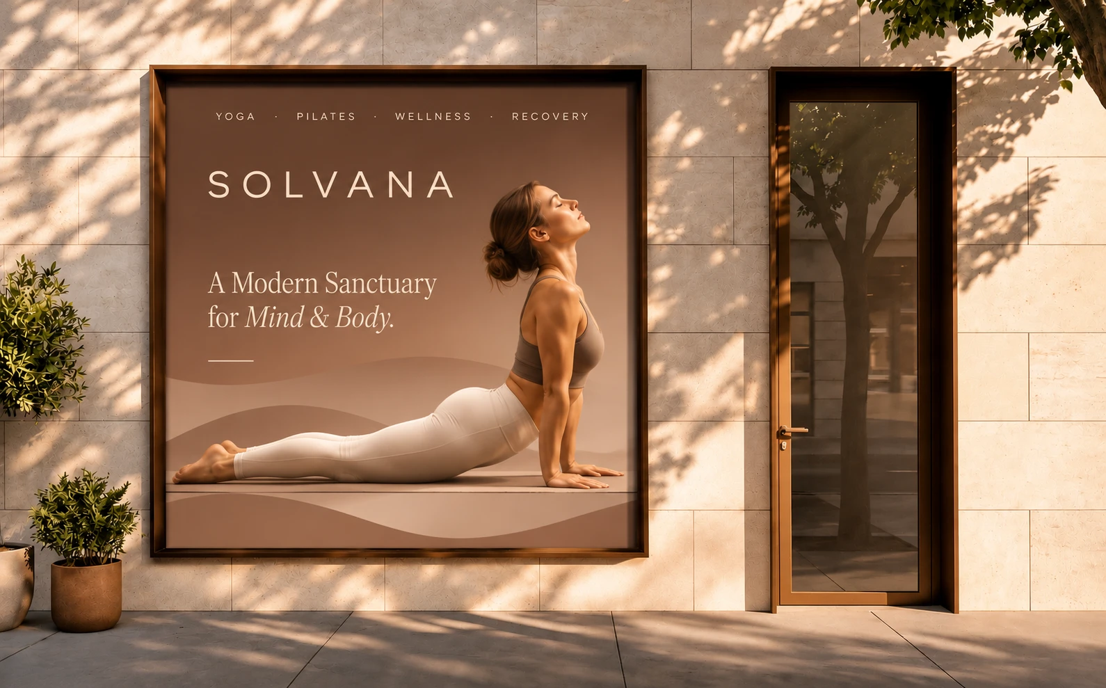
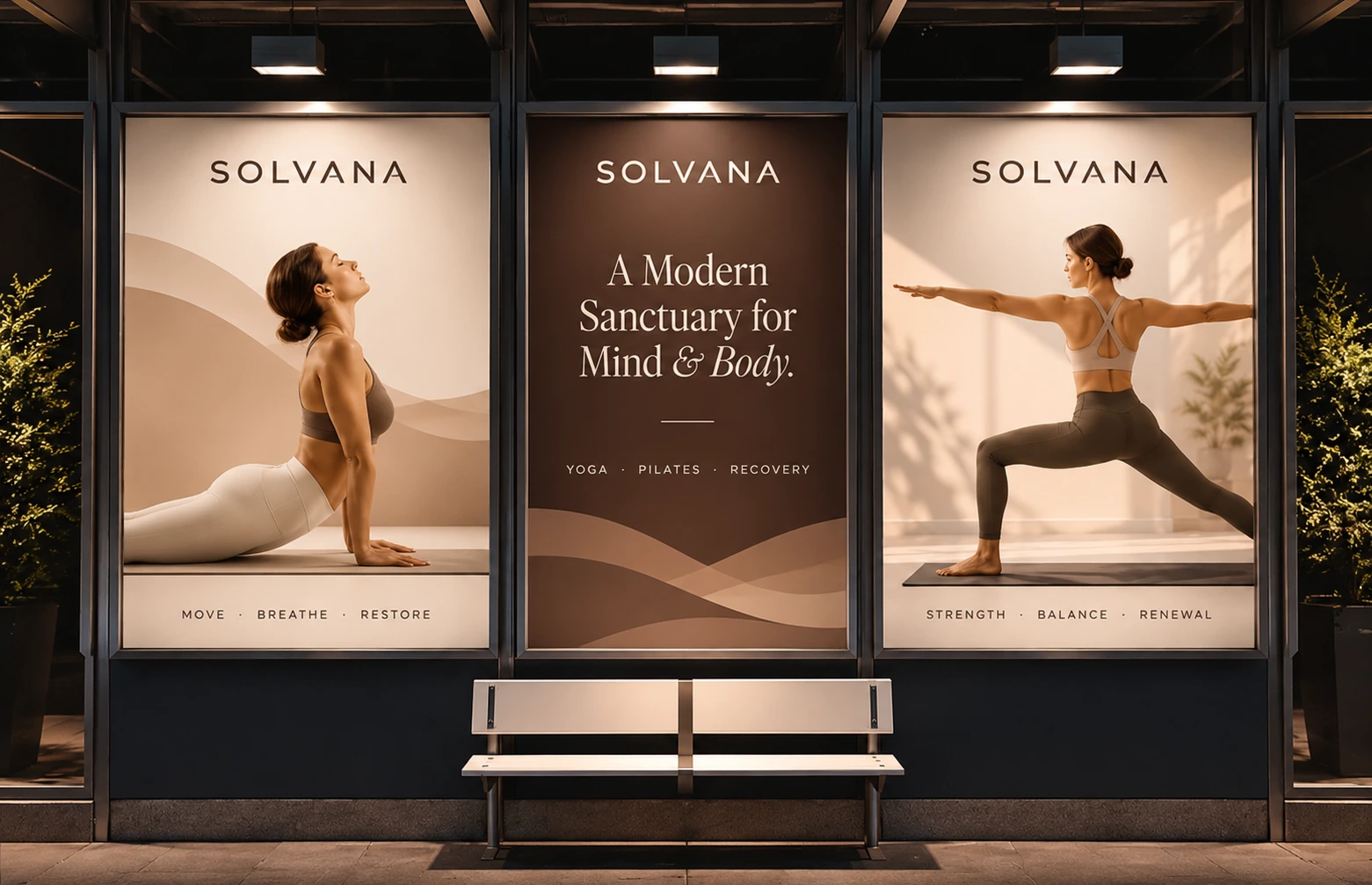
The palette draws on earth and skin tones (cocoa, clay, sand and blush), with a muted sage for contrast. The photography is soft and full of natural light, focused on stillness rather than performance.
Section label: digital
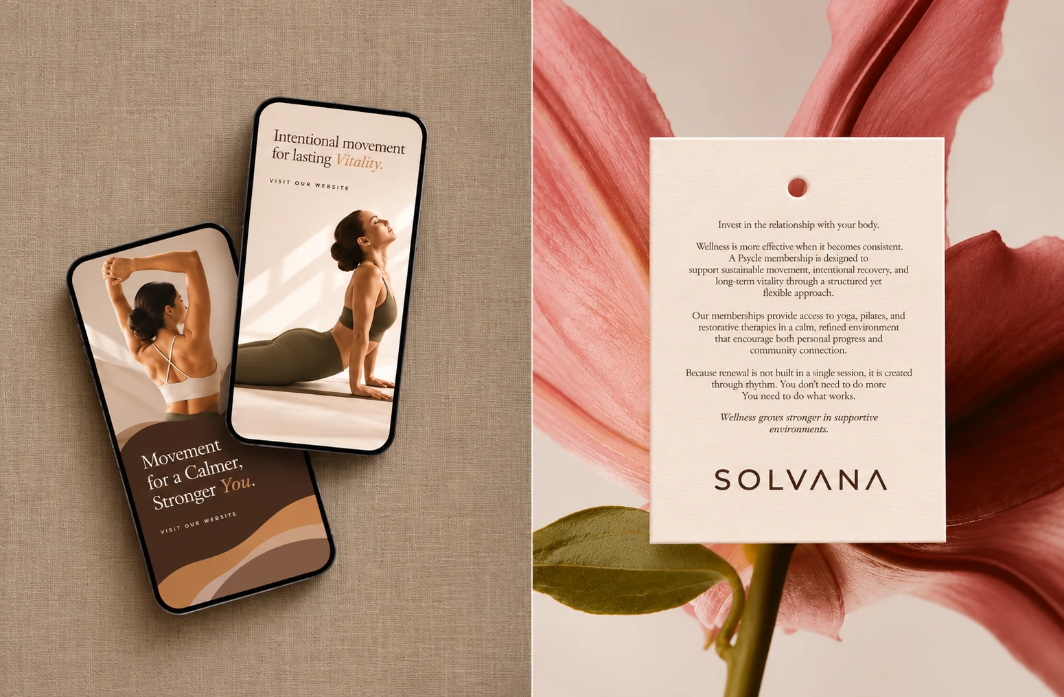
Digital: a consistent, calm presence across social, mobile and web.
Section label: stationery
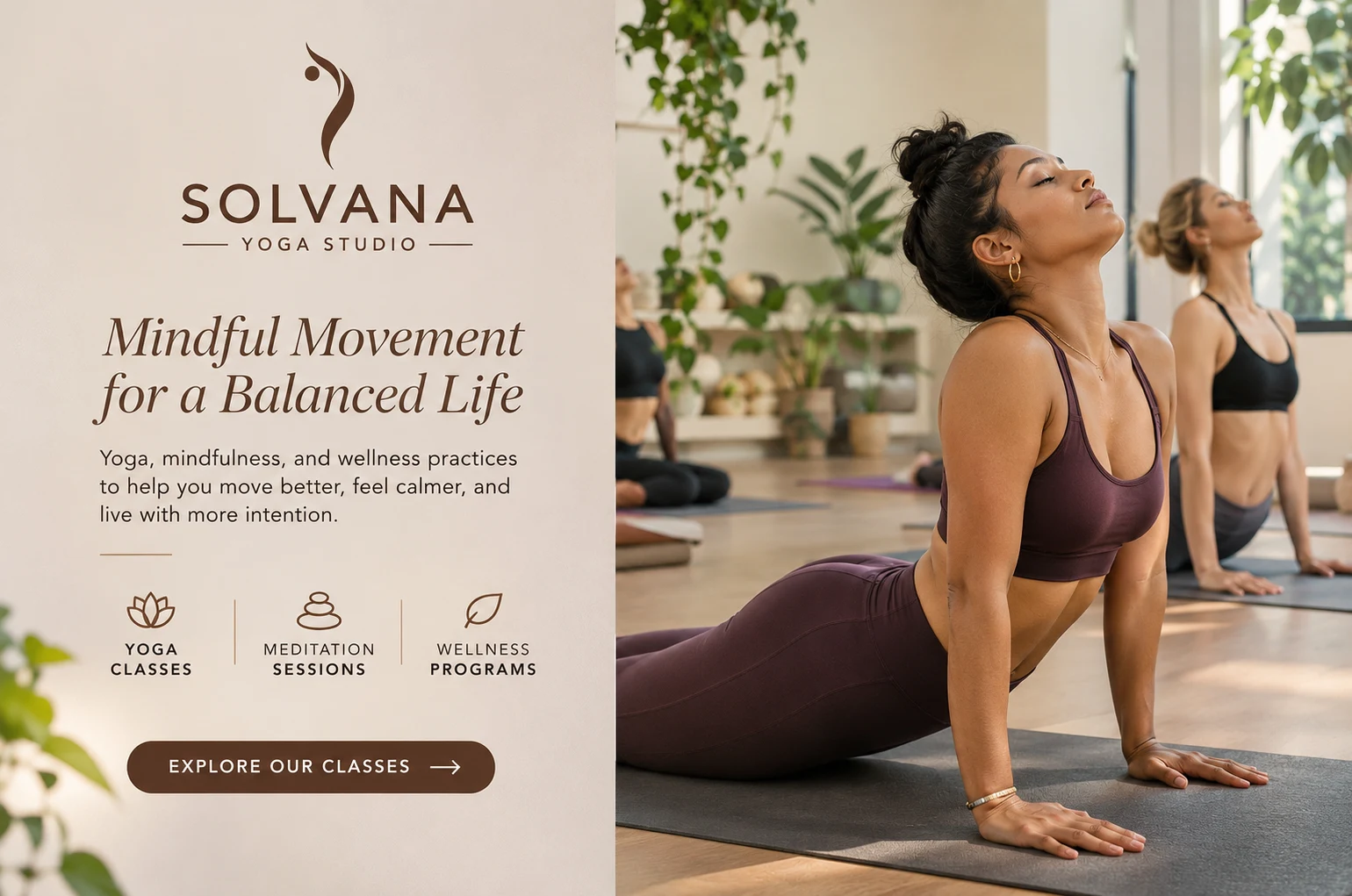
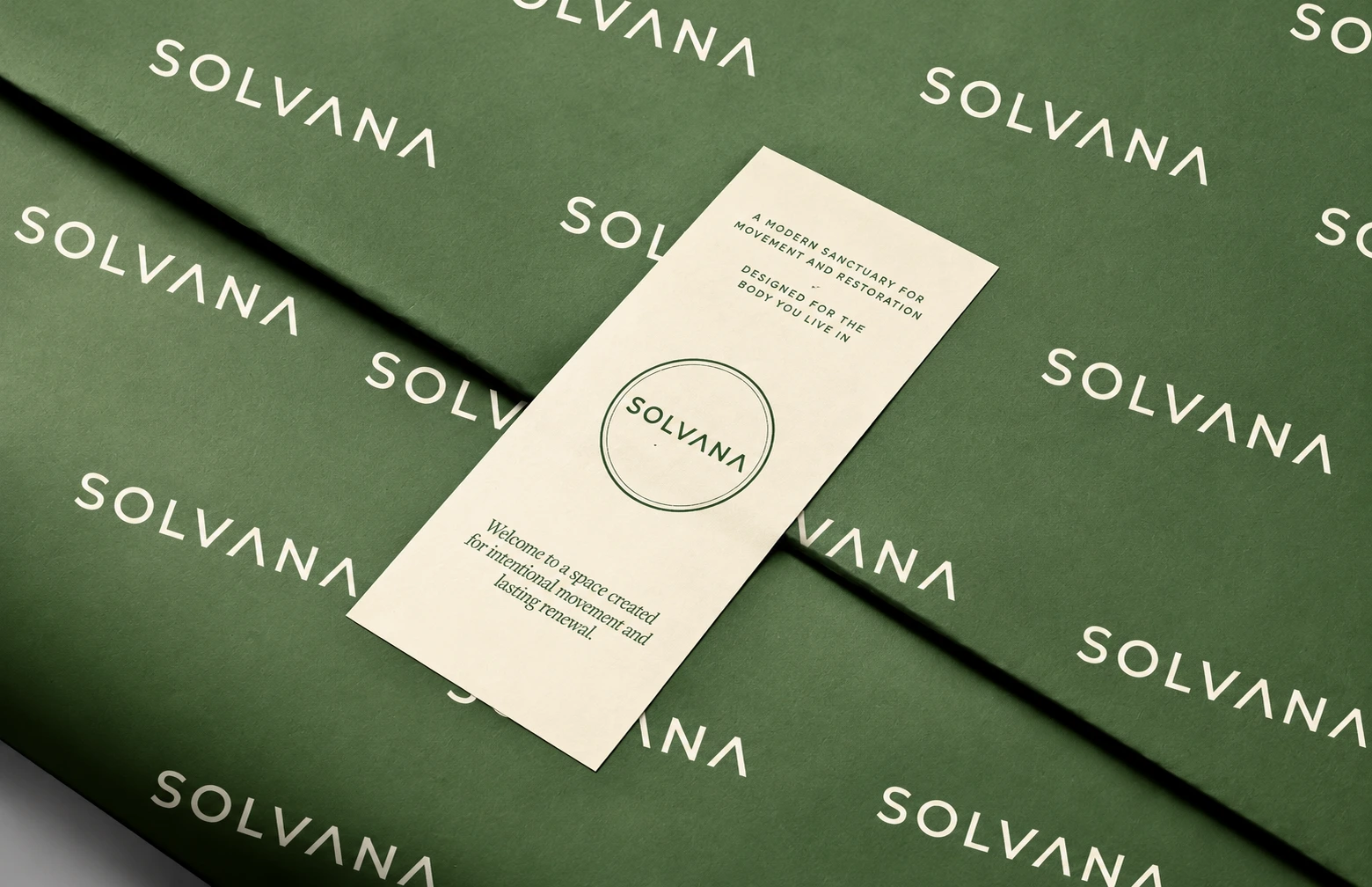
Print and stationery: tactile, minimal and warm.
Section label: merch and packaging
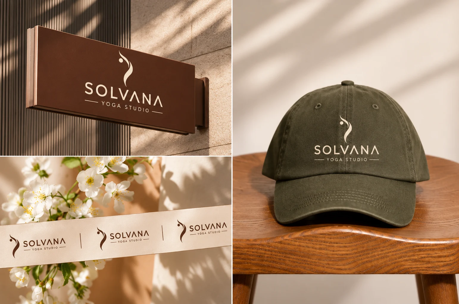
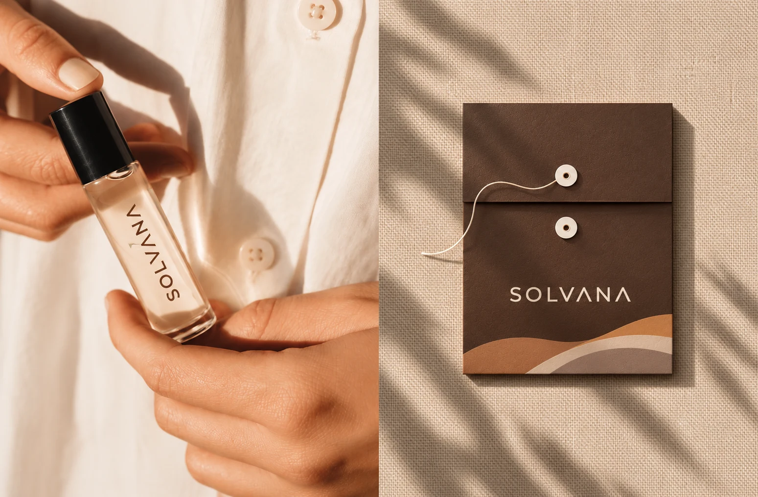
Merchandise and packaging: the brand people take home.
Section label: out-of-home
Out-of-home: quiet confidence at street scale.
Deliverables and result
What I delivered: logo and wordmark system, colour palette and typography, photography and art direction, social media templates, mobile app screens, website design, stationery, merchandise and packaging, and out-of-home.
A complete, flexible identity that feels like slowing down. Every touchpoint shares one visual language, so the brand is recognisable at any size and in any context.
Concept note
Self-initiated concept project.
1 like · 2 views · Nov 11, 2026
Solvana is a self initiated brand identity for a boutique yoga studio, built to feel calm, grounded and premium without the usual wellness clichés. The project


