The network for creativity
Join 1.25M professional creatives like you
Connect with clients, get discovered, and run your business 100% commission-free
Creatives on Contra have earned over $150M and we are just getting started
Back to feedPost
Taste Test
Hey everyone! Between these two cards color options, which one would you recommend presenting?
4 voted
17%
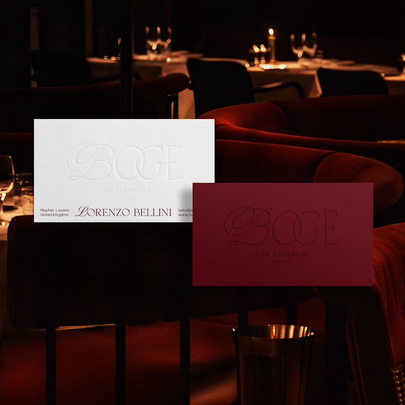
19 voted
83%
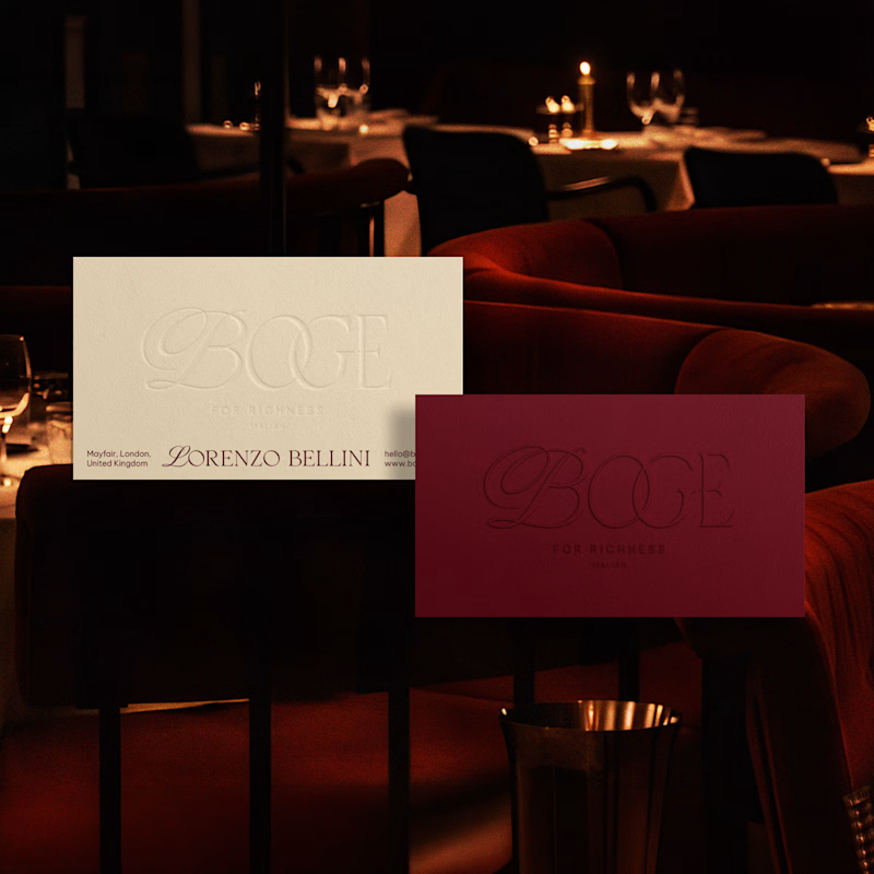
23 votes
Closed


Incredible design! I would definetely go with cream one, but white would be sharper if you were to strengthen the shadows on the line of text.

Thanks for the valuable insight.💯

Creamy ochre one looks more attractive
My partner also liked that one.

Creamy ochre
Thank you for the suggestion.

Nice i will go with 2nd one
Thanks, bro! I've uploaded the full project. Take your time checking it out, and I'd really appreciate your honest feedback and any insights you have.

The Creamy Ochre option on the right is the clear winner here. The warm palette integrates flawlessly with the upscale restaurant lighting, elevating the brand's premium identity without any abrupt color shock.
EXCELLENT tonal choices!
Thank you for the valuable insight. Take your time checking the full project, and I'd really appreciate your honest feedback and any insights you have.
https://contra.com/p/MLrlAUX3-boge-contemporary-italian-fine-dining-brand-identity?r=shovonartistry

love the aesthetics mate!
Thanks, bro. The full project is now live. Whenever you have some time, please take a look and share your thoughts and constructive feedback.

Thanks, bro! The complete project is finally up. No rush at all. When you get a chance, I'd love to hear your valuable insights and suggestions.


I will go with the creamy ochre
Thanks, bro! The full project is live now. Have a look whenever you have time, and let me know what you think. Your feedback always means a lot.
Awesome, will look into it
Thanks 😍

CREAMY ORCHE IS OBVIOUS...
Thanks, bro! I just uploaded the complete project. Feel free to go through it whenever you're free. I'd genuinely appreciate your thoughts and any suggestions for improvement.
https://contra.com/p/MLrlAUX3-boge-contemporary-italian-fine-dining-brand-identity?r=shovonartistry
Amazing thoughts, effects, concept, and visuals..I would love to collab with such amazing and outstanding partners for better learning in making a brand identity.

Cream it is, I love this color combo bro💕
Thanks, bro! I've uploaded the full project. Take your time reviewing it, and I'd really appreciate any valuable feedback or insights you have.
The network for creativity
Join 1.25M professional creatives like you
Connect with clients, get discovered, and run your business 100% commission-free
Creatives on Contra have earned over $150M and we are just getting started








Related posts


Covers are my weakest muscle. I can build a whole visual world, and then freeze at one thumbnail 😅
MALA FLORA: a tattoo studio + gallery built from my painting Jardín Turbio. A shows the site on the street, B shows the flow in motion.
Which one makes you want to click?
3 voted
20%
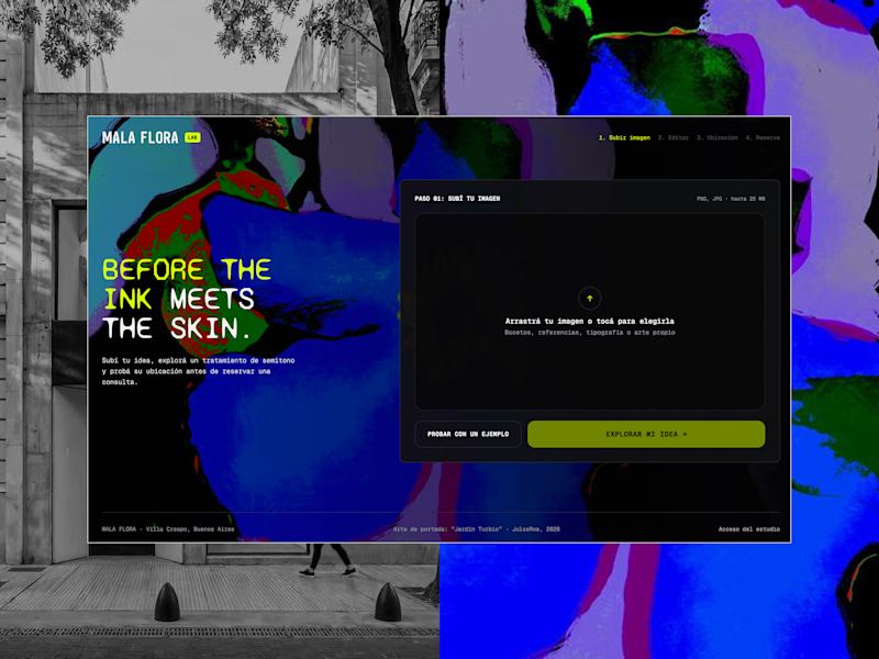
12 voted
80%
15 votes
Closed


B, the tattoo frames moving made me stop scrolling where A reads more like a site screenshot

The previous poll on this preloader had exactly 50-50 results between Horizontal gallery and Circle intro. Now I'm continuing with 2 other options. Which one is better? Check the live preview here
19 voted
53%
17 voted
47%
36 votes
Closed

Team mosaic!!