The network for creativity
Join 1.25M professional creatives like you
Connect with clients, get discovered, and run your business 100% commission-free
Creatives on Contra have earned over $150M and we are just getting started
Back to feedPost
Taste Test
Hey everyone! Between these two cards color options, which one would you recommend presenting?
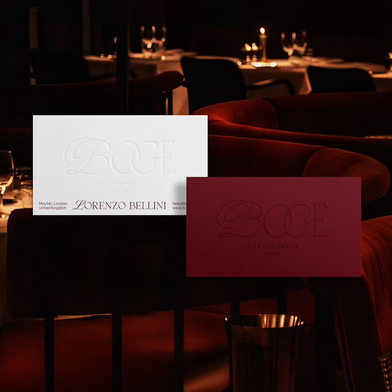
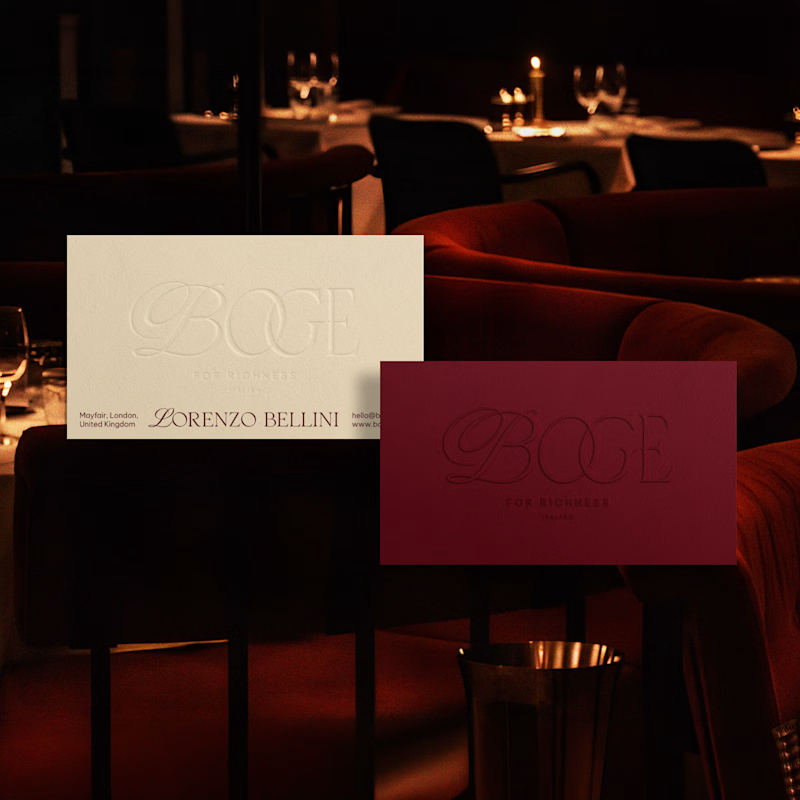
16 votes
Ends in 6h

The Creamy Ochre option on the right is the clear winner here. The warm palette integrates flawlessly with the upscale restaurant lighting, elevating the brand's premium identity without any abrupt color shock.
EXCELLENT tonal choices!


Incredible design! I would definetely go with cream one, but white would be sharper if you were to strengthen the shadows on the line of text.

Thanks for the valuable insight.💯

Creamy ochre one looks more attractive
My partner also liked that one.

Creamy ochre
Thank you for the suggestion.

Nice i will go with 2nd one
The network for creativity
Join 1.25M professional creatives like you
Connect with clients, get discovered, and run your business 100% commission-free
Creatives on Contra have earned over $150M and we are just getting started
Trending

Claude
Claude has entered the design space. How are you using it?

Contra University
Learn from expert creatives how to earn more using next-gen AI tools.
Brand Design
The best brand designers are on Contra. Scroll to see what's trending in brand design. What are you building?
creativeaiflow
Creative AI workflows are evolving. What tools do you use, and what are their strengths and weaknesses?
freelancerlife
Freelancer life is wins, pivots, and everything in between. What’s yours right now?



Related posts


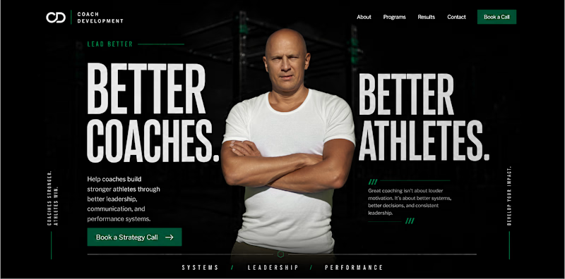
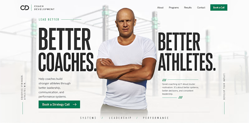
Light and dark themes can create completely different impressions of the same brand.
The light version feels more open, clear, and approachable. It creates a sense of trust, accessibility, and calm.
The dark version feels more focused, powerful, and premium. It adds intensity, authority, and a stronger sense of expertise.
The content and structure remain the same, but the emotional perception changes.
For a sports psychology coach working with athletes and coaches, which theme feels more suitable to you: light or dark?


99 voted
69%
44 voted
31%
143 votes
Closed

I always prefer dark mode, but I don't know why I think light mode looks good to me

Which of the mockup options do you prefer?
10 voted
50%
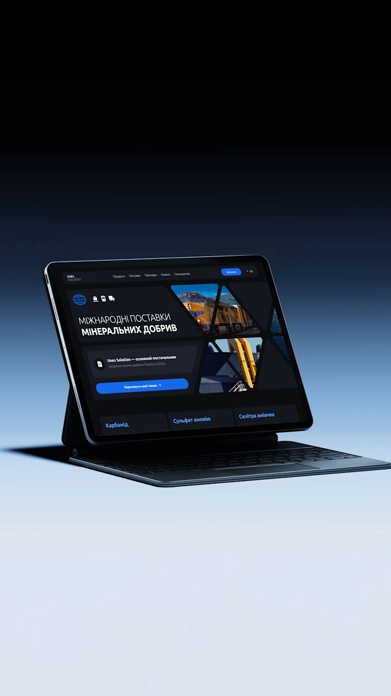
10 voted
50%
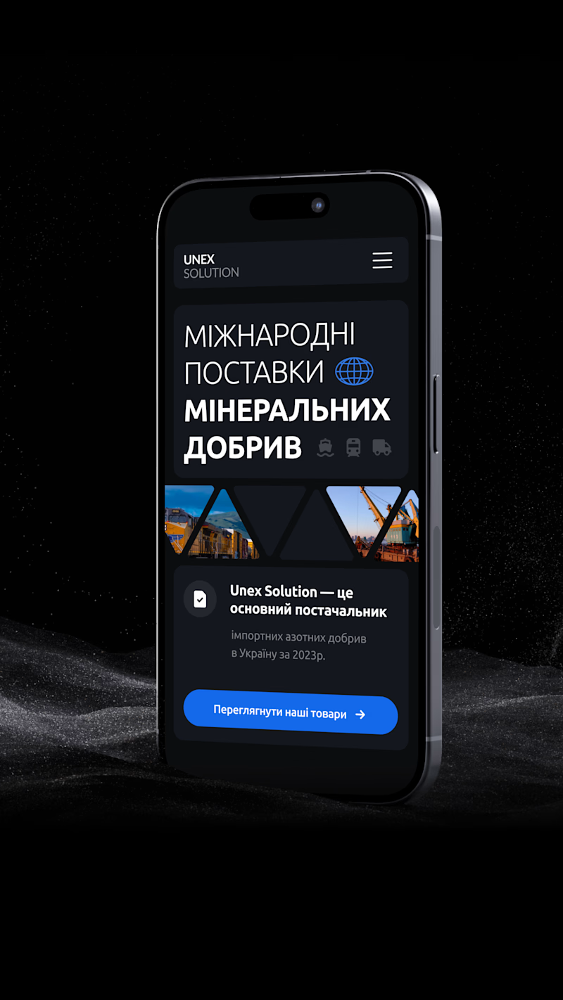
20 votes
Closed

V 1 looks more detail-oriented

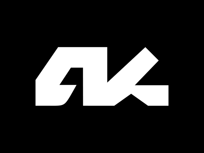
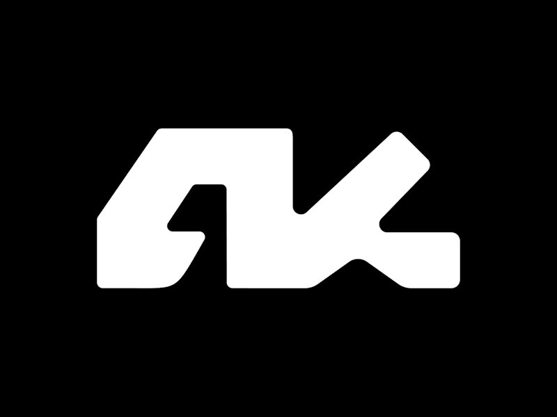
Which do you prefer: Sharp edges or rounded?
50 voted
38%
82 voted
62%
132 votes
Closed

Depends on what type of brand you are working on