The network for creativity
Join 1.25M professional creatives like you
Connect with clients, get discovered, and run your business 100% commission-free
Creatives on Contra have earned over $150M and we are just getting started
Back to feedPost
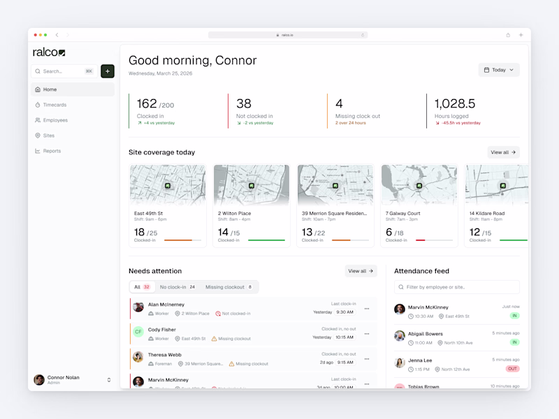
Built a Sales Dashboard focused on one thing:
clarity over clutter.
Instead of dumping charts, this answers:
→ Which categories actually drive revenue
→ Where profit is strong vs misleading
→ City-level performance differences
→ Monthly trends that impact decisions
Key insight:
High sales don’t always mean high profit — margin tells the real story.
Designed with a dark UI to keep focus on data, not distractions.
If your dashboard looks good but doesn’t guide decisions, it’s just decoration.
The Sales vs Profit side-by-side bar chart by city is the standout — San Diego leading in sales but New York showing stronger profit margin tells a completely different story than revenue alone. The dark UI choice is smart too, it removes visual noise and forces attention on the...
The network for creativity
Join 1.25M professional creatives like you
Connect with clients, get discovered, and run your business 100% commission-free
Creatives on Contra have earned over $150M and we are just getting started
Related posts
Could Claude Design replace your first design sprint?
I tested Claude Design to build a Personal Financial dashboard interactive prototype — starting with nothing but plain language and rough Figma screenshots. Here's my honest take:
✨ What wowed me
The depth of product logic genuinely surprised me. It didn't just lay out components — it thought like a product designer. It generated an insight like "If you increase your monthly contributions by £100, you'd end up with £112K" in the relevant section. Something I hadn't even thought to include.
🟡 The icons and layout felt warm and considered from the very first generation.
🟡 It even brought a lightweight design system: edit/set your fonts and background, and it updates across the entire prototype.
🟡 And before building anything, Claude Design asks thoughtful questions about your colour choices, fonts, and intent, which genuinely helps you spend your tokens wisely.
🚧 What it can't replace yet
The interaction layer. Some interactions worked, some were just layout — and for a mid-fidelity prototype, I get it. But crucial interactions need to function. That said, I think Claude Code will eventually sort this out.
The verdict? Claude Design isn't replacing Figma or a senior product designer anytime soon — but the thoughtfulness it brings to the first draft is genuinely impressive.
Have you tried building a prototype with AI yet? What was your experience? 👇
♥️ Btw, if anyone's interested in the product, I'm actually close to the final version! Follow @clearday.financial.dashboard for updates, stay tuned! 👀
good job
Real Estate Analytics Dashboard | Revalo
Designed a multi-panel property management dashboard for real estate platforms that need sales performance and listing compliance visible in one place not split across two tools.
What was delivered:
KPI cards showing Total Sales ($34,678 +8%) and Property Views (46,246 -1.8%) vs last week
Dark flow chart tracking revenue vs expenses Jan–Dec with an October peak at 435 total revenue
The fraud detection reports panel flagging 4 mismatched listings (789 Sunset Blvd, 345 Hollywood, 456 Maple Ave) with "Detected" badges.
Sales analytics bar chart showing Total Units Sold 345/500 with Total Sales vs Total Earnings breakdown Sep–Dec
Property listing table with Sold and Pending status badges and transaction dates
Built for proptech startups, real estate SaaS platforms, and marketplace operators managing large active listing volumes.
If your platform needs a dashboard that handles both performance and compliance, this is the kind of work we do.
Tools: Figma, Jitter
Let's build something better. 👋
Dashboard design exploration and one more ☀️Light or 🌘Dark taste test 🤌
52 voted
37%
88 voted
63%
140 votes
Closed
Hard to choose, but Dark Mode 🌘 always brings that high-fidelity, premium feel that builds instant Visual Authority. It makes those dashboard data points pop like luxury assets. Great exploration!
Trending
Claude
Claude has entered the design space. How are you using Claude Design?
Contra University
Learn from expert creatives how to earn more using next-gen AI tools.
creativeaiflow
Creative AI workflows are evolving. What tools do you use, and what are their strengths and weaknesses?
portfolioreview
The best portfolios tell a story, not just show a grid. Share yours for feedback.
freelancerlife
Freelancer life is wins, pivots, and everything in between. What’s yours right now?