The network for creativity
Join 1.25M professional creatives like you
Connect with clients, get discovered, and run your business 100% commission-free
Creatives on Contra have earned over $150M and we are just getting started
Back to feedPost

Built a Sales Dashboard focused on one thing:
clarity over clutter.
Instead of dumping charts, this answers:
→ Which categories actually drive revenue
→ Where profit is strong vs misleading
→ City-level performance differences
→ Monthly trends that impact decisions
Key insight:
High sales don’t always mean high profit — margin tells the real story.
Designed with a dark UI to keep focus on data, not distractions.
If your dashboard looks good but doesn’t guide decisions, it’s just decoration.


The Sales vs Profit side-by-side bar chart by city is the standout — San Diego leading in sales but New York showing stronger profit margin tells a completely different story than revenue alone. The dark UI choice is smart too, it removes visual noise and forces attention on the...
The network for creativity
Join 1.25M professional creatives like you
Connect with clients, get discovered, and run your business 100% commission-free
Creatives on Contra have earned over $150M and we are just getting started











Related posts

Exploring a clean, modern SaaS dashboard UI. Focused on simple layouts, smooth interactions, and a better user experience 🚀


i had to like this, it got my attention, very nice build mate.


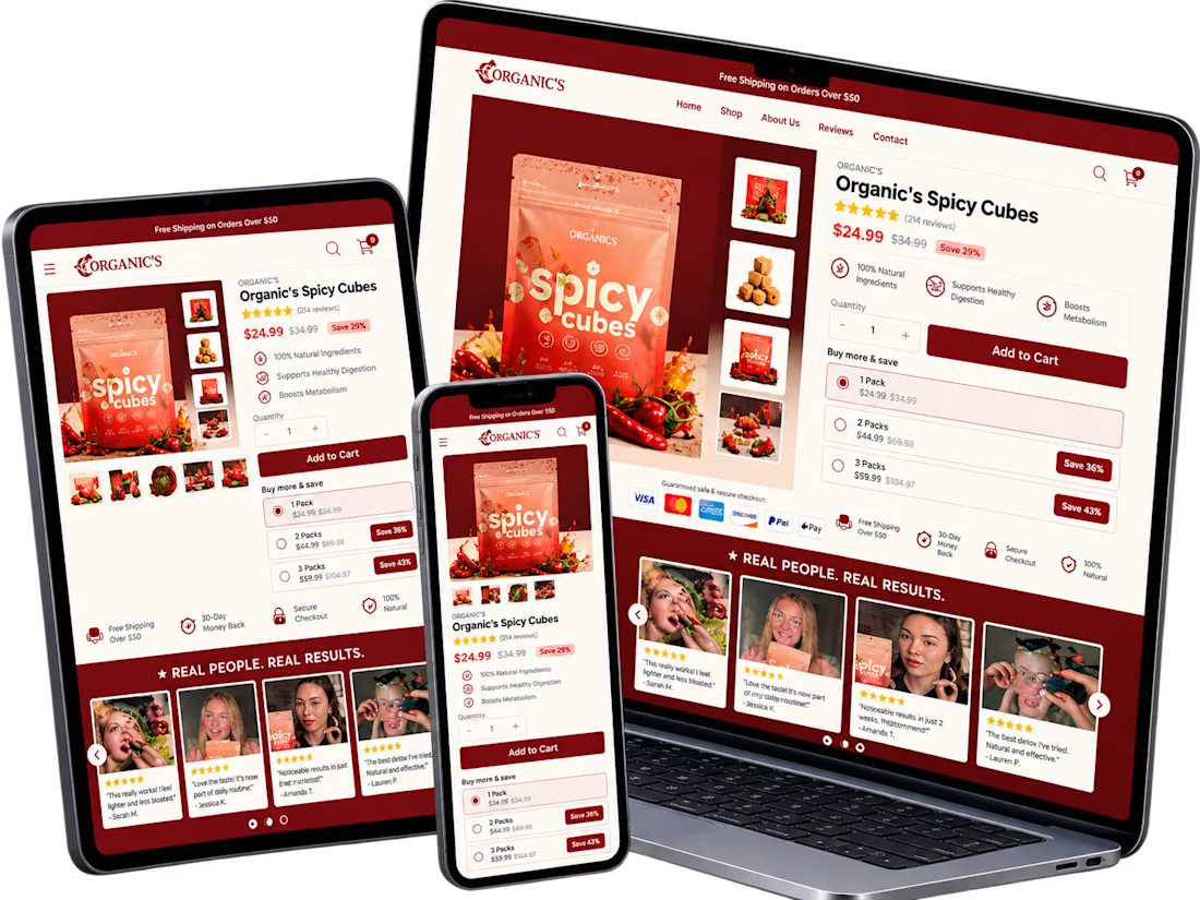
A conversion-focused Shopify product page featuring a clean, modern layout and an intuitive shopping experience.
The page brings together an engaging product gallery, bundle selection, clear Add to Cart actions, customer testimonials, product education, comparison tables, and FAQs.
The design emphasizes visual hierarchy, product discovery, purchase clarity, and trust-building elements to help shoppers make informed decisions.
Focus: Shopify UI/UX, product page design, and conversion rate optimization.


Clean layout. Keeping the bundle options, comparison table and FAQs on the same page really helps buyers decide without extra clicks. Great work on the product page structure.

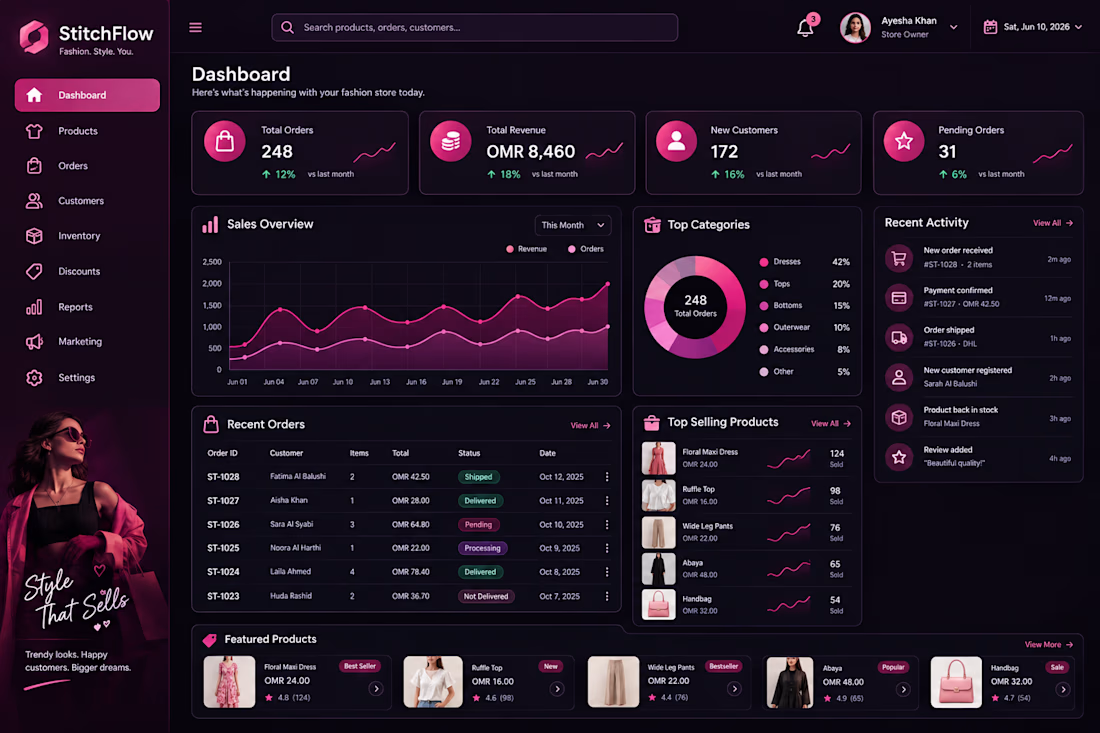
Stitch Flow — Women’s Fashion Dashboard UI Design 🎨
What do you think of the design? I’d love to hear your honest opinion and suggestions! 💗


That's really fulfilling design it has all you need but it needs to be more minimalistic ❤️
Great job Abi🎉🎉🎉