The network for creativity
Join 1.25M professional creatives like you
Connect with clients, get discovered, and run your business 100% commission-free
Creatives on Contra have earned over $150M and we are just getting started
Back to feedPost

Could Claude Design replace your first design sprint?
I tested Claude Design to build a Personal Financial dashboard interactive prototype — starting with nothing but plain language and rough Figma screenshots. Here's my honest take:
✨ What wowed me
The depth of product logic genuinely surprised me. It didn't just lay out components — it thought like a product designer. It generated an insight like "If you increase your monthly contributions by £100, you'd end up with £112K" in the relevant section. Something I hadn't even thought to include.
🟡 The icons and layout felt warm and considered from the very first generation.
🟡 It even brought a lightweight design system: edit/set your fonts and background, and it updates across the entire prototype.
🟡 And before building anything, Claude Design asks thoughtful questions about your colour choices, fonts, and intent, which genuinely helps you spend your tokens wisely.
🚧 What it can't replace yet
The interaction layer. Some interactions worked, some were just layout — and for a mid-fidelity prototype, I get it. But crucial interactions need to function. That said, I think Claude Code will eventually sort this out.
The verdict? Claude Design isn't replacing Figma or a senior product designer anytime soon — but the thoughtfulness it brings to the first draft is genuinely impressive.
Have you tried building a prototype with AI yet? What was your experience? 👇
♥️ Btw, if anyone's interested in the product, I'm actually close to the final version! Follow @clearday.financial.dashboard for updates, stay tuned! 👀


great job 👌

Great job, keep it up!

good job

This is incredible!


Nice work👏👏🔥

nicely done!

I've used Claude Design myself and the design it creates does not look like generic AI developed designed. By the way, good work on the dashboard


Great work
Great job

Welldone

wohhh, thats so cool!!!
The network for creativity
Join 1.25M professional creatives like you
Connect with clients, get discovered, and run your business 100% commission-free
Creatives on Contra have earned over $150M and we are just getting started





Related posts


Built the StupidFish Design System from the ground up and covering everything from color, typography, spacing, and components to comprehensive documentation.
Designed and documented for both web and mobile, creating a consistent, scalable foundation that makes product design and development faster and more cohesive.
Check out the full case study here →

Really thorough system, nice job

Designed this interactive 3d dashboard with Opus 5.5 for an industrial company's vehicle and material tracking dashboard
A full 3D simulation of the plant, every truck tracked from gate to dock
Both modes are pixel precise. Which one you like?
4 voted
40%
6 voted
60%
10 votes
Closed

Voted Dark. On a dashboard watching trucks move from gate to dock all day, dark is easier on the eyes, and the 3D bars and route lines glow against it. Light is clean, but dark makes the live movement the focus.

Then: 1 month, 1 template.
Now: 1 week, 15 templates.
Same designer, different workflow.
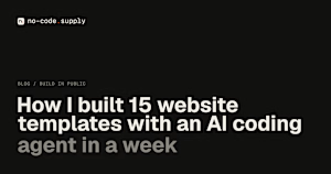
I wrote up how I built no-code.supply: fifteen website templates, each with its own brand, in HTML and React, and some in Framer too. Claude Code did most of the typing. I did the directing.
no-code.supply
How I built 15 website templates with an AI coding agent in a week
How I built 15 AI-ready website templates with Claude Code in a week: the workflow, the quality bar, and why a template is only the starting point.

Going from one template a month to fifteen a week is wild. How much of the design direction did you still do by hand?