The network for creativity
Join 1.25M professional creatives like you
Connect with clients, get discovered, and run your business 100% commission-free
Creatives on Contra have earned over $150M and we are just getting started
Back to feedPost
Taste Test
Dashboard design exploration and one more ☀️Light or 🌘Dark taste test 🤌
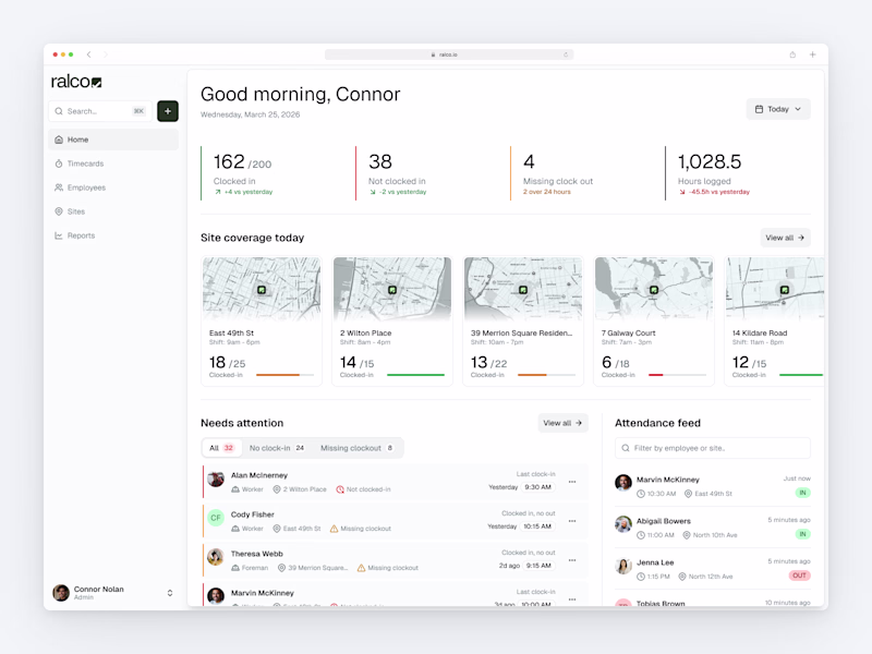
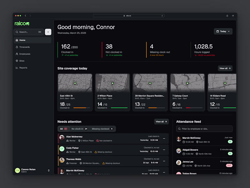
50 votes
Ends in 1d
While Im the man of darkness, this one is better with light ✌️
My design mind says dark but business mind chose the light one!
Perfect, high quality and with premium standards
Dark looks cleaner!
Clean and structured work! ❤🔥
I don't know, both look great and hard to choose but for this design dark looked better to me!
I like the dark version better!
Dark one
Hard to choose, but Dark Mode 🌘 always brings that high-fidelity, premium feel that builds instant Visual Authority. It makes those dashboard data points pop like luxury assets. Great exploration!
Super cool
I prefer the light one as it's is less stressfull overall, in the dark version the colors like the red yellow green are bright enough to give me a little stress (I'm talking about cognitive load) also point to be noted, I use light theme everywhere phone laptop etc that too in full brightness 😅😂
Dark
I always choose dark mode just because the contrast is better,
i mean most area on the screen is dark which make my eyes more comfortable.
The network for creativity
Join 1.25M professional creatives like you
Connect with clients, get discovered, and run your business 100% commission-free
Creatives on Contra have earned over $150M and we are just getting started
Related posts
meet tofu 🐶 - a pixel corgi that lives on my shipped work, dies on my laziness, and can haunt me forever (probably). built under 48 hours.
go visit while he's alive: https://tofu-hark.zocomputer.io/
tofu is a personal website with consequences.
pixel-art corgi. health bar wired to github and linear. every hour of silence drains him, live, in front of anyone watching. as health drops the scene shifts cooler and dimmer.
below 20%, any visitor clicks "generate shame." zo's llm writes a meme using my exact idle hours and last commit. memegen renders it. posts to discord. my phone buzzes.
when he hits zero: eulogy, tombstone on /graveyard. 50 flowers from strangers and he comes back from an egg.
tofu talks to visitors continuously - zo llm reads his health, idle time, the hour, whether you've been before. at 3am: "it's 3am and we're both still here."
zo-native: zo llm (minimax 2.7) · zo native database · zo sms
connected: github · linear · letterboxd + tmdb · memegen api
48 hours. 14 animation states. 3 live environments.
the creative vision:
most personal websites are finished before you visit. i wanted one that changes based on whether i'm working.
two worlds on purpose: the main site is a game hud - 8-bit pixel art, press start 2p, 14 animation states. the graveyard is victorian - playfair epitaphs, collective resurrection. deliberately different planets.
the shame mechanic works because it's specific, not clever. zo llm knows my exact idle hours and last ticket. generic shame bounces off. specific shame doesn't.
zo native throughout - llm, database, sms. this is what personal computing looks like when the infrastructure gets out of the way.
:: :: ::
Anthropic announces Claude Design.
Everybody on the internet screaming: DESIGNERS ARE DONE!!!
Meanwhile also Anthropic 👇 🤷♂️
Hi...
Trending
Runway
AI video generation is exploding. What are you dreaming up in Runway?
Contra University
Learn from expert creatives how to earn more using next-gen AI tools.
creativeaiflow
Creative AI workflows are evolving. What tools do you use, and what are their strengths and weaknesses?
portfolioreview
The best portfolios tell a story, not just show a grid. Share yours for feedback.
freelancerlife
Freelancer life is wins, pivots, and everything in between. What’s yours right now?