The network for creativity
Join 1.25M professional creatives like you
Connect with clients, get discovered, and run your business 100% commission-free
Creatives on Contra have earned over $150M and we are just getting started
Back to feedPost
The Rebranding Challenge - Season Investments
One of the key challenges was deciding what to change and what was worth preserving.
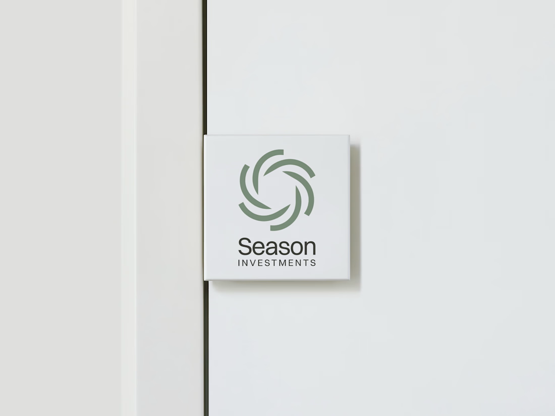
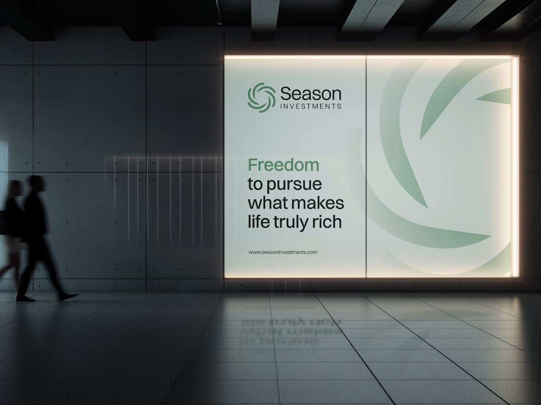
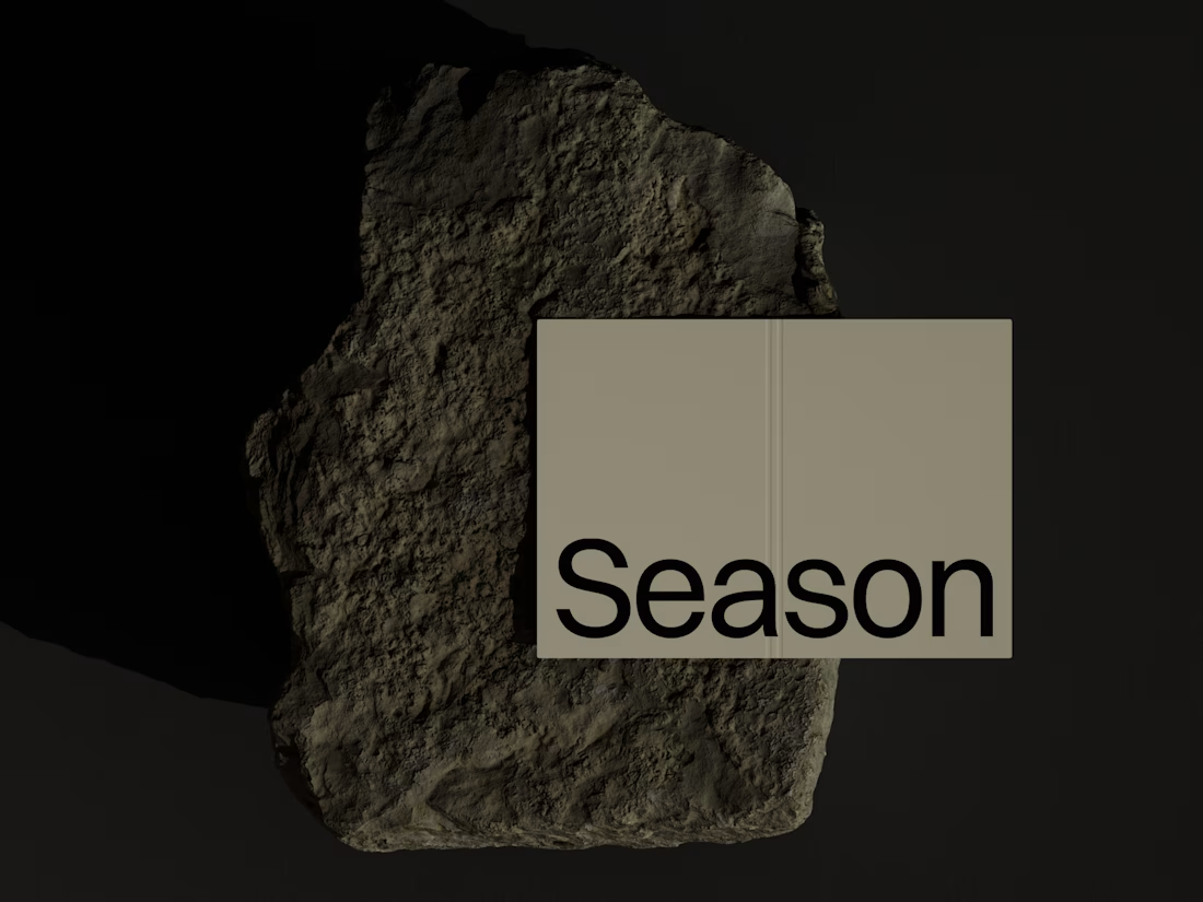
Rather than starting from scratch, the new identity retains a visual connection to Season Investments’ heritage, but reframes it for a more contemporary and flexible brand system.
A major improvement was creating a symbol that can work independently from the wordmark. This gives the brand a stronger presence across investment platforms, digital interfaces, profile images, and other compact applications where the previous identity was difficult to use.
The result is a more adaptable system that moves the brand forward without losing its familiarity.





Nice work! 😍

Thank you!

Such a strong concept. Everything feels so polished! 🔥
Thanks 🙌

Typography on point! Really inspiring work.
Thank you!


Splitting a standalone symbol from the wordmark is the right call for investment platforms — avatars and compact UI were probably where the old lockup died. Nice that you kept a visual tie to heritage instead of a full reset. Did you define minimum clear space for the mark on dark photo headers?
Exactly. The standalone mark gives us much more flexibility across smaller digital applications. And yes, we defined clear space for it across different backgrounds, including dark photography, to make sure it always had enough room to breathe.

A standalone symbol that works without the wordmark is a smart fix. The swirl feels like it fits investing.
Thank you! The symbol actually evolved from the original logo rather than being created from scratch. We modernized and refined it both visually and conceptually, giving it a new meaning while keeping a clear connection to the brand’s heritage.

Love how adaptable this feels across compact digital spaces. Really well done. Any plans to post the original before version for comparison?
Thank you! Here you can check the comparasion.
https://on.contra.com/qQnjfg
on.contra.com
Season Investments - Rebranding After 14 years in business, Season Investments set out to refresh...
Season Investments - Rebranding After 14 years in business, Season Investments set out to refresh and modernize their brand identity. The existing mark no longer reflected the values and direction th…
The network for creativity
Join 1.25M professional creatives like you
Connect with clients, get discovered, and run your business 100% commission-free
Creatives on Contra have earned over $150M and we are just getting started











Related posts

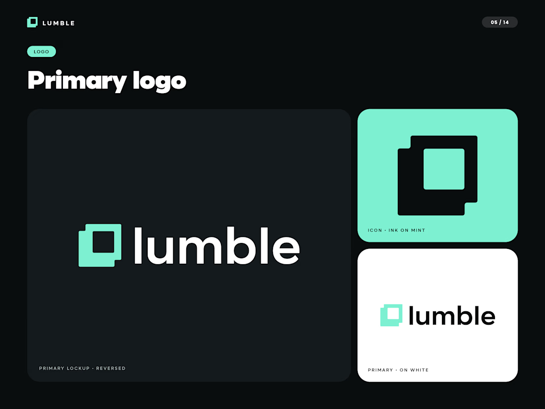
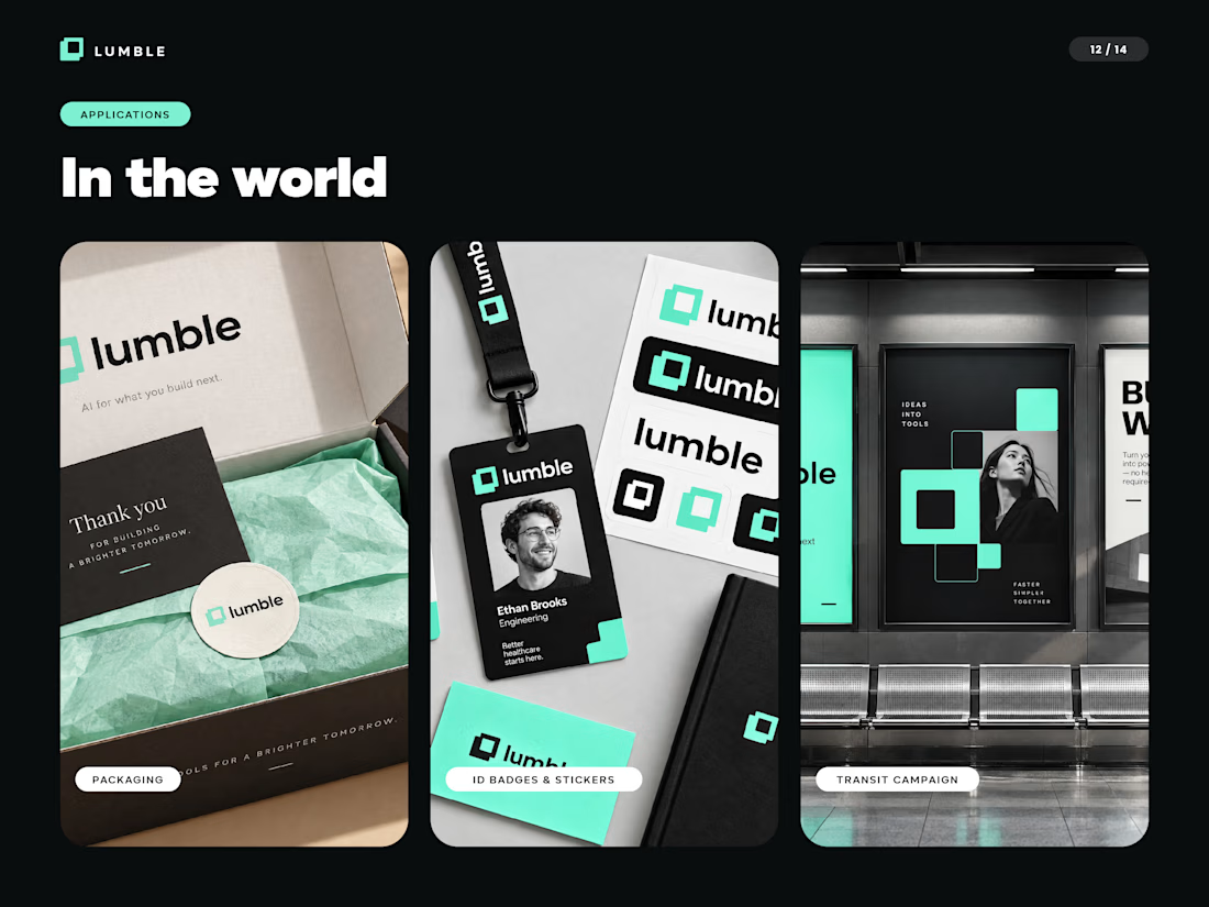
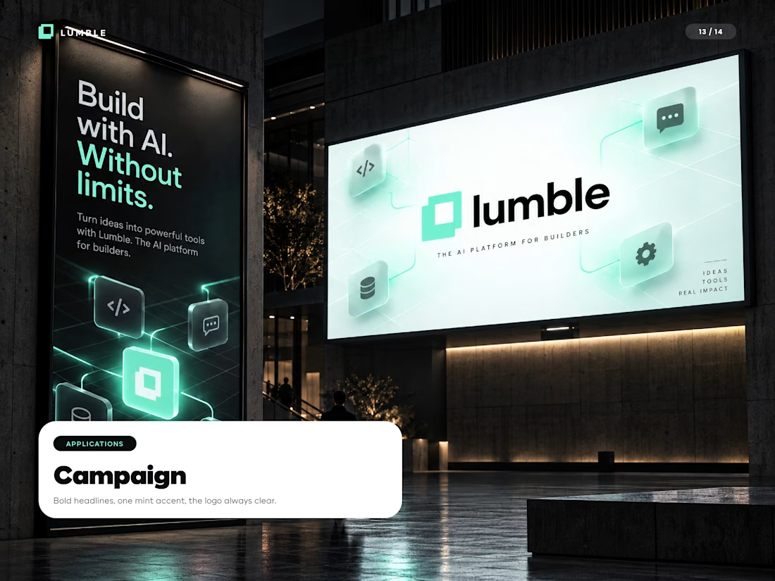
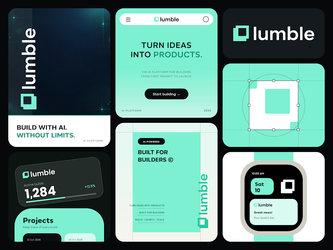
I created the complete brand identity for Lumble, an AI platform for builders: logo, colour system, typography, photography direction, brand guidelines and real-world applications including stationery, packaging, UI and campaign mockups.
Deliverables: logo suite and variations, 14-page brand guidelines, editable Illustrator-ready files (SVG and PDF), social media brand board.
Looking for startup or tech brand identity work? Let's talk. aslam7136@gmail.com

Great job Aslam your work really has a strong identity 🔥🔥

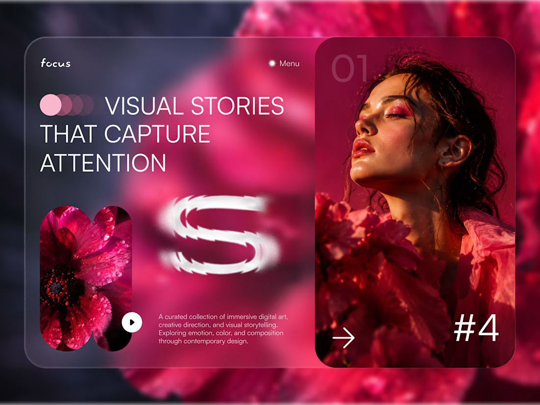
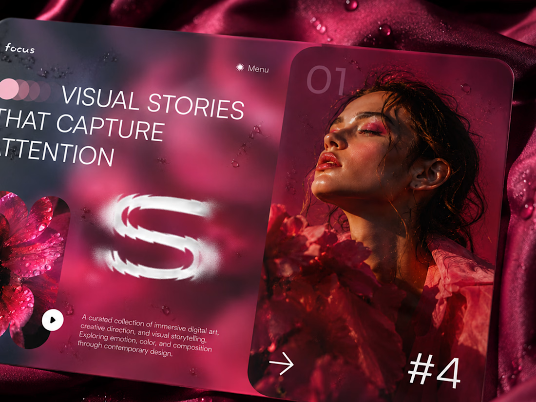
FOCUS — Creative Portfolio & Digital Art Website 🌸✨
A visually expressive website concept for a creative portfolio, built around digital art, bold imagery, and visual storytelling
The design combines vibrant pink tones, soft gradients, experimental typography, and immersive photography to create a distinctive editorial experience
Special attention was given to:
• Bold editorial hero composition
• Vibrant pink and dark color palette
• Experimental typography and visual details
• Immersive photography and digital artwork
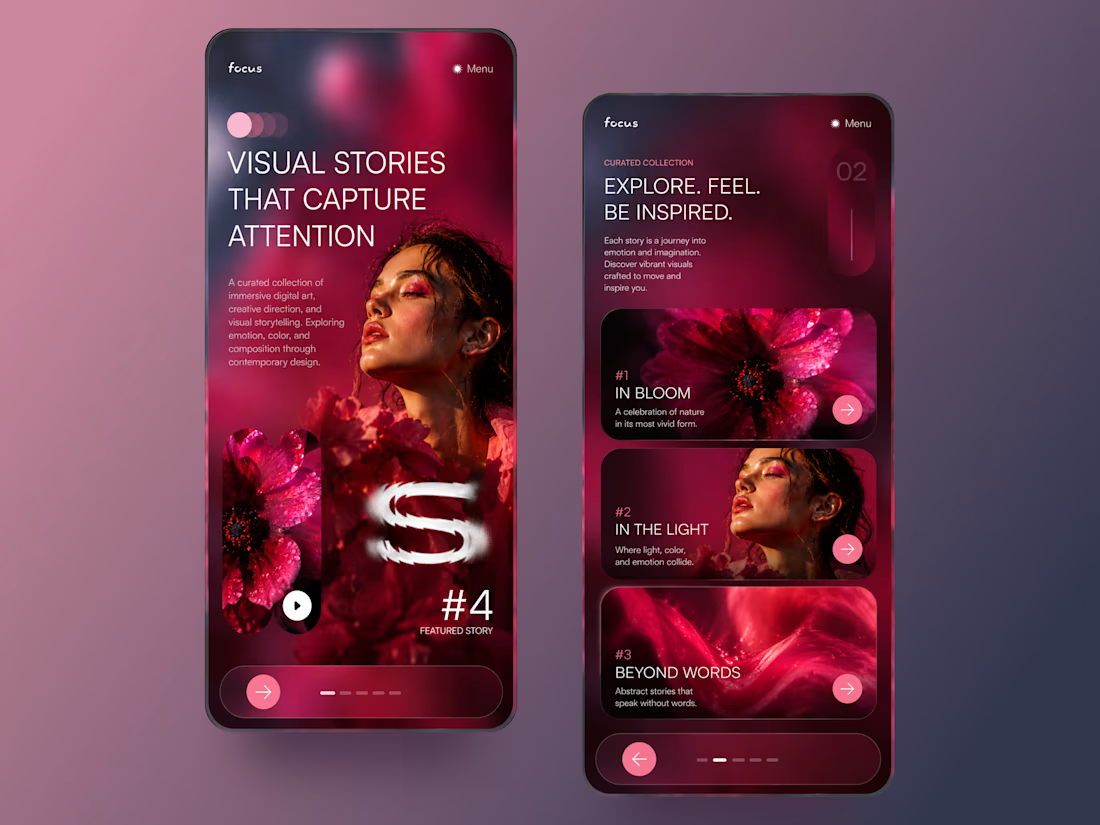
• Creative project gallery and navigation
• Responsive mobile experience
• Clean layouts with a strong visual identity
The result is an expressive digital experience that puts creativity, emotion, and visual storytelling at the center of every screen 💗
Looking to create a standout portfolio or website for a creative brand? Let’s connect 🚀



Option A is absolutely stunning 🔥🔥🔥🔥🔥
Option B it miss something
Great job Leena🎉🎉🎉