The network for creativity
Join 1.25M professional creatives like you
Connect with clients, get discovered, and run your business 100% commission-free
Creatives on Contra have earned over $150M and we are just getting started
Back to feedPost

Miko Beach — Brand Identity
A custom wordmark designed for a luxury beachfront destination in Albania.
The focus was on creating a clean, timeless identity through bespoke typography rather than relying on literal beach imagery—resulting in a versatile mark that works beautifully across signage, uniforms, menus, and digital touchpoints.
Feedback is always appreciated. ✌️


The network for creativity
Join 1.25M professional creatives like you
Connect with clients, get discovered, and run your business 100% commission-free
Creatives on Contra have earned over $150M and we are just getting started



Related posts

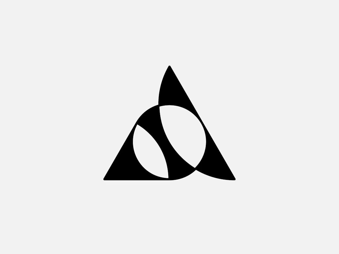
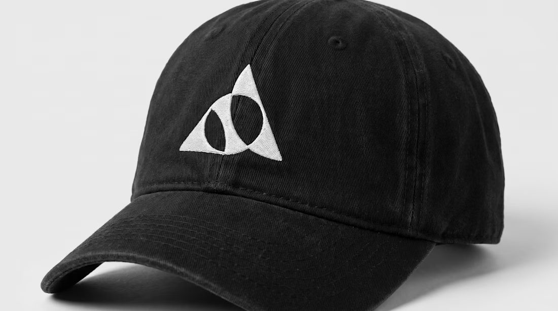
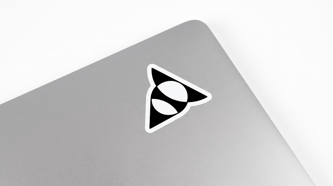
Exclusive premade abstract triangle A logo.
One buyer, full copyright transfer.
A triangle, a circle, and one sweeping curve forming a stylized letter A with two leaf-like shapes in negative space. Built for AI companies, tech startups, fintech platforms, and architecture studios.
Available now: https://brandforma.com/work/abstract-triangle-a-logo-for-sale
Design by Bohdan Harbaruk // Brandforma Studio

TOP!!

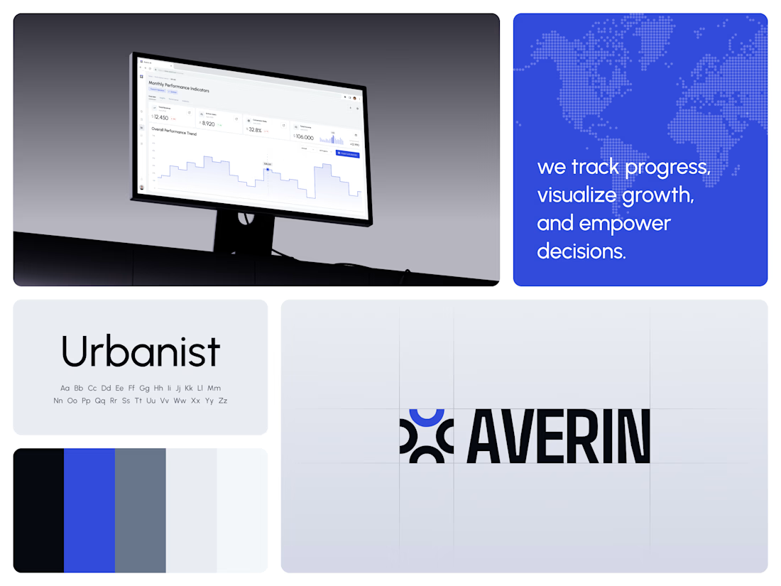
AI Analytics Dashboard
One blue runs from the logo to the chart line.
Revenue, active users, conversion rate and income sit in a row of cards above the trend chart. The cards answer where the numbers stand. The stepped line answers how they got there, holding each period's value until the next, with a tooltip on a dashed guide line for the exact figure.
The identity pairs a four-arc mark with a condensed wordmark, drawn to the same top and bottom lines on the construction grid. The top arc's blue comes back in the slogan tile, the chart line and the main button, so the brand and the product share one accent.
Designed by the Hue & Machine team.
#DashboardDesign #DataVisualization #SaaS #Analytics #AI #WebApp #BrandIdentity #UIDesign #ProductDesign #FigmaDesign



Ovéa — care with character.
One skincare identity across bottles, jars and tubes. I designed the wordmark, pink-and-cobalt packaging system, campaign applications and digital mockups, then brought the collection into motion.
A consistent visual language, with room for each product to feel individual.
View the full case study. Building a skincare brand? Let’s talk about your identity and packaging.

Love the colour direction and the visual language. Everything feels so well thought out. The overall look is beautiful.