The network for creativity
Join 1.25M professional creatives like you
Connect with clients, get discovered, and run your business 100% commission-free
Creatives on Contra have earned over $150M and we are just getting started
Back to feedPost

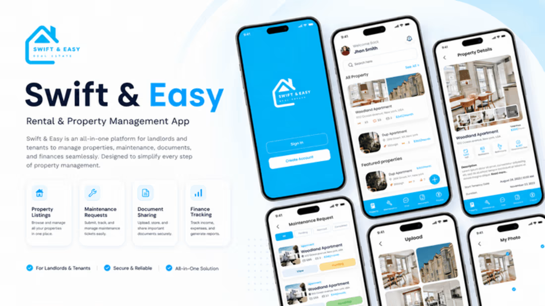
Nexzil Labs designed and delivered Swift and Easy end to end — from discovery and requirements through design, development, testing, and release.
The platform unifies three operational domains: property management, administrative records, and subscription billing. Tenants, landlords, and platform administrators each work in the same system with distinct permission boundaries.
The challenge. A broad feature surface across three parallel tracks, with access control as the critical constraint — the same records surfaced differently depending on role.
Our approach. Discovery and role mapping to settle permissions before build. Requirements translated into structured BRD, SRS, and FRD documentation. Sprint-based delivery with design and engineering working from shared scope. QA and UAT run against defined acceptance criteria, then release and post-launch support.
Delivered. Mobile and web applications, backend and API architecture, admin operations tooling, and full QA coverage.
#PropTech #PropertyManagement #ProductDevelopment #SaaS #MobileApp #SoftwareDevelopment #NexzilLabs

The network for creativity
Join 1.25M professional creatives like you
Connect with clients, get discovered, and run your business 100% commission-free
Creatives on Contra have earned over $150M and we are just getting started




Related posts

What should a beekeeping website explain before asking someone to choose a hive?
For Bee Girl, I designed and built a complete Shopify website around a clear journey: meet the colony, understand what’s inside a nucleus hive, compare the options, and connect with the beekeeper.
Honey yellow, hive black, warm cream, and bold typography bring the same visual language across desktop and mobile layouts.
One design decision that ties it together: the page explains the colony and its five frames before introducing the hive-quantity choices. Education gives the product selection context.
I handled the complete website project for the client through Fiverr, using Shopify. This video walks through the homepage.
Which would you explore first—the hive options, field classes, or the beekeeper’s story?
Explore the full Bee Girl case study: https://contra.com/p/WqNFR67b-bee-girl-shopify-website-design-for-beekeeping
If you’re building a Shopify website for a specialist business, I’m available for website design and development projects.


I'd open the hive options first, but only because the colony section already told me what I'm buying. Explaining the five frames before the quantity choice is a smart order. Teaching before asking someone to choose is so underrated in Shopify stores.

For Ranch University, I designed and built a custom Kajabi website and course platform + community around ranch ownership and life on the land.
Earthy colors, ranch photography, and spacious layouts carry through the site, membership pages, and course presentation. I also handled the course structure and offer setup behind the scenes.


Solar Energy Website
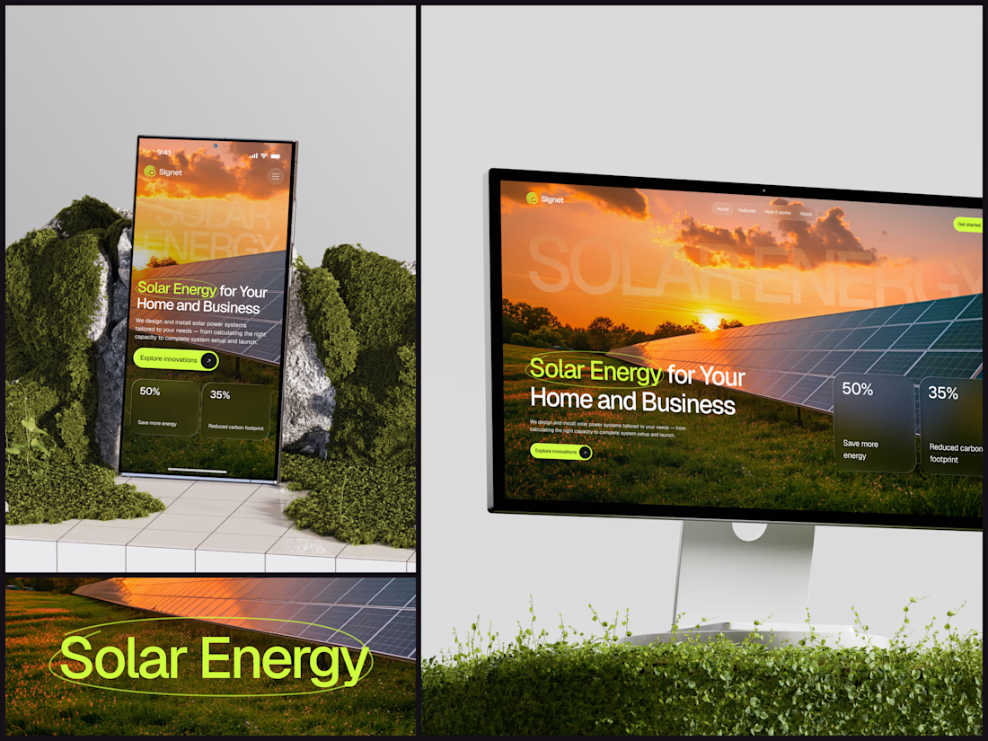
A thin lime circle tells you which two words this page is about.
The headline sits over a sunset photo of a panel field. The "Get started" and "Explore innovations" buttons share the circle's lime, so the eye moves from the circled words straight to the next step.
Large faded capitals repeat those two words across the sky, faint enough to stay inside the photo. On mobile they break onto two lines, and the headline and button stack above two frosted cards.
Only two words of "Solar Energy for Your Home and Business" are lime, and the whole page follows them.
Designed by the Hue & Machine team.
#SolarEnergy #RenewableEnergy #CleanTech #WebDesign #LandingPage #HeroSection #UIDesign #ResponsiveDesign #MobileDesign #FigmaDesign



This is really cool, Nice job Dmytro

