The network for creativity
Join 1.25M professional creatives like you
Connect with clients, get discovered, and run your business 100% commission-free
Creatives on Contra have earned over $150M and we are just getting started
Back to feedPost

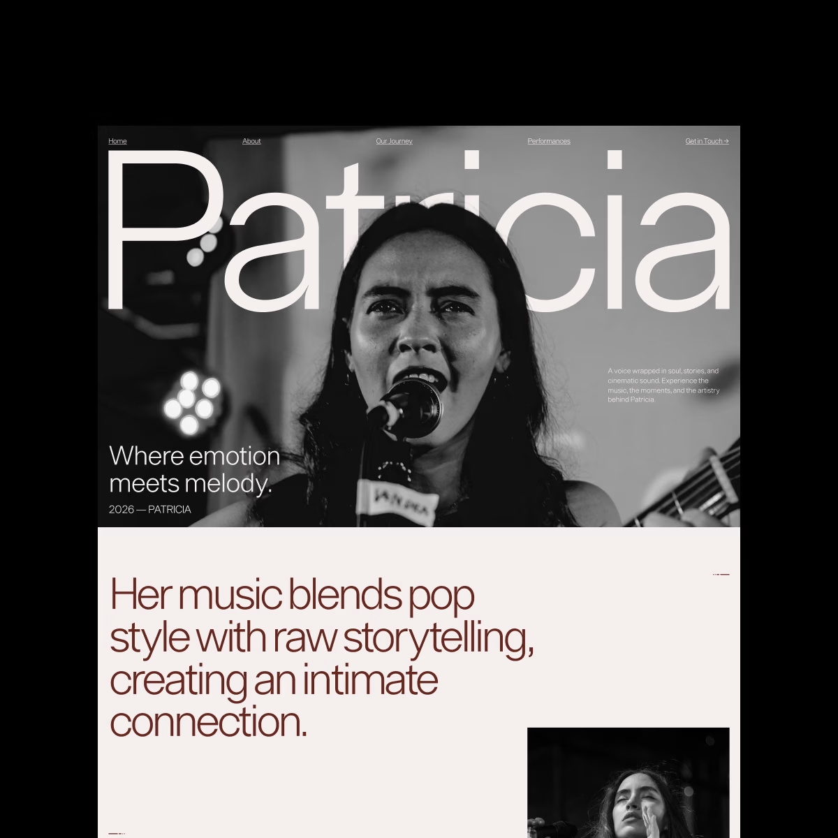
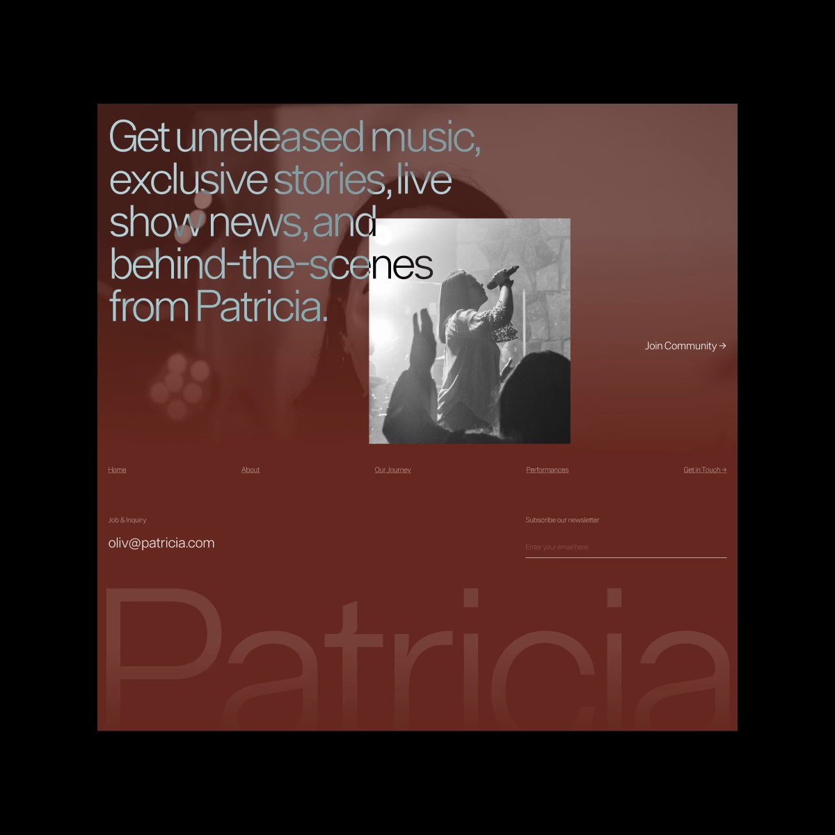
Patricia — Personal Singer Website. Bold, personal, and a little dramatic.
I played with oversized typography, monochrome photography, and an editorial layout to create a space where the artist’s personality feels just as important as the music.

love it!

the editorialll vibes 👊🏻

Love the colors!

Super work

The typography and monochrome imagery work so well together🔥

Oversized type plus monochrome photography is a perfect match for a singer, it lets the personality carry the page instead of decoration. Where emotion meets melody sets the mood instantly. This feels like a real artist site, not a template.
The network for creativity
Join 1.25M professional creatives like you
Connect with clients, get discovered, and run your business 100% commission-free
Creatives on Contra have earned over $150M and we are just getting started




Related posts

What should a creative agency website actually feel like?
For Orvika, we didn't want another agency site built around the same safe layouts and predictable sections.
We pushed the visual direction further with oversized typography, editorial layouts, bold imagery, and stronger contrast, while keeping the experience structured enough to communicate the agency's work and capabilities clearly.
The goal wasn't just to make it look different.
It was to make the agency feel different.
Designed in Figma and built in Framer.
We're sharing more of the websites and digital experiences we've been working on here over the next few weeks.




Very neat man

Built it. It's live: Offseason Ghost
A fictional brand for a travel vlogger who never shows their face — not once, not even by accident. The scroll doesn't just reveal sections, it scrubs the actual hero video: you pull stillness into full-send velocity with your own scroll.
Concept, identity, motion system — all one weekend, all personal.

The word "perfectionist" is just another word I find strange. You can't always be perfect... there is nothing like a perfect body of work.
Your opinion may differ ♡


I perfectly agree with you Bolaji. Sometimes in the bid of trying to make something perfect we remove the life out it.