The network for creativity
Join 1.25M professional creatives like you
Connect with clients, get discovered, and run your business 100% commission-free
Creatives on Contra have earned over $150M and we are just getting started
Back to feedPost

I used to strive for perfection, but recently I’ve realized that trying to make everything perfect just makes me create less.
I spend so much time wondering whether an idea is good enough that sometimes, I end up not making anything at all.
So I keep reminding myself to create first and judge later.
Not everything has to be my best work. Not every idea has to turn out exactly the way I imagined it.
Sometimes, it’s better to make something, learn from it, and move on to the next thing.
So, what will you create next?

Something that helped me with perfection was telling myself, "Create like a kid, refine like a teacher."
Kids don't think. They just create whatever comes to mind. Teachers help us to improve what we made and grow in our skills.
Time to bring the feeling back!

Love this! Great way to think about the process.

This hits close to home, I'll sit on a concept way too long just second guessing it. Might steal "create first, judge later" as a rule for this week. Was there a specific project that snapped you out of the perfectionist loop, or did it build up gradually?

That “create first, judge later” message pairs beautifully with the expressive lettering—warm, imperfect texture that makes the idea feel lived-in rather than polished away.


the yellow type on the flower video is so good

So real. Done is always better than perfect! Love this vibe.

We all do this unfortunately. The number of things I've either not started or stopped creating mid-way because they don't fit into the quality or aesthetic bucket I want them to is actually depressing. My wish for all creatives is to snap out of this need to be perfect early on...


Create first, judge later is the line I needed today. The judging part is where I lose the most time, not the making.

Yesss!! Same here. Ironically that perfectionism makes your work worse and as you said you create less.
One thing I'm trying to do now, is make sure I'm enjoying what I'm creating and actually be creative and make stuff.

Really awesome

"Create first judge later" resonates so much. What’s your trick to keep momentum going when perfectionism creeps back in?

Good Work!

that looks like the portrait of the song
Golden brown

beautiful

“Create first and judge later” is a useful distinction. A small first version also gives you something concrete to get feedback on, instead of trying to solve every possible problem before anyone has seen it.

Always intrigued about creating a typeface animation easily without using after effects. How did you create this btw? 🙌
appreciate it Karina!

Oh wow!

Love this already ❤️

Awesome! 🔥 @Karina
The network for creativity
Join 1.25M professional creatives like you
Connect with clients, get discovered, and run your business 100% commission-free
Creatives on Contra have earned over $150M and we are just getting started









Related posts

New week. New ideas. More room to grow. ✨
One thing I'm learning as a creative is that growth doesn't happen only when you're working on a big project. Sometimes, it's in the small decisions, the things you learn, the ideas you explore, and the courage to keep showing up.
Whether I'm working on architectural visualization, exploring digital design, or learning something new, I want every step to make me better at what I do.
I'm starting this week with an open mind, fresh energy, and a reminder to myself that there's always room to improve.
To everyone building something of their own, keep going. Your progress matters, even when it feels slow. 🤝
What are you working on or hoping to improve this week?
#Design #3DDesign #CreativeProcess


Really like how clearly the idea comes across.

New Exploration 🎉
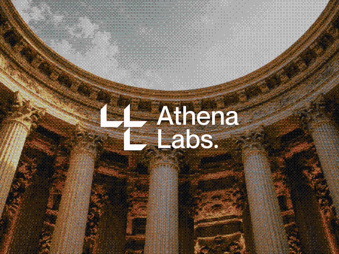
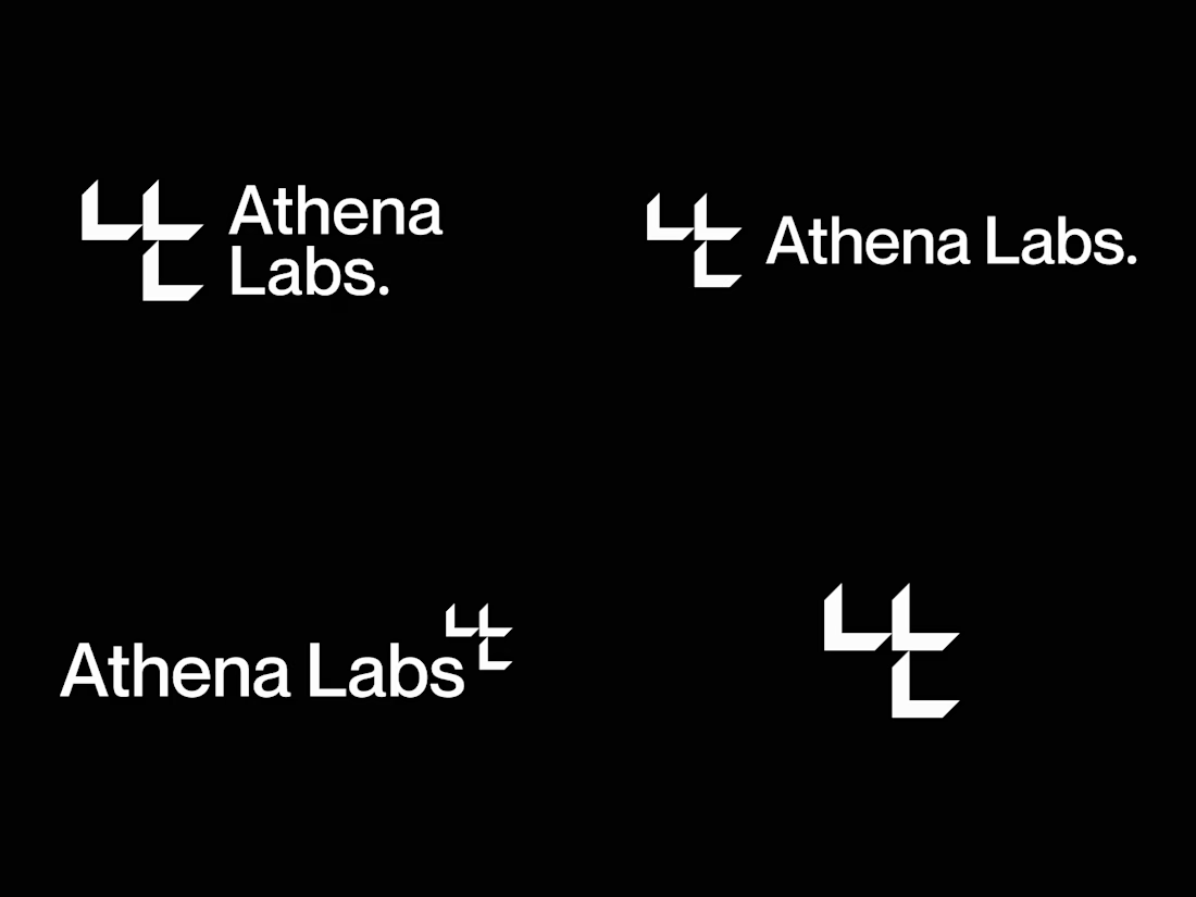
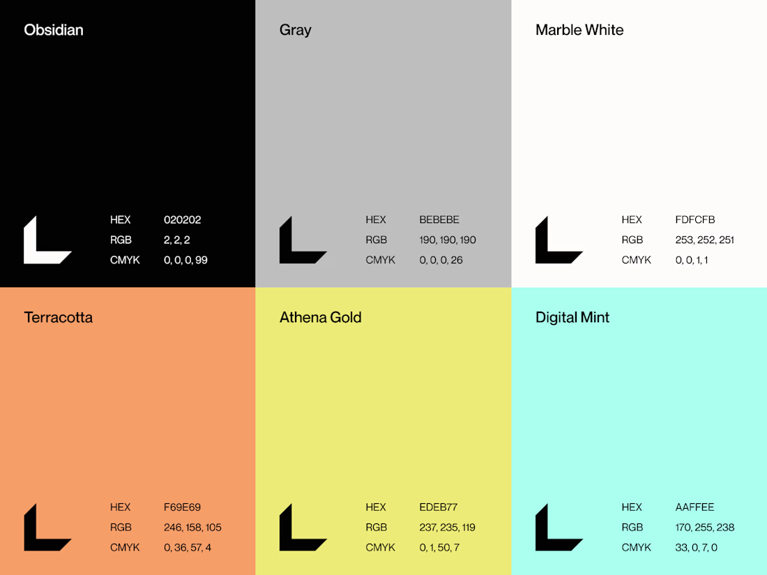
Spatial intelligence for the built world.



The exploration turns nothing but well

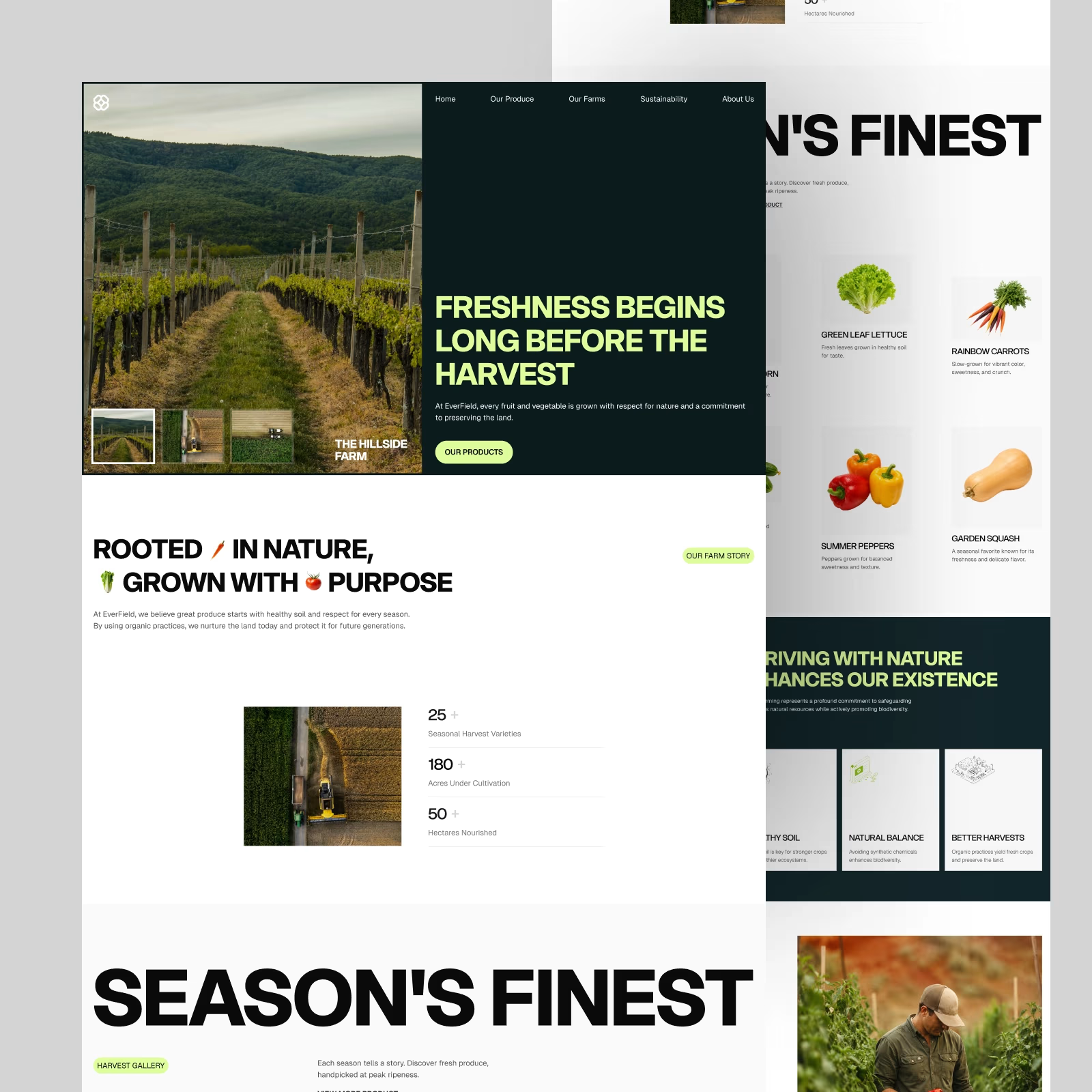
EverField — Farm & Produce Website. One of the favorite hero sections from this exploration.
Big imagery, bold type, and a simple split layout. Does this direction work for an agriculture brand?