The network for creativity
Join 1.25M professional creatives like you
Connect with clients, get discovered, and run your business 100% commission-free
Creatives on Contra have earned over $150M and we are just getting started
Back to feedPost

What should a creative agency website actually feel like?
For Orvika, we didn't want another agency site built around the same safe layouts and predictable sections.
We pushed the visual direction further with oversized typography, editorial layouts, bold imagery, and stronger contrast, while keeping the experience structured enough to communicate the agency's work and capabilities clearly.
The goal wasn't just to make it look different.
It was to make the agency feel different.
Designed in Figma and built in Framer.
We're sharing more of the websites and digital experiences we've been working on here over the next few weeks.




The oversized type does the feeling, and the structured project rows underneath stop it from reading as just a poster. That split is what most agency sites skip.


Love the colors!

The network for creativity
Join 1.25M professional creatives like you
Connect with clients, get discovered, and run your business 100% commission-free
Creatives on Contra have earned over $150M and we are just getting started

Challenges
View all


Related posts

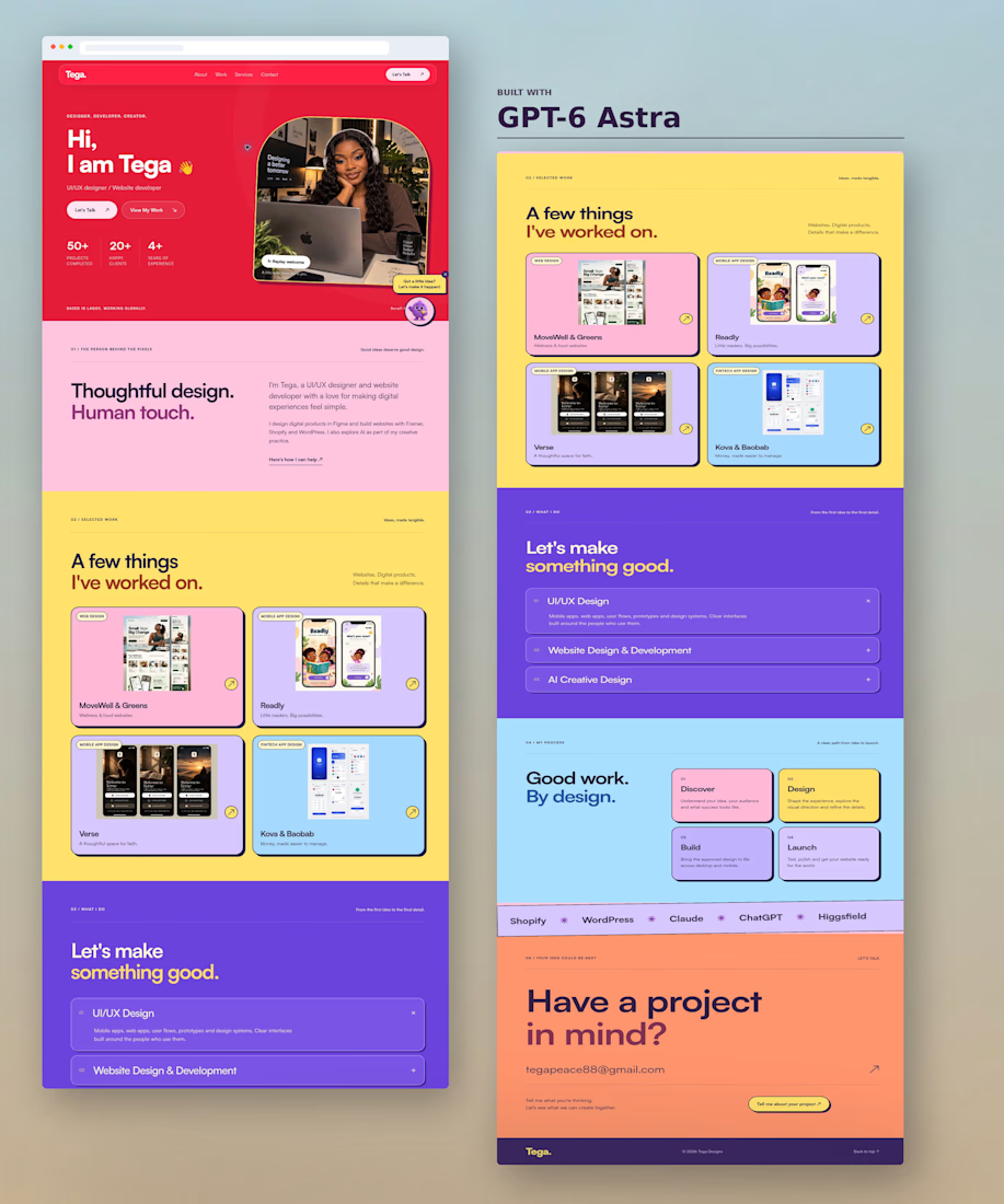
GPT-6 Astra one-shotted my portfolio website 👇
I posted it across my socials and it came with mixed reactions 😂
Now I’m curious what the creative community here on Contra thinks.
What do you think of the design and the Soft Neo-Brutalist style?
Hit or miss? 👀
#gpt6astra #uiuxdesigner #neobrutalism

A hit for me

Someone said FOOTER?
If you need a website that reflects your brand, I got one spot available for September 🙌


Boooom Mattia this is one crazy footer!! 🙌

A SaaS website can explain every feature perfectly and still leave one question unanswered:
Why should I care?
That's why CORESPACE includes Stories.
Instead of only describing what the product does, Stories give those features context — showing how they're used and what they make possible.
Features explain the product.
Stories make it relatable.
The “why should I care?” framing is exactly the right antidote to feature tours. Turning real team stories into the connective tissue between the product and its impact makes the homepage feel human, not just informative.