The network for creativity
Join 1.25M professional creatives like you
Connect with clients, get discovered, and run your business 100% commission-free
Creatives on Contra have earned over $150M and we are just getting started
Back to feedPost

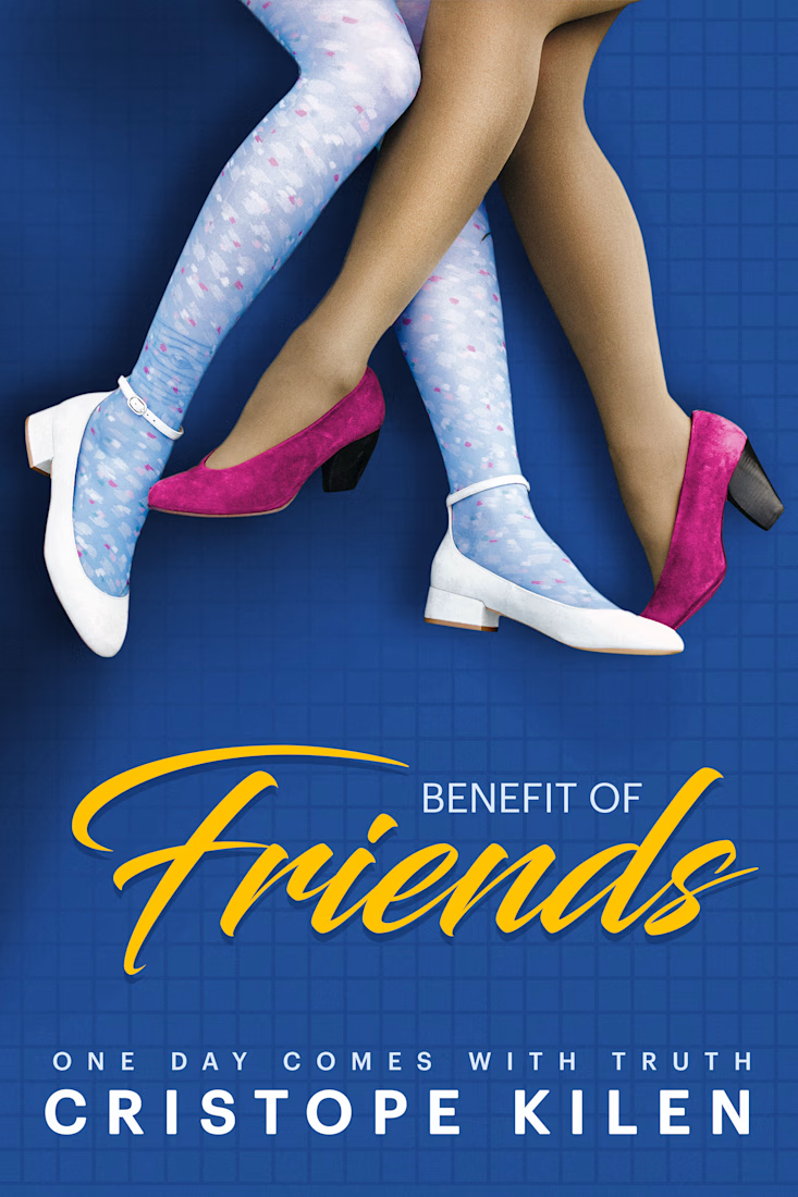
My client needed a cover for Benefit of Friends, a contemporary novel exploring friendship, identity, and the hidden truths that shape relationships. The objective was to create a clean, memorable cover that immediately sparked curiosity while reflecting the emotional contrast between appearance and reality.
The primary challenge was communicating the story’s central theme without relying on character portraits or overly literal imagery. Instead, I developed a conceptual illustration centered on two pairs of crossed legs wearing contrasting shoes and hosiery. This symbolic composition hints at duality, different personalities, and the unexpected connections between the characters, inviting readers to interpret the visual before opening the book.
A vibrant blue background was chosen to create strong shelf presence, while the bold yellow script title adds warmth, energy, and contrast. Careful attention was given to typography, spacing, and visual hierarchy to ensure the cover remains impactful both in print and as a digital thumbnail. The final design delivers a modern, minimalist visual identity that captures the novel’s intrigue while remaining clean, memorable, and commercially appealing.


The network for creativity
Join 1.25M professional creatives like you
Connect with clients, get discovered, and run your business 100% commission-free
Creatives on Contra have earned over $150M and we are just getting started







Related posts

So, what is ROSI?
A few cans.
Five colours.
One very simple fish.
A ridiculously large wordmark.
And hopefully proof that everyday products don’t have to look everyday.

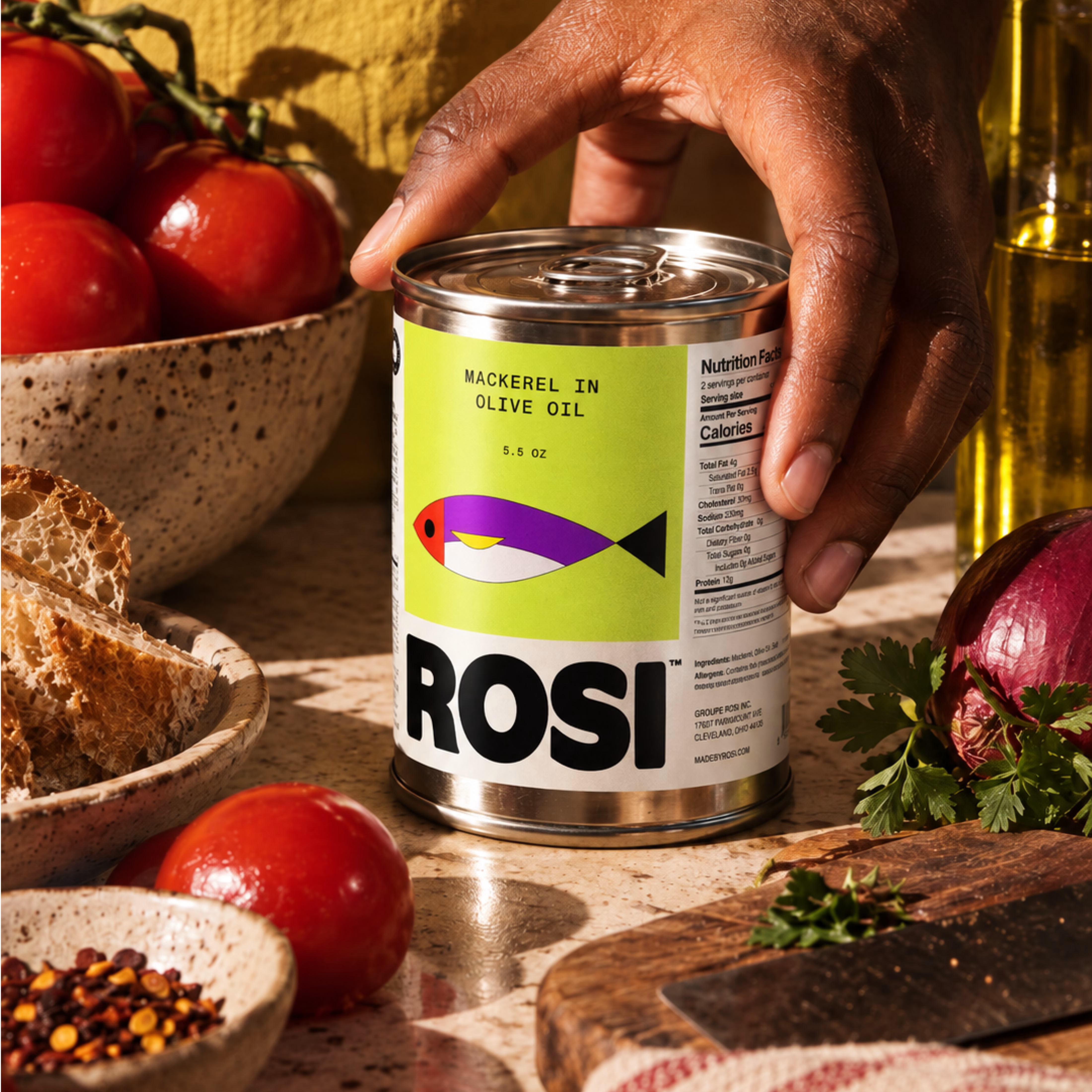
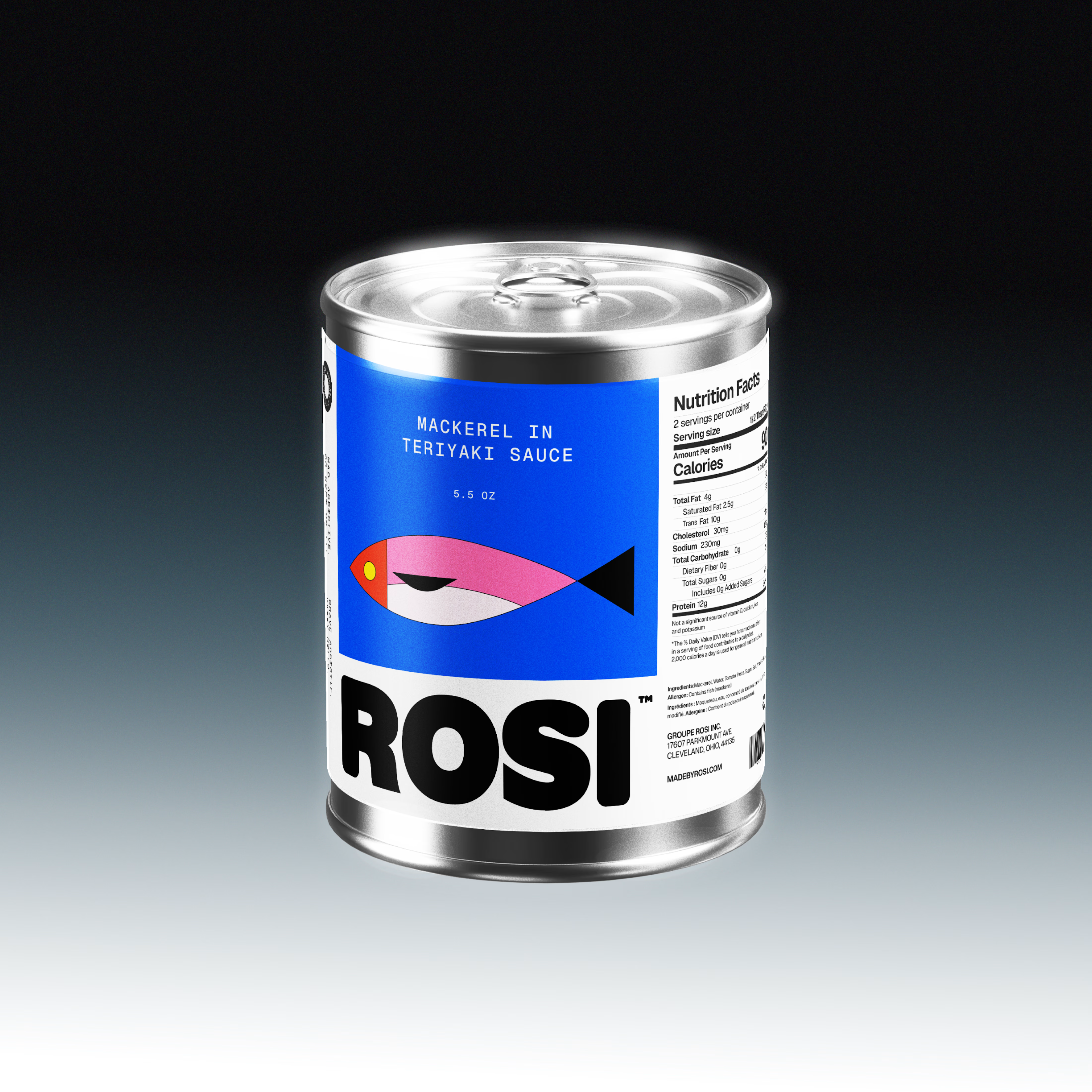
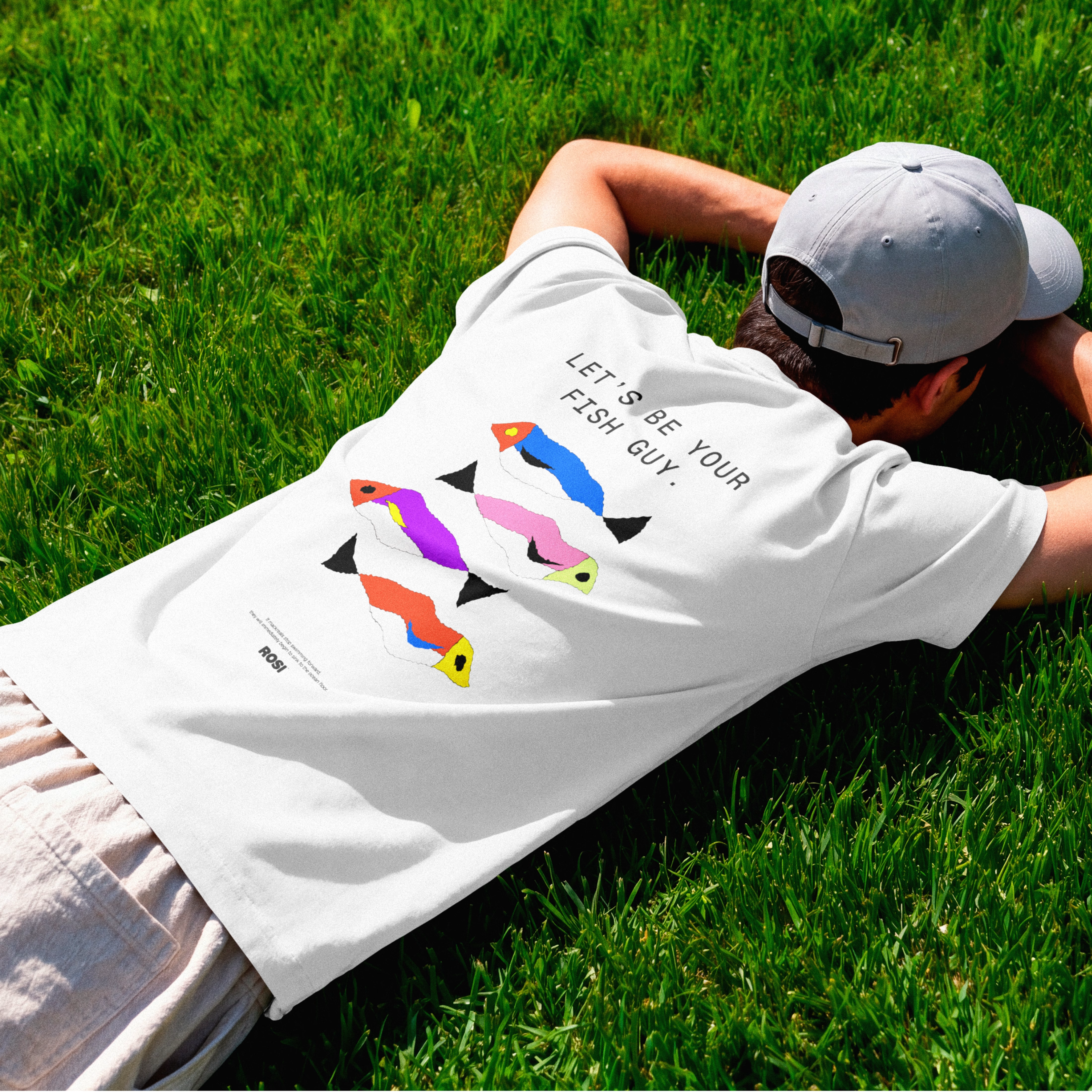

The ridiculously large wordmark is the entire personality, tinned fish has never strutted like this. Proof that confidence is a design decision, not a budget line.

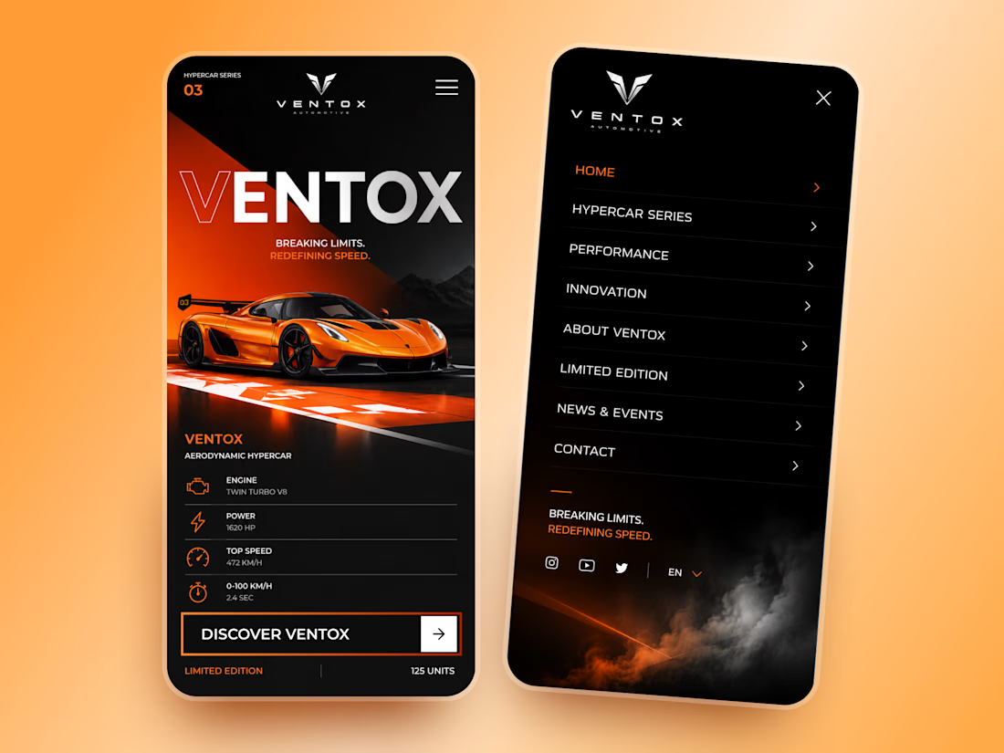
Ventox — Hypercar Landing Page 🏎️🔥
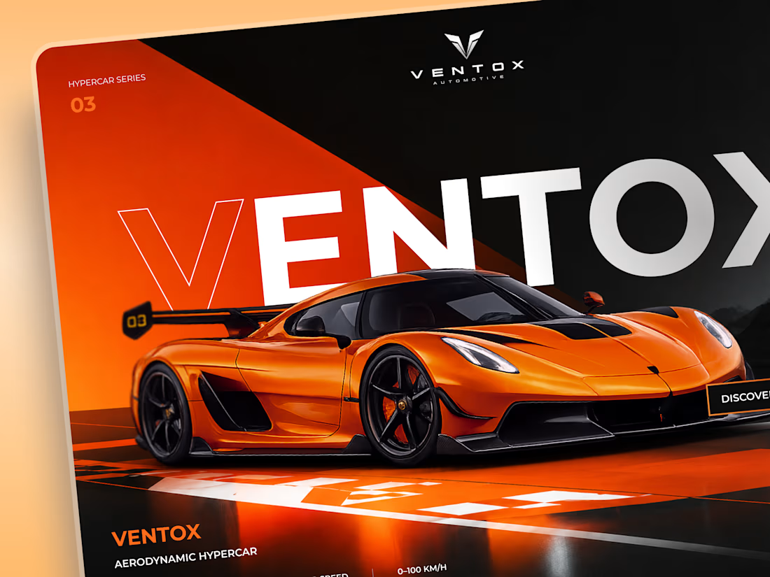
Ventox is a high-performance automotive landing page concept built around speed, exclusivity, and bold visual storytelling.
The design combines a striking orange hypercar, oversized typography, and a dramatic black-and-orange palette to create an immersive digital experience.
Special attention was given to:
A cinematic hero composition that puts the hypercar in the spotlight.
Oversized typography that reinforces the brand's identity.
Sharp geometric shapes and high-contrast colors inspired by speed.
Performance specifications presented in a clean, structured layout.
A prominent CTA that directs attention to the vehicle.
Responsive mobile layouts with simplified content and intuitive navigation.
The result is a bold automotive experience that brings together premium aesthetics, performance-focused storytelling, and clear navigation.
Looking to create a distinctive website for your automotive or luxury brand? Let's build something extraordinary. ⚡


🙌

Is sketching part of your creative workflow or we've forgotten what it feels to be human?
Depending on the projec's scope, I normally like to explore my ideas on paper before I come up with the best solution.
And no, they're not perfect.
They are rough and messy, my goal is so...

It used to be but now i try to create and start digitally as my drawing sucks so i feel like it saves my time somehow!