

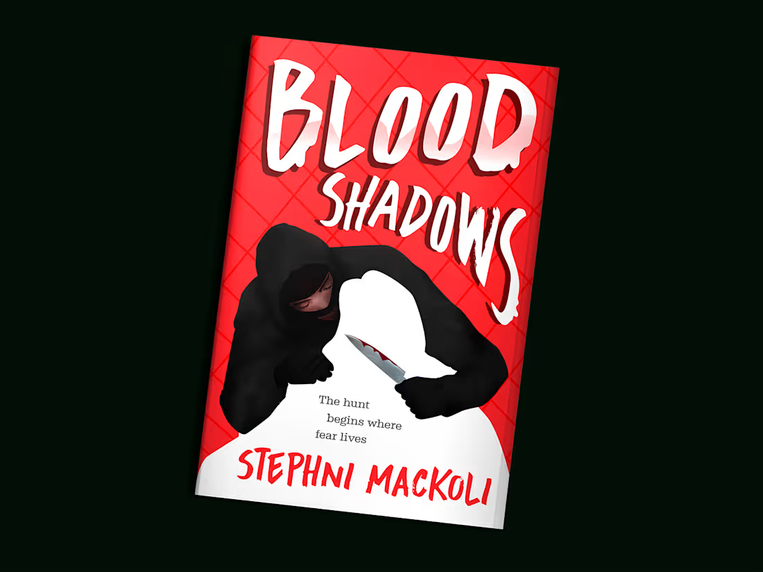
My client needed a cover for Blood Shadows, a horror thriller that would immediately grab readers' attention and communicate suspense, danger, and psychological fear. The goal was to create a bold, minimalist illustration that stood out in crowded online marketplaces while remaining memorable at thumbnail size.
The biggest challenge was building tension using a limited number of visual elements rather than relying on a highly detailed scene. I developed a striking composition centered on the contrast between a dark hooded figure and a white silhouette, allowing the viewer to instantly recognize the threat while leaving enough mystery to spark curiosity. The blood-stained knife acts as the primary storytelling element, hinting at violence without revealing the plot.
A vivid red background was chosen to symbolize danger and create immediate visual impact, while the bold horror-inspired typography reinforces the genre and enhances readability. Every element was carefully balanced to maximize contrast, visual hierarchy, and shelf presence. The final design delivers a clean yet unsettling visual identity that captures the novel's dark atmosphere and invites readers to uncover the mystery hidden within its pages.
0
19
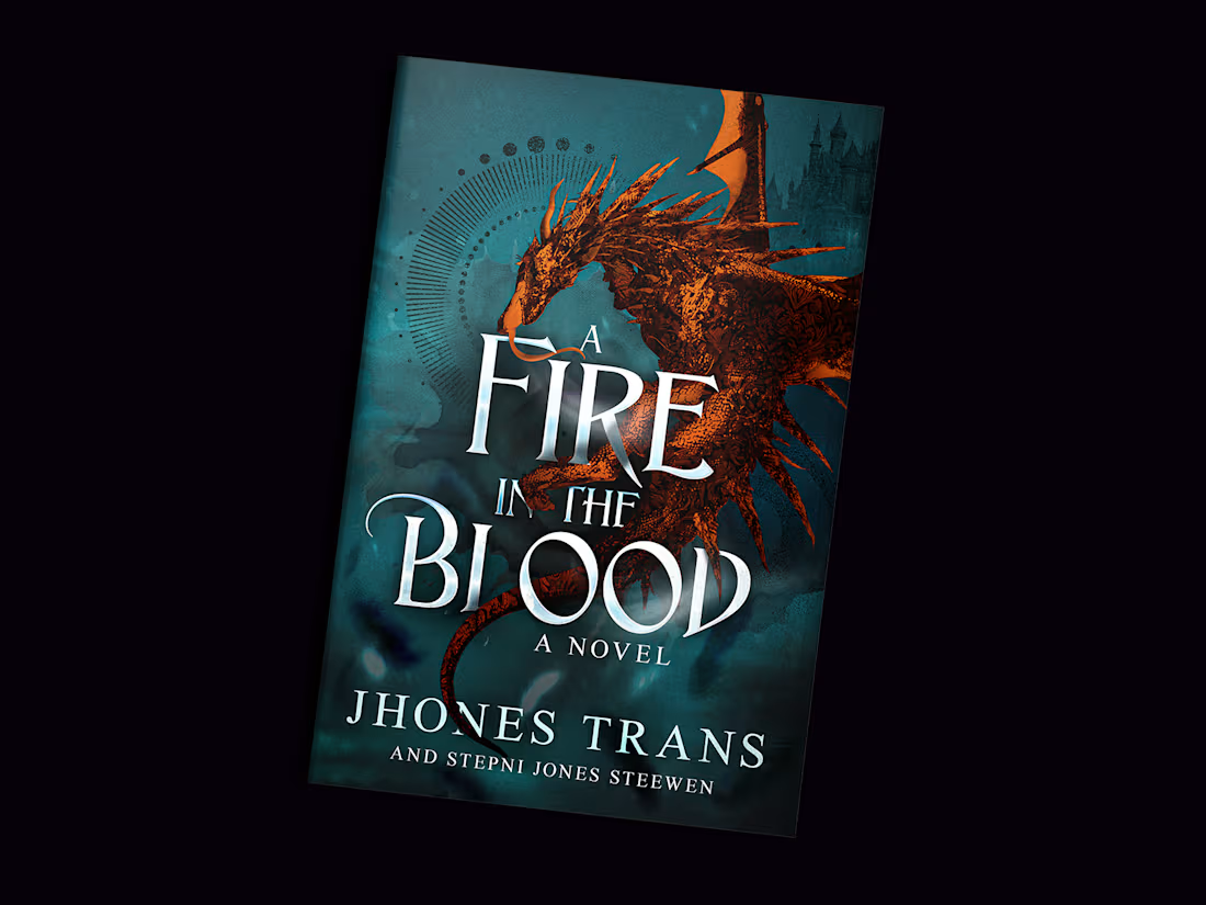
My client needed a cover for A Fire in the Blood, an epic fantasy novel centered around dragons, ancient power, and a richly imagined world. The goal was to create a cinematic cover that immediately communicated the fantasy genre while capturing the novel’s sense of mystery, danger, and adventure.
The main challenge was balancing the dragon as the dominant focal point without overwhelming the typography or other storytelling elements. To achieve this, I carefully composed the illustration so the dragon naturally wrapped around the title, allowing both the artwork and typography to complement one another. Subtle architectural silhouettes, mystical symbols, and atmospheric effects were incorporated to expand the world beyond the central figure and hint at the larger narrative.
A dramatic teal and ember-orange color palette was chosen to create strong visual contrast, symbolizing the clash between magic and fire while ensuring the cover stood out in crowded online marketplaces. Layered textures, cinematic lighting, and carefully crafted typography were used to create depth and readability at every size. The final design delivers a bold visual identity that immerses readers in the novel’s fantasy world while remaining highly effective for both print and digital publication.
0
18
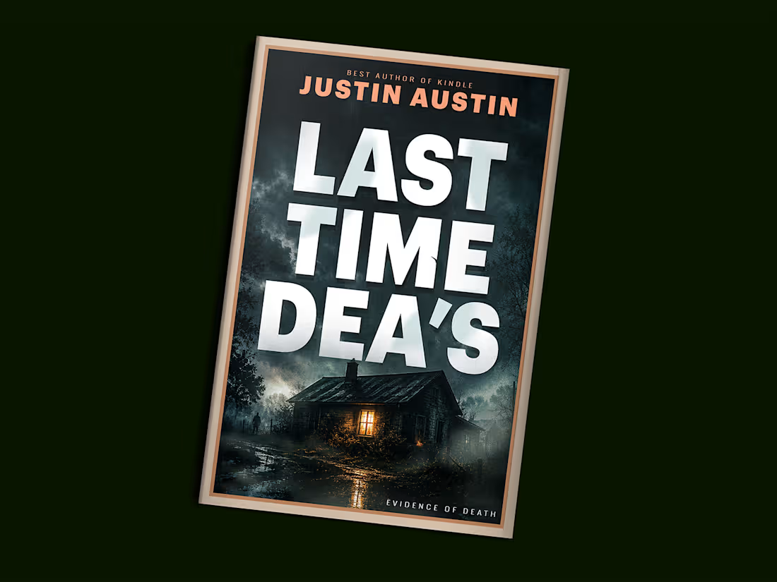
My client needed a cover for Last Time Dea’s, a psychological thriller designed to capture readers' attention within seconds. The goal was to create a bold, suspenseful cover that immediately communicated the genre while creating a sense of mystery and danger.
The biggest challenge was balancing a clean, marketable design with enough visual tension to intrigue potential readers. Rather than overcrowding the composition, I focused on strong visual hierarchy by making the title the dominant element, ensuring maximum readability at both full size and thumbnail scale. The abandoned house, stormy sky, glowing window, and distant silhouette were carefully arranged to suggest isolation, hidden secrets, and an unfolding mystery without revealing too much of the story.
A dark cinematic color palette, dramatic lighting, and atmospheric fog were used to build suspense and draw the viewer's eye toward the illuminated house. Every design decision, from typography to composition, was made to enhance the psychological tension while delivering a commercially competitive cover that stands out across both print and digital marketplaces.
0
32
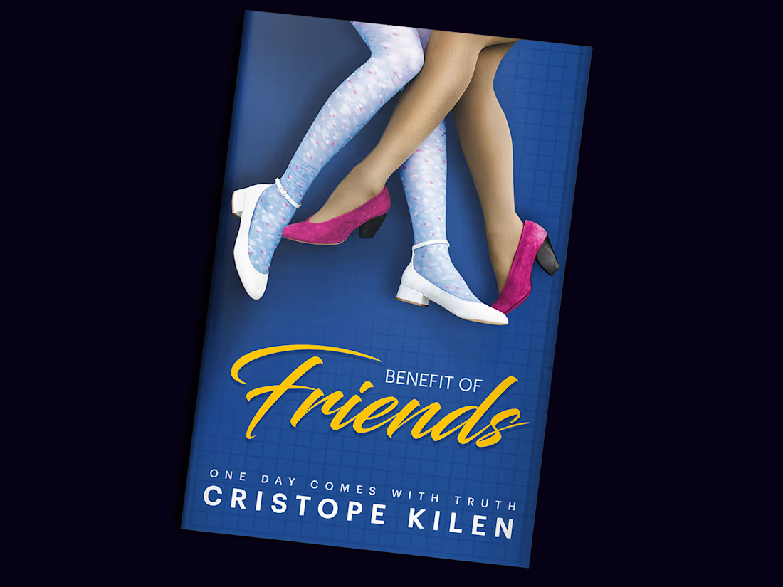
My client needed a cover for Benefit of Friends, a contemporary novel exploring friendship, identity, and the hidden truths that shape relationships. The objective was to create a clean, memorable cover that immediately sparked curiosity while reflecting the emotional contrast between appearance and reality.
The primary challenge was communicating the story’s central theme without relying on character portraits or overly literal imagery. Instead, I developed a conceptual illustration centered on two pairs of crossed legs wearing contrasting shoes and hosiery. This symbolic composition hints at duality, different personalities, and the unexpected connections between the characters, inviting readers to interpret the visual before opening the book.
A vibrant blue background was chosen to create strong shelf presence, while the bold yellow script title adds warmth, energy, and contrast. Careful attention was given to typography, spacing, and visual hierarchy to ensure the cover remains impactful both in print and as a digital thumbnail. The final design delivers a modern, minimalist visual identity that captures the novel’s intrigue while remaining clean, memorable, and commercially appealing.
0
47