The network for creativity
Join 1.25M professional creatives like you
Connect with clients, get discovered, and run your business 100% commission-free
Creatives on Contra have earned over $150M and we are just getting started
Back to feedPost

🙌

Is sketching part of your creative workflow or we've forgotten what it feels to be human?
Depending on the projec's scope, I normally like to explore my ideas on paper before I come up with the best solution.
And no, they're not perfect.
They are rough and messy, my goal is so...

Very nice

Same for me- the human touch is at the basis of every idea.

It used to be but now i try to create and start digitally as my drawing sucks so i feel like it saves my time somehow!

Nice work Bro


Wow it’s perfect
The network for creativity
Join 1.25M professional creatives like you
Connect with clients, get discovered, and run your business 100% commission-free
Creatives on Contra have earned over $150M and we are just getting started

Challenges
View all


Related posts

💯
Is sketching part of your creative workflow or we've forgotten what it feels to be human?
Depending on the projec's scope, I normally like to explore my ideas on paper before I come up with the best solution.
And no, they're not perfect.
They are rough and messy, my goal is so...

💯💥

Is AI finally good enough to shoot a product demo on its own, or human touch is still needed?
I generated a 20s product demo with Seedance 2.5 in a single take providing it with one product image reference and an example video transcript (posted in the comments).
Do you disclose...

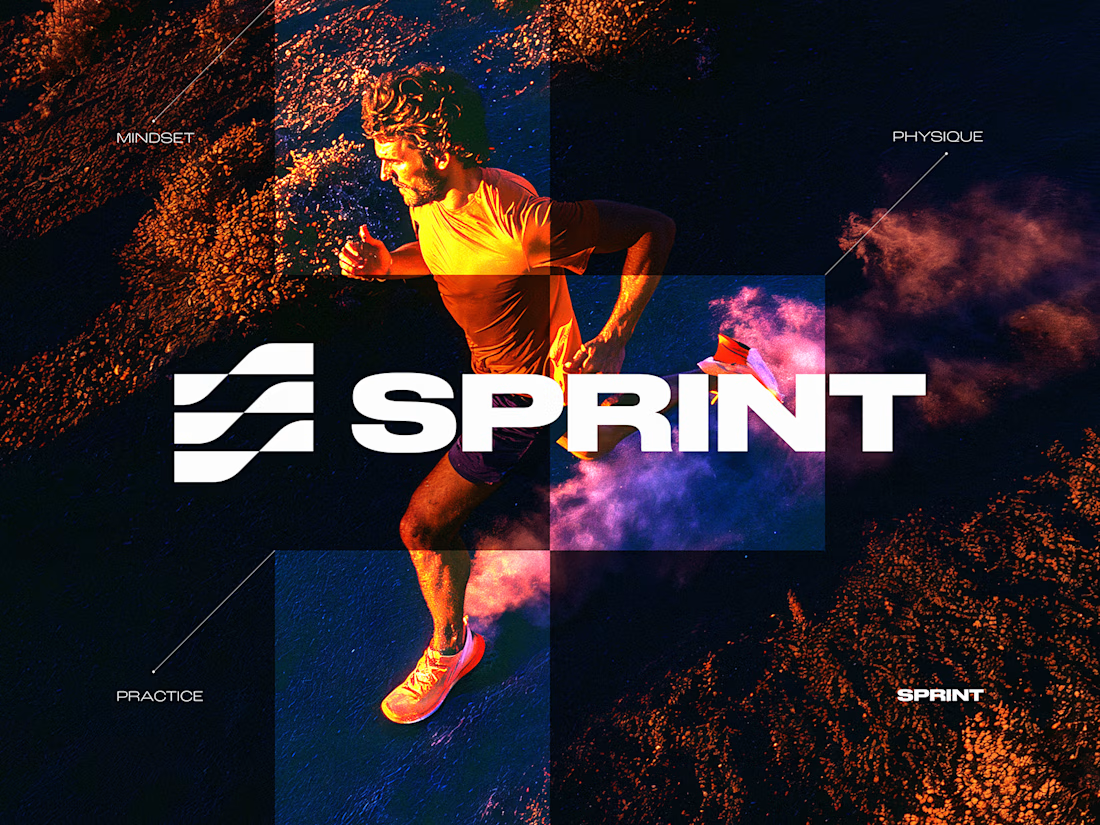
SPRINT — Experimental Brand Visual
A visual experiment built around an unused logo concept from a recent branding project.
The design was created manually, while exploring how AI-driven aesthetics are increasingly influencing contemporary visual language, even when AI itself isn’t part of the design process.
Logo design, art direction and visual exploration.



Good work