The network for creativity
Join 1.25M professional creatives like you
Connect with clients, get discovered, and run your business 100% commission-free
Creatives on Contra have earned over $150M and we are just getting started
Back to feedPost
Sthorm Riders · Inside the website
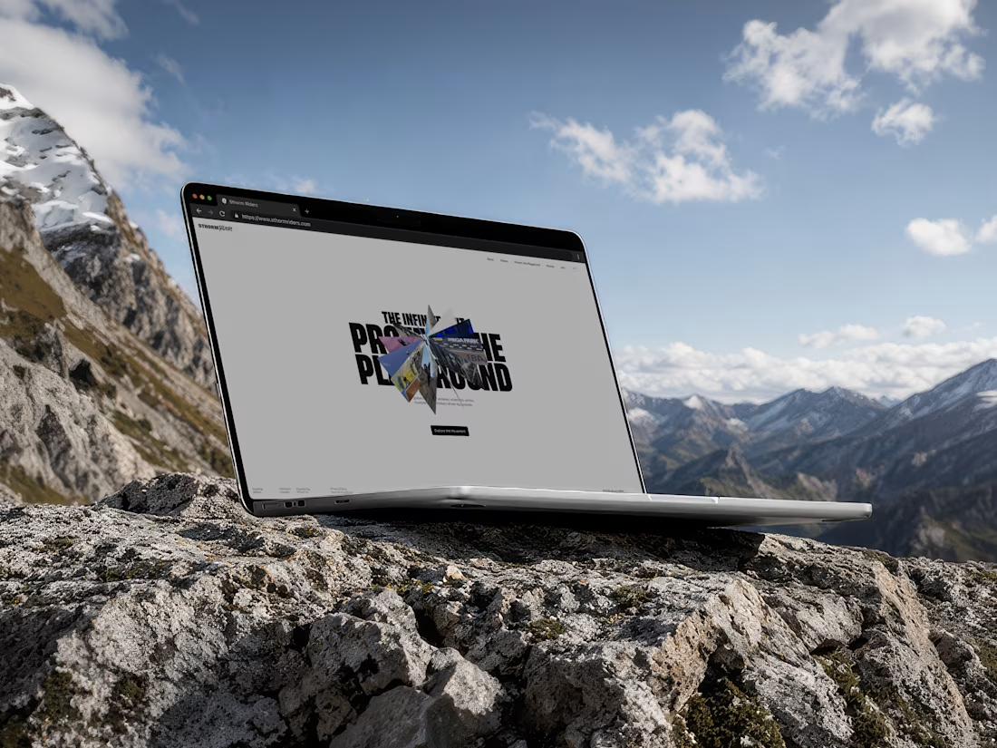
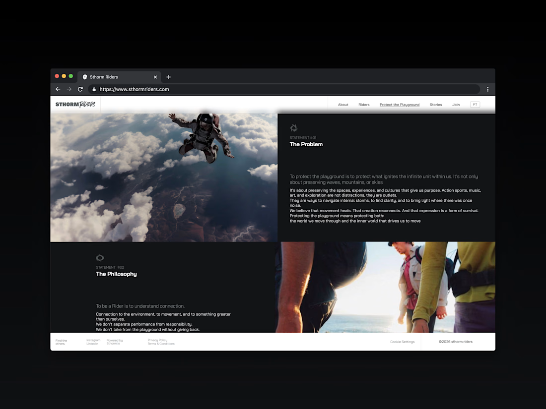
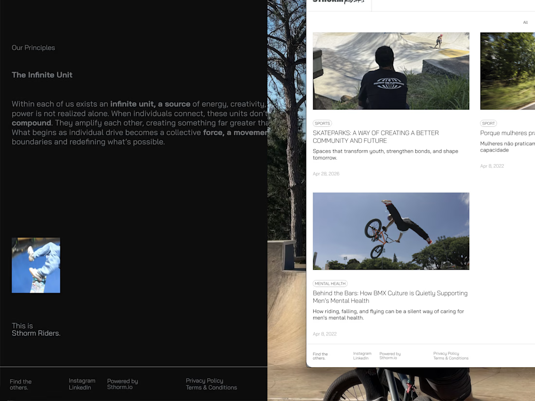
The site is built as a sequence of statements. The Problem, The Philosophy, The Infinite Unit. Each one paired with footage that carries the weight while the type stays quiet and structural.
We wanted the reading to feel like descending into something rather than scrolling past it. Full-bleed imagery on one side, dark space and room to breathe on the other, so no rider or idea has to compete for attention.
Stories closes the loop. Skateparks, mental health, community. Proof that the movement lives outside the site too.



love it!


Thanks!

The structural typography paired with full-bleed imagery builds such a grounded atmosphere. Did you face any challenges balancing the heavy footage loads in Framer?
Thanks Ilya. Yes, that was the tricky part. Short clips, aggressive compression, poster frames, and lazy loading section by section so Framer never has to carry more than one heavy asset at once. Keeping the type structural meant we could let the footage do the work without doubling the load.
The network for creativity
Join 1.25M professional creatives like you
Connect with clients, get discovered, and run your business 100% commission-free
Creatives on Contra have earned over $150M and we are just getting started











Related posts


A Recent Framer-Based Brand Experience for a Real Estate Company


Super clean brand system! 🤌 Love the mint on dark contrast and how the mark works across touchpoints - that ID card mockup is chef's kiss. Great Framer execution for real estate!

The only glow on the Kestra page is the reflective strip on the jacket. It comes from the image itself, so the Framer layers on top stay flat: grey, white and mono text, no glow effects on buttons or headings. That keeps the page easy to edit, because nothing in the UI depends on one lighting setup. If you swap the photo, the glow goes with it. Would you add a glow effect in Framer or keep it in the image?

wow, nothing but top notch

Santa Monica Tile & Stone E-Commerce Design, 2025.
Buying tile online is mostly guesswork, so I designed a concept store where every page answers one buyer question. Shoppable rooms show how it looks, a coverage calculator tells you how much you need, and free samples let you see it first. Deep green, warm gold, and an AI tile scan that turns inspiration photos into products. Open for e-commerce and web design projects.
Full case study on my Contra Profile

TOP!!


