The network for creativity
Join 1.25M professional creatives like you
Connect with clients, get discovered, and run your business 100% commission-free
Creatives on Contra have earned over $150M and we are just getting started
Back to feedPost
Taste Test


the dark and light screens both look good


Upgoating the darl theme

which one do you prefer most here?

light theme is great for this concept.🙌

Why choose? Have you considered keeping both and giving users a toggle switch based on system preferences or lighting conditions?


Dark


The dark goes well for the project.

light feels more natural!

Whenever someone asks me if I prefer dark or light, I'll always say dark! But it's really just a matter of taste :)

Dark


Dark always

Dark🔥

Dark looks way better

Dark Mode


dark for me.. the place photos carry more on that background

Always a sucker for a well-executed dark mode. The color balance here feels modern, focused, and very premium.

Congratulations 🎉

I like dark mostly I use also ...


Dark

Dark all the way. The contrast in your UI makes the content pop without competing with it. Light modes always feel a bit busy to me.


Dark

❤️❤️❤️


Dark


I think giving both options to user. Let the user decide what mode they like the most!

Light looks cleaner
The network for creativity
Join 1.25M professional creatives like you
Connect with clients, get discovered, and run your business 100% commission-free
Creatives on Contra have earned over $150M and we are just getting started



Related posts


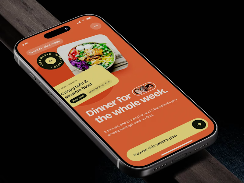
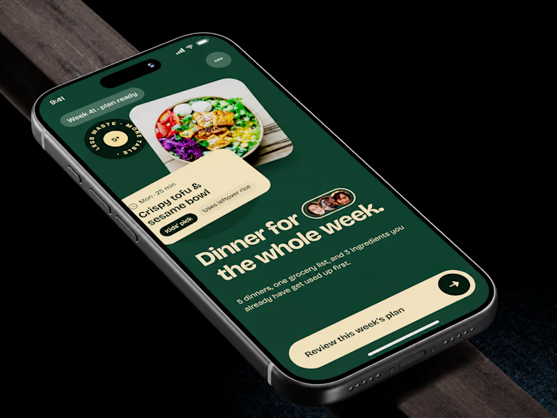
🧪 TASTY TEST: WHICH ONE MAKES NEXT WEEK FEEL SORTED?
Meal planner mobile app design. Same UX, two palettes.
🍊 A · Citrus Energy
Orange + buttery yellow. Appetite first.
🌿 B · Forest Calm
Deep green + cream. A calmer weekly ritual.
💡 GROWTH THINKING
Users want dinner handled, not another planning task.
My hypothesis: orange could win the first tap; green could signal less effort. I’d test plan-open rate AND grocery-list completion. More taps mean little if people abandon the next step.
🗳️ A OR B — WHICH WOULD YOU TRUST WITH NEXT WEEK’S DINNERS?
Vote and tell me why.
📩 BUILDING A MOBILE APP? LET’S FIND WHAT’S HOLDING GROWTH BACK.
https://calendly.com/asol_design/demo
#MobileAppDesign #AsolDesign
15 voted
68%
7 voted
32%
22 votes
Closed


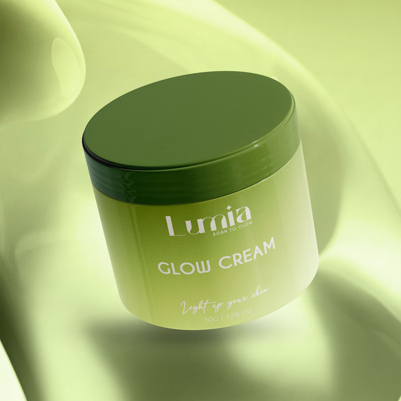
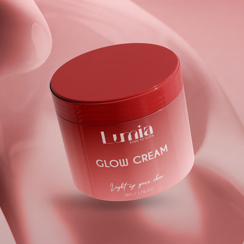
Which packaging color catches your eye first?

6 voted
46%
7 voted
54%
13 votes
Closed

The green version catches my eye first: the dark olive lid gives the lighter jar a clear focal point. I would also test the small white label text at thumbnail size, since the soft lighting reduces its contrast in both versions.

Quick poll for builders & designers here: When you're designing a data-heavy dashboard that people keep open for 6+ hours a day, do you default to Warm Light Mode or Low-Glare Dark Mode first?
4 voted
67%
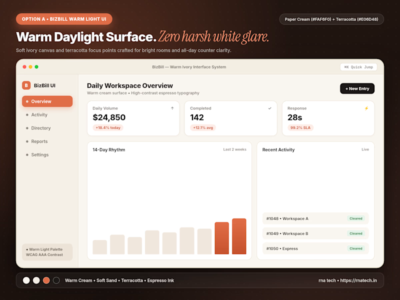
2 voted
33%
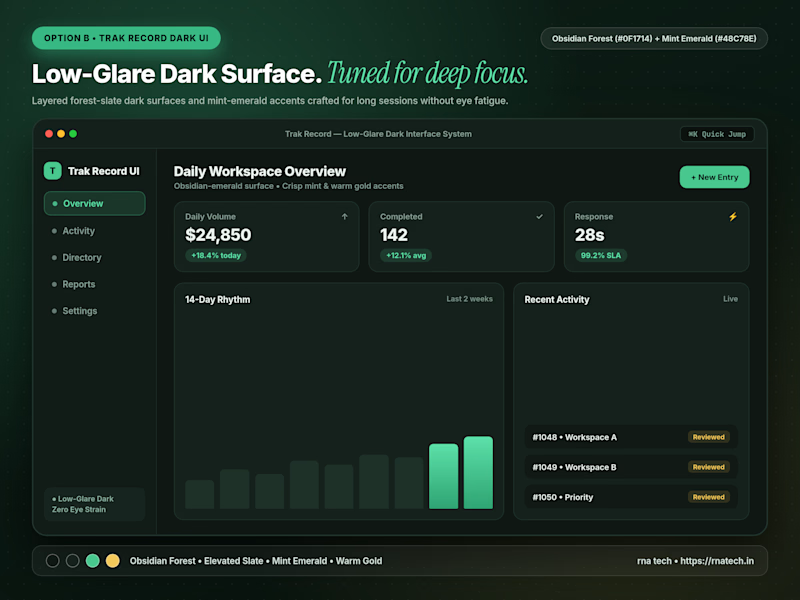
6 votes
Closed

I’d start with warm light mode for a clean, comfortable look, but low-glare dark mode is a great option for long working hours too!