The network for creativity
Join 1.25M professional creatives like you
Connect with clients, get discovered, and run your business 100% commission-free
Creatives on Contra have earned over $150M and we are just getting started
Back to feedPost
Taste Test
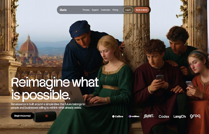
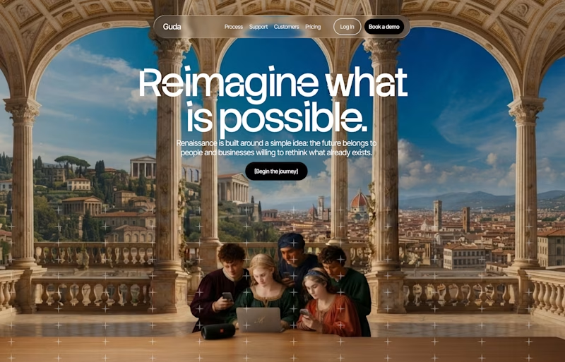
RENAISSANCE Website hero section.
which should I work on? And why? 😊

32 voted
62%
20 voted
38%
52 votes
Closed


I used google labs, Flow AI

B is so crazy 🔥 ..Contrast 💯
Weldone, Paul!
What font did you use? I love it so much
Thanks, font is Stack Sans Notch
Thanks so muc!

B is creatively persuasive
Thanks

I’d go with A. The mix of Renaissance imagery with such a modern layout has more of a “wait, what’s going on here?” effect.
B is a common layout in my opinion and the overall composition looks a bit off to me.
Thank you.
Also I posted a little design poll today 👀 would love to see which direction you’d pick.
ok , i will check

I think i will go with A

Thank you

A 🔥

B's archway does more than recenter the text — it frames the viewer as looking in on the scene, which suits "reimagine" better than A's flatter crop. The alignment choice feels secondary to that framing decision.

I feel like B slightly more zoomed in would be perfect, I love the concept for both though

Nice


Left Aligned

I’ll go with the center aligned because it lets you see the context of the page without having to look further
Thank you.

I originally thought (and voted) for the center-aligned option (B), but I actually think A is the winner.
B appealed to me at first glance because I love the composition of the image, and the overall feel is more editorial, which I usually gravitate toward.
But in A, your eye is...
Thank you.

I would use A image in B but leave the center alignment. The nav bar is also better in B.

I like the one on the right because it doesn't look generic.


This design is so cool! Contralabs vibe.

Left aligned won by a decent margin and I get why, that Florence rooftop shot has more depth with the group looking outward, the center version reads a bit more like a stock travel ad.

A is Ok

This is a classic work. Great job👍
The network for creativity
Join 1.25M professional creatives like you
Connect with clients, get discovered, and run your business 100% commission-free
Creatives on Contra have earned over $150M and we are just getting started











Related posts

15 seconds of smooth UI, editorial layouts, and micro-interactions.
Kept the micro-interactions snappy, typography expressive, and transitions buttery smooth.
Rate this UI animation from 1 to 10 in the comments, or tell me what you’d improve! 😉


Solid 10/10 bro! 🔥 Micro-interactions are super snappy and transitions are buttery smooth indeed. Editorial layout game is strong. Keep it up!

Here we go, check the full case study, I think you will love it! 🎃


Love this! 🎃 The pumpkin concept for Renesia is super creative - perfectly matches the Pumpkin Seed Oil story. Clean work in Illustrator & Figma!


Lovely cohesive work, Alex. The motion is spot on!