
Arval Rizki
UI Designer and Graphic Designer


Hello everyone! I just created a 3D pop-up card component in Framer. You can try it out—just click the link below 👇🏻👇🏻
Link Product
(https://www.framer.com/community/marketplace/components/3d-pop-out-card/)Link Preview
(https://mycomponent.framer.website/)Key Features:
• 3D Pop-Out Effect: Layered cutout objects jump, scale, and rotate on hover with smooth spring physics.
• Cursor Tracking Spotlight: Dynamic radial glow follows the cursor seamlessly across the card.
• Reactive Glow Border: The border automatically lights up nearest to your mouse position using the same glow color.
• Complete Customization: Easily adjust images, typography, padding (all vs. per-side), border styles, shadows, and spring dynamics.
• 60+ FPS Performance: Powered by Framer Motion for buttery-smooth animations with zero layout shift.
2
2
166
Behind the Project
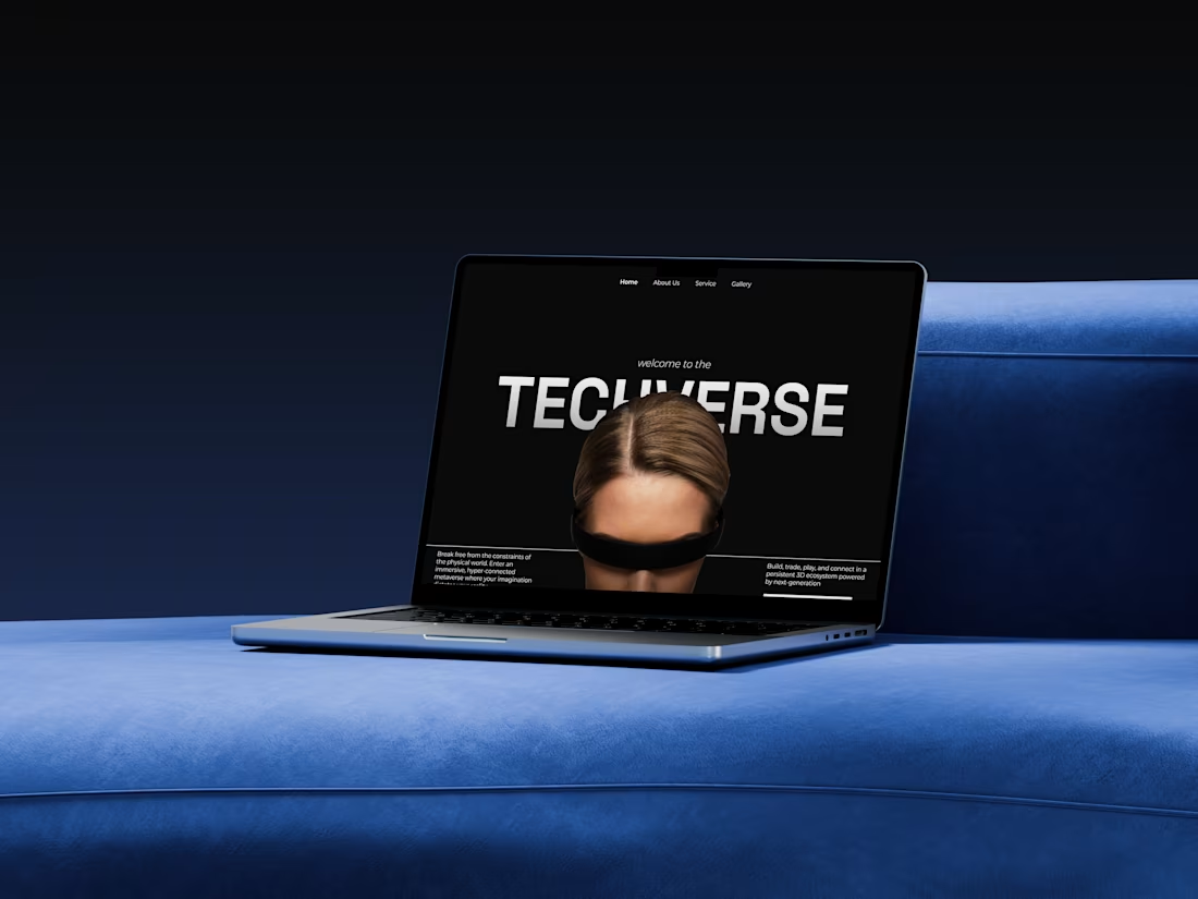
Techverse — Technology Company Landing Page
Techverse is a conceptual landing page for a futuristic technology company exploring the intersection of AI, virtual reality, and digital experiences.
The main goal was to create a website that feels as innovative as the technology it represents, while keeping the experience structured and easy to navigate.
The Challenge
The challenge was finding the balance between a futuristic visual identity and a clear user experience. Instead of creating a typical corporate technology website, I wanted the interface to feel more immersive and experimental.
Design Approach
I built the visual direction around:
Dark, high-contrast interface
Oversized typography
3D futuristic imagery
Geometric compositions
Minimal navigation
Bold visual transitions
The page follows a narrative structure, starting with the Techverse introduction, moving into its genesis and core dimensions, followed by testimonials, visual exploration, and finally the Quantum Leap section.
Visual Storytelling
The hero section immediately introduces the futuristic atmosphere through a 3D character and oversized TECHVERSE typography.
Throughout the page, large imagery and typography are used as visual anchors, while sections such as Visual Matrix and Quantum Leap create moments of contrast and immersion.
The goal was to make users feel like they're entering a digital world, rather than simply visiting a technology company's website.
My Role
UI/UX Design · Visual Design · Art Direction · Landing Page Design
Tools: Figma · Framer
Outcome
The final result is a bold, immersive landing page that combines futuristic aesthetics with structured UX, creating a digital experience that communicates innovation, experimentation, and the future of technology.
0
102
Archon — Architecture Studio Landing Page
Designing a bold digital identity for an architecture studio
Archon is a conceptual landing page for a contemporary architecture studio focused on creating spaces that balance light, time, form, and human experience.
The goal was to create a website that feels like an extension of the studio's architectural philosophy—not just a portfolio filled with project images.
The Challenge
Architecture portfolios often depend heavily on photography.
While strong imagery can communicate the quality of a project, I wanted to create an experience where the layout, typography, imagery, and interactions work together as part of the storytelling.
The main challenge was balancing three things:
Visual impact
The website needed to immediately communicate the studio's creative character.
Clarity
Visitors should quickly understand the studio's disciplines and capabilities.
Storytelling
The portfolio shouldn't feel like a simple gallery. It should guide visitors through the studio's philosophy and work.
The Design Direction
I approached the website like designing a physical architectural space.
Each section has a specific purpose and acts as a transition to the next part of the story.
The visual language combines:
Editorial typography
Architectural photography
Strong geometric compositions
Generous whitespace
Minimal navigation
Muted architectural imagery
The result is a visual identity that feels contemporary, editorial, and architectural without becoming overly corporate.
Building the Experience
01 Establishing the Identity
The hero section immediately introduces Archon through oversized typography layered over an architectural photograph.
Instead of using a traditional hero layout with a large headline and CTA, I treated the brand name almost like an architectural element.
The typography becomes part of the composition.
02 Introducing the Philosophy
The next section introduces the idea behind the studio:
Shaping Light, Time, and Form
A large cityscape image establishes the studio's relationship with the built environment, while supporting copy explains its approach to architecture.
The goal was to make the introduction feel more like an editorial spread than a typical agency website.
03 Architectural Disciplines
The services section translates the studio's capabilities into three visual categories:
Residential Architecture
Commercial Architecture
Landscape Design
Rather than presenting services as a conventional text list, each discipline is paired with its own architectural imagery.
This makes the information easier to scan while keeping the visual storytelling intact.
04 Creating Human Connection
The Alliance section introduces testimonials through an experimental visual composition.
Large architectural forms become the background while testimonials float above them.
This section breaks the rhythm of the previous content and creates a more immersive moment in the experience.
05 Letting the Work Speak
The portfolio section intentionally uses large-scale imagery.
Instead of placing multiple small project cards on screen, the design gives each architectural image enough space to communicate its material, geometry, light, and atmosphere.
The photography becomes the primary content.
06 The Final Invitation
The final CTA uses a full-width architectural photograph with a simple message:
Let Us Build the Future You Inhabit.
The intention was to end the experience with a statement rather than another generic "Contact Us" section.
The CTA feels like a natural continuation of the studio's philosophy.
Visual System
Typography
Large display typography creates hierarchy and gives the website an editorial character.
The oversized Archon wordmark in the hero acts almost like a physical structure within the composition.
Color
The primary interface stays minimal and neutral, allowing architectural photography to dominate.
Cyan and orange are introduced selectively to create contrast and give the visual identity a more contemporary character.
Imagery
Architectural photography is treated as a core design element rather than decoration.
Images are selected based on:
Geometry → Light → Material → Composition
The User Journey
The page follows a simple narrative:
Identity
↓
Studio Philosophy
↓
Disciplines
↓
Social Proof
↓
Portfolio
↓
Call to Action
This creates a natural progression from "Who are they?" to "What do they do?", then finally to "Let's work together."
0
92
Behind the Project
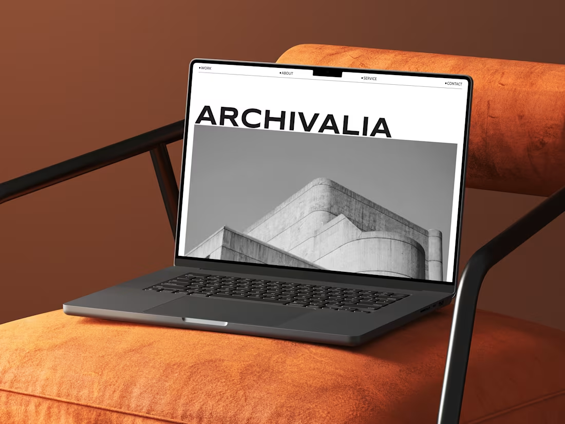
Archivalia — Architecture Studio Landing Page
Overview
Archivalia is a conceptual landing page designed for a modern architecture studio that believes architecture is more than constructing buildings—it's about creating timeless experiences.
The goal of this project wasn't simply to design another portfolio website. Instead, I wanted to create a digital experience that reflects the same principles architects use when designing physical spaces: clarity, balance, structure, and intentionality.
Every section is treated like a room in a building, guiding visitors naturally through the studio's story.
The Challenge
Many architecture websites rely heavily on beautiful imagery but often struggle with visual hierarchy and storytelling.
I noticed three common issues:
Projects feel disconnected from the studio's identity.
Excessive animations distract from the work.
Visitors don't clearly understand what makes the studio unique.
The challenge was creating a landing page where the architecture itself becomes the hero, while still providing a memorable browsing experience.
Design Approach
Instead of designing around UI trends, I borrowed inspiration from architectural principles.
Editorial Layout
The layout uses generous white space, strong alignment, and asymmetric composition inspired by architectural magazines.
Rather than overwhelming users with content, every section has room to breathe.
Monochrome Visual Language
Architecture is already visually rich.
Using a monochrome palette allows textures, geometry, and lighting to become the primary visual elements while introducing red only as an accent for emphasis and calls-to-action.
This creates a timeless aesthetic that doesn't compete with the projects themselves.
Typography as Architecture
The oversized headlines act like structural elements.
Large typography creates rhythm throughout the page while reinforcing confidence and professionalism.
Instead of decorative graphics, typography becomes part of the visual composition.
Storytelling Through Scrolling
The scrolling experience follows a deliberate narrative:
Introduction → establish the studio identity.
About → communicate philosophy and design values.
Services → explain expertise without overwhelming details.
Testimonials → build credibility through social proof.
Featured Projects → let the work speak for itself.
Final CTA → encourage visitors to start a conversation.
The page feels less like browsing a website and more like walking through an architectural exhibition.
Design Decisions
Hero Section
A full-width architectural photograph immediately establishes scale and atmosphere.
The oversized logo reinforces confidence while maintaining minimalism.
About Section
Instead of a lengthy introduction, the content is concise and supported by subtle oversized background typography, reinforcing brand identity without creating visual clutter.
Services
Services are presented in a clean editorial list.
The highlighted item naturally draws attention while preserving a minimalist aesthetic.
Featured Projects
The project gallery intentionally avoids rigid symmetry.
Different image sizes mimic the feeling of browsing an architecture magazine, creating visual rhythm while showcasing diverse projects.
Final Call-to-Action
Rather than using an aggressive marketing banner, the final section delivers one bold statement:
Let's Create Your Dream Space
This emotional message closes the narrative and encourages consultation naturally.
Design System
Style
Editorial Minimalism
Swiss-inspired Grid
Contemporary Architecture
Color Palette
Black
White
Neutral Gray
Accent Red
Typography
Bold Sans-serif
Oversized Display Headlines
Clean Editorial Body Text
Tools
Figma
What I Learned
This project reinforced an important principle:
Good architecture isn't about adding more elements—it's about removing everything unnecessary until only the essential remains.
The same philosophy applies to digital design.
Every spacing decision, typographic scale, image placement, and interaction was carefully considered to create an experience that feels calm, premium, and intentional.
Rather than chasing visual trends, this project focuses on timeless design principles that communicate trust, professionalism, and craftsmanship.
Outcome
The final landing page successfully balances editorial storytelling, minimalist aesthetics, and clear user flow, resulting in a premium digital presence suitable for architecture firms, interior studios, and creative design agencies seeking to showcase their work with elegance and confidence.
0
108