The network for creativity
Join 1.25M professional creatives like you
Connect with clients, get discovered, and run your business 100% commission-free
Creatives on Contra have earned over $150M and we are just getting started
Back to feedPost
Taste Test


Which homepage would make you more likely to explore the platform?
HackStack features bold typography, teal gradients, and a centered layout focused on AI tools and automation. DataVistaHQ uses purple accents, a split layout, and a prominent dashboard preview to introduce its business intelligence platform.
I would like your perspective on the visual design, clarity, and first impression. Which approach communicates its value more effectively and makes you want to take the next step?
Vote for your preferred design and share what influenced your choice: the colors, headline, layout, dashboard preview, or overall presentation.
#WebDesign #AIWebsites #UIUXDesign #SaaSDesign #TransformedDesign




12 votes
Ends in 4h

DataVistaHQ gets my vote. The dashboard preview does the explaining before a single headline is read, which matters for a data product where trust comes from seeing the tool work. HackStack has the stronger headline, but the centred layout hides the product one scroll too late....
That’s a thoughtful comparison. Showing the product early can build trust, while a strong headline helps earn attention. Testing both click-through engagement and what visitors do after landing would help determine which approach works best.

Agreed. Showing the actual product right away makes the value easier to understand, and the teal headline adds energy. It would be interesting to see whether that combination also keeps visitors engaged after they click through.

Visually, I lean toward DataVistaHQ, but the cognitive load is really high. The value proposition and the stats feel like they're competing for attention.
On the other hand, HackStack has a much better visual hierarchy. The value proposition and CTA group immediately give me a...
Thanks for the thoughtful comparison. I can see how the competing stats and value proposition could make DataVistaHQ feel overwhelming. HackStack’s clearer hierarchy makes the main message and next step easier to understand.

DataVistaHQ looks more like it. The colors, dashboard picture makes it much better option
Thank you Anyadi. Helpful to know that the colors and dashboard image make DataVistaHQ the stronger choice for you.

DataVistaHQ. It's the same rule I use for email heroes: show the product working above the fold, then let the headline explain it.
Thank you Timothy. Showing the product working gives visitors context right away. I appreciate that insight and the connection to email design.

HackStack!
Thank you for the vote Muhammad! What stood out most to you about HackStack?
I would say the name :D because I just had an incident on Hackerank last week 😂


teal one. the purple split feels busier with the dashboard squeezed in
Thank you Benjamin. That is useful feedback on the spacing. Giving the dashboard more room is something I will keep in mind as I refine the layout.

I would go for the first one because it looks more professional, clean, and visually appealing. It also has a better layout, making it easier for visitors to navigate and understand the content. Overall, I think the first design creates a stronger first impression.
Thank you for the detailed feedback Isaac. A clear layout and strong first impression are priorities, so I appreciate you explaining why the first design works better for you.
The network for creativity
Join 1.25M professional creatives like you
Connect with clients, get discovered, and run your business 100% commission-free
Creatives on Contra have earned over $150M and we are just getting started



Related posts

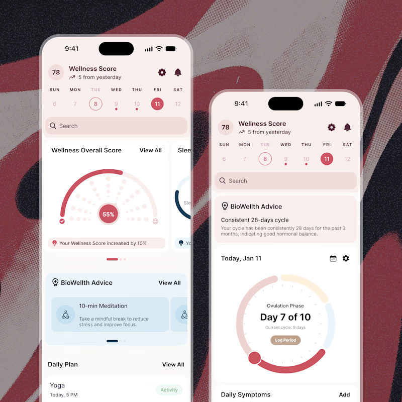
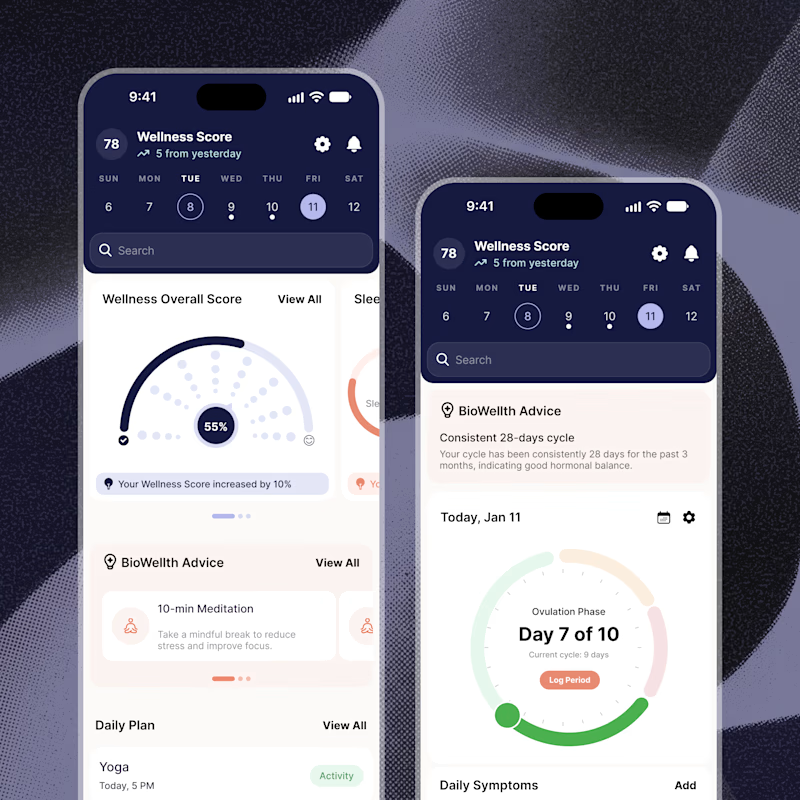
Exploring two color palette directions for a women’s health app. Which one feels right to you? 👀
32 voted
56%
25 voted
44%
57 votes
Closed

Both are amazing! The purple definitely has better contrast, but I’d still go with the berry one, purely a personal preference

Crypto Portfolio Dashboard
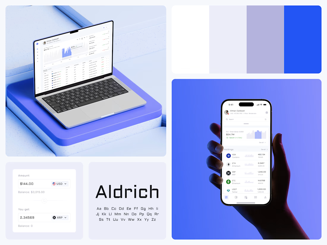
Blue means one thing here: the range you are looking at.
The value chart is a row of thin gray bars, and only the selected date range fills in blue. You read the period that matters and keep the months around it as context.
The phone carries the same chart above the holdings list. Each coin gets its own small bar chart between the name and the amount, so you can scan the whole portfolio for movement without opening a single coin.
Trading screens get busy fast. This one stays light and calm, so the numbers lead: total value, realized and unrealized P&L and open positions, all on one screen.
Designed by the Hue & Machine team.
#Crypto #Fintech #DashboardDesign #TradingPlatform #DataVisualization #UIDesign #ProductDesign #WebApp #MobileDesign #FigmaDesign


Nice Ui Dmytro

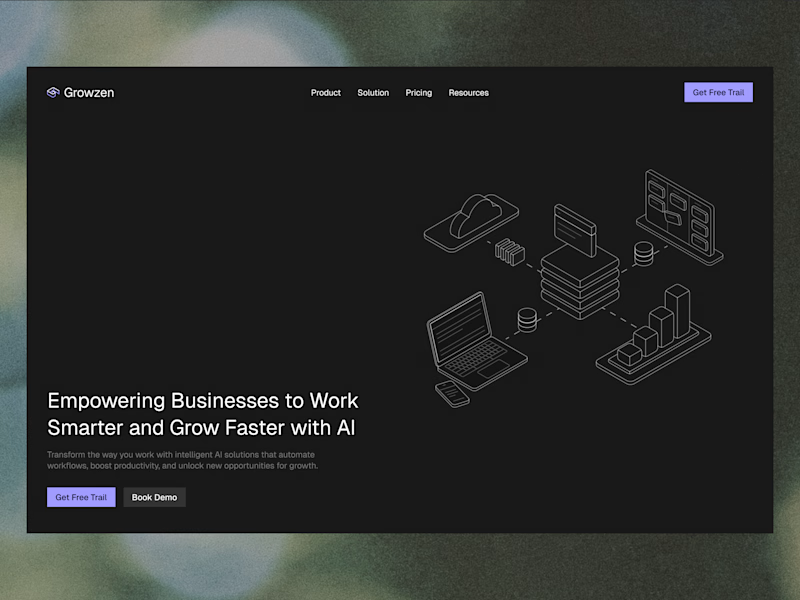
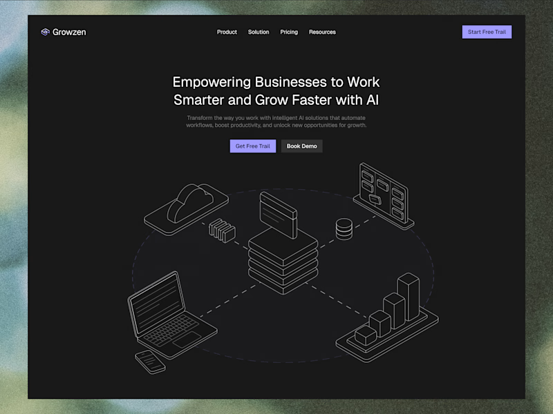
Designed a website concept for AI powered platform.
I wanted to give it a clean, minimal with a custom isometric illustration in the hero section.
Which version do you like better?
19 voted
59%
13 voted
41%
32 votes
Closed
