
Mackenzie TerHaar
Let's make things make sense, and make them beautiful too :)



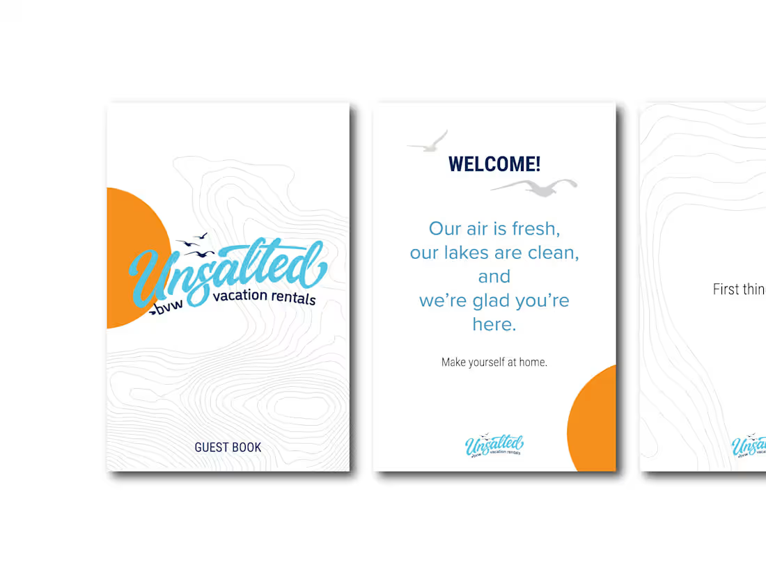
Unsalted Vacation Rentals — Guest Book Design
A branded guest book designed for Unsalted Vacation Rentals to create a welcoming, informative, and cohesive experience for vacation-rental guests.
Role - Graphic/Visual Designer
Focus - Brand Design • Information Hierarchy • Print Design • Visual Communication
Client - Unsalted Vacation Rentals
The Challenge
Vacation-rental guests need quick access to important information—from Wi-Fi and emergency contacts to house rules and checkout instructions—without feeling overwhelmed by a wall of text or disconnected instructions.
The goal was to turn essential guest information into a clear, approachable, and on-brand experience that felt consistent with Unsalted's vacation-focused identity.
The Solution
I designed a cohesive 14-page guest book that balances practical information with brand personality and creates a clear flow throughout the guest experience.
- Structured information into intuitive sections covering arrival, support, house rules, checkout, and future bookings
- Established clear visual hierarchy so important information—such as emergency contacts, quiet hours, and checkout requirements—is easy to find
- Applied Unsalted's visual identity through typography, color, imagery, and graphic elements
- Created a welcoming brand experience beginning with a branded introduction and continuing through the guest's entire stay
- Included strategic business touchpoints encouraging guests to book directly for future stays and introducing Unsalted's property-management services
- Designed for real-world use with concise copy, scannable layouts, and practical information guests can reference throughout their stay
Final Design
Welcome & Brand Introduction
- An inviting opening establishes the Unsalted experience and immediately orients guests to the property.
Guest Information
- Essential Wi-Fi, support, emergency, and house information is organized for quick reference.
House Rules & Checkout
- Clear hierarchy makes expectations and checkout responsibilities easy to understand and follow.
Stay → Return
- The final pages turn the guest experience into an opportunity to encourage direct bookings and continued engagement with the brand.
0
35
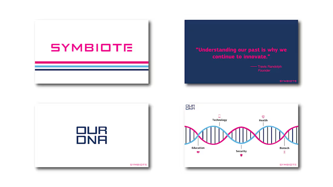
Symbiote — Branded Presentation Design
A complete presentation redesign that transformed a dated, disjointed PowerPoint into a cohesive branded experience for employee onboarding and prospective client presentations.
Role - Visual Designer
Focus - Presentation Design • Brand Design • Visual Storytelling • Information Hierarchy • Content Structure
Tools - Adobe Illustrator
The Challenge
The original presentation lacked visual cohesion and a clear narrative, making it difficult to communicate Symbiote's story, capabilities, and value to both new employees and prospective customers.
The Solution
I restructured and redesigned the presentation to create a clearer visual and narrative flow while establishing a cohesive Symbiote-branded system throughout.
- Reorganized content into a more intentional narrative, from company history and identity through capabilities and design process
- Created a cohesive visual system using Symbiote's existing brand colors, logo, imagery, and custom company typeface
- Designed custom typography treatments using Symbiote's unique typeface to create a more distinctive branded experience
- Improved information hierarchy to make dense content, timelines, certifications, and company information easier to digest
- Created visual storytelling moments to break up informational content and reinforce key brand messages
- Designed for two audiences — communicating Symbiote's story internally while also functioning as an introduction to prospective customers
0
46
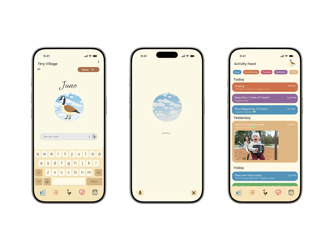
Tiny Village — AI-Powered Baby Tracking App
A mobile app concept designed to make baby tracking and caregiver communication feel lighter, more intuitive, and less overwhelming. At the center of the experience is Juno, an empathetic AI companion designed to help caregivers track, organize, and navigate the everyday demands of caring for a baby.
Role - UX Designer / UX Design Lead
Focus - User Research • UX Strategy • AI Interaction Design • Visual Design • Prototyping • Usability Testing
Client - Tiny Village — General Assembly Client Project
The Challenge
Caregivers are constantly tracking feeding, sleep, diapers, medications, appointments, and other details—often while exhausted and physically occupied with a baby. Existing tracking tools can add to that mental load with rigid inputs, excessive notifications, and fragmented communication between caregivers.
Tiny Village was designed to make tracking faster, more natural, and more collaborative.
The Solution
Juno, an AI companion, sits at the center of the experience—allowing caregivers to interact through natural language and voice rather than relying solely on manual data entry.
Key features included:
- One-click verbal tracking for hands-free logging
- Juno AI assistant for tracking, reminders, guidance, and support
- Shared activity feed to keep caregivers informed in real time
- Collaborative communication around the baby's needs
- Visualized baby data to make patterns easier to understand
- Family coordination tools to distribute caregiving responsibilities
Final Design
Juno — AI Assistant - An approachable AI companion designed to make tracking feel conversational rather than administrative.
Voice Tracking - Hands-free interaction allows caregivers to log information when their hands—or attention—are occupied.
Activity Feed - A shared timeline keeps important updates visible across parents and caregivers.
1
1
129
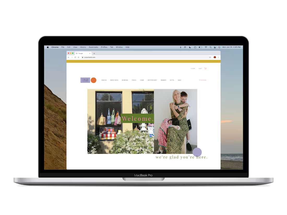
The Yo Store — E-Commerce UX/UI Redesign
A UX/UI redesign for The Yo Store, a Portland-based independent retailer, focused on creating a cleaner, more intuitive e-commerce experience while preserving the warmth and personality of the physical store.
Role - UX/UI Designer
Focus - E-Commerce UX • Information Architecture • UI Design
Tools - Figma, Procreate, ChatGPT, Adobe Suite
The Challenge
The existing shopping experience made product discovery and inventory browsing less intuitive, while the digital experience didn't fully capture the personality and curated feel of the physical store.
Key Improvements
- Simplified navigation and information architecture
- Added sorting and filtering for easier product discovery
- Created dedicated Sale and Back Soon sections
- Introduced Shop Fave to highlight staff/customer favorites
- Refined the visual system to create a calmer, more cohesive shopping experience
Final Design
Homepage
- A cleaner visual system brings the personality of The Yo Store into the digital experience.
Sale / Product Discovery
- Sorting and category organization make it easier to browse the product selection.
Product Detail
- Clear hierarchy makes product information easier to scan and evaluate.
Cart
- A simplified cart experience keeps product, quantity, and pricing information easy to understand.
1
107