The network for creativity
Join 1.25M professional creatives like you
Connect with clients, get discovered, and run your business 100% commission-free
Creatives on Contra have earned over $150M and we are just getting started
Back to feedPost
Taste Test
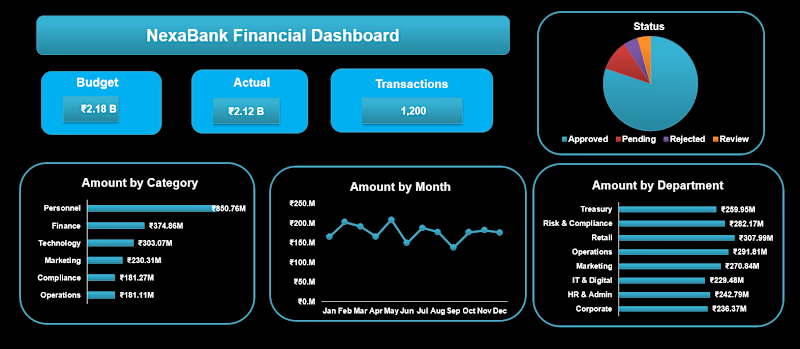
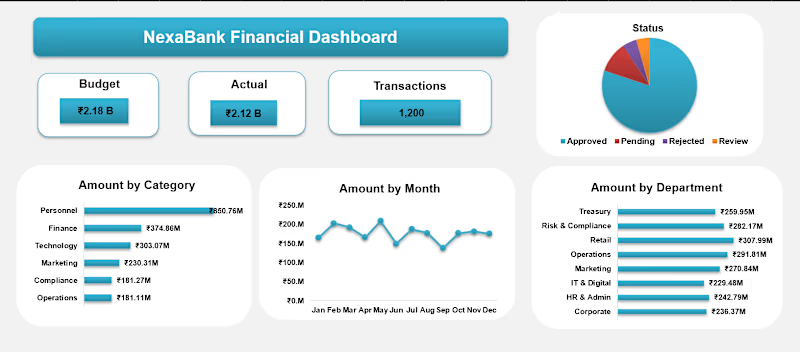
I made this Nexabank Financial Dashboard for my client.
Which one is looking better?
Let me know your thoughts.


3 voted
43%
4 voted
57%
7 votes
Closed


Both looks good but the first one is better

Thanks a lot Kabir

Option 2 for me — it feels cleaner and easier to scan, while keeping the KPIs and charts visually clear. Both are well structured, but Option 2 feels more presentation-ready.
Thanks a lot didi
The network for creativity
Join 1.25M professional creatives like you
Connect with clients, get discovered, and run your business 100% commission-free
Creatives on Contra have earned over $150M and we are just getting started





Related posts

Swiss-inspired web design exploration. Which one would you go with?
11 voted
37%
19 voted
63%
30 votes
Closed

expanded for user convinience

Just created a Framer website preloader with 2 options to choose from. The difference is the sequence of what appears first and the reveal animation. I made two options because I can’t choose which is best lol. What’s your favorite, Option 1 or 2?
BTW if you want this for free (normally $12), like it on the Framer Marketplace (on this link) and comment here so I know, and I’ll send it to your DM.

20 voted
48%
22 voted
52%
42 votes
Closed
Option 1 feels better than Option 2 for me


Booking Calendar: Compact or Expanded?
I’m testing two calendar layouts for booking a spa hotel stay.
Version A - Compact. The calendar, selected dates, number of nights, and button remain inside one card.
Version B - Expanded. After the check-in date is selected, a separate booking summary card appears below the calendar.
The functionality is the same - only the presentation and visual hierarchy are different.
Which version feels clearer and easier to use?
17 voted
49%
18 voted
51%
35 votes
Closed

How do you create videos like these?