The network for creativity
Join 1.25M professional creatives like you
Connect with clients, get discovered, and run your business 100% commission-free
Creatives on Contra have earned over $150M and we are just getting started
Back to feedPost
Taste Test

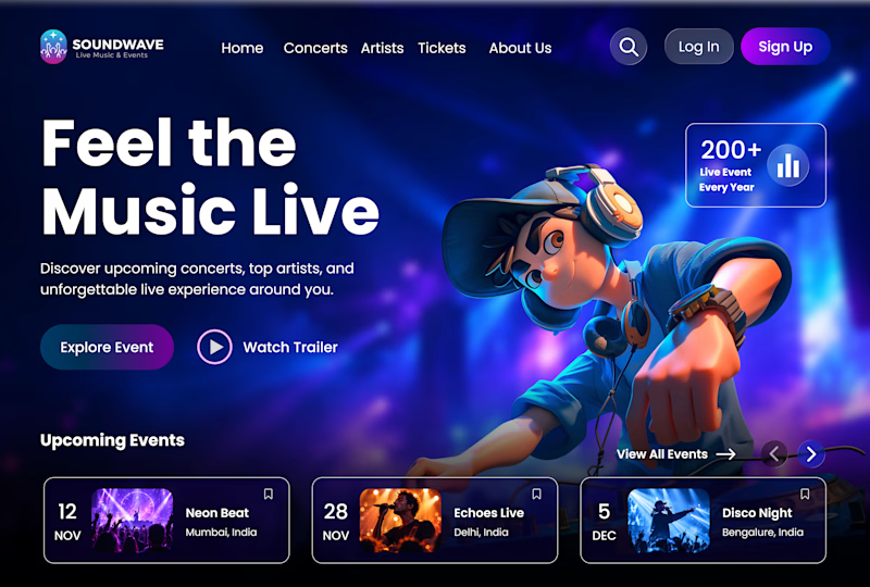
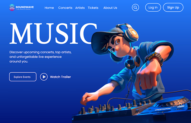
Do you prefer having cards directly on the hero section for a faster access, or a minimal hero layout that focused on visual impact?
Which approach works better for a music plateform?

6 voted
50%
6 voted
50%
12 votes
Closed

Voted Immersive Dark. It suits a music platform better, the glow gives it more energy.
Thanks for voting, Rafee! Glad you liked the immersive direction.

Cards on hero is the way for music platforms! Users want instant access to events, not just visuals. Your dark immersive UI with cards balances both perfectly 🔥
Thanks, Sagar! 🔥 That’s exactly the balance I wanted to explore between quick access to events and an immersive visual experience.

Option b got me

Cards on the hero, all the way. A music platform is something you open every day, so instant access to events and drops matters more than visual impact. The minimal version looks beautiful, but it makes me do one more click to get anywhere. Are you leaning toward a hybrid, like a slim card strip under a smaller hero?
Great observation, Timothy! I agree that instant access is key for a music platform. I’ll test a slim card strip to balance both.

Immersive Dark UI is stunning🔥🔥🔥🔥
Thanks, Mostafa

Immersive Dark UI is attention seeking!!!

Minimal
Thanks for voting! 😊
The network for creativity
Join 1.25M professional creatives like you
Connect with clients, get discovered, and run your business 100% commission-free
Creatives on Contra have earned over $150M and we are just getting started











Related posts

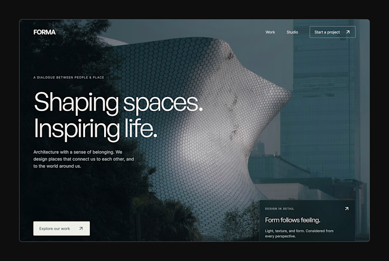
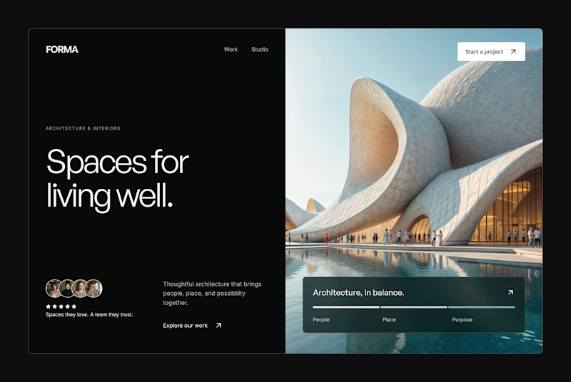
Design Exploration: Hero Section of Architecture Website. Which one do you think much better?


12 voted
43%
16 voted
57%
28 votes
Closed


🌲 Nordhaus | Prefab Timber Homes Website (Framer)
Homes that grow quietly with the forest, now on the web. 🏡
Nordhaus is a website for a Latvian builder of prefabricated timber homes, created in Figma and built in Framer as a responsive site for desktop, tablet and mobile. It brings the brand's calm Nordic character through full-screen photography, a scroll-driven process story, a horizontal model gallery and interactive testimonials.
✨ Template coming soon to Framer.


Wonderful design man

New template in the book.
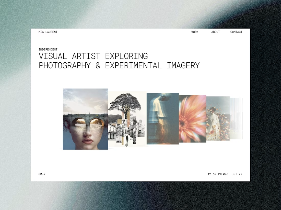
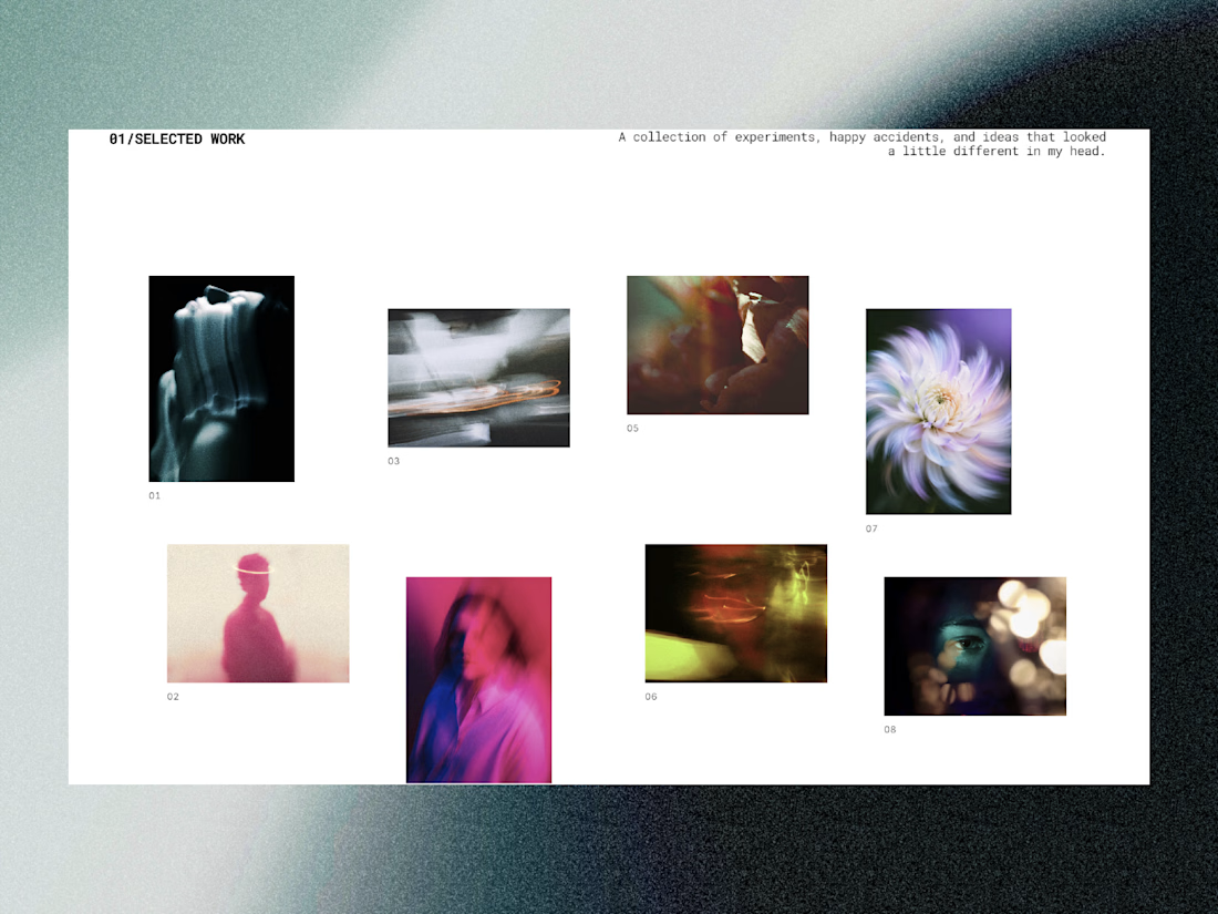
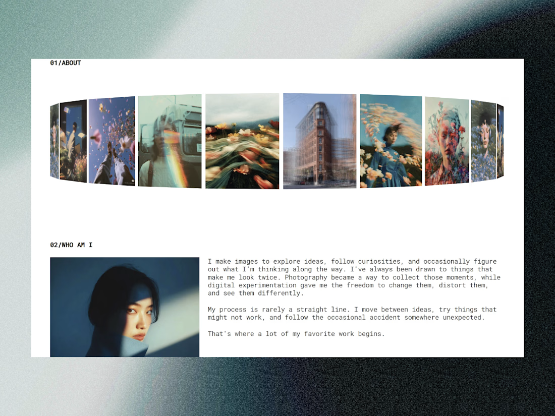
Made for artists!

creative work