The network for creativity
Join 1.25M professional creatives like you
Connect with clients, get discovered, and run your business 100% commission-free
Creatives on Contra have earned over $150M and we are just getting started
Back to feedPost
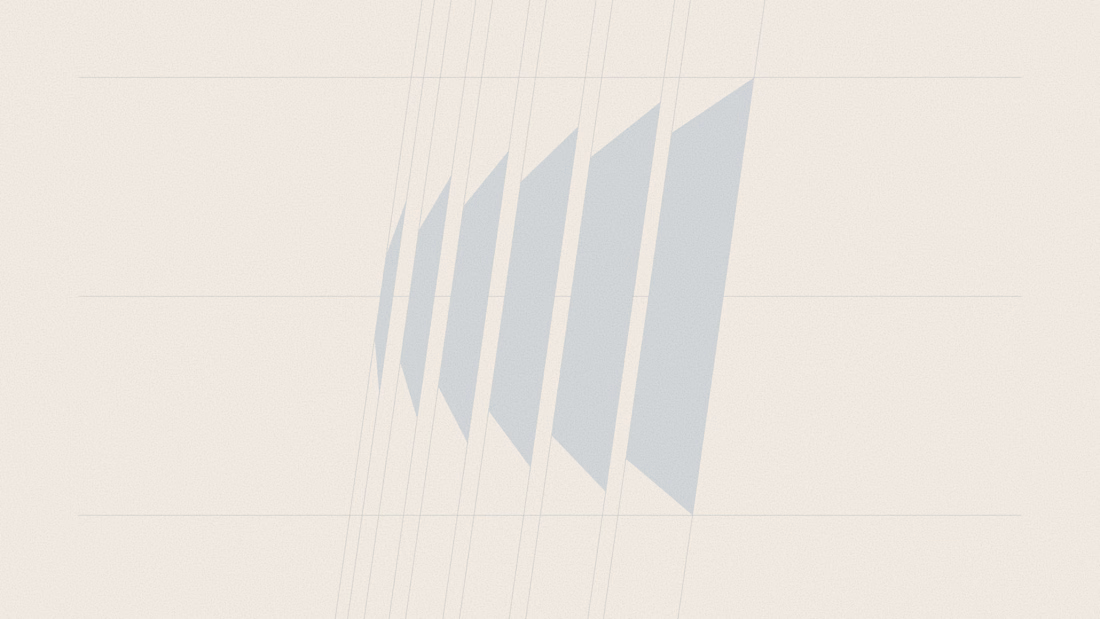
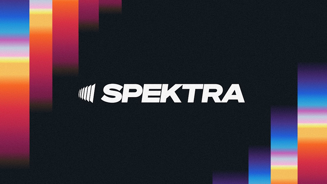
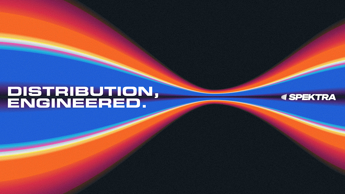
A closer look at the Spektra logo I designed.
The mark fans out from a narrow point, while the wordmark leans forward. together, they give it a sense of movement without needing much detail.
There’s a lot of color in the wider identity, so the logo holds its own in plain white. Simple geometry with enough weight to stand up to everything around it.


Kudooss. .... ... .🔥


Thanks!

This is fire, Daniel
The logo conveys the story
Thank you so much!

🙌

The way the mark fans outward while the wordmark leans forward gives it this natural momentum. Clean restraint in an identity that clearly has a lot of energy in it.
Thank you, that was the goal.

This is so great
Well-Designed!
Thank you so, so much!

The way the mark and wordmark both suggest forward motion without feeling too literal is really well handled.

beautiful, i love the thought you put into the work here!

Awesome!

the fanning out mark is such a clean way to get movement without over designing it. and holding up in plain white is the real test, thats where most logos fall apart. really solid

This is amazing!

Well-done


Solid work!

fresh and innovative take. So inspiring! 😍


Really Cool work🔥👏👏

You are absolutely right but to me the font is not perfectly matching withe the logo personality. how many fonts did you try ?

Amazing design

Outstanding work🔥

Awesome!

Lovely, simple and premium

Daniel always showing up, you the real GOAT

This is mind blowing

Super sick man

The restraint is what makes this work. The white mark carries a clear sense of motion on its own, while the spectrum can live around it without competing. I’m curious did you test how the narrow gaps hold up at favicon or app-icon size?


This is rad

Great job here

The restraint in the mark is what makes the wider identity work so well. There’s already a lot of speed and energy in the visual system, so keeping the logo this compact and directional gives it something solid to anchor around. Really well balanced.

The movement in the mark is subtle but really effective, and the white logo lets the colorful identity shine without competing with it 👌🎨

Logo carrying the brand energy.


This is mind blowing
wait for the full case study
Alright Daniel,
Waiting for that

fusion Look
The network for creativity
Join 1.25M professional creatives like you
Connect with clients, get discovered, and run your business 100% commission-free
Creatives on Contra have earned over $150M and we are just getting started











Related posts


Approved logo for a mental health and daily habit app built for seafarers and offshore workers.
Can't wait to share more.


Lovely cohesive work, Alex. The motion is spot on!

15 seconds of smooth UI, editorial layouts, and micro-interactions.
Kept the micro-interactions snappy, typography expressive, and transitions buttery smooth.
Rate this UI animation from 1 to 10 in the comments, or tell me what you’d improve! 😉


Solid 10/10 bro! 🔥 Micro-interactions are super snappy and transitions are buttery smooth indeed. Editorial layout game is strong. Keep it up!