The network for creativity
Join 1.25M professional creatives like you
Connect with clients, get discovered, and run your business 100% commission-free
Creatives on Contra have earned over $150M and we are just getting started
Back to feedPost
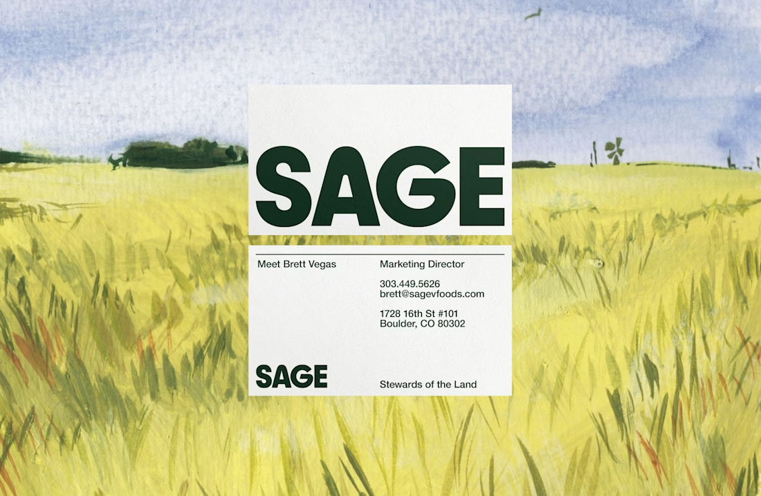
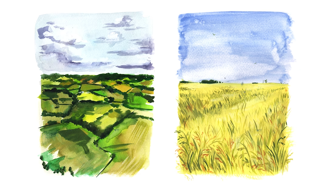
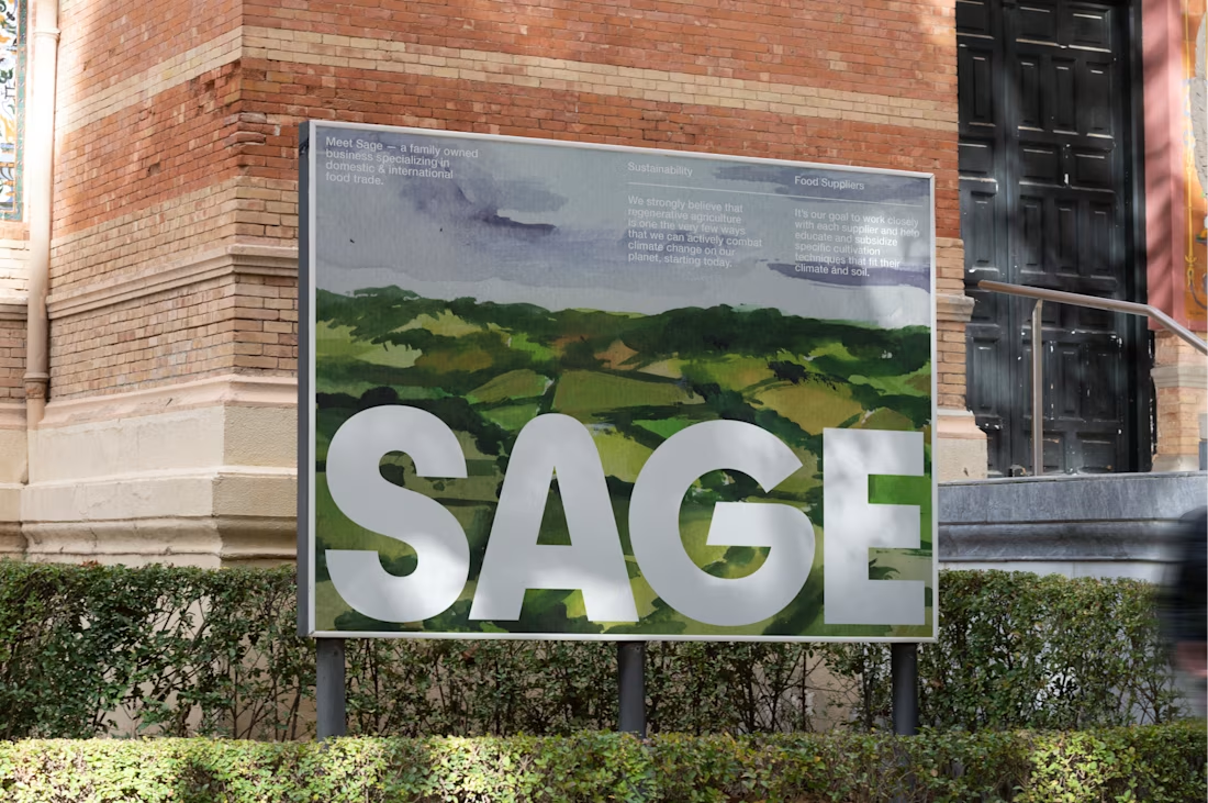
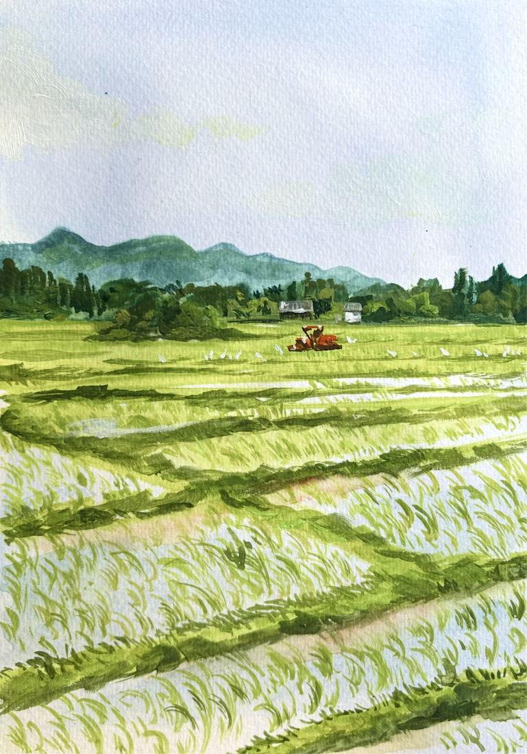
Watercolor Illustrations and Identity Design for Sage, a commercial rice company. Work done through Anchovies Agency within my role as Illustrative Art Director.




This looks clean and well thought out. How long did it take you to bring everything together?

Thank you so much! It took our agency about 2 weeks to to get design & identity thought out while Illustrations took me about 2-3 Days to sketch and finalize!
Great work! keep it up!


This is TOO GOOD
Aw thanks so much!!

great job 👌

Looks attractive

It is really pleasant to scroll through. Really nice work!

Oh wow! These are so calming and the Sage logo goes so well overlayed with the watercolors

This looks great — thanks for sharing.

After a long time, I came across a watercolor painting. Thanks for creating and sharing one. Loved it.

looks so good i love those cards

omgg I love thiss

Amazing work 👏

amazing
awsome


I love this concept!

Beautiful watercolors! I also like how the boldness of the Sage wordmark goes so well against the delicacy of the watercolor illustration


So nice Kira!
The network for creativity
Join 1.25M professional creatives like you
Connect with clients, get discovered, and run your business 100% commission-free
Creatives on Contra have earned over $150M and we are just getting started




Related posts

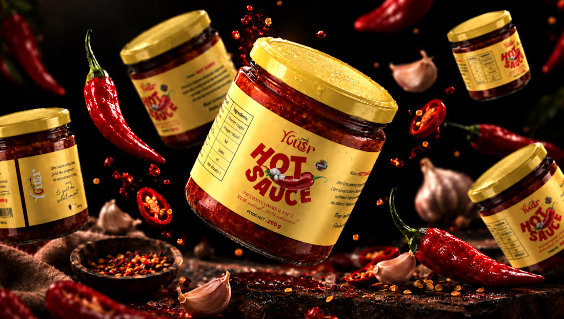
Yousr — Hot Sauce Brand Identity & Packaging Design
Turning bold flavor into a bold visual identity.
Yusr Hot Sauce is a food packaging project created to translate the intensity, heat, and character of the product into a striking visual experience.
The packaging combines a warm, distinctive color palette with bold typography and expressive graphic elements, creating an identity that immediately communicates the product's spicy and authentic character.
The visual direction was developed around the contrast between the rich red tones of the chili sauce and the warm cream of the label, creating a strong and recognizable presence across the product range.
From the label design to the final product presentation, every element was carefully considered to enhance the product's personality while maintaining clarity and brand consistency.
The final art direction brings the packaging to life through a dramatic food-focused environment, using rich textures, controlled lighting, and carefully composed ingredients to create an appetizing and memorable product experience.
A packaging identity designed to capture attention, communicate flavor, and give Yusr Hot Sauce a distinctive presence.
View the full project : https://www.behance.net/gallery/255675391/Yousr-Hot-Sauce-Brand-Identity-Packaging-Design
#PackagingDesign #FoodPackaging #HotSauce #LabelDesign #FoodBranding #ProductDesign #ArtDirection



Sharing this amazing project I had the pleasure to work on ⚡️
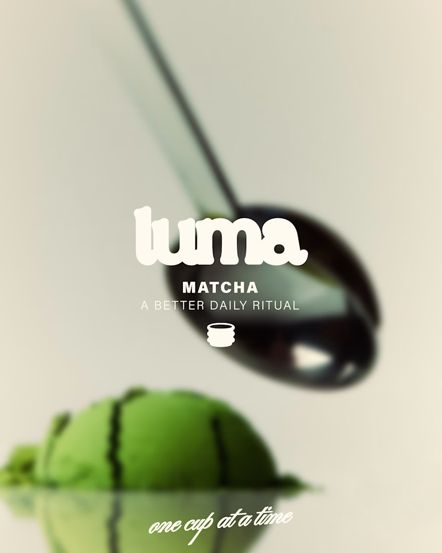
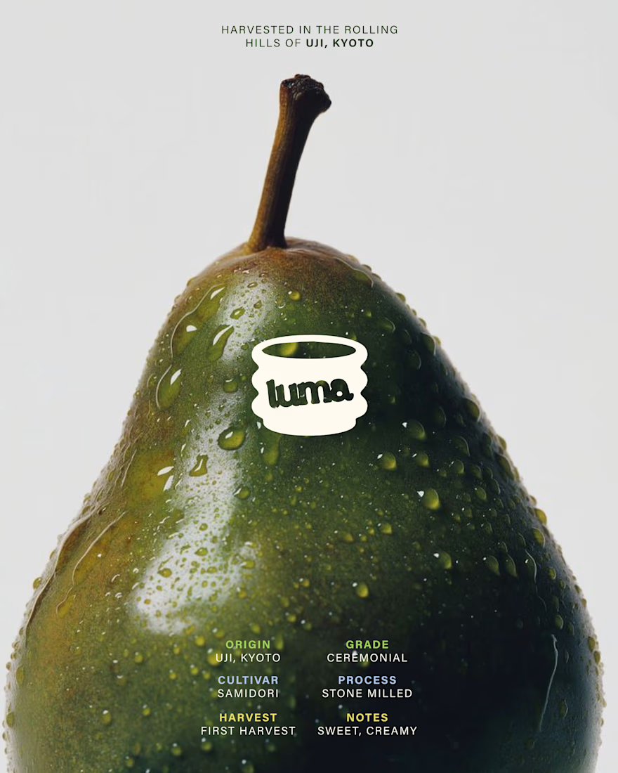
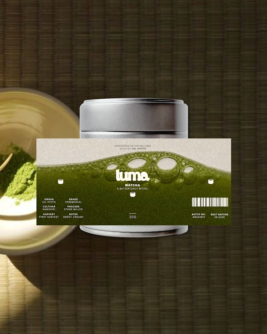
LUMA is a matcha brand built around the ritual of taking a moment for yourself.
The identity combines a fresh, playful color palette with a clean and contemporary visual language, creating a brand that feels vibrant without losing its sense of calm.
The result is a modern matcha identity that brings together natural qualities with a bright, lifestyle-driven aesthetic.
Check the full project on https://www.behance.net/gallery/255763939/LUMA-Matcha-Branding
Tell me your thoughts! 🔥🍵

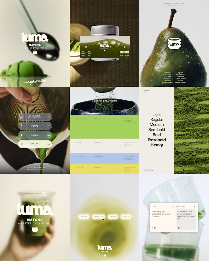

Most of the matcha shelf is muted and ceremonial-looking, so a bright palette is exactly what makes this findable. The trade is that brightness tends to read as everyday latte rather than premium grade, and that shows up in what people expect to pay - was the daily-ritual end the deliberate target rather than the ceremonial one?

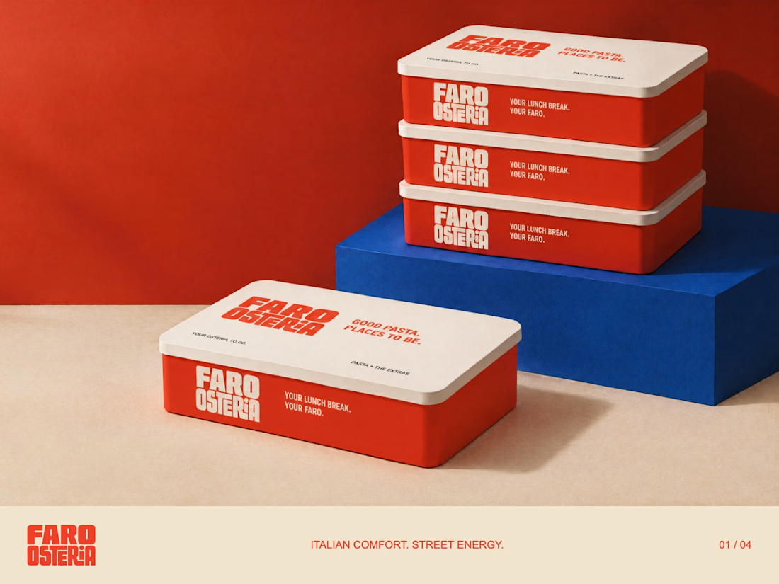
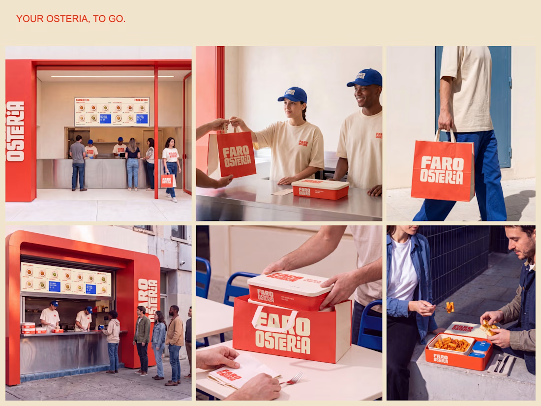
FARO OSTERIA — Italian comfort. Street energy.
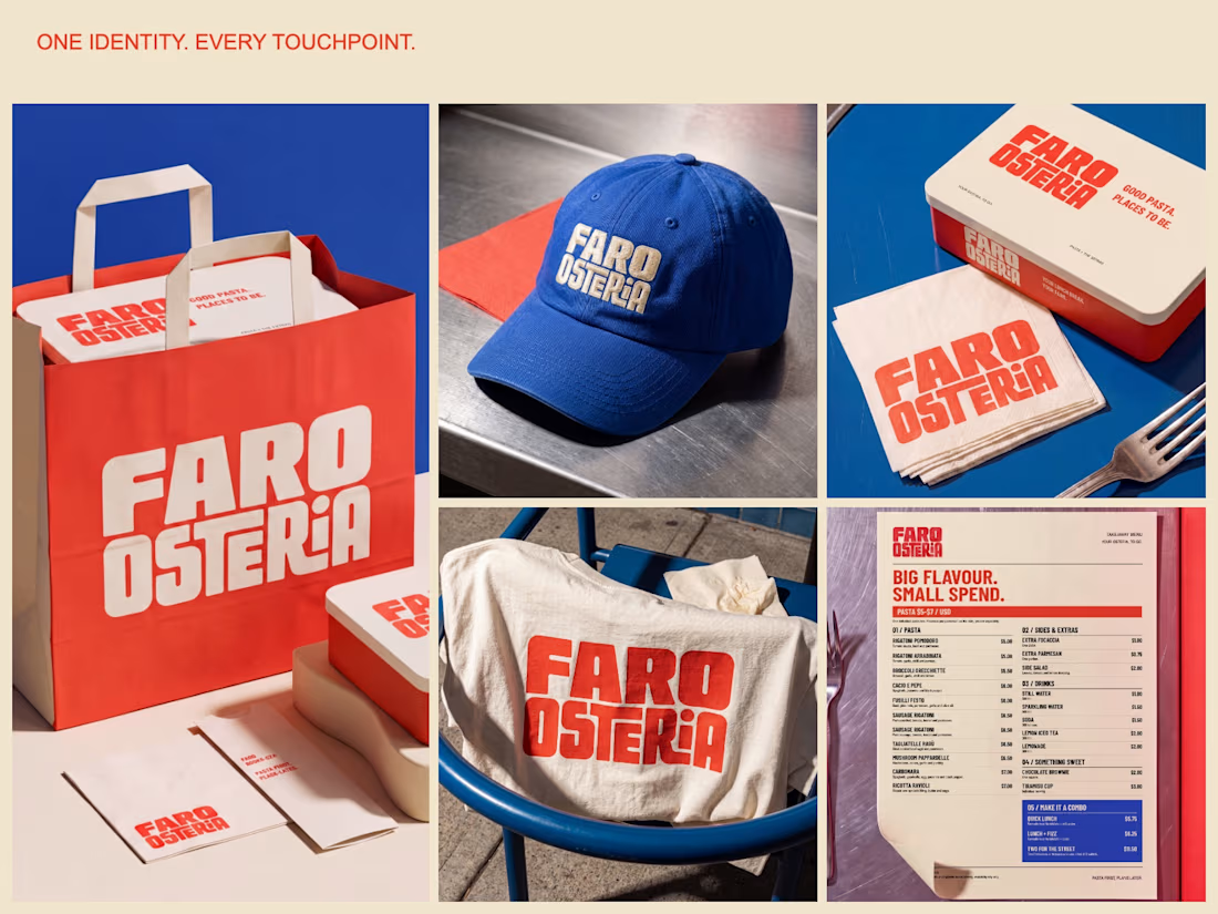
A brand and takeaway concept built around the entire meal: bold packaging, a clear digital menu and a street presence that carries the same identity from counter to customer.
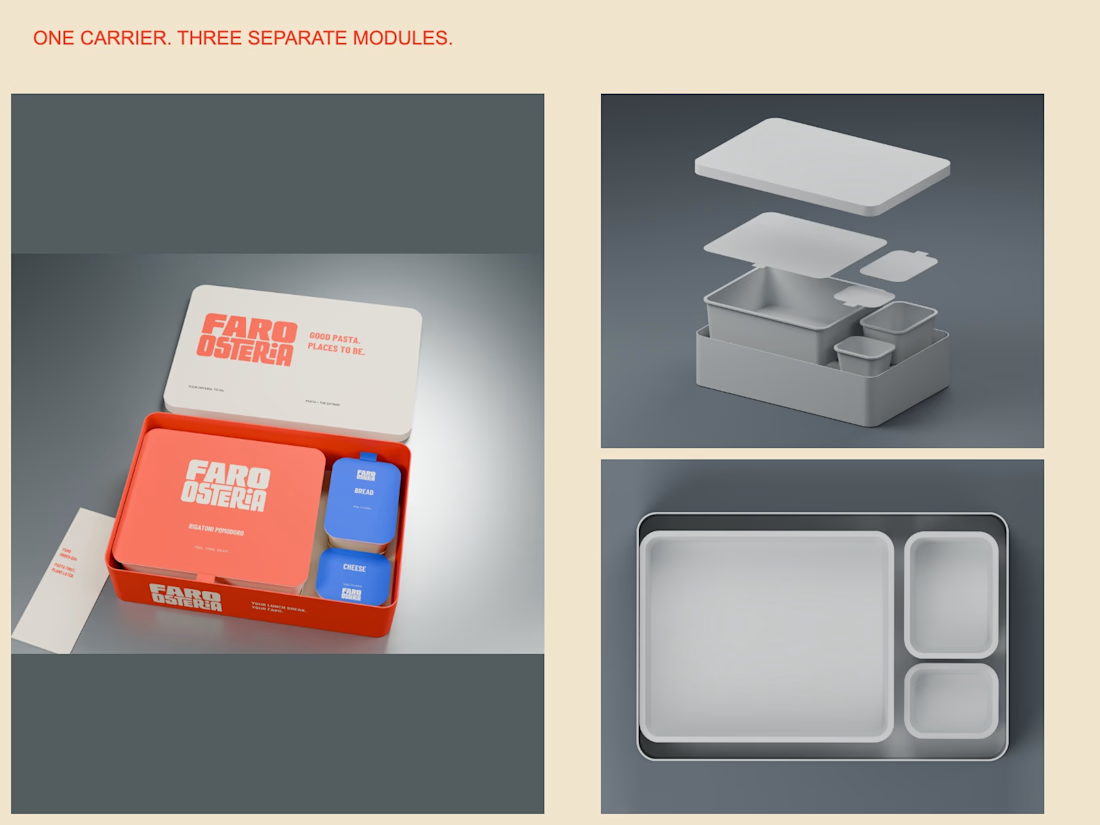
The packaging study uses one carrier with separate pasta, bread and cheese modules. The visual system extends through a $5–$7 pasta menu, uniforms, bags and editorial campaign imagery.
Creative Direction — Mauricio Pontual.
Concept study. Packaging modelled in Blender; campaign imagery developed with AI-assisted tools and art direction.
Explore the complete project:
https://www.behance.net/gallery/255879863/Faro-Osteria-Food-Branding-Packaging-Design



Amazing🙌